KimTools / Controls / TextBox
Kt TextBox
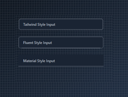
An enhanced, highly flexible text input control for Modern WinForms supporting custom styles, SVG icons, and automatic casing.

🟢 DESIGNER SUPPORT
This control has full Visual Studio design-time support.
Drag it from the Toolbox onto your form, customize its properties directly in the Properties window, and KimTools will generate the corresponding code for you.
Style
| Style | Kt-TextBoxStyle | Sets the TextBox’s style. |
|---|
TextPlaceholder
| TextPlaceholder | String | Sets the TextBox’s placeholder. |
|---|
TextCasing
| TextCasing | Kt-TextCasing | Sets the input character casing. |
|---|
IconLeft
| IconLeft | String | Sets the Icon left. |
|---|
IconRight
| IconRight | String | Sets the Icon right. |
|---|
Loading
| Loading | Boolean | Gets or sets a value indicating whether to show loader |
|---|
Password
| Password | Boolean | Gets or sets a value indicating whether the text in the TextBox control should appear as the default password character. |
|---|
Bg
| Bg | Kt-Color | Sets the Bg. |
|---|
Border
| Border | Kt-Color | Sets the Border. |
|---|
BorderActive
| BorderActive | Kt-Color | Sets the Border active. |
|---|
BorderRadius
| BorderRadius | Int32 | Sets the TextBox’s border radius. |
|---|
SVG Icon Slots
Add visual clarity using built-in SVG icons on the left or right of the input via IconLeft and IconRight.
🔴 🟡 🟢
var panel = new Panel
{
    Width = 300,
    Height = 110,
    BackColor = Color.Transparent
};

var searchInput = new KtTextBox
{
    MinimumSize = new Size(280, 40),
    TextPlaceholder = "Search...",
    IconLeft = "search",
    IconRight = "close",
    Style = KtTextBox.KtTextBoxStyle.Tailwind,
    BorderActive = KtColor.INFO
};

var passwordInput = new KtTextBox
{
    MinimumSize = new Size(280, 40),
    TextPlaceholder = "Enter Password",
    Password = true,
    IconLeft = "lock",
    IconRight = "eye",
    Style = KtTextBox.KtTextBoxStyle.Fluent,
    BorderActive = KtColor.WARNING
};

panel.Controls.Add(searchInput);
panel.Controls.Add(passwordInput);

searchInput.Location = new Point(10, 10);
passwordInput.Location = new Point(10, 60);
Auto
Light
Dark


Async Loading State
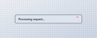
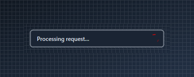
Set Loading = true to show an active spinner indicator and automatically disable user input during processing.
🔴 🟡 🟢
var panel = new Panel
{
    Width = 300,
    Height = 60,
    BackColor = Color.Transparent
};

var loadingInput = new KtTextBox
{
    MinimumSize = new Size(280, 40),
    Text = "Processing request...",
    Loading = true,
    Style = KtTextBox.KtTextBoxStyle.Tailwind,
    BorderActive = KtColor.ERROR
};

panel.Controls.Add(loadingInput);
loadingInput.Location = new Point(10, 10);
Auto
Light
Dark
API Reference
| Bg | Kt-Color | Sets the Bg. |
| Border | Kt-Color | Sets the Border. |
| BorderActive | Kt-Color | Sets the Border active. |
| Content | Kt-Color | Sets the Content. |
| Style | Kt-TextBoxStyle | Sets the TextBox’s style. |
| TextCasing | Kt-TextCasing | Sets the input character casing. |
| AcceptsReturn | Boolean | Gets or sets a value indicating whether pressing ENTER in a multiline TextBox control creates a new line of text in the control or activates the default button for the form. |
| AcceptsTab | Boolean | Gets or sets a value indicating whether pressing the TAB key in a multiline text box control types a TAB character in the control instead of moving the focus to the next control in the tab order. |
| AutoSizeHeight | Boolean | Indicates whether the control can respond to user interaction. |
| Enabled | Boolean | Indicates whether the control can respond to user interaction. |
| HideSelection | Boolean | Gets or sets a value indicating whether the selected text in the text box control remains highlighted when the control loses focus. |
| Loading | Boolean | Gets or sets a value indicating whether to show loader |
| Modified | Boolean | Gets or sets a value that indicates that the text box control has been modified by the user since the control was created or its contents were last set. |
| Password | Boolean | Gets or sets a value indicating whether the text in the TextBox control should appear as the default password character. |
| ReadOnly | Boolean | Sets a value indicating whether text in the text box is read-only. |
| ShortcutsEnabled | Boolean | Gets or sets a value indicating whether the defined shortcuts are enabled. |
| TextWrap | Boolean | Indicates whether a multiline text box control automatically wraps words to the beginning of the next line when necessary. |
| PasswordChar | Char | Gets or sets the character used to mask characters of a password in a single-line TextBox control. |
| IconStroke | Double | Sets the Icon stroke. |
| ForeColor | Color | Sets the TextBox’s foreground color. |
| DefaultFont | Font | Sets the text input’s font. |
| CustomIconLeft | Image | Sets the TextBox’s left icon. |
| CustomIconRight | Image | Sets the TextBox’s right icon. |
| BorderRadius | Int32 | Sets the TextBox’s border radius. |
| BorderThickness | Int32 | Sets TextBox’s border thickness. |
| IconPadding | Int32 | Sets the TextBox’s padding for both the left and the right icon. |
| IconSize | Int32 | Sets the Icon size. |
| MaxLength | Int32 | Gets or sets the maximum number of characters the user can type or paste into the text box control. |
| SelectionLength | Int32 | Gets or sets the number of characters selected in the text box. |
| SelectionStart | Int32 | Gets or sets the starting point of text selected in the text box. |
| TextOffsetX | Int32 | Sets the TextBox’s left margin. |
| TextOffsetY | Int32 | Sets the TextBox’s top margin. |
| IconLeft | String | Sets the Icon left. |
| IconRight | String | Sets the Icon right. |
| TextPlaceholder | String | Sets the TextBox’s placeholder. |
| SelectedText | String | Gets or sets a value indicating the currently selected text in the control. |
| Text | String | Sets the text input. |
| Lines | String[] | Gets or sets the lines of text in a text box control. |
| AutoCompleteMode | AutoCompleteMode | Gets or sets an option that controls how automatic completion works for the TextBox. |
| AutoCompleteSource | AutoCompleteSource | Gets or sets a value specifying the source of complete strings used for automatic completion. |
| AutoCompleteCustomSource | AutoCompleteStringCollection | Gets or sets a custom System.Collections.Specialized.StringCollection to use when the AutoCompleteSource property is set to CustomSource. |
| Cursor | Cursor | Represents the image used to paint the mouse pointer. |
| TextAlign | HorizontalAlignment | Gets or sets how text is aligned in a TextBox control. |
| ScrollBars | ScrollBars | Indicates which scroll bars will be shown when the TextBox is set to multiline. |