Kt ProgressRadial
A customizable circular progress indicator with gradient arcs, independent cap styles, sub/superscript annotations, and smooth animation support.

🟢 DESIGNER SUPPORT
This control has full Visual Studio design-time support.
Drag it from the Toolbox onto your form, customize its properties directly in the Properties window, and KimTools will generate the corresponding code for you.
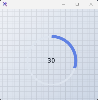
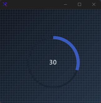
Flat / Minimal Radial
A clean solid-color ring with uniform track thickness and flat caps. No gradients, no ornamentation — just a precise arc against a subtle track.
var panel = new FlowLayoutPanel
{
    Width = 240,
    Height = 240,
    Padding = new Padding(20),
    BackColor = Color.Transparent,
    AutoScroll = false,
    FlowDirection = FlowDirection.TopDown
};

var radial = new KtProgressRadial
{
    Width = 180,
    Height = 180,
    Margin = new Padding(10),
    Value = 42,
    Minimum = 0,
    Maximum = 100,
    Background = KtColor.BASE_2,
    Foreground = KtColor.PRIMARY % 80,
    Thickness = 6,
    CircleMargin = 10,
    CapStart = KtProgressRadial.CapStyles.Flat,
    CapEnd = KtProgressRadial.CapStyles.Flat,
    ValueColor = KtColor.CONTENT,
    ValueMargin = new Padding(0)
};

panel.Controls.Add(radial);
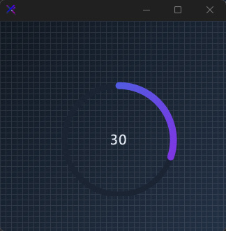
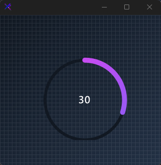
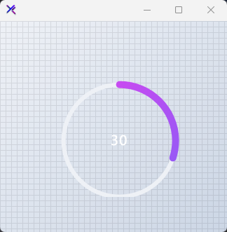
Gradient / Neon Radial
A vivid Fuchsia-to-Violet gradient sweep with a thick, rounded progress arc. High contrast against a deep base makes the ring feel electric and modern.
var panel = new FlowLayoutPanel
{
    Width = 240,
    Height = 240,
    Padding = new Padding(20),
    BackColor = Color.Transparent,
    AutoScroll = false,
    FlowDirection = FlowDirection.TopDown
};

var radial = new KtProgressRadial
{
    Width = 180,
    Height = 180,
    Margin = new Padding(10),
    Value = 78,
    Minimum = 0,
    Maximum = 100,
    Background = KtColor.BASE_1,
    Foreground = (KtColor.Fuchsia, KtColor.Violet, 45),
    Thickness = 6,
    CircleMargin = 10,
    CapStart = KtProgressRadial.CapStyles.Round,
    CapEnd = KtProgressRadial.CapStyles.Round,
    ValueColor = KtColor.White,
    ValueMargin = new Padding(0)
};

panel.Controls.Add(radial);

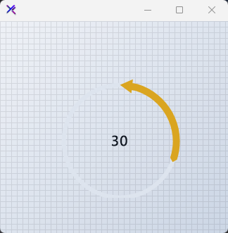
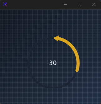
Cap Styles (CapStart, CapEnd)
Individual control over the start and end line caps: Flat, Round, Arrow, or Triangle. Here the arc begins with an arrow and terminates in a triangle for a directional, gauge-like read.
var panel = new FlowLayoutPanel
{
    Width = 240,
    Height = 240,
    Padding = new Padding(20),
    BackColor = Color.Transparent,
    AutoScroll = false,
    FlowDirection = FlowDirection.TopDown
};

var radial = new KtProgressRadial
{
    Width = 180,
    Height = 180,
    Margin = new Padding(10),
    Value = 60,
    Minimum = 0,
    Maximum = 100,
    Background = KtColor.BASE_2,
    Foreground = KtColor.WARNING,
    Thickness = 6,
    CircleMargin = 10,
    CapStart = KtProgressRadial.CapStyles.Arrow,
    CapEnd = KtProgressRadial.CapStyles.Triangle,
    ValueColor = KtColor.CONTENT,
    ValueMargin = new Padding(0)
};

panel.Controls.Add(radial);
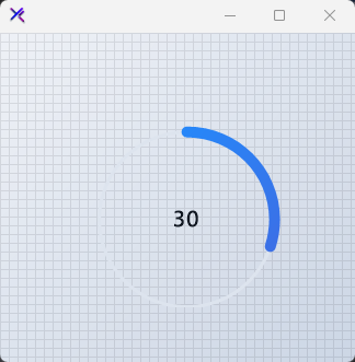
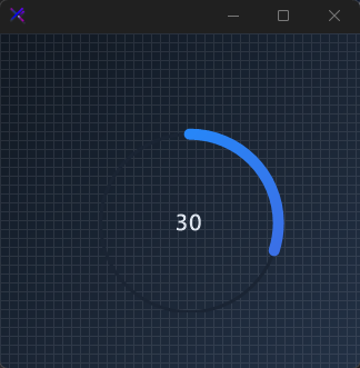
Track Thickness (Thickness)
Control the background track weight independently. A thin 3 px track beneath the default bold fill creates strong hierarchical focus on the current value.
var panel = new FlowLayoutPanel
{
    Width = 240,
    Height = 240,
    Padding = new Padding(20),
    BackColor = Color.Transparent,
    AutoScroll = false,
    FlowDirection = FlowDirection.TopDown
};

var radial = new KtProgressRadial
{
    Width = 180,
    Height = 180,
    Margin = new Padding(10),
    Value = 55,
    Minimum = 0,
    Maximum = 100,
    Background = KtColor.BASE_2,
    Foreground = (KtColor.INFO, KtColor.PRIMARY),
    Thickness = 3,
    CircleMargin = 10,
    CapStart = KtProgressRadial.CapStyles.Round,
    CapEnd = KtProgressRadial.CapStyles.Round,
    ValueColor = KtColor.CONTENT,
    ValueMargin = new Padding(0)
};

panel.Controls.Add(radial);
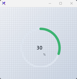
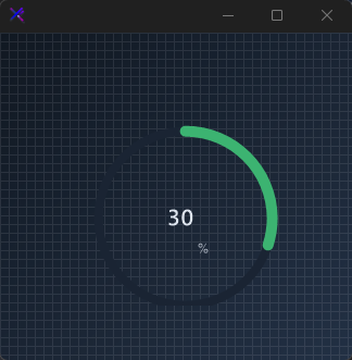
Percentage Mode (IsPercentage)
Set IsPercentage = true to display the value as a percent with a % superscript. The superscript is automatically positioned and tinted via SuperScriptColor.
var panel = new FlowLayoutPanel
{
    Width = 240,
    Height = 240,
    Padding = new Padding(20),
    BackColor = Color.Transparent,
    AutoScroll = false,
    FlowDirection = FlowDirection.TopDown
};

var radial = new KtProgressRadial
{
    Width = 180,
    Height = 180,
    Margin = new Padding(10),
    Value = 65,
    Minimum = 0,
    Maximum = 100,
    IsPercentage = true,
    Background = KtColor.BASE_2,
    Foreground = KtColor.SUCCESS,
    Thickness = 8,
    CircleMargin = 10,
    CapStart = KtProgressRadial.CapStyles.Round,
    CapEnd = KtProgressRadial.CapStyles.Round,
    ValueColor = KtColor.CONTENT,
    SuperScriptColor = KtColor.CONTENT % 70,
    ValueMargin = new Padding(0)
};

panel.Controls.Add(radial);
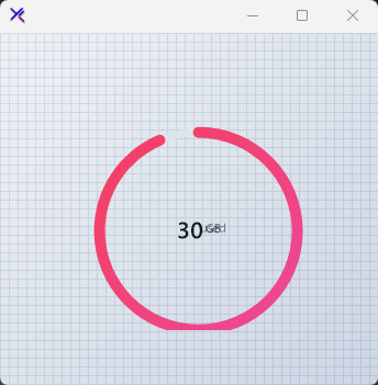
Subscript & Superscript (SubScriptText, SuperScriptText)
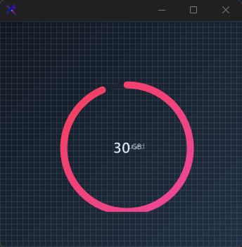
Annotate the center value with secondary labels. SuperScriptText sits above-right, SubScriptText sits below-right — each with independent margins, colors, and a shared SecondaryFont.
var panel = new FlowLayoutPanel
{
    Width = 260,
    Height = 260,
    Padding = new Padding(20),
    BackColor = Color.Transparent,
    AutoScroll = false,
    FlowDirection = FlowDirection.TopDown
};

var radial = new KtProgressRadial
{
    Width = 200,
    Height = 200,
    Margin = new Padding(10),
    Value = 12,
    Minimum = 0,
    Maximum = 32,
    Background = KtColor.BASE_2,
    Foreground = (KtColor.Rose, KtColor.Pink),
    Thickness = 6,
    CircleMargin = 10,
    CapStart = KtProgressRadial.CapStyles.Round,
    CapEnd = KtProgressRadial.CapStyles.Round,
    ValueColor = KtColor.CONTENT,
    SuperScriptText = "GB",
    SuperScriptColor = KtColor.CONTENT % 70,
    SuperScriptMargin = new Padding(5, 20, 0, 0),
    SubScriptText = "used",
    SubScriptColor = KtColor.CONTENT % 50,
    SubScriptMargin = new Padding(5, -20, 0, 0),
    SecondaryFont = new Font("Segoe UI", 8f),
    ValueMargin = new Padding(0)
};

panel.Controls.Add(radial);
Animated / Indeterminate (Animated, AnimationInterval, AnimationSpeed)
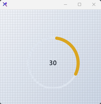
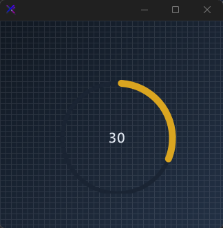
When Animated = true and the value is between min and max, the arc continuously rotates. Control the spin speed with AnimationInterval (degrees per tick) and AnimationSpeed (timer interval in ms).
var panel = new FlowLayoutPanel
{
    Width = 240,
    Height = 240,
    Padding = new Padding(20),
    BackColor = Color.Transparent,
    AutoScroll = false,
    FlowDirection = FlowDirection.TopDown
};

var radial = new KtProgressRadial
{
    Width = 180,
    Height = 180,
    Margin = new Padding(10),
    Value = 50,
    Minimum = 0,
    Maximum = 100,
    Animated = true,
    AnimationInterval = 4,
    AnimationSpeed = 30,
    Background = KtColor.BASE_2,
    Foreground = KtColor.WARNING,
    Thickness = 6,
    CircleMargin = 10,
    CapStart = KtProgressRadial.CapStyles.Round,
    CapEnd = KtProgressRadial.CapStyles.Round,
    ValueColor = KtColor.CONTENT,
    ValueMargin = new Padding(0)
};

panel.Controls.Add(radial);
API Reference
| Foreground | Kt-Brush | Sets the progress color. |
| SubScriptColor | Kt-Color | Sets the subscript color. |
| SuperScriptColor | Kt-Color | Sets the superscript color. |
| Background | Kt-Color | Sets the progress background color. |
| ValueColor | Kt-Color | Sets the progress background color. |
| CapStart | CapStyles | Sets the rendering style of the progress starting point. |
| CapEnd | CapStyles | Sets the rendering style of the progress ending point. |
| Animated | Boolean | Sets a value indicating whether the progress movement will be animated. |
| IsPercentage | Boolean | Sets a value indicating whether the progress value will be in percentage format. |
| Font | Font | Sets the control’s primary font. |
| SecondaryFont | Font | Sets the secondary font. |
| Value | Int32 | Sets the progress value. |
| Minimum | Int32 | Sets the minimum progress value. |
| Maximum | Int32 | Sets the maximum progress value. |
| CircleMargin | Int32 | Sets the circle margin. |
| Thickness | Int32 | Sets the line thickness. |
| AnimationInterval | Int32 | Sets the animation interval. |
| AnimationSpeed | Int32 | Sets the animation speed. |
| SubScriptText | String | Sets the subscript text. |
| SuperScriptText | String | Sets the superscript text. |
| ValueMargin | Padding | Sets the value text margin. |
| SuperScriptMargin | Padding | Sets the superscript margin. |
| SubScriptMargin | Padding | Sets the subscript margin. |