Kt RadioBox
A customizable, stylish radio button control for WinForms with built-in binding and color states.

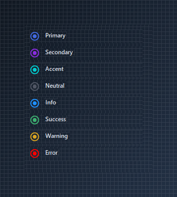
🟢 DESIGNER SUPPORT
This control has full Visual Studio design-time support.
Drag it from the Toolbox onto your form, customize its properties directly in the Properties window, and KimTools will generate the corresponding code for you.
RadioColor
| RadioColor | Kt-Color | Sets the radio color. |
|---|
OutlineColor
| OutlineColor | Kt-Color | Sets the outline color. |
|---|
BorderThickness
| BorderThickness | Int32 | Sets the outline’s border thickness. |
|---|
Binding a Label Control
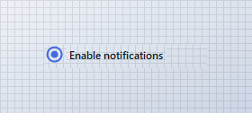
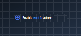
KtRadioBox supports direct binding to external controls (such as Label) via the BindingControl property. Clicking the bound label automatically toggles the radio button and handles position placement.
var row = new Panel
{
    Width = 180,
    Height = 26,
    BackColor = Color.Transparent
};

var radio = new KtRadioBox
{
    Size = new Size(21, 21),
    RadioColor = KtColor.PRIMARY,
    OutlineColor = KtColor.PRIMARY,
    AllowBindingControlLocation = true
};

var label = new Label
{
    Text = "Enable notifications",
    AutoSize = true,
    Cursor = Cursors.Hand
};

// Add to container first
row.Controls.Add(radio);
row.Controls.Add(label);

// Assign binding control after container addition
radio.BindingControl = label;
radio.BindingControlPosition = KtRadioBox.BindingControlPositions.Right;
Radio Group
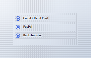
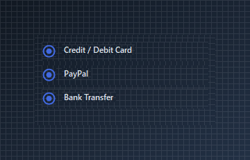
Multiple KtRadioBox instances sharing the same parent container automatically handle mutual exclusion, ensuring only one option in the group is selected at a time.
var row1 = new Panel
{
    Width = 240,
    Height = 28,
    Location = new Point(10, 10),
    BackColor = Color.Transparent
};

var radio1 = new KtRadioBox
{
    Size = new Size(21, 21),
    RadioColor = KtColor.PRIMARY,
    OutlineColor = KtColor.PRIMARY,
    Checked = true
};

var label1 = new Label
{
    Text = "Credit / Debit Card",
    AutoSize = true
};

row1.Controls.Add(radio1);
row1.Controls.Add(label1);
radio1.Location = new Point(0, 3);
label1.Location = new Point(radio1.Right + 8, 4);

var row2 = new Panel
{
    Width = 240,
    Height = 28,
    Location = new Point(10, 44),
    BackColor = Color.Transparent
};

var radio2 = new KtRadioBox
{
    Size = new Size(21, 21),
    RadioColor = KtColor.PRIMARY,
    OutlineColor = KtColor.PRIMARY,
    Checked = false
};

var label2 = new Label
{
    Text = "PayPal",
    AutoSize = true
};

row2.Controls.Add(radio2);
row2.Controls.Add(label2);
radio2.Location = new Point(0, 3);
label2.Location = new Point(radio2.Right + 8, 4);

var row3 = new Panel
{
    Width = 240,
    Height = 28,
    Location = new Point(10, 78),
    BackColor = Color.Transparent
};

var radio3 = new KtRadioBox
{
    Size = new Size(21, 21),
    RadioColor = KtColor.PRIMARY,
    OutlineColor = KtColor.PRIMARY,
    Checked = false
};

var label3 = new Label
{
    Text = "Bank Transfer",
    AutoSize = true
};

row3.Controls.Add(radio3);
row3.Controls.Add(label3);
radio3.Location = new Point(0, 3);
label3.Location = new Point(radio3.Right + 8, 4);

container.Controls.Add(row1);
container.Controls.Add(row2);
container.Controls.Add(row3);
Custom State Colors and Borders
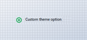
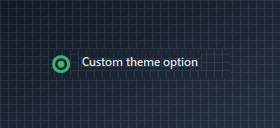
Customize individual states using RadioColor, OutlineColor, OutlineColorUnchecked, and BorderThickness.
var row = new Panel
{
    Width = 180,
    Height = 28,
    BackColor = Color.Transparent
};

var radio = new KtRadioBox
{
    Size = new Size(21, 21),
    RadioColor = KtColor.SUCCESS,
    OutlineColor = KtColor.SUCCESS,
    OutlineColorUnchecked = KtColor.NEUTRAL,
    BorderThickness = 3,
    Checked = true
};

var label = new Label
{
    Text = "Custom theme option",
    AutoSize = true
};

row.Controls.Add(radio);
row.Controls.Add(label);

radio.Location = new Point(0, 3);
label.Location = new Point(radio.Right + 8, 4);
API Reference
| RadioColor | Kt-Color | Sets the radio color. |
| RadioColorTabFocused | Kt-Color | Sets the radio color on focus. |
| OutlineColorUnchecked | Kt-Color | Sets the radio’s outline color when unchecked. |
| OutlineColorTabFocused | Kt-Color | Sets the radio’s color when focused. |
| OutlineColor | Kt-Color | Sets the outline color. |
| BindingControlPosition | BindingControlPositions | Sets the position of the bound control in relation to the radio button. |
| Checked | Boolean | Sets a value indicating whether the radio is checked. |
| AllowBindingControlLocation | Boolean | Indicates whether the control will allow the bound control’s location to be positioned based on it’s own location. |
| BorderThickness | Int32 | Sets the outline’s border thickness. |
| BindingControl | Control | Sets the control to bind directly with; this in most cases is a Label. This setting also binds with the most appropriate events for the control selected. |