KimTools / Controls / Date
Kt Date
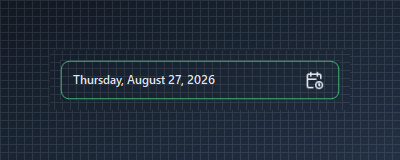
A modern, highly customizable Date Picker control for WinForms supporting custom icons, border radius, theme color styling, and alignment modes.

🟢 DESIGNER SUPPORT
This control has full Visual Studio design-time support.
Drag it from the Toolbox onto your form, customize its properties directly in the Properties window, and KimTools will generate the corresponding code for you.
Icon & Text Alignment
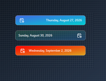
Configure IconAlign to place the calendar icon on the left or right side of the picker while automatically syncing text alignment.
🔴 🟡 🟢
var panel = new Panel
{
    Width = 300,
    Height = 110,
    BackColor = Color.Transparent
};

var dateLeft = new KtDate
{
    Width = 280,
    Height = 40,
    IconAlign = HorizontalAlignment.Left,
    Border = KtColor.INFO,
    BorderRadius = 6f
};

var dateRight = new KtDate
{
    Width = 280,
    Height = 40,
    IconAlign = HorizontalAlignment.Right,
    Border = KtColor.PRIMARY,
    BorderRadius = 6f
};

panel.Controls.Add(dateLeft);
panel.Controls.Add(dateRight);

dateLeft.Location = new Point(10, 10);
dateRight.Location = new Point(10, 60);
Auto
Light
Dark


Gradient Backgrounds (KtBrush Expressions)
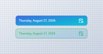
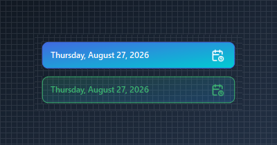
Leverage implicit tuple conversions (start, stop, angle) and KtColor opacity modifiers (%) to easily assign smooth linear gradients and subtle background surfaces.
🔴 🟡 🟢
var panel = new Panel
{
    Width = 300,
    Height = 110,
    BackColor = Color.Transparent
};

// Linear Gradient Background created using a 3-tuple (StartColor, StopColor, Angle)
var tupleGradientPicker = new KtDate
{
    Width = 280,
    Height = 40,
    Border = KtColor.PRIMARY,
    BorderRadius = 8f,
    TextColor = KtColor.White,
    IconColor = KtColor.White,
    Background = (KtColor.PRIMARY, KtColor.ACCENT, 45) // Implicit 3-tuple conversion
};

// Glassmorphic/Semi-Transparent Gradient with KtColor Opacity Modifiers (%)
var subtleGradientPicker = new KtDate
{
    Width = 280,
    Height = 40,
    Border = KtColor.SUCCESS,
    BorderRadius = 8f,
    TextColor = KtColor.SUCCESS,
    IconColor = KtColor.SUCCESS,
    Background = (KtColor.SUCCESS % 20, KtColor.INFO % 20) // Implicit 2-tuple conversion
};

panel.Controls.Add(tupleGradientPicker);
panel.Controls.Add(subtleGradientPicker);

tupleGradientPicker.Location = new Point(10, 10);
subtleGradientPicker.Location = new Point(10, 60);
Auto
Light
Dark
Display Week Numbers
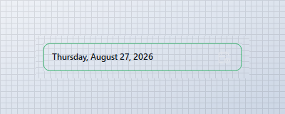
Enable DisplayWeekNumbers = true to inject week numbers into the drop-down calendar view.
🔴 🟡 🟢
var panel = new Panel
{
    Width = 300,
    Height = 60,
    BackColor = Color.Transparent
};

var datePicker = new KtDate
{
    Width = 280,
    Height = 40,
    DisplayWeekNumbers = true,
    Border = KtColor.SUCCESS,
    BorderRadius = 8f
};

panel.Controls.Add(datePicker);
datePicker.Location = new Point(10, 10);
Auto
Light
Dark
API Reference
| Background | Kt-Brush | Sets the indicator icon. |
| Border | Kt-Color | Sets the border/background color. |
| IconColor | Kt-Color | Sets the date picker icon color. |
| TextColor | Kt-Color | Sets the foreground color. |
| DisplayWeekNumbers | Boolean | Sets a value indicating whether the week numbers will be displayed. |
| Icon | Image | Sets the date picker icon. |
| Height | Int32 | Sets minimum height of the date picker. |
| TextMargin | Int32 | Sets the left text margin. |
| BorderRadius | float Nullable | Sets the border radius. |
| BorderWidth | float | Sets the border thickness. |
| IconAlign | HorizontalAlignment | Sets the indicator location. |