Kt CheckBox
A themeable, better-looking checkbox for WinForms, inspired by iCheck, with per-state color control.

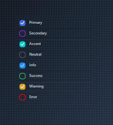
🟢 DESIGNER SUPPORT
This control has full Visual Studio design-time support.
Drag it from the Toolbox onto your form, customize its properties directly in the Properties window, and KimTools will generate the corresponding code for you.
| ColorScheme | Kt-Color | Sets the Color scheme. |
|---|
Anchoring a Label
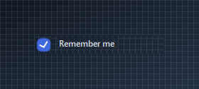
KtCheckBox aligns relative to external Label controls when positioned inside the same parent container.
var row = new Panel
{
    Width = 180,
    Height = 26,
    BackColor = Color.Transparent
};

var checkbox = new KtCheckBox
{
    Size = new Size(22, 22),
    ColorScheme = KtColor.PRIMARY
};

var label = new Label
{
    Text = "Remember me",
    AutoSize = true,
    Cursor = Cursors.Hand
};

label.Click += (s, e) => checkbox.Checked = !checkbox.Checked;

// Add to container first
row.Controls.Add(checkbox);
row.Controls.Add(label);

// Configure positions after adding to container
checkbox.Location = new Point(0, 2);
label.Location = new Point(checkbox.Right + 8, 4);
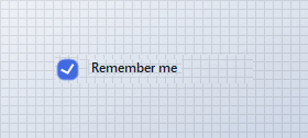
Style
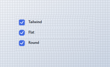
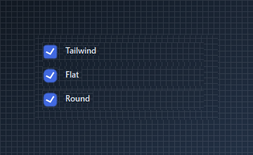
Switch between Tailwind, Flat, and Round presets. Round pairs well with a higher BorderRadius for a fully pill-shaped box.
var tailwindPanel = new Panel
{
    Width = 230,
    Height = 28,
    Location = new Point(10, 10),
    BackColor = Color.Transparent
};

var tailwind = new KtCheckBox
{
    Size = new Size(22, 22),
    BorderRadius = 6,
    Checked = true
};

var tailwindLabel = new Label
{
    Text = "Tailwind",
    AutoSize = true
};

tailwindPanel.Controls.Add(tailwind);
tailwindPanel.Controls.Add(tailwindLabel);
tailwind.Location = new Point(0, 2);
tailwindLabel.Location = new Point(tailwind.Right + 8, 4);

var flatPanel = new Panel
{
    Width = 230,
    Height = 28,
    Location = new Point(10, 44),
    BackColor = Color.Transparent
};

var flat = new KtCheckBox
{
    Size = new Size(22, 22),
    BorderRadius = 0,
    Checked = true
};

var flatLabel = new Label
{
    Text = "Flat",
    AutoSize = true
};

flatPanel.Controls.Add(flat);
flatPanel.Controls.Add(flatLabel);
flat.Location = new Point(0, 2);
flatLabel.Location = new Point(flat.Right + 8, 4);

var roundPanel = new Panel
{
    Width = 230,
    Height = 28,
    Location = new Point(10, 78),
    BackColor = Color.Transparent
};

var round = new KtCheckBox
{
    Size = new Size(22, 22),
    BorderRadius = 10,
    Checked = true
};

var roundLabel = new Label
{
    Text = "Round",
    AutoSize = true
};

roundPanel.Controls.Add(round);
roundPanel.Controls.Add(roundLabel);
round.Location = new Point(0, 2);
roundLabel.Location = new Point(round.Right + 8, 4);

container.Controls.Add(tailwindPanel);
container.Controls.Add(flatPanel);
container.Controls.Add(roundPanel);
ThreeState + CheckState
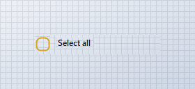
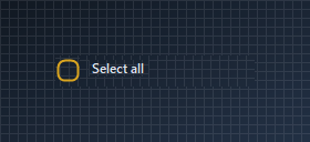
Set ThreeState to true and use Indeterminate for parent checkboxes whose children are only partially selected.
var row = new Panel
{
    Width = 180,
    Height = 28,
    BackColor = Color.Transparent
};

var checkbox = new KtCheckBox
{
    Size = new Size(22, 22),
    ColorScheme = KtColor.WARNING,
    ThreeState = true,
    CheckState = KtCheckBox.CheckStates.Indeterminate
};

var label = new Label
{
    Text = "Select all",
    AutoSize = true
};

// Add to container first
row.Controls.Add(checkbox);
row.Controls.Add(label);

// Set coordinates after adding to container
checkbox.Location = new Point(0, 2);
label.Location = new Point(checkbox.Right + 8, 4);
Custom OnCheck / OnUncheck colors
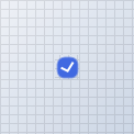
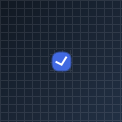
For finer control than ColorScheme provides, configure BorderColor, CheckBoxColor, and CheckmarkColor directly on OnCheck and OnUncheck.
var checkbox = new KtCheckBox
{
    Size = new Size(22, 22),
    Checked = true
};

checkbox.OnCheck.CheckBoxColor = KtColor.SUCCESS;
checkbox.OnCheck.BorderColor = KtColor.SUCCESS;
checkbox.OnCheck.CheckmarkColor = Color.White;

checkbox.OnUncheck.BorderColor = KtColor.NEUTRAL % 60;
Checklist
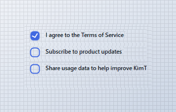
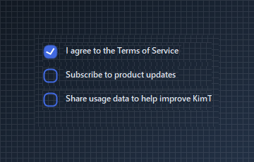
Pair KtCheckBox with labels inside simple Panel containers to create a vertical checklist.
var terms = new Panel
{
    Width = 240,
    Height = 28,
    Location = new Point(10, 10),
    BackColor = Color.Transparent
};

var termsCheckbox = new KtCheckBox
{
    Size = new Size(22, 22),
    ColorScheme = KtColor.PRIMARY,
    Checked = true
};

var termsLabel = new Label
{
    Text = "I agree to the Terms of Service",
    AutoSize = true
};

terms.Controls.Add(termsCheckbox);
terms.Controls.Add(termsLabel);
termsCheckbox.Location = new Point(0, 2);
termsLabel.Location = new Point(termsCheckbox.Right + 8, 4);

var updates = new Panel
{
    Width = 240,
    Height = 28,
    Location = new Point(10, 44),
    BackColor = Color.Transparent
};

var updatesCheckbox = new KtCheckBox
{
    Size = new Size(22, 22),
    ColorScheme = KtColor.PRIMARY,
    Checked = false
};

var updatesLabel = new Label
{
    Text = "Subscribe to product updates",
    AutoSize = true
};

updates.Controls.Add(updatesCheckbox);
updates.Controls.Add(updatesLabel);
updatesCheckbox.Location = new Point(0, 2);
updatesLabel.Location = new Point(updatesCheckbox.Right + 8, 4);

var usage = new Panel
{
    Width = 240,
    Height = 28,
    Location = new Point(10, 78),
    BackColor = Color.Transparent
};

var usageCheckbox = new KtCheckBox
{
    Size = new Size(22, 22),
    ColorScheme = KtColor.PRIMARY,
    Checked = false
};

var usageLabel = new Label
{
    Text = "Share usage data to help improve KimTools",
    AutoSize = true
};

usage.Controls.Add(usageCheckbox);
usage.Controls.Add(usageLabel);
usageCheckbox.Location = new Point(0, 2);
usageLabel.Location = new Point(usageCheckbox.Right + 8, 4);

container.Controls.Add(terms);
container.Controls.Add(updates);
container.Controls.Add(usage);
API Reference
| LabelPosition | BindingControlPositions | Gets or sets the position of the bound control in relation to the CheckBox. |
| Style | CheckBoxStyles | [Deprecated] Gets or sets the standard CheckBox style to be applied. |
| ColorScheme | Kt-Color | Sets the Color scheme. |
| Checked | Boolean | Sets the CheckBox check-state to true or false. |
| AnimateCheckMark | Boolean | Indicates whether the Checkmark will allow check-state-change animations/transitions at runtime. |
| AnimateCheckBox | Boolean | Indicates whether the CheckBox will allow standard animations at runtime. |
| AllowBindingControlLocation | Boolean | Indicates whether the CheckBox will allow the bound control’s location to be positioned based on it’s own location. |
| ToolTip | String | Allows you to easily set some ToolTip information to be displayed to the user on mouse-hovering over the control. |
| Cursor | Cursor | The cursor that appears when the pointer moves over the control. |
| Label | Label | Gets or sets the control to bind directly with the CheckBox; this in most cases is a Label. This setting also binds the most appropriate events of the CheckBox to the control selected. |