Kt SvgCanvas
A high-performance SVG canvas with a full templating engine supporting model binding, loops, conditionals, show/hide, processing instructions, and CSS SmartFormat variables.

🟢 DESIGNER SUPPORT
This control has full Visual Studio design-time support.
Drag it from the Toolbox onto your form, customize its properties directly in the Properties window, and KimTools will generate the corresponding code for you.
<svg width="100%" height="100%" viewBox="0 0 24 24" fill="none" stroke="currentColor" stroke-width="2" stroke-linecap="round" stroke-linejoin="round">
<path stroke="none" d="M0 0h24v24H0z" fill="none"/><path d="M19.5 12.572l-7.5 7.428l-7.5 -7.428a5 5 0 1 1 7.5 -6.566a5 5 0 1 1 7.5 6.572" />
</svg>
<svg width="100%" height="100%" viewBox="0 0 24 24" fill="none" stroke="currentColor" stroke-width="2" stroke-linecap="round" stroke-linejoin="round">
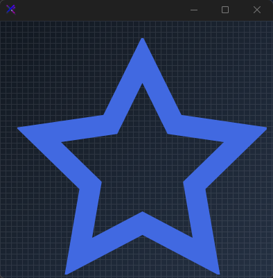
<path stroke="none" d="M0 0h24v24H0z" fill="none"/><path d="M12 17.75l-6.172 3.245l1.179 -6.873l-5 -4.867l6.9 -1l3.086 -6.253l3.086 6.253l6.9 1l-5 4.867l1.179 6.873z" />
</svg>
<svg width="100%" height="100%" viewBox="0 0 24 24" fill="none" stroke="currentColor" stroke-width="2" stroke-linecap="round" stroke-linejoin="round">
<path stroke="none" d="M0 0h24v24H0z" fill="none"/><path d="M10 5a2 2 0 1 1 4 0a7 7 0 0 1 4 6v3a4 4 0 0 0 2 3h-16a4 4 0 0 0 2 -3v-3a7 7 0 0 1 4 -6" /><path d="M9 17v1a3 3 0 0 0 6 0v-1" />
</svg>
<svg width="100%" height="100%" viewBox="0 0 24 24" fill="none" stroke="currentColor" stroke-width="2" stroke-linecap="round" stroke-linejoin="round">
<path stroke="none" d="M0 0h24v24H0z" fill="none"/><path d="M5 12l5 5l10 -10" />
</svg>
<svg width="100%" height="100%" viewBox="0 0 24 24" fill="none" stroke="currentColor" stroke-width="2" stroke-linecap="round" stroke-linejoin="round">
<path stroke="none" d="M0 0h24v24H0z" fill="none"/><path d="M10.325 4.317c.426 -1.756 2.924 -1.756 3.35 0a1.724 1.724 0 0 0 2.573 1.066c1.543 -.94 3.31 .826 2.37 2.37a1.724 1.724 0 0 0 1.065 2.572c1.756 .426 1.756 2.924 0 3.35a1.724 1.724 0 0 0 -1.066 2.573c.94 1.543 -.826 3.31 2.37 2.37a1.724 1.724 0 0 0 -2.37 2.37a1.724 1.724 0 0 0 -2.572 1.065c-.426 1.756 -2.924 1.756 -3.35 0a1.724 1.724 0 0 0 -2.573 -1.066c-1.543 .94 -3.31 -.826 -2.37 -2.37a1.724 1.724 0 0 0 -1.065 -2.572c-1.756 -.426 -1.756 -2.924 0 -3.35a1.724 1.724 0 0 0 1.066 -2.573c-.94 -1.543 .826 -3.31 2.37 -2.37c1 .608 2.296 .07 2.572 -1.065z" /><path d="M9 12a3 3 0 1 0 6 0a3 3 0 0 0 -6 0" />
</svg>
<svg width="100%" height="100%" viewBox="0 0 24 24" fill="none" stroke="currentColor" stroke-width="2" stroke-linecap="round" stroke-linejoin="round">
<path stroke="none" d="M0 0h24v24H0z" fill="none"/><path d="M5 12l-2 0l9 -9l9 9l-2 0" /><path d="M5 12v7a2 2 0 0 0 2 2h10a2 2 0 0 0 2 -2v-7" /><path d="M9 21v-6a2 2 0 0 1 2 -2h2a2 2 0 0 1 2 2v6" />
</svg>
<svg width="100%" height="100%" viewBox="0 0 24 24" fill="none" stroke="currentColor" stroke-width="2" stroke-linecap="round" stroke-linejoin="round">
<path stroke="none" d="M0 0h24v24H0z" fill="none"/><path d="M3 7a2 2 0 0 1 2 -2h14a2 2 0 0 1 2 2v10a2 2 0 0 1 -2 2h-14a2 2 0 0 1 -2 -2v-10z" /><path d="M3 7l9 6l9 -6" />
</svg>
<svg width="100%" height="100%" viewBox="0 0 24 24" fill="none" stroke="currentColor" stroke-width="2" stroke-linecap="round" stroke-linejoin="round">
<path stroke="none" d="M0 0h24v24H0z" fill="none"/><path d="M10 10m-7 0a7 7 0 1 0 14 0a7 7 0 1 0 -14 0" /><path d="M21 21l-6 -6" />
</svg>
<svg width="100%" height="100%" viewBox="0 0 24 24" fill="none" stroke="currentColor" stroke-width="2" stroke-linecap="round" stroke-linejoin="round">
<path stroke="none" d="M0 0h24v24H0z" fill="none"/><path d="M8 7a4 4 0 1 0 8 0a4 4 0 0 0 -8 0" /><path d="M6 21v-2a4 4 0 0 1 4 -4h4a4 4 0 0 1 4 4v2" />
</svg>
<svg width="100%" height="100%" viewBox="0 0 24 24" fill="none" stroke="currentColor" stroke-width="2" stroke-linecap="round" stroke-linejoin="round">
<path stroke="none" d="M0 0h24v24H0z" fill="none"/><path d="M18 6l-12 12" /><path d="M6 6l12 12" />
</svg>
Icon Row / Tabler Set
Display multiple Tabler icons side-by-side in individual KtSvgCanvas instances. Each canvas carries its own KtSvgTemplate with a distinct icon path. Canvas dimensions are set to 80 % of the panel height for uniform, responsive sizing. Use the Color property to theme each icon independently against a transparent background.
var panel = new FlowLayoutPanel
{
    Width = 500,
    Height = 500,
    Padding = new Padding(25),
    BackColor = Color.Transparent,
    AutoScroll = false,
    FlowDirection = FlowDirection.LeftToRight
};

string[] icons = { IconHome, IconUser, IconHeart, IconHeart };
KtColor[] colors = { KtColor.PRIMARY, KtColor.INFO, KtColor.ERROR, KtColor.WARNING };

for (int i = 0; i < icons.Length; i++)
{
    int dim = 100;

    var canvas = new KtSvgCanvas
    {
        Width = dim,
        Height = dim,
        Margin = new Padding(8),
        BackColor = Color.Transparent,
        Color = colors[i]
    };

    canvas.Templates.Add(new KtSvgTemplate(canvas.Templates)
    {
        Name = $"icon-{i}",
        Svg = icons[i]
    });

    panel.Controls.Add(canvas);
}


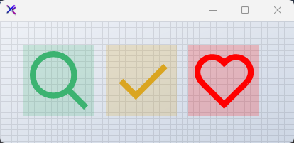
Themed Icons (Color, BackColor)
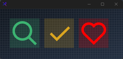
Tabler icons inherit the canvas Color as their stroke color. Place canvases on contrasting BackColor surfaces - light on dark, primary on white, or tinted washes. The error state uses KtColor.ERROR at full strength over a 20 % opacity wash. This makes the same vector paths adapt to any theme surface without duplicating SVG markup.
var panel = new FlowLayoutPanel
{
    Width = 420,
    Height = 200,
    Padding = new Padding(20),
    BackColor = Color.Transparent,
    AutoScroll = false,
    FlowDirection = FlowDirection.LeftToRight
};

int dim = 100;

var canvasSearch = new KtSvgCanvas
{
    Width = dim,
    Height = dim,
    Margin = new Padding(8),
    BackColor = KtColor.SUCCESS % 20,
    Color = KtColor.SUCCESS
};

canvasSearch.Templates.Add(new KtSvgTemplate(canvasSearch.Templates)
{
    Name = "search",
    Svg = IconSearch
});

var canvasCheck = new KtSvgCanvas
{
    Width = dim,
    Height = dim,
    Margin = new Padding(8),
    BackColor = KtColor.WARNING % 20,
    Color = KtColor.WARNING
};

canvasCheck.Templates.Add(new KtSvgTemplate(canvasCheck.Templates)
{
    Name = "check",
    Svg = IconCheck
});

var canvasHeart = new KtSvgCanvas
{
    Width = dim,
    Height = dim,
    Margin = new Padding(8),
    BackColor = KtColor.ERROR % 20,
    Color = KtColor.ERROR
};

canvasHeart.Templates.Add(new KtSvgTemplate(canvasHeart.Templates)
{
    Name = "heart",
    Svg = IconHeart
});

panel.Controls.Add(canvasSearch);
panel.Controls.Add(canvasCheck);
panel.Controls.Add(canvasHeart);

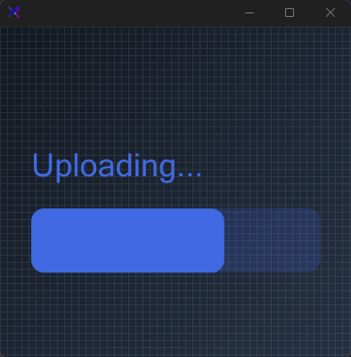
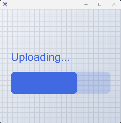
Model-Bound Progress Bar & Text
A simplified progress bar built with basic <rect> elements and top-left text using dominant-baseline="hanging" to prevent vertical cropping.
var canvas = new KtSvgCanvas
{
    Width = 400,
    Height = 400,
    BackColor = Color.Transparent,
    Color = KtColor.PRIMARY,
    Dock = DockStyle.Fill
};

canvas.Templates.Add(new KtSvgTemplate(canvas.Templates)
{
    Name = "status",
    Svg = """
          <svg width="100%" height="100%" viewBox="0 0 100 100" fill="none" >
              <!-- Top-Left Text -->
              <text x="5" y="45" dominant-baseline="hanging" font-size="10" font-weight="bold" fill="currentColor">{status}</text>

              <!-- Progress Track Background -->
              <rect x="5" y="55" width="90" height="20" rx="4" fill="currentColor" opacity="0.2" />

              <!-- Active Progress Fill -->
              <rect x="5" y="55" width="{progress}" height="20" rx="4" fill="currentColor" />
          </svg>
          """
});

canvas.Model["status"] = "Uploading...";
canvas.Model["progress"] = 60; // 0 to 90 scale to fit the track width
canvas.Render();

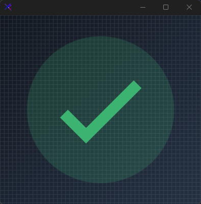
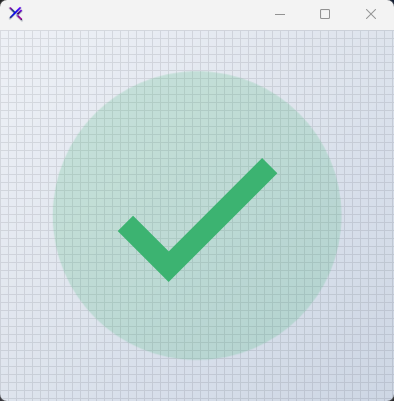
Conditional Rendering (x-if / x-else)
Toggle entire SVG branches using x-if and x-else attributes.
var canvas = new KtSvgCanvas
{
    Width = 400,
    Height = 400,
    BackColor = Color.Transparent,
};

canvas.Templates.Add(new KtSvgTemplate(canvas.Templates)
{
    Name = "toggle",
    // preserveAspectRatio="xMidYMid meet" centers and fills the 400x400 space uniformly
    Svg = """
          <svg width="100%" height="100%" viewBox="0 0 100 100" preserveAspectRatio="xMidYMid meet" xmlns="http://www.w3.org/2000/svg">
             <circle cx="50" cy="50" r="40" fill="currentColor" opacity="0.2"/>
              <g x-if="isActive">
                  <!-- Centered 100x100 relative geometry -->
                  <polyline points="30,52 42,64 70,36" stroke="currentColor" stroke-width="6" stroke-linecap="round" stroke-linejoin="round" fill="none"/>
              </g>
          </svg>
          """
});

canvas.Model["isActive"] = true;
canvas.Color = canvas.Model["isActive"].ToObject<bool>()
    ? KtColor.SUCCESS
    : KtColor.NEUTRAL;

canvas.Render();

List Rendering with loops (x-for)
Repeat SVG fragments with x-for using a JSON array literal injected via <script>. The compiler expands the loop into SmartFormat list syntax, binding each iteration to the declared variable. Reference item properties directly - {x} and {a} - to build ratings, step indicators, or dot pagers without manual duplication.
var canvas = new KtSvgCanvas
{
    Width = 400,
    Height = 400,
    BackColor = Color.Transparent,
    Color = KtColor.WARNING
};

canvas.Templates.Add(new KtSvgTemplate(canvas.Templates)
{
    Name = "rating",
    Svg = """
        <svg width="100%" height="100%" viewBox="0 0 100 100" fill="none" xmlns="http://www.w3.org/2000/svg">
          <script>
           {
             "dots":[
                {"x":10,"a":1},
                {"x":30,"a":1},
                {"x":50,"a":1},
                {"x":70,"a":0.2},
                {"x":90,"a":0.2}]
            }
          </script>
          <g x-for="dots">
             <circle cx="{x}%" cy="50%" r="8%" fill="currentColor" opacity="{a}"/>
          </g>
        </svg>
        """
});
Visibility Toggles (x-show / x-hide)
Control visibility without removing elements from the DOM using x-show and x-hide. These attributes compile to SVG visibility rules driven by the model. Useful for soft-state indicators - online dots, notification badges, or validation checkmarks.
var canvas = new KtSvgCanvas
{
    Width = 400,
    Height = 400,
    BackColor = Color.Transparent,
    Color = KtColor.WARNING
};

canvas.Templates.Add(new KtSvgTemplate(canvas.Templates)
{
    Name = "visibility",
    Svg = """
        <svg width="100%" height="100%" viewBox="0 0 100 100" fill="none" xmlns="http://www.w3.org/2000/svg">
            <rect x="5%" y="10%" width="90%" height="80%" rx="8"
                  fill="currentColor" opacity="0.08"/>

            <rect x-show="{visible}"
                  x="10%" y="20%" width="35%" height="60%" rx="6"
                  fill="currentColor" opacity="0.9"/>

            <circle x-show="{visible}"
                    cx="27.5%" cy="50%" r="12%"
                    fill="white" opacity="0.25"/>

            <rect x-hide="{hidden}"
                  x="55%" y="20%" width="35%" height="60%" rx="6"
                  fill="currentColor" opacity="0.35"/>

            <circle x-hide="{hidden}"
                    cx="72.5%" cy="50%" r="12%"
                    fill="currentColor" opacity="0.9"/>
        </svg>
        """
});

canvas.Model["visible"] = true;
canvas.Model["hidden"] = false;
canvas.Render();

Template Injection (<?bg?>, x-bg)
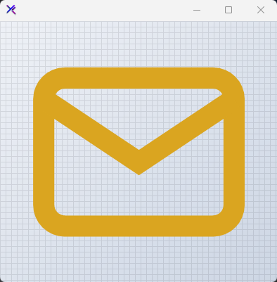
Compose complex graphics by referencing sibling templates. Use processing instructions <?templateName?> or <x-templateName/> tags to inline one template into another. Here a soft background wash is defined once and injected into the foreground mail icon, keeping markup DRY.
var canvas = new KtSvgCanvas
{
    Width = 400,
    Height = 400,
    BackColor = Color.Transparent,
    Color = KtColor.WARNING
};


// Background template - injected by processing instruction
canvas.Templates.Add(new KtSvgTemplate(canvas.Templates)
{
    Name = "bg",
    Svg = """
             <circle cx="50%" cy="50%" r="50%" fill="currentColor" opacity="0.5"/>
        """
});

// Foreground template - consumes bg via <?bg?> then draws the icon
canvas.Templates.Add(new KtSvgTemplate(canvas.Templates)
{
    Name = "main",
    Svg = """
        <svg width="100%" height="100%" viewBox="0 0 24 24" fill="none" stroke="currentColor" stroke-width="2" stroke-linecap="round" stroke-linejoin="round">
           <x-bg/>
            <path stroke="none" d="M0 0h24v24H0z" fill="none"/>
            <path d="M3 7a2 2 0 0 1 2 -2h14a2 2 0 0 1 2 2v10a2 2 0 0 1 -2 2h-14a2 2 0 0 1 -2 -2v-10z" />
            <path d="M3 7l9 6l9 -6" />
        </svg>
        """
});

CSS Variables (var())
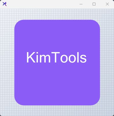
Inside <style> blocks, the var() syntax is rewritten to SmartFormat placeholders. This lets you drive CSS values from the Model dictionary at runtime. Use it for theme tokens, dynamic palettes, or responsive stroke widths without inline attribute repetition.
var canvas = new KtSvgCanvas
{
    Width = 400,
    Height = 400,
    BackColor = Color.Transparent,
    Color = KtColor.WARNING,
    Dock = DockStyle.Fill
};


canvas.Templates.Add(new KtSvgTemplate(canvas.Templates)
{
    Name = "cssvar",
    Svg = """
        <svg width="100%" height="100%" viewBox="0 0 100 100"  fill="none" preserveAspectRatio="xMidYMid meet" xmlns="http://www.w3.org/2000/svg">
            <style>
              .box {
                 fill: var(accent);
                 stroke: var(accent);
                 stroke-width: 2;
              }
            </style>
            <rect class="box" x="10" y="10" width="80" height="80" rx="8"/>
            <text x="20" y="50" dominant-baseline="central" text-anchor="middle" font-size="14" fill="white">{label}</text>
        </svg>
        """
});

canvas.Model["accent"] = "#8b5cf6";
canvas.Model["label"] = "KimTools";
canvas.Render();
Advanced Composition
Combine <script> data injection, x-for, property binding, arithmetic expressions, and x-show in a single template. A JSON script block seeds the context with an array of metrics. The loop renders three bars with percentage heights driven by {val}, conditional HIGH badges via {val > 80}, and centered labels. This demonstrates how KtSvgCanvas acts as a declarative data-visualization surface.
var canvas = new KtSvgCanvas
{
    Width = 400,
    Height = 400,
    BackColor = Color.Transparent,
    Color = KtColor.WARNING
};


canvas.Templates.Add(new KtSvgTemplate(canvas.Templates)
{
    Name = "dashboard",
    Svg = """
        <svg width="100%" height="100%" viewBox="0 0 100 100" fill="none" xmlns="http://www.w3.org/2000/svg">
            <g _:width="2">
                <circle cx="20" cy="20" r="20"
                    stroke="currentColor"
                    stroke-width="{width}"/>
            </g>
        </svg>
        """
});