Kt CheckButton
A themeable multi-select toggle control for WinForms, with independent Checked/Unchecked styling for background, border and icon.

🟢 DESIGNER SUPPORT
This control has full Visual Studio design-time support.
Drag it from the Toolbox onto your form, customize its properties directly in the Properties window, and KimTools will generate the corresponding code for you.
Background
| Background | Kt-Brush | Sets the Background. |
|---|
Border
| Border | Kt-Brush | Sets the panel’s border color. |
|---|
Icon
| Icon | String | Sets the Icon. |
|---|
Default Checked / Unchecked states
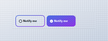
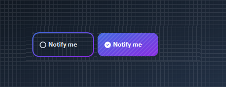
Border defaults to a Primary/Secondary gradient outline; Background_Checked fills that same gradient solid once Checked is true. Icon swaps from an outline circle to a filled check automatically.
// using KimTools.WinForms;
// Out of the box, KtCheckButton is a gradient-outlined toggle that
// fills solid on Checked, no configuration required.
var unchecked_ = new KtCheckButton { Text = "Notify me", Checked = false };
var checked_ = new KtCheckButton { Text = "Notify me", Checked = true };
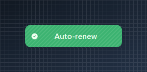
Solid Background_Checked
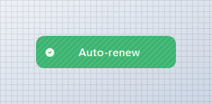
Style the checked state independently of the unchecked state with a solid Kt-Color instead of the default gradient.
// using KimTools.WinForms;
var check = new KtCheckButton();
check.Text = "   Auto-renew";
check.Width = 200;
// Clear the default gradient border and give Checked its own solid fill
check.Border = KtBrush.None;
check.Background_Checked = KtColor.SUCCESS;
check.Checked = true;
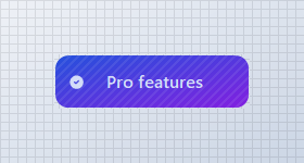
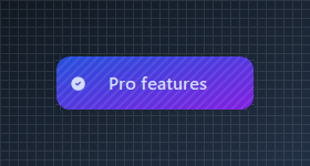
Gradient Background_Checked
Use semantic theme colors so the checked fill tracks the current global theme.
// using KimTools.WinForms;
var check = new KtCheckButton();
check.Text = "  Pro features";
check.Width = 200;
check.Size = new Size(180, 50);

// Background_Checked supports Kt-Color gradients with an optional angle
check.Background_Checked =
(
    startColor: KtColor.PRIMARY[50],
    stopColor: KtColor.SECONDARY[50],
    angle: 45 // optional (0-360)
);
check.Checked = true;
Icon + Icon_Checked
Pair an unchecked and checked icon, and tint the checked icon independently with IconColor_Checked.
// using KimTools.WinForms;
var check = new KtCheckButton();
check.Text = "Starred";

// Icon / Icon_Checked accept Tabler icon names independently
check.Icon = "Tabler.outline.star";
check.Icon_Checked = "Tabler.solid.star_filled";
check.IconColor_Checked = KtColor.WARNING;
check.Checked = true;


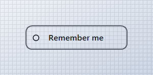
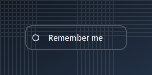
Outlined Border / Border_Checked
Clear both backgrounds and give Border_Checked its own color for a ghost toggle that only changes outline color on check.
// using KimTools.WinForms;
var check = new KtCheckButton();
check.Text = "Remember me";
check.TextAlign = ContentAlignment.MiddleCenter;
check.Width = 200;
// Keep both states as outlines, no fill in either
check.Background = KtBrush.None;
check.Background_Checked = KtBrush.None;
check.Border = KtColor.NEUTRAL;
check.Border_Checked = KtColor.PRIMARY;
check.BorderWidth = 2f;
Border Radius
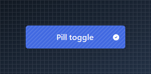
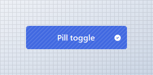
Set BorderRadius from 0 (square) to .99f (pill) or >1 (int) for actual pixels.
// using KimTools.WinForms;
var check = new KtCheckButton();
check.Text = "Pill toggle";
check.Width = 200;
check.ImageAlign = ContentAlignment.MiddleRight;
check.Background_Checked = KtColor.PRIMARY;

// BorderRadius runs 0 (square) .. .99f (fully pill-shaped)
check.BorderRadius = .99f;
check.BorderRadius = 5f; // Actual pixels
check.Checked = true;

Rounded Icon CheckButton
Drop the label, center the icon and pair Icon / Icon_Checked for a favorite-style toggle.
// using KimTools.WinForms;
var check = new KtCheckButton();
check.Text = string.Empty;
check.ImageAlign = ContentAlignment.MiddleCenter;
check.Size = new Size(50, 50);
check.Padding = Padding.Empty;
check.BorderRadius = .99f;

// Icon / Icon_Checked accept a Tabler icon name; IconSize / IconStroke tune rendering
check.Icon = "heart";
check.Icon_Checked = "heart-filled";
check.IconColor_Checked = KtColor.ERROR;
check.IconSize = 20;
check.IconStroke = 2.5;


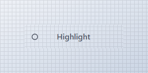
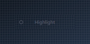
Foreground + Foreground_Checked
Override the label color for each state independently of the current theme.
// using KimTools.WinForms;
var check = new KtCheckButton();
check.Text = "Highlight";
check.Width = 200;
check.TextAlign = ContentAlignment.MiddleCenter;
check.Background = KtBrush.None;
check.Background_Checked = KtBrush.None;
check.Border = KtBrush.None;

// Foreground / Foreground_Checked override label color independently of Background
check.Foreground = KtColor.NEUTRAL;
check.Foreground_Checked = KtColor.PRIMARY;
Multi-select Panel
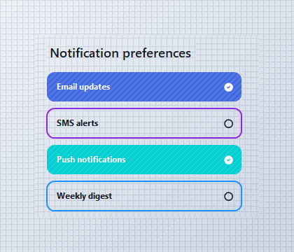
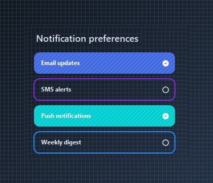
KtCheckButton has no built-in grouping, so any number of them can be checked at once inside a Panel, FlowLayoutPanel, or TableLayoutPanel - ideal for settings and permission lists.
// using KimTools.WinForms;
// Each KtCheckButton toggles independently, no group container required
// for multiselect behavior - just stack them in any panel or layout.
var email = new KtCheckButton { Text = "Email updates", Checked = true };
var sms = new KtCheckButton { Text = "SMS alerts", Checked = false };
var push = new KtCheckButton { Text = "Push notifications", Checked = true };
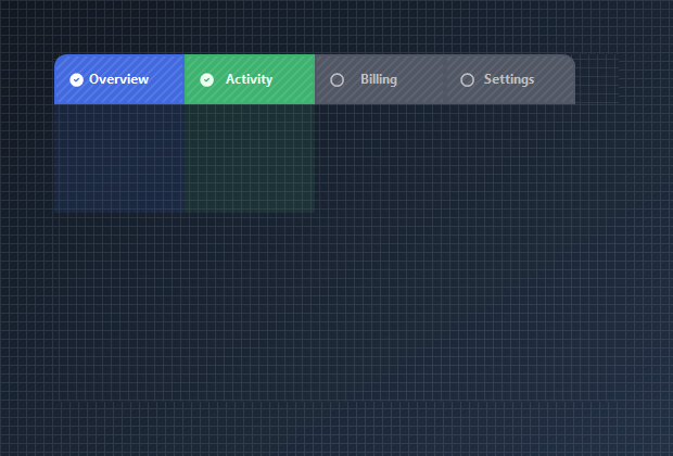
Multi-select Tabbed Pages with BorderEdges
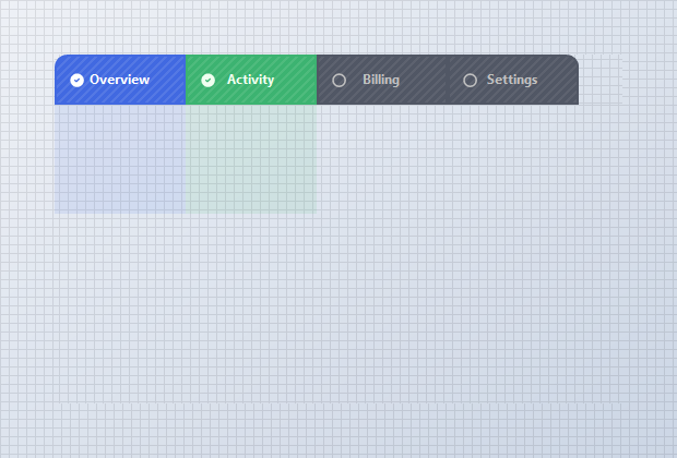
Toggle BorderEdges per state so a checked tab drops its bottom border and fuses with the pane beneath it, while unchecked tabs fall back to a quiet bottom underline. Since KtCheckButton isn’t grouped, more than one tab - and its page - can stay active at the same time.
// using KimTools.WinForms;
var overview = new KtCheckButton { Text = "Overview", Checked = true };
overview.Border = KtColor.PRIMARY;
overview.Background_Checked = KtColor.PRIMARY;
overview.BorderRadius = 10f;

// A checked tab draws only its top/left/right edge and fuses with
// the pane below it;
overview.BorderEdges.TopLeft
    = overview.BorderEdges.TopRight
    = overview.BorderEdges.BottomLeft = true;

overview.BorderEdges.BottomRight = false;
API Reference
| Background | Kt-Brush | Sets the Background. |
| Background_Checked | Kt-Brush | Sets the Background Checked. |
| Border | Kt-Brush | Sets the panel’s border color. |
| Border_Checked | Kt-Brush | Sets the panel’s border color. |
| BorderEdges | Edges | Sets the Border edges. |
| Foreground | Kt-Color | Sets the Foreground. |
| Foreground_Checked | Kt-Color | Sets the Foreground Checked. |
| IconColor | Kt-Color | Sets the Icon color. |
| IconColor_Checked | Kt-Color | Sets the IconColor Checked. |
| Pattern | Kt-Pattern | Sets the Pattern. |
| IconStroke | Double | Sets the Icon stroke. |
| ImageAlign | ContentAlignment | The alignment of the image that will be displayed on the control. |
| TextAlign | ContentAlignment | The alignment of the text that will be displayed on the control. |
| BorderStyle | DashStyle | Sets the panel’s border style. |
| BorderStyle_Checked | DashStyle | Sets the BorderStyle Checked. |
| IconSize | Int32 | Sets the Icon size. |
| BorderRadius | float Nullable | Sets the Border radius. |
| BorderWidth | float | Sets the Border width. |
| Icon | String | Sets the Icon. |
| Icon_Checked | String | Sets the Icon Checked. |
| Value | String | Sets the Value. |
| Cursor | Cursor | The cursor that appears when the pointer moves over the control. |
| Padding | Padding | Specifies the interior spacing of a control. |
| BorderMargin | Padding | Sets the border Margin. |