KimTools / Controls / Switch
Kt Switch
A smooth, highly customizable toggle switch control for Modern WinForms supporting custom state styling and animations.

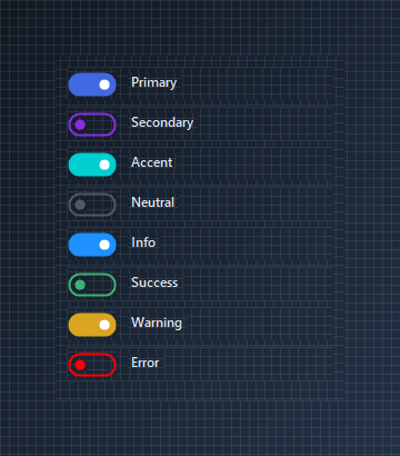
🟢 DESIGNER SUPPORT
This control has full Visual Studio design-time support.
Drag it from the Toolbox onto your form, customize its properties directly in the Properties window, and KimTools will generate the corresponding code for you.
StateOn
| StateOn | Kt-SwitchState | Sets the visual properties of the ‘ON’ toggle state. |
|---|
StateOff
| StateOff | Kt-SwitchState | Sets the visual properties of the ‘OFF’ toggle state. |
|---|
BorderRadius
BorderThickness
Animation
| Animation | Int32 | Sets the animation speed. |
|---|
Customizing State Colors
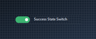
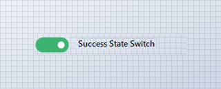
Control the background, thumb, and border colors for active and inactive states independently using StateOn and StateOff.
🔴 🟡 🟢
var row = new Panel
{
    Width = 220,
    Height = 30,
    BackColor = Color.Transparent
};

var toggle = new KtSwitch
{
    Size = new Size(50, 24),
    Checked = true,
    StateOn = new KtSwitch.KtSwitchState
    {
        Bg = KtColor.SUCCESS,
        Thumb = KtColor.White,
        Border = KtColor.SUCCESS
    },
    StateOff = new KtSwitch.KtSwitchState
    {
        Bg = KtColor.NEUTRAL,
        Thumb = KtColor.White,
        Border = KtColor.NEUTRAL
    }
};

var label = new Label
{
    Text = "Success State Switch",
    AutoSize = true
};

row.Controls.Add(toggle);
row.Controls.Add(label);

toggle.Location = new Point(0, 3);
label.Location = new Point(toggle.Right + 10, 6);
Auto
Light
Dark

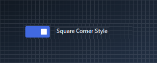
Square & Custom Border Radii
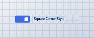
Adjust overall border curvature with BorderRadius and thumb roundness with BorderRadiusThumb to create sleek rectangular toggle switches.
🔴 🟡 🟢
var row = new Panel
{
    Width = 220,
    Height = 30,
    BackColor = Color.Transparent
};

var toggle = new KtSwitch
{
    Size = new Size(52, 26),
    Checked = true,
    BorderRadius = 4,
    BorderRadiusThumb = 2,
    BorderThickness = 2,
    StateOn = new KtSwitch.KtSwitchState
    {
        Bg = KtColor.PRIMARY,
        Thumb = KtColor.White,
        Border = KtColor.PRIMARY
    }
};

var label = new Label
{
    Text = "Square Corner Style",
    AutoSize = true
};

row.Controls.Add(toggle);
row.Controls.Add(label);

toggle.Location = new Point(0, 2);
label.Location = new Point(toggle.Right + 10, 6);
Auto
Light
Dark
API Reference
| Bg | Kt-Color | Sets the Bg. |
| Thumb | Kt-Color | Sets the Thumb. |
| StateOff | Kt-SwitchState | Sets the visual properties of the ‘OFF’ toggle state. |
| StateOn | Kt-SwitchState | Sets the visual properties of the ‘ON’ toggle state. |
| Checked | Boolean | Sets a value indicating whether the Toggle Switch has been checked. |
| Animation | Int32 | Sets the animation speed. |
| ThumbMargin | Int32 | Sets the thumb’s (inner circle) padding. |
| BorderRadius | Int32 Nullable | Sets the Border radius. |
| BorderRadiusThumb | Int32 Nullable | Sets the Border radius thumb. |
| BorderThickness | Int32 Nullable | Sets the Border thickness. |
| Cursor | Cursor | The cursor that appears when the pointer moves over the control. |