Kt Rating
A customizable rating input with star, circle, and square shapes, independent color states for empty, hover, rated, and disabled, plus read-only and right-click-to-clear support.

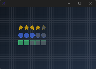
🟢 DESIGNER SUPPORT
This control has full Visual Studio design-time support.
Drag it from the Toolbox onto your form, customize its properties directly in the Properties window, and KimTools will generate the corresponding code for you.
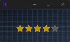
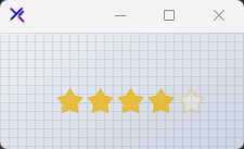
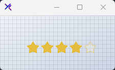
Star Shape (RatingShapes.Star)
The classic rating layout rendered with precision-calculated star geometry.
var rating = new KtRating
{
    Value = 4,
    Maximum = 5,
    Shape = KtRating.RatingShapes.Star,
    OuterRadius = 12,
    Spacing = 4,
    BorderThickness = 1,
    RatedFillColor = KtColor.Yellow % 75,
    RatedBorderColor = KtColor.Yellow,
    EmptyFillColor = KtColor.Yellow[90] % 25,
    EmptyBorderColor = KtColor.Yellow % 50
};

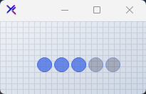
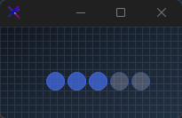
Circle Shape (RatingShapes.Circle)
A modern, minimalist circular rating variant suitable for step indicators or simple scores.
var rating = new KtRating
{
    Value = 3,
    Maximum = 5,
    Shape = KtRating.RatingShapes.Circle,
    OuterRadius = 10,
    Spacing = 4,
    BorderThickness = 1,
    RatedFillColor = KtColor.PRIMARY % 75,
    RatedBorderColor = KtColor.PRIMARY,
    EmptyFillColor = KtColor.PRIMARY[90] % 25,
    EmptyBorderColor = KtColor.PRIMARY % 50
};
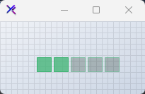
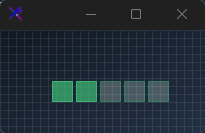
Square Shape (RatingShapes.Square)
A compact, box-style rating indicator ideal for quantitative scale displays.
var rating = new KtRating
{
    Value = 2,
    Maximum = 5,
    Shape = KtRating.RatingShapes.Square,
    OuterRadius = 10,
    Spacing = 4,
    BorderThickness = 1,
    RatedFillColor = KtColor.SUCCESS % 75,
    RatedBorderColor = KtColor.SUCCESS,
    EmptyFillColor = KtColor.SUCCESS[90] % 25,
    EmptyBorderColor = KtColor.SUCCESS % 50
};
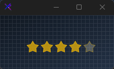
Read-Only Mode (ReadOnly)
Set ReadOnly = true to present static scores while suppressing hover and click interactions.
var rating = new KtRating
{
    Value = 4,
    Maximum = 5,
    ReadOnly = true,
    Shape = KtRating.RatingShapes.Star,
    OuterRadius = 12,
    Spacing = 4,
    BorderThickness = 1,
    RatedFillColor = KtColor.Yellow % 75,
    RatedBorderColor = KtColor.Yellow,
    EmptyFillColor = KtColor.Yellow[90] % 25,
    EmptyBorderColor = KtColor.Yellow % 50
};
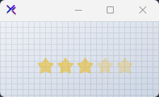
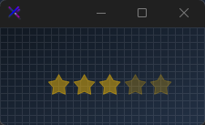
Disabled State (Enabled = false)
Configures independent opacity palettes via DisabledRatedFillColor and DisabledEmptyFillColor.
var rating = new KtRating
{
    Value = 3,
    Maximum = 5,
    Enabled = false,
    Shape = KtRating.RatingShapes.Star,
    OuterRadius = 12,
    Spacing = 4,
    BorderThickness = 1,
    DisabledRatedFillColor = KtColor.Yellow % 50,
    DisabledEmptyFillColor = KtColor.Yellow % 25
};
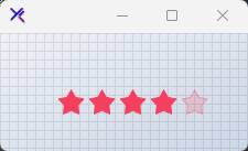
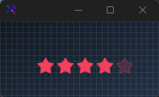
Custom Palette (KtColor)
Assign custom theme tones across Rated, Empty, and Hover states to blend with application branding.
var rating = new KtRating
{
    Value = 4,
    Maximum = 5,
    Shape = KtRating.RatingShapes.Star,
    OuterRadius = 12,
    Spacing = 4,
    BorderThickness = 1,
    RatedFillColor = KtColor.Rose,
    RatedBorderColor = KtColor.Rose,
    EmptyFillColor = KtColor.Rose % 20,
    EmptyBorderColor = KtColor.Rose % 40,
    HoverFillColor = KtColor.Rose % 60,
    HoverBorderColor = KtColor.Rose
};
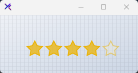
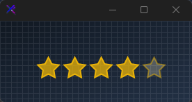
Custom Sizing (OuterRadius, Spacing)
Adjust overall element bounds using OuterRadius, shape distance via Spacing, and outline stroke width with BorderThickness.
var rating = new KtRating
{
    Value = 4,
    Maximum = 5,
    Shape = KtRating.RatingShapes.Star,
    OuterRadius = 16,
    Spacing = 6,
    BorderThickness = 2,
    RatedFillColor = KtColor.Yellow % 75,
    RatedBorderColor = KtColor.Yellow,
    EmptyFillColor = KtColor.Yellow[90] % 25,
    EmptyBorderColor = KtColor.Yellow % 50
};
API Reference
| DisabledEmptyFillColor | Kt-Color | Sets the fill KtColor of unrated shapes when disabled. |
| DisabledRatedFillColor | Kt-Color | Sets the fill KtColor of rated shapes when disabled. |
| EmptyFillColor | Kt-Color | Sets the fill KtColor of unrated shapes. |
| EmptyBorderColor | Kt-Color | Sets the border color of unrated shapes. |
| HoverFillColor | Kt-Color | Sets the fill KtColor of rating shapes on hover. |
| HoverBorderColor | Kt-Color | Sets the border color of rating shapes on hover. |
| RatedFillColor | Kt-Color | Sets the fill KtColor of rated shapes. |
| RatedBorderColor | Kt-Color | Sets the border color of rated shapes. |
| Shape | RatingShapes | Sets the rating shape style. |
| ReadOnly | Boolean | Sets a value indicating whether the rating is in read-only mode. |
| RightClickToClear | Boolean | Sets a value indicating whether the rating will be cleared after right-clicking it. |
| Value | integer | Sets the current rating value. |
| Maximum | integer | Sets the maximum rating count. |
| Spacing | integer | Sets the spacing between rating shapes. |
| BorderThickness | integer | Sets the border thickness of rating shapes. |
| OuterRadius | float | Sets the rating’s shape radius. |
| InnerRadius | float | Sets the inner radius of the star shape. |