Kt Menu
An expandable tree-style navigation menu supporting independently themeable state styles, gradient highlights, custom connector lines, checkboxes, and inline badge tags.

🟢 DESIGNER SUPPORT
This control has full Visual Studio design-time support.
Drag it from the Toolbox onto your form, customize its properties directly in the Properties window, and KimTools will generate the corresponding code for you.
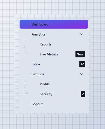
Flat / Minimal Design System
Soft tinted selection with no gradients. The selected state uses a low-opacity primary wash (PRIMARY % 15) with primary-colored text and a modest 6 px radius. No border, no shadow — just clean hierarchy through spacing and subtle color.
var panel = new FlowLayoutPanel
{
    Width = 260,
    Height = 340,
    Padding = new Padding(10),
    BackColor = Color.Transparent,
    AutoScroll = false
};

var menu = new KtMenu
{
    Width = 240,
    Height = 320,
    Margin = new Padding(5),
    ItemHeight = 34,
    Indent = 18,
    Menu = { Background = KtColor.BASE },
    MenuItem = { TextColor = KtColor.CONTENT },
    MenuItemSelected =
    {
        Background = (KtColor.PRIMARY,KtColor.SECONDARY),
        TextColor =Color.White,
        BorderRadius = 6
    }
};

menu.Nodes.AddRange(BuildNodes());
menu.ExpandAll();
menu.SelectedNode = menu.Nodes[0];

panel.Controls.Add(menu);

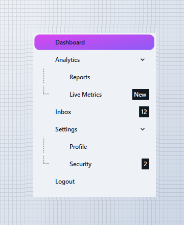
Neon / Dark Design System
A deep BASE_1 background with pure white text. The active row pops with a vivid Fuchsia-to-Violet gradient at a 45° angle, wrapped in a 10 px rounded pill. High contrast and saturated accents give the UI an electric, modern feel.
var panel = new FlowLayoutPanel
{
    Width = 260,
    Height = 340,
    Padding = new Padding(10),
    BackColor = Color.Transparent,
    AutoScroll = false
};

var menu = new KtMenu
{
    Width = 240,
    Height = 320,
    Margin = new Padding(5),
    ItemHeight = 34,
    Indent = 18,
    Background = KtColor.BASE_1,
    Foreground = KtColor.CONTENT,
    MenuItemChecked =
    {
        Background = (KtColor.Fuchsia, KtColor.Violet),
        TextColor = Color.White,
        BorderRadius = 10
     },
    MenuItemSelected =
    {
        Background = (KtColor.Fuchsia, KtColor.Violet ),
        TextColor =Color.White,
        BorderRadius = 10
    }
};

menu.Nodes.AddRange(BuildNodes());
menu.ExpandAll();
menu.SelectedNode = menu.Nodes[2];

panel.Controls.Add(menu);
Pill / Rounded Design System
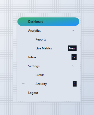
Fully capsule-shaped active rows with a 20 px border radius. The selection uses a calm Success-to-Info gradient on the default base background. Solid connector lines (DashStyle.Solid) reinforce the structured, friendly aesthetic.
var panel = new FlowLayoutPanel
{
    Width = 260,
    Height = 340,
    Padding = new Padding(10),
    BackColor = Color.Transparent,
    AutoScroll = false
};

var menu = new KtMenu
{
    Width = 240,
    Height = 320,
    Margin = new Padding(5),
    ItemHeight = 34,
    Indent = 18,
    LineStyle = DashStyle.Solid,
    LineWidth = 1f,
    Foreground = KtColor.CONTENT,
    Background = KtColor.BASE,

    MenuItemSelected =
    {
        Background = (KtColor.SUCCESS, KtColor.INFO),
        TextColor =Color.White,
        BorderRadius = 20
    }
};

menu.Nodes.AddRange(BuildNodes());
menu.ExpandAll();
menu.SelectedNode = menu.Nodes[3];

panel.Controls.Add(menu);


Inline Badges (Tag, TagBackground, TagColor, TagVisible)
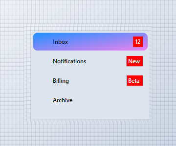
Set a plain string on TreeNode.Tag and it renders as a compact badge next to the item label, styled through the owning KtMenuStyle’s Tag* properties. Useful for unread counts, “New” flags, or status chips — no custom cell renderer required.
var panel = new FlowLayoutPanel
{
    Width = 260,
    Height = 200,
    Padding = new Padding(10),
    BackColor = Color.Transparent,
    AutoScroll = false
};

var menu = new KtMenu
{
    Width = 240,
    Height = 180,
    Margin = new Padding(5),
    Foreground = KtColor.CONTENT,
    Background = KtColor.BASE,
    MenuItem =
    {
        TextColor = KtColor.CONTENT,
        TagBackground = KtColor.ERROR,
        TagColor =Color.White
    }
};

menu.Nodes.Add(new TreeNode("Inbox") { Tag = "12" });
menu.Nodes.Add(new TreeNode("Notifications") { Tag = "New" });
menu.Nodes.Add(new TreeNode("Billing") { Tag = "Beta" });
menu.Nodes.Add(new TreeNode("Archive"));

panel.Controls.Add(menu);
Selection & Check States (MenuItemSelected, MenuItemChecked)
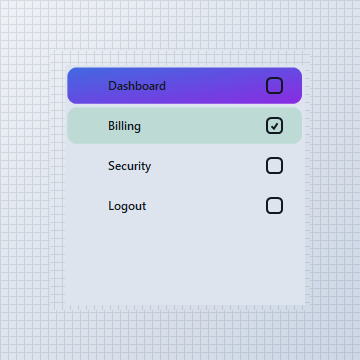
The active row (MenuItemSelected) and any checked row (MenuItemChecked, with CheckBoxes = true) each carry their own independent style, so a highlighted selection and a completed/checked item read as visually distinct states within the same tree.
var panel = new FlowLayoutPanel
{
    Width = 260,
    Height = 260,
    Padding = new Padding(10),
    BackColor = Color.Transparent,
    AutoScroll = false
};

var menu = new KtMenu
{
    Width = 240,
    Height = 240,
    Margin = new Padding(5),
    CheckBoxes = true,
    Foreground = KtColor.CONTENT,
    Background = KtColor.BASE,
    MenuItem = { TextColor = KtColor.CONTENT },
    MenuItemSelected =
    {
        Background = (KtColor.PRIMARY, KtColor.SECONDARY, 45),
        TextColor =Color.White
    },
    MenuItemChecked =
    {
        Background = KtColor.SUCCESS % 20,
        TextColor = KtColor.SUCCESS
    }
};

var billing = new TreeNode("Billing") { Checked = true };
var security = new TreeNode("Security");

menu.Nodes.Add(new TreeNode("Dashboard"));
menu.Nodes.Add(billing);
menu.Nodes.Add(security);
menu.Nodes.Add(new TreeNode("Logout"));

menu.SelectedNode = security;

panel.Controls.Add(menu);
KtMenuStyle
| Background | Kt-Brush | Sets the Background. |
| Border | Kt-Brush | Sets the Border. |
| ImageFilter | Kt-Brush | Sets the Image filter. |
| TagBackground | Kt-Brush | Sets the Tag background. |
| TagColor | Kt-Color | Sets the Tag color. |
| TextColor | Kt-Color | Sets the Text color. |
| TagFont | Font | Sets the Tag font. |
| TextFont | Font | Sets the Text font. |
| ImageOffset | Point | Sets the Image offset. |
| TagOffset | Point | Sets the Tag offset. |
| TextOffset | Point | Sets the Text offset. |
| ImageVisible | Boolean Nullable | Sets the Image visible. |
| TagVisible | Boolean Nullable | Sets the Tag visible. |
| TextVisible | Boolean Nullable | Sets the Text visible. |
| TextEllipsis | Boolean Nullable | Sets the Text ellipsis. |
| BorderRadius | Double Nullable | Sets the Border radius. |
| BorderWidth | Double Nullable | Sets the Border width. |
| TextAlign | ContentAlignment Nullable | Sets the Text align. |
| BorderStyle | DashStyle Nullable | Sets the Border style. |
API Reference
| Background | Kt-Color | Sets the background color. |
| Foreground | Kt-Color | Sets the Foreground color. |
| Menu | Kt-MenuStyle | Sets the Menu. |
| MenuItem | Kt-MenuStyle | Sets the Menu item. |
| MenuItemChecked | Kt-MenuStyle | Sets the Menu item checked. |
| MenuItemSelected | Kt-MenuStyle | Sets the Menu item selected. |
| SubMenu | Kt-MenuStyle | Sets the Sub menu. |
| SubMenuExpanded | Kt-MenuStyle | Sets the Sub menu expanded. |
| LineStyle | DashStyle | Sets the Line style. |
| LineWidth | float | Sets the Line width. |