Kt Pages
An invisible tab-based navigation container for Modern WinForms that provides SPA-style routing, custom page transitions, navigation history, and design-time extenders.

🟢 DESIGNER SUPPORT
This control has full Visual Studio design-time support.
Drag it from the Toolbox onto your form, customize its properties directly in the Properties window, and KimTools will generate the corresponding code for you.
Extender Integration
When designing forms in Visual Studio, KtPages acts as an Extender Provider for ButtonBase controls (including KtRadioButton and standard WinForms buttons).
- Select Target Control
Choose your navigation control (e.g.,KtRadioButtonorKtButton) in the Visual Studio designer surface. - Locate Extender Property
In the Properties Window, find thePage on [KtPagesName]extender property provided by theKtPagescontainer. - Assign Target Page
Select or enter the targetTabPagekey/name you want to navigate to when the control is clicked.
AllowTransitions
| AllowTransitions | Boolean | Sets a value indicating whether transitions are enabled. |
|---|
TransitionType
| TransitionType | AnimationType | Sets the type of transition to be used when moving from one page to another. |
|---|
Background
| Background | Kt-Color | Sets the Background. |
|---|
Radio Button Tab Navigation
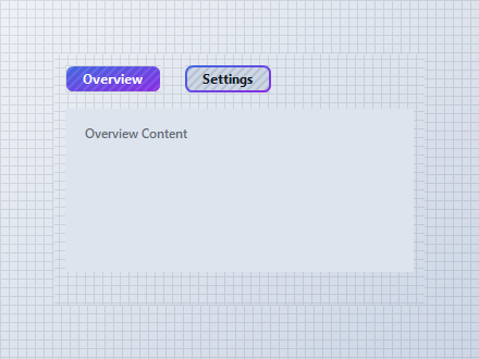
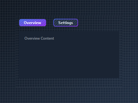
Use KtRadioButton controls with Icon = null as custom tab headers by linking them with pages.Set_Page(radioButton, pageKey). Transition background colors between KtColor.PRIMARY (checked) and KtColor.BASE_3 (unchecked) to highlight active tabs.
var container = new Panel
{
    Width = 340,
    Height = 230,
    BackColor = Color.Transparent
};

var pages = new KtPages
{
    Width = 320,
    Height = 150,
    Background = KtColor.BASE
};

var tabOverview = new TabPage("Overview") { Text = "Overview" };
var tabSettings = new TabPage("Settings") { Text = "Settings" };

tabOverview.Controls.Add(new KtLabel { Text = "Overview Content", Auto = true, Location = new Point(15, 15) });
tabSettings.Controls.Add(new KtLabel { Text = "Settings Content", Auto = true, Location = new Point(15, 15) });

pages.TabPages.Add(tabOverview);
pages.TabPages.Add(tabSettings);

var rbOverview = new KtRadioButton
{
    Text = "Overview",
    Checked = true,
    Icon = null,
    Icon_Checked = null,
    AutoSize = true,
    Background = KtColor.PRIMARY,
    Location = new Point(10, 10)
};

var rbSettings = new KtRadioButton
{
    Text = "Settings",
    Checked = false,
    Icon = null,
    Icon_Checked = null,
    AutoSize = true,
    Background = KtColor.BASE_3,
    Location = new Point(120, 10)
};

// Link radio buttons directly to target page keys using the extender provider
pages.Set_Page(rbOverview, "Overview");
pages.Set_Page(rbSettings, "Settings");

// Toggle visual tab states on selection change for all radio tabs
rbOverview.CheckedChanged += (s, e) =>
{
    rbOverview.Background = rbOverview.Checked ? KtColor.PRIMARY : KtColor.BASE_3;
};

rbSettings.CheckedChanged += (s, e) =>
{
    rbSettings.Background = rbSettings.Checked ? KtColor.PRIMARY : KtColor.BASE_3;
};

container.Controls.Add(rbOverview);
container.Controls.Add(rbSettings);
container.Controls.Add(pages);

pages.Location = new Point(10, 50);
Programmatic Navigation & History
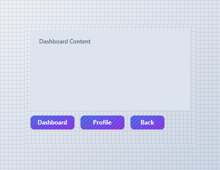
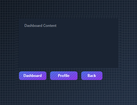
Use Navigate() to transition between pages and GoBack() to pop the built-in stack navigation history.
var container = new Panel
{
    Width = 340,
    Height = 240,
    BackColor = Color.Transparent
};

var pages = new KtPages
{
    Width = 320,
    Height = 160,
    Background = KtColor.BASE
};

var tabDashboard = new TabPage("Dashboard") { Text = "Dashboard" };
var tabProfile = new TabPage("Profile") { Text = "Profile" };

tabDashboard.Controls.Add(new KtLabel { Text = "Dashboard Content", Auto = true, Location = new Point(15, 15) });
tabProfile.Controls.Add(new KtLabel { Text = "Profile Content", Auto = true, Location = new Point(15, 15) });

pages.TabPages.Add(tabDashboard);
pages.TabPages.Add(tabProfile);

var btnDash = new KtButton { Text = "Dashboard", Width = 90, Height = 30, Location = new Point(10, 180) };
var btnProf = new KtButton { Text = "Profile", Width = 90, Height = 30, Location = new Point(110, 180) };
var btnBack = new KtButton { Text = "Back", Width = 70, Height = 30, Location = new Point(210, 180) };

btnDash.Click += (s, e) => pages.Navigate(tabDashboard);
btnProf.Click += (s, e) => pages.Navigate(tabProfile);
btnBack.Click += (s, e) => pages.GoBack();

container.Controls.Add(pages);
container.Controls.Add(btnDash);
container.Controls.Add(btnProf);
container.Controls.Add(btnBack);

pages.Location = new Point(10, 10);
Wizard Step Operators
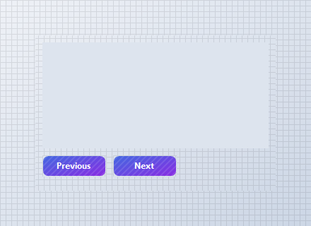
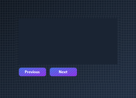
Advance or rewind pages easily using overloaded increment (pages++) and decrement (pages--) operators.
var container = new Panel
{
    Width = 340,
    Height = 220,
    BackColor = Color.Transparent
};

var pages = new KtPages
{
    Width = 320,
    Height = 150,
    Background = KtColor.BASE
};

pages.TabPages.Add(new TabPage("Step1") { Text = "Step 1" });
pages.TabPages.Add(new TabPage("Step2") { Text = "Step 2" });
pages.TabPages.Add(new TabPage("Step3") { Text = "Step 3" });

var btnPrev = new KtButton { Text = "Previous", Width = 90, Height = 30, Location = new Point(10, 170) };
var btnNext = new KtButton { Text = "Next", Width = 90, Height = 30, Location = new Point(110, 170) };

// Increment (++) advances to next page; Decrement (--) retreats to previous page
btnPrev.Click += (s, e) => { _ = pages--; };
btnNext.Click += (s, e) => { _ = pages++; };

container.Controls.Add(pages);
container.Controls.Add(btnPrev);
container.Controls.Add(btnNext);
pages.Location = new Point(10, 10);
API Reference
| Background | Kt-Color | Sets the Background. |
| Transition | Animation | Sets the transition options to be applied when moving between pages. |
| TransitionType | AnimationType | Sets the type of transition to be used when moving from one page to another. |
| AllowTransitions | Boolean | Sets a value indicating whether transitions are enabled. |