KimTools / Components / PopOver
Kt PopOver
An extender provider that turns any control into a popover trigger, showing a target control in a dropdown with configurable direction, shadow, and lifecycle events.

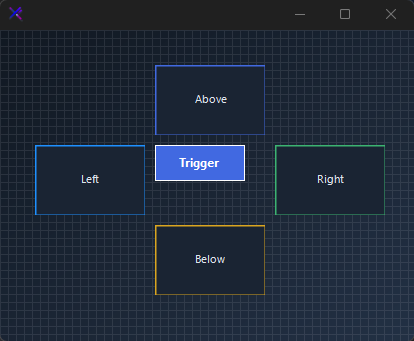
Direction Control (SetDirection)
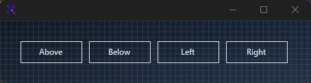
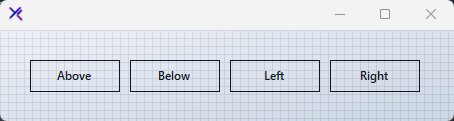
Call SetDirection(trigger, direction) to position the dropdown relative to each trigger. Directions include AboveRight, BelowRight, Left, Right, and Default. Each trigger control can have its own direction independent of the component default.
🔴 🟡 🟢
var panel = new FlowLayoutPanel
{
    Width = 460,
    Height = 120,
    Padding = new Padding(20),
    BackColor = Color.Transparent,
    AutoScroll = false,
    FlowDirection = FlowDirection.LeftToRight
};

var popOver = new KtPopOver { Shadow = true, Direction = ToolStripDropDownDirection.Default };

var btnAbove = new Button { Text = "Above", Width = 90, Height = 32, Margin = new Padding(5), FlatStyle = FlatStyle.Flat };
var btnBelow = new Button { Text = "Below", Width = 90, Height = 32, Margin = new Padding(5), FlatStyle = FlatStyle.Flat };
var btnLeft = new Button { Text = "Left", Width = 90, Height = 32, Margin = new Padding(5), FlatStyle = FlatStyle.Flat };
var btnRight = new Button { Text = "Right", Width = 90, Height = 32, Margin = new Padding(5), FlatStyle = FlatStyle.Flat };

popOver.SetDirection(btnAbove, ToolStripDropDownDirection.AboveRight);
popOver.SetDirection(btnBelow, ToolStripDropDownDirection.BelowRight);
popOver.SetDirection(btnLeft, ToolStripDropDownDirection.Left);
popOver.SetDirection(btnRight, ToolStripDropDownDirection.Right);

panel.Controls.Add(btnAbove);
panel.Controls.Add(btnBelow);
panel.Controls.Add(btnLeft);
panel.Controls.Add(btnRight);
Auto
Light
Dark

Drop Shadow (Shadow)
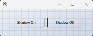
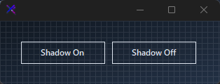
Toggle Shadow = true to add a system drop shadow to the popover dropdown. When false, the popover appears flat against the parent form.
🔴 🟡 🟢
var panel = new FlowLayoutPanel
{
    Width = 320,
    Height = 120,
    Padding = new Padding(20),
    BackColor = Color.Transparent,
    AutoScroll = false,
    FlowDirection = FlowDirection.LeftToRight
};

var withShadow = new KtPopOver { Shadow = true };
var withoutShadow = new KtPopOver { Shadow = false };

var btnShadow = new Button { Text = "Shadow On", Width = 120, Height = 32, Margin = new Padding(5), FlatStyle = FlatStyle.Flat };
var btnNoShadow = new Button { Text = "Shadow Off", Width = 120, Height = 32, Margin = new Padding(5), FlatStyle = FlatStyle.Flat };

panel.Controls.Add(btnShadow);
panel.Controls.Add(btnNoShadow);
Auto
Light
Dark
Lifecycle Events (Opened, Opening, Closed, Closing)
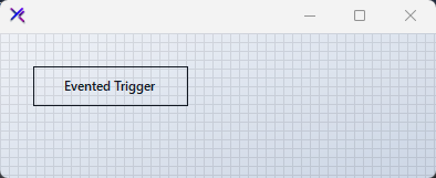
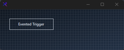
Subscribe to Opened / Closed for side effects after the dropdown shows or hides. Use Opening and Closing (both CancelEventArgs) to intercept and prevent the action when conditions aren’t met.
🔴 🟡 🟢
var panel = new FlowLayoutPanel
{
    Width = 400,
    Height = 160,
    Padding = new Padding(20),
    BackColor = Color.Transparent,
    AutoScroll = false,
    FlowDirection = FlowDirection.TopDown
};

var popOver = new KtPopOver { Shadow = true };

popOver.Opened += (s, e) => { /* popover opened */ };
popOver.Closed += (s, e) => { /* popover closed */ };
popOver.Opening += (s, e) => { /* cancel via e.Cancel = true */ };
popOver.Closing += (s, e) => { /* cancel via e.Cancel = true */ };

var btn = new Button { Text = "Evented Trigger", Width = 140, Height = 36, Margin = new Padding(5), FlatStyle = FlatStyle.Flat };

panel.Controls.Add(btn);
Auto
Light
Dark
API Reference
| Shadow | Boolean | Sets the Shadow. |
| Direction | ToolStripDropDownDirection | Sets the Direction. |