Kt Spinner
A customizable animated loading spinner with preset styles, dash patterns, cap shapes, speed control, and optional center text.

🟢 DESIGNER SUPPORT
This control has full Visual Studio design-time support.
Drag it from the Toolbox onto your form, customize its properties directly in the Properties window, and KimTools will generate the corresponding code for you.
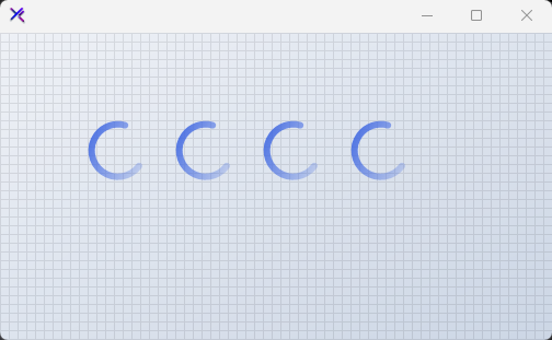
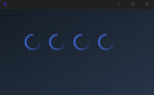
Style Presets (Preset, AllowPresets)
Enable AllowPresets and pick from Solid, Dash, Dot, or Diamond. Each preset automatically configures Style, DashCap, and CapStyle to a cohesive look.
var panel = new FlowLayoutPanel
{
    Width = 420,
    Height = 120,
    Padding = new Padding(20),
    BackColor = Color.Transparent,
    AutoScroll = false,
    FlowDirection = FlowDirection.LeftToRight
};

var solid = new KtSpinner
{
    Width = 60,
    Height = 60,
    Margin = new Padding(10),
    Preset = KtSpinner.Presets.Solid,
    Color = KtColor.PRIMARY,
    Thickness = 6,
};

var dash = new KtSpinner
{
    Width = 60,
    Height = 60,
    Margin = new Padding(10),
    Preset = KtSpinner.Presets.Dash,
    Color = KtColor.PRIMARY,
    Thickness = 6,
};

var dot = new KtSpinner
{
    Width = 60,
    Height = 60,
    Margin = new Padding(10),
     Preset = KtSpinner.Presets.Dot,
    Color = KtColor.PRIMARY,
    Thickness = 6,
};

var diamond = new KtSpinner
{
    Width = 60,
    Height = 60,
    Margin = new Padding(10),
     Preset = KtSpinner.Presets.Diamond,
    Color = KtColor.PRIMARY,
    Thickness = 6,
};

panel.Controls.Add(solid);
panel.Controls.Add(dash);
panel.Controls.Add(dot);
panel.Controls.Add(diamond);
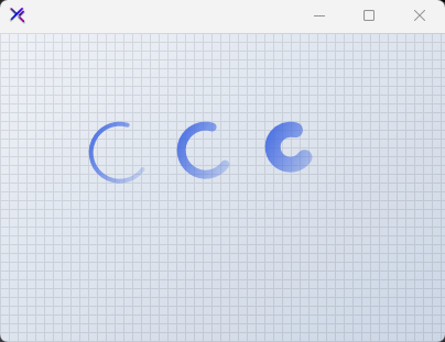
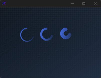
Ring Thickness (Thickness)
Scale the stroke weight from 4 px to 14 px. Thicker rings feel bolder and more prominent; thinner rings are subtle and elegant.
var panel = new FlowLayoutPanel
{
    Width = 320,
    Height = 120,
    Padding = new Padding(20),
    BackColor = Color.Transparent,
    AutoScroll = false,
    FlowDirection = FlowDirection.LeftToRight
};

var thin = new KtSpinner
{
    Width = 60,
    Height = 60,
    Margin = new Padding(10),
    Color = KtColor.PRIMARY,
    Thickness = 4,
    Speed = 3,
};

var medium = new KtSpinner
{
    Width = 60,
    Height = 60,
    Margin = new Padding(10),
    Color = KtColor.PRIMARY,
    Thickness = 8,
    Speed = 3,
};

var thick = new KtSpinner
{
    Width = 60,
    Height = 60,
    Margin = new Padding(10),
    Color = KtColor.PRIMARY,
    Thickness = 14,
    Speed = 3,
};

panel.Controls.Add(thin);
panel.Controls.Add(medium);
panel.Controls.Add(thick);
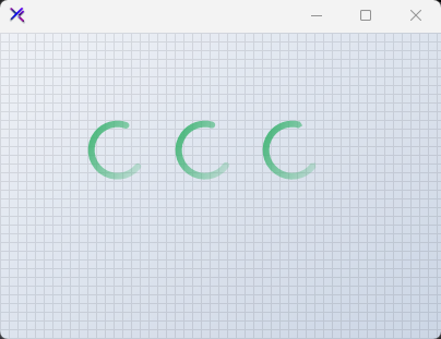
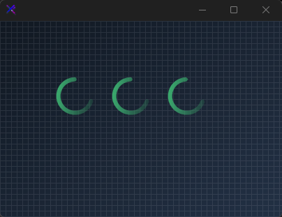
Cap Styles (CapStyle, CapPoint)
Control the line-end shape with Flat, Round, or Triangle. CapPoint decides whether the cap appears at the Start, End, or Both ends of the rotating arc.
var panel = new FlowLayoutPanel
{
    Width = 320,
    Height = 120,
    Padding = new Padding(20),
    BackColor = Color.Transparent,
    AutoScroll = false,
    FlowDirection = FlowDirection.LeftToRight
};

var flat = new KtSpinner
{
    Width = 60,
    Height = 60,
    Margin = new Padding(10),
    Color = KtColor.SUCCESS,
    Thickness = 6,
    CapStyle = KtSpinner.CapStyles.Flat,
    CapPoint = KtSpinner.CapPoints.Both,
};

var round = new KtSpinner
{
    Width = 60,
    Height = 60,
    Margin = new Padding(10),
    Color = KtColor.SUCCESS,
    Thickness = 6,
    CapStyle = KtSpinner.CapStyles.Round,
    CapPoint = KtSpinner.CapPoints.Both,
};

var triangle = new KtSpinner
{
    Width = 60,
    Height = 60,
    Margin = new Padding(10),
    Color = KtColor.SUCCESS,
    Thickness = 6,
    CapStyle = KtSpinner.CapStyles.Triangle,
    CapPoint = KtSpinner.CapPoints.Both,
};

panel.Controls.Add(flat);
panel.Controls.Add(round);
panel.Controls.Add(triangle);
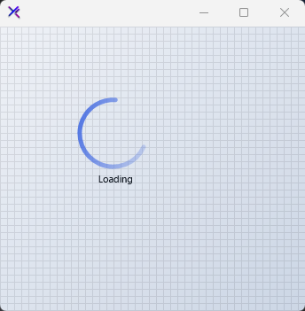
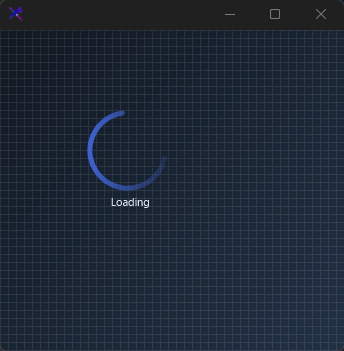
Center Text (ShowText, Text, TextColor)
Set ShowText = true to render a label inside the spinner ring. Use TextColor and Font to match your design system. The ring automatically shrinks to fit the text.
var panel = new FlowLayoutPanel
{
    Width = 260,
    Height = 160,
    Padding = new Padding(20),
    BackColor = Color.Transparent,
    AutoScroll = false,
    FlowDirection = FlowDirection.LeftToRight
};

var spinner = new KtSpinner
{
    Width = 100,
    Height = 100,
    Margin = new Padding(10),
    Color = KtColor.PRIMARY,
    Thickness = 5,
    Speed = 2,
    ShowText = true,
    Text = "Loading",
    TextColor = KtColor.CONTENT,
    Font = new Font("Segoe UI", 8f),
};

panel.Controls.Add(spinner);
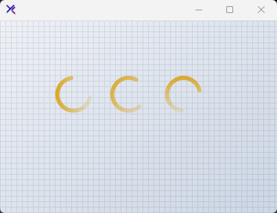
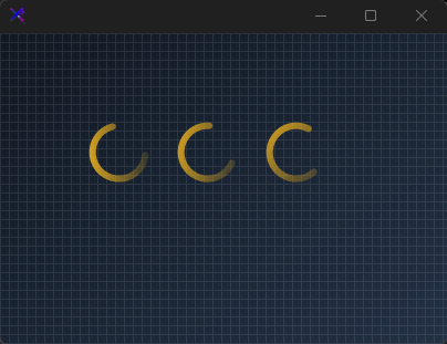
Animation Speed (Speed)
Control the rotation velocity. Speed = 1 is calm and deliberate; Speed = 8 is urgent and energetic. Adjust to match the perceived weight of the operation being waited on.
var panel = new FlowLayoutPanel
{
    Width = 320,
    Height = 120,
    Padding = new Padding(20),
    BackColor = Color.Transparent,
    AutoScroll = false,
    FlowDirection = FlowDirection.LeftToRight
};

var slow = new KtSpinner
{
    Width = 60,
    Height = 60,
    Margin = new Padding(10),
    Color = KtColor.WARNING,
    Thickness = 6,
    Speed = 1,
};

var normal = new KtSpinner
{
    Width = 60,
    Height = 60,
    Margin = new Padding(10),
    Color = KtColor.WARNING,
    Thickness = 6,
    Speed = 4,
};

var fast = new KtSpinner
{
    Width = 60,
    Height = 60,
    Margin = new Padding(10),
    Color = KtColor.WARNING,
    Thickness = 6,
    Speed = 8,
};

panel.Controls.Add(slow);
panel.Controls.Add(normal);
panel.Controls.Add(fast);
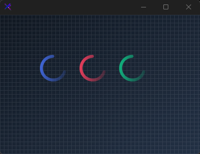
Color Themes (Color)
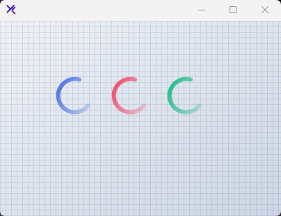
Swap the entire spinner accent with any KtColor. The ring uses a linear gradient from the chosen color to transparent, giving it a soft trailing edge regardless of the base hue.
var panel = new FlowLayoutPanel
{
    Width = 320,
    Height = 120,
    Padding = new Padding(20),
    BackColor = Color.Transparent,
    AutoScroll = false,
    FlowDirection = FlowDirection.LeftToRight
};

var primary = new KtSpinner
{
    Width = 60,
    Height = 60,
    Margin = new Padding(10),
    Color = KtColor.PRIMARY,
    Thickness = 6,
};

var rose = new KtSpinner
{
    Width = 60,
    Height = 60,
    Margin = new Padding(10),
    Color = KtColor.Rose,
    Thickness = 6,
};

var emerald = new KtSpinner
{
    Width = 60,
    Height = 60,
    Margin = new Padding(10),
    Color = KtColor.Emerald,
    Thickness = 6,
};

panel.Controls.Add(primary);
panel.Controls.Add(rose);
panel.Controls.Add(emerald);

API Reference
| Color | Kt-Color | Sets the indicator color. |
| TextColor | Kt-Color | Sets the fore color. |
| CapPoint | CapPoints | Sets the point where the cap will be applied. |
| CapStyle | CapStyles | Sets the indicator cap style. |
| DashCap | DashCaps | Sets the indicator dash cap format. |
| Preset | Presets | Sets a loading style preset. Ensure that the property ‘AllowPresets’ is enabled. |
| Style | Styles | Sets the indicator ring style. |
| AllowPresets | Boolean | Sets a value indicating whether style presets are allowed. |
| ShowText | Boolean | Sets a value indicating whether the text will be displayed. |
| Font | Font | Sets the text font. |
| Speed | Int32 | Sets the progress speed. |
| Thickness | Int32 | Sets the progress thickness. |
| DashWidth | float | Sets the indicator dash pattern. |
| Text | String | Sets the loader text. |
| TextPadding | Padding | Sets the text padding. |