Kt ProgressGauge
An arc-based gauge meter with dual-range color support, automatic background generation, cap style control, and smooth value transitions.

🟢 DESIGNER SUPPORT
This control has full Visual Studio design-time support.
Drag it from the Toolbox onto your form, customize its properties directly in the Properties window, and KimTools will generate the corresponding code for you.
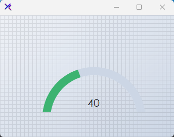
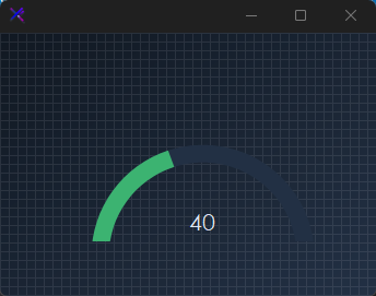
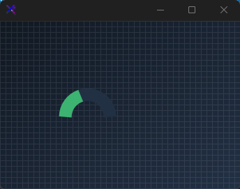
Flat / Minimal Gauge
A clean semicircular arc with flat line caps and a uniform success color. No range labels — just the value arc and a subtle track for uncluttered dashboards.
var panel = new FlowLayoutPanel
{
    Width = 260,
    Height = 180,
    Padding = new Padding(20),
    BackColor = Color.Transparent,
    AutoScroll = false,
    FlowDirection = FlowDirection.TopDown
};

var gauge = new KtProgressGauge
{
    Width = 220,
    Height = 140,
    Margin = new Padding(5),
    Value = 55,
    Minimum = 0,
    Maximum = 100,
    Thickness = 16,
    ProgressColorLow = KtColor.SUCCESS,
    ProgressColorHigh = KtColor.SUCCESS,
    ProgressBackColor = KtColor.BASE_3,
    ProgressCap = KtProgressGauge.CapStyles.Flat,
    ShowValueLabel = true,
    ShowRangeLabels = false,
    TextValueColor = KtColor.CONTENT,
};

panel.Controls.Add(gauge);
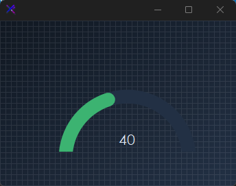
Dual-Range Colors (ProgressColorLow, ProgressColorHigh, WarningMark)
Set WarningMark to define the threshold between low and high ranges. Below the mark the arc renders ProgressColorLow; above it switches to ProgressColorHigh. Useful for health, load, or risk indicators that need immediate visual state changes.
var panel = new FlowLayoutPanel
{
    Width = 260,
    Height = 180,
    Padding = new Padding(20),
    BackColor = Color.Transparent,
    AutoScroll = false,
    FlowDirection = FlowDirection.TopDown
};

var gauge = new KtProgressGauge
{
    Width = 220,
    Height = 140,
    Margin = new Padding(5),
    Value = 82,
    Minimum = 0,
    Maximum = 100,
    Thickness = 20,
    ProgressColorLow = KtColor.SUCCESS,
    ProgressColorHigh = KtColor.ERROR,
    ProgressBackColor = KtColor.BASE_3,
    ProgressCap = KtProgressGauge.CapStyles.Round,
    WarningMark = 70,
    ShowValueLabel = true,
    ShowRangeLabels = true,
    TextValueColor = KtColor.CONTENT,
    TextRangeColor = KtColor.CONTENT % 50,
};

panel.Controls.Add(gauge);
Arc Thickness (Thickness)
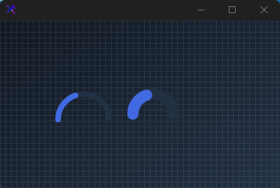
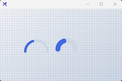
Scale the gauge weight from a hairline 8 px to a bold 28 px. Thicker arcs feel more prominent and tactile; thinner arcs suit dense dashboard grids.
var panel = new FlowLayoutPanel
{
    Width = 320,
    Height = 180,
    Padding = new Padding(20),
    BackColor = Color.Transparent,
    AutoScroll = false,
    FlowDirection = FlowDirection.LeftToRight
};

var thin = new KtProgressGauge
{
    Width = 90,
    Height = 120,
    Margin = new Padding(5),
    Value = 60,
    Minimum = 0,
    Maximum = 100,
    Thickness = 8,
    ProgressColorLow = KtColor.PRIMARY,
    ProgressColorHigh = KtColor.PRIMARY,
    ProgressBackColor = KtColor.BASE_3,
    ProgressCap = KtProgressGauge.CapStyles.Round,
    ShowValueLabel = false,
    ShowRangeLabels = false,
};

var medium = new KtProgressGauge
{
    Width = 90,
    Height = 120,
    Margin = new Padding(5),
    Value = 60,
    Minimum = 0,
    Maximum = 100,
    Thickness = 16,
    ProgressColorLow = KtColor.PRIMARY,
    ProgressColorHigh = KtColor.PRIMARY,
    ProgressBackColor = KtColor.BASE_3,
    ProgressCap = KtProgressGauge.CapStyles.Round,
    ShowValueLabel = false,
    ShowRangeLabels = false,
};

var thick = new KtProgressGauge
{
    Width = 90,
    Height = 120,
    Margin = new Padding(5),
    Value = 60,
    Minimum = 0,
    Maximum = 100,
    Thickness = 28,
    ProgressColorLow = KtColor.PRIMARY,
    ProgressColorHigh = KtColor.PRIMARY,
    ProgressBackColor = KtColor.BASE_3,
    ProgressCap = KtProgressGauge.CapStyles.Round,
    ShowValueLabel = false,
    ShowRangeLabels = false,
};

panel.Controls.Add(thin);
panel.Controls.Add(medium);
panel.Controls.Add(thick);

Value & Range Labels (ShowValueLabel, ShowRangeLabels, Prefix, Suffix)
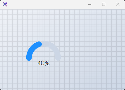
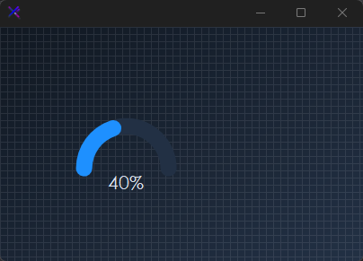
Toggle the center value label and the min/max range labels independently. Use Prefix and Suffix to format the reading (e.g., $, %, °C).
var panel = new FlowLayoutPanel
{
    Width = 320,
    Height = 200,
    Padding = new Padding(20),
    BackColor = Color.Transparent,
    AutoScroll = false,
    FlowDirection = FlowDirection.LeftToRight
};

var valueOnly = new KtProgressGauge
{
    Width = 130,
    Height = 140,
    Margin = new Padding(5),
    Value = 45,
    Minimum = 0,
    Maximum = 100,
    Thickness = 18,
    ProgressColorLow = KtColor.INFO,
    ProgressColorHigh = KtColor.INFO,
    ProgressBackColor = KtColor.BASE_3,
    ProgressCap = KtProgressGauge.CapStyles.Round,
    ShowValueLabel = true,
    ShowRangeLabels = false,
    Prefix = "",
    Suffix = "%",
    TextValueColor = KtColor.CONTENT,
};

var fullLabels = new KtProgressGauge
{
    Width = 130,
    Height = 140,
    Margin = new Padding(5),
    Value = 78,
    Minimum = 0,
    Maximum = 100,
    Thickness = 18,
    ProgressColorLow = KtColor.WARNING,
    ProgressColorHigh = KtColor.WARNING,
    ProgressBackColor = KtColor.BASE_3,
    ProgressCap = KtProgressGauge.CapStyles.Round,
    ShowValueLabel = true,
    ShowRangeLabels = true,
    Prefix = "",
    Suffix = "",
    TextValueColor = KtColor.CONTENT,
    TextRangeColor = KtColor.CONTENT % 50,
};

panel.Controls.Add(valueOnly);
panel.Controls.Add(fullLabels);
Auto-Generated Track (AutoGenerateProgressColorWhenLow, LighteningFactor)
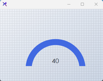
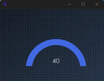
When AutoGenerateProgressColorWhenLow = true, the background track is automatically tinted from ProgressColorLow using LighteningFactor (default 70). This keeps the track visually related to the fill without manual color management.
var panel = new FlowLayoutPanel
{
    Width = 260,
    Height = 180,
    Padding = new Padding(20),
    BackColor = Color.Transparent,
    AutoScroll = false,
    FlowDirection = FlowDirection.TopDown
};

var gauge = new KtProgressGauge
{
    Width = 220,
    Height = 140,
    Margin = new Padding(5),
    Value = 35,
    Minimum = 0,
    Maximum = 100,
    Thickness = 20,
    ProgressColorLow = KtColor.PRIMARY,
    ProgressColorHigh = KtColor.ERROR,
    ProgressBackColor = KtColor.BASE_3,
    ProgressCap = KtProgressGauge.CapStyles.Round,
    WarningMark = 70,
    AutoGenerateProgressColorWhenLow = true,
    AutoGenerateProgressColorWhenHigh = false,
    LighteningFactor = 70,
    ShowValueLabel = true,
    ShowRangeLabels = true,
    TextValueColor = KtColor.CONTENT,
    TextRangeColor = KtColor.CONTENT % 50,
};

panel.Controls.Add(gauge);
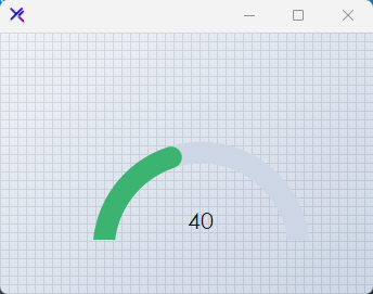
Cap Styles (ProgressCap)
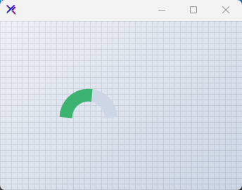
Flat produces a hard-edged arc termination; Round softens the ends with circular caps. Round caps feel friendlier and more modern; flat caps read as precise and technical.
var panel = new FlowLayoutPanel
{
    Width = 260,
    Height = 180,
    Padding = new Padding(20),
    BackColor = Color.Transparent,
    AutoScroll = false,
    FlowDirection = FlowDirection.LeftToRight
};

var flat = new KtProgressGauge
{
    Width = 100,
    Height = 120,
    Margin = new Padding(5),
    Value = 60,
    Minimum = 0,
    Maximum = 100,
    Thickness = 18,
    ProgressColorLow = KtColor.SUCCESS,
    ProgressColorHigh = KtColor.SUCCESS,
    ProgressBackColor = KtColor.BASE_3,
    ProgressCap = KtProgressGauge.CapStyles.Flat,
    ShowValueLabel = false,
    ShowRangeLabels = false,
};

var round = new KtProgressGauge
{
    Width = 100,
    Height = 120,
    Margin = new Padding(5),
    Value = 60,
    Minimum = 0,
    Maximum = 100,
    Thickness = 18,
    ProgressColorLow = KtColor.SUCCESS,
    ProgressColorHigh = KtColor.SUCCESS,
    ProgressBackColor = KtColor.BASE_3,
    ProgressCap = KtProgressGauge.CapStyles.Round,
    ShowValueLabel = false,
    ShowRangeLabels = false,
};

panel.Controls.Add(flat);
panel.Controls.Add(round);
API Reference
| ProgressColorLow | Kt-Color | Sets the Gauge’s progress color whenever it is within the low or minimum value ranges. |
| ProgressColorHigh | Kt-Color | Sets the gauge’s progress color whenever it is within the high or maximum value ranges as specified by the property ‘ProgressHighValueMark’. |
| TextRangeColor | Kt-Color | Sets the gauge’s range labels’ color. |
| TextValueColor | Kt-Color | Sets the gauge’s value label color. |
| ProgressBackColor | Kt-Color | Sets the gauge’s progress bakcground color. |
| ProgressCap | CapStyles | Sets the rendering style of the progress edges. |
| ShowRangeLabels | Boolean | Sets a value indicating whether the gauge’s range labels will be displayed. |
| ShowValueLabel | Boolean | Sets a value indicating whether the gauge’s value label will be displayed. |
| AutoGenerateProgressColorWhenLow | Boolean | When set to true, a lighter background color will be automatically generated for the progress background color that is based on the set ‘ProgressColorLow’ color. |
| AutoGenerateProgressColorWhenHigh | Boolean | When set to true, a lighter background color will be automatically generated for the progress background color that is based on the set ‘ProgressColorHigh’ color. |
| Font | Font | Sets the gauge’s standard font. |
| RangeLabelsFont | Font | Sets the Range labels font. |
| Value | Int32 | Sets the gauge’s pointer value. |
| Minimum | Int32 | Sets the minimum range value. |
| Maximum | Int32 | Sets the maximum range value. |
| WarningMark | Int32 | Sets the point at which the gauge should mark as the beginning of high value ranges. |
| LighteningFactor | Int32 | Applies a lightening value/factor that will be used to generate the progress background color when the value set is either high or low. (Default is 70) |
| Thickness | Int32 | Sets the gauge’s progress thickness. |
| RangeEnd | Int32 | Sets the Range end. |
| RangeStart | Int32 | Sets the Range start. |
| ProgressHighValueMark | Int32 | Sets the Progress high value mark. |
| Prefix | String | Sets the gauge’s prefix text that precedes the gauge value. |
| Suffix | String | Sets the gauge’s suffix text that is displayed besides the gauge value. |