Kt Select
A fully owner-drawn dropdown with rounded corners, theme-aware colors, adjustable indicator styles, and independent styling for the closed surface and dropdown list items.

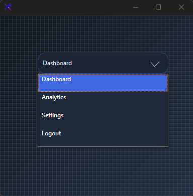
🟢 DESIGNER SUPPORT
This control has full Visual Studio design-time support.
Drag it from the Toolbox onto your form, customize its properties directly in the Properties window, and KimTools will generate the corresponding code for you.
var select = new KtSelect();
Flat / Minimal Select
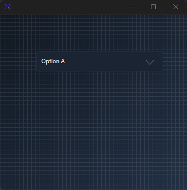
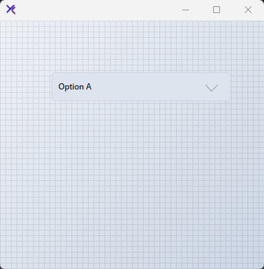
A thin-bordered, low-radius dropdown with an outline indicator. Muted BASE_3 border on a BASE surface keeps the control unobtrusive in dense forms.
var panel = new FlowLayoutPanel
{
    Width = 300,
    Height = 120,
    Padding = new Padding(20),
    BackColor = Color.Transparent,
    AutoScroll = false,
    FlowDirection = FlowDirection.TopDown
};

var select = new KtSelect
{
    Width = 260,
    Height = 36,
    Margin = new Padding(5),
    Bg = KtColor.BASE,
    BorderColor = KtColor.BASE_3,
    BorderRadius = 4,
    TextColor = KtColor.CONTENT,
    IndicatorColor = KtColor.CONTENT % 50,
    TextAlignment = KtSelect.TextAlign.Left,
    IndicatorAlignment = KtSelect.Indicator.Right,
    DropdownBorderThickness = KtSelect.BorderThickness.Thin,
    FillIndicator = false,
    ItemBackColor = KtColor.BASE,
    ItemForeColor = KtColor.CONTENT,
    ItemHighLightColor = KtColor.PRIMARY % 15,
    ItemHighLightForeColor = KtColor.PRIMARY,
    ItemBorderColor = KtColor.BASE_3 % 20,
};

select.Items.AddRange(["Option A", "Option B", "Option C"]);
select.SelectedIndex = 0;

panel.Controls.Add(select);

Pill / Rounded Select
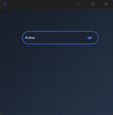
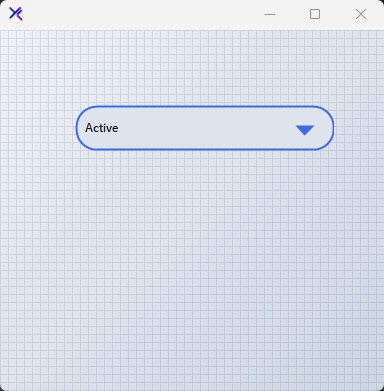
A thick-bordered capsule with a filled primary indicator. BorderRadius = 20 and DropdownBorderThickness.Thick give the control a bold, button-like presence.
var panel = new FlowLayoutPanel
{
    Width = 300,
    Height = 120,
    Padding = new Padding(20),
    BackColor = Color.Transparent,
    AutoScroll = false,
    FlowDirection = FlowDirection.TopDown
};

var select = new KtSelect
{
    Width = 260,
    Height = 40,
    Margin = new Padding(5),
    Bg = KtColor.BASE_2,
    BorderColor = KtColor.PRIMARY,
    BorderRadius = 20,
    TextColor = KtColor.CONTENT,
    IndicatorColor = KtColor.PRIMARY,
    TextAlignment = KtSelect.TextAlign.Left,
    IndicatorAlignment = KtSelect.Indicator.Right,
    DropdownBorderThickness = KtSelect.BorderThickness.Thick,
    FillIndicator = true,
    ItemBackColor = KtColor.BASE_2,
    ItemForeColor = KtColor.CONTENT,
    ItemHighLightColor = KtColor.PRIMARY,
    ItemHighLightForeColor = KtColor.White,
    ItemBorderColor = KtColor.BASE_3 % 30,
};

select.Items.AddRange(["Active", "Paused", "Archived"]);
select.SelectedIndex = 0;

panel.Controls.Add(select);

Text & Indicator Alignment (TextAlignment, IndicatorAlignment)
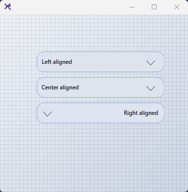
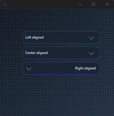
Position the label and chevron independently. TextAlign.Left with Indicator.Right is the default. Swap to TextAlign.Right + Indicator.Left for RTL-friendly layouts or centered headers.
var panel = new FlowLayoutPanel
{
    Width = 300,
    Height = 220,
    Padding = new Padding(20),
    BackColor = Color.Transparent,
    AutoScroll = false,
    FlowDirection = FlowDirection.TopDown
};

var left = new KtSelect
{
    Width = 260,
    Height = 36,
    Margin = new Padding(5),
    Bg = KtColor.BASE_2,
    BorderColor = KtColor.PRIMARY % 50,
    BorderRadius = 14,
    TextColor = KtColor.CONTENT,
    IndicatorColor = !KtColor.BASE_2,
    TextAlignment = KtSelect.TextAlign.Left,
    IndicatorAlignment = KtSelect.Indicator.Right,
    DropdownBorderThickness = KtSelect.BorderThickness.Thin,
};

var center = new KtSelect
{
    Width = 260,
    Height = 36,
    Margin = new Padding(5),
    Bg = KtColor.BASE_2,
    BorderColor = KtColor.PRIMARY % 50,
    BorderRadius = 14,
    TextColor = KtColor.CONTENT,
    IndicatorColor = !KtColor.BASE_2,
    TextAlignment = KtSelect.TextAlign.Center,
    IndicatorAlignment = KtSelect.Indicator.Right,
    DropdownBorderThickness = KtSelect.BorderThickness.Thin,
};

var right = new KtSelect
{
    Width = 260,
    Height = 36,
    Margin = new Padding(5),
    Bg = KtColor.BASE_2,
    BorderColor = KtColor.PRIMARY % 50,
    BorderRadius = 14,
    TextColor = KtColor.CONTENT,
    IndicatorColor = !KtColor.BASE_2,
    TextAlignment = KtSelect.TextAlign.Right,
    IndicatorAlignment = KtSelect.Indicator.Left,
    DropdownBorderThickness = KtSelect.BorderThickness.Thin,
};

left.Items.AddRange(["Left aligned", "Center aligned", "Right aligned"]);
center.Items.AddRange(["Left aligned", "Center aligned", "Right aligned"]);
right.Items.AddRange(["Left aligned", "Center aligned", "Right aligned"]);

left.SelectedIndex = 0;
center.SelectedIndex = 1;
right.SelectedIndex = 2;

panel.Controls.Add(left);
panel.Controls.Add(center);
panel.Controls.Add(right);
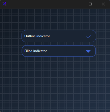
Indicator Styles (FillIndicator, DropdownBorderThickness)
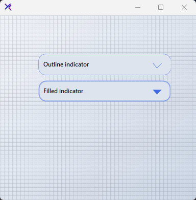
FillIndicator = false draws a hollow chevron; true fills it. Pair with DropdownBorderThickness.Thick to make the indicator visually heavier.
var panel = new FlowLayoutPanel
{
    Width = 300,
    Height = 160,
    Padding = new Padding(20),
    BackColor = Color.Transparent,
    AutoScroll = false,
    FlowDirection = FlowDirection.TopDown
};

var outline = new KtSelect
{
    Width = 260,
    Height = 36,
    Margin = new Padding(5),
    Bg = KtColor.BASE_2,
    BorderColor = KtColor.PRIMARY % 50,
    BorderRadius = 14,
    TextColor = KtColor.CONTENT,
    IndicatorColor = KtColor.PRIMARY,
    TextAlignment = KtSelect.TextAlign.Left,
    IndicatorAlignment = KtSelect.Indicator.Right,
    DropdownBorderThickness = KtSelect.BorderThickness.Thin,
    FillIndicator = false,
};

var filled = new KtSelect
{
    Width = 260,
    Height = 36,
    Margin = new Padding(5),
    Bg = KtColor.BASE_2,
    BorderColor = KtColor.PRIMARY % 50,
    BorderRadius = 14,
    TextColor = KtColor.CONTENT,
    IndicatorColor = KtColor.PRIMARY,
    TextAlignment = KtSelect.TextAlign.Left,
    IndicatorAlignment = KtSelect.Indicator.Right,
    DropdownBorderThickness = KtSelect.BorderThickness.Thick,
    FillIndicator = true,
};

outline.Items.AddRange(["Outline indicator", "Filled indicator"]);
filled.Items.AddRange(["Outline indicator", "Filled indicator"]);

outline.SelectedIndex = 0;
filled.SelectedIndex = 1;

panel.Controls.Add(outline);
panel.Controls.Add(filled);
Disabled State (DisabledBackColor, DisabledBorderColor, DisabledForeColor, DisabledIndicatorColor)
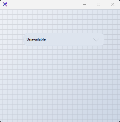
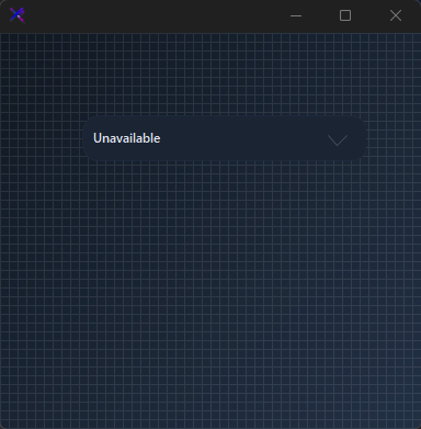
When Enabled = false, the control swaps to its disabled palette. Each surface — background, border, text, and indicator — can be tuned independently for accessible contrast.
var panel = new FlowLayoutPanel
{
    Width = 300,
    Height = 120,
    Padding = new Padding(20),
    BackColor = Color.Transparent,
    AutoScroll = false,
    FlowDirection = FlowDirection.TopDown
};

var select = new KtSelect
{
    Width = 260,
    Height = 36,
    Margin = new Padding(5),
    Enabled = false,
    Bg = KtColor.BASE_2,
    BorderColor = KtColor.BASE_3 % 50,
    BorderRadius = 14,
    TextColor = KtColor.CONTENT % 50,
    IndicatorColor = KtColor.CONTENT % 25,
    TextAlignment = KtSelect.TextAlign.Left,
    IndicatorAlignment = KtSelect.Indicator.Right,
    DropdownBorderThickness = KtSelect.BorderThickness.Thin,
    DisabledBackColor = KtColor.BASE_2,
    DisabledBorderColor = KtColor.BASE_3 % 50,
    DisabledForeColor = KtColor.CONTENT % 50,
    DisabledIndicatorColor = KtColor.CONTENT % 25,
};

select.Items.AddRange(["Unavailable", "Offline", "Restricted"]);
select.SelectedIndex = 0;

panel.Controls.Add(select);
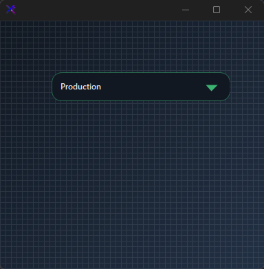
Dropdown List Styling (ItemBackColor, ItemHighLightColor, ItemBorderColor)
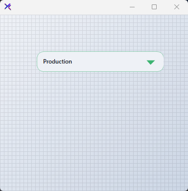
The opened list is fully owner-drawn. Set ItemBackColor for the list surface, ItemHighLightColor for the active row, and ItemBorderColor for the separators. ItemTopMargin and TextLeftMargin fine-tune item padding.
var panel = new FlowLayoutPanel
{
    Width = 300,
    Height = 120,
    Padding = new Padding(20),
    BackColor = Color.Transparent,
    AutoScroll = false,
    FlowDirection = FlowDirection.TopDown
};

var select = new KtSelect
{
    Width = 260,
    Height = 36,
    Margin = new Padding(5),
    Bg = KtColor.BASE_1,
    BorderColor = KtColor.SUCCESS % 50,
    BorderRadius = 14,
    TextColor = KtColor.CONTENT,
    IndicatorColor = KtColor.SUCCESS,
    TextAlignment = KtSelect.TextAlign.Left,
    IndicatorAlignment = KtSelect.Indicator.Right,
    DropdownBorderThickness = KtSelect.BorderThickness.Thin,
    FillIndicator = true,
    ItemBackColor = KtColor.BASE_1,
    ItemForeColor = KtColor.CONTENT,
    ItemHighLightColor = KtColor.SUCCESS,
    ItemHighLightForeColor = KtColor.White,
    ItemBorderColor = KtColor.BASE_3 % 30,
    ItemTopMargin = 2,
    TextLeftMargin = 8,
};

select.Items.AddRange(["Deploy", "Staging", "Production", "Rollback"]);
select.SelectedIndex = 2;

panel.Controls.Add(select);
API Reference
| IndicatorColor | Kt-Color | Sets the indicator color. |
| ItemForeColor | Kt-Color | Sets the default items’ fore color. |
| DisabledBackColor | Kt-Color | Sets the dropdown’s back color when disabled. |
| DisabledBorderColor | Kt-Color | Sets the dropdown’s border color when disabled. |
| DisabledIndicatorColor | Kt-Color | Sets the dropdown’s indicator color when disabled. |
| DisabledForeColor | Kt-Color | Sets the dropdown’s fore color when disabled. |
| ItemHighLightColor | Kt-Color | Sets the highlighted item’s back color. |
| ItemHighLightForeColor | Kt-Color | Sets the highlighted item’s fore color. |
| BorderColor | Kt-Color | Sets dropdown’s border color. |
| Bg | Kt-Color | Sets the dropdown’s background color. |
| ItemBorderColor | Kt-Color | Sets the dropdown’s items border color. |
| ItemBackColor | Kt-Color | Sets the background color of the dropdown list. |
| TextColor | Kt-Color | Sets the dropdown’s fore color. |
| DisabledColor | Kt-Color | Sets the Disabled color. |
| DropdownBorderThickness | BorderThickness | Sets the dropdown’s border thickness. |
| Direction | Directions | Sets the Direction. |
| IndicatorAlignment | Indicator | Sets the indicator’s alignment position. |
| IndicatorLocation | Indicator | Sets the Indicator location. |
| TextAlignment | TextAlign | Sets the default text alignment. |
| DropDownTextAlign | TextAlign | Sets the Drop down text align. |
| Enabled | Boolean | Enables or Disables the control |
| FillIndicator | Boolean | Sets a value inidicating whether the indicator will be filled. |
| FillDropDown | Boolean | Sets the Fill drop down. |
| Font | Font | Sets the dropdown’s font. |
| ItemHeight | Int32 | Sets the dropdown’s height. |
| BorderRadius | Int32 | Sets the dropdown’s border radius. |
| TextLeftMargin | Int32 | Sets the margin between the dropdown’s text and its borders. |
| ItemTopMargin | Int32 | Sets the margin between each dropdown’s item and the items container. |
| Height | Int32 | Sets the dropdown’s item height. |
| Width | Int32 | Sets dropdown’s item width. |
| Text | String | Sets the dropdown’s text. |