Kt Slider
A horizontal range slider with state-based theming, fill/outline thumb styles, thick/thin track borders, and smooth color transitions.

🟢 DESIGNER SUPPORT
This control has full Visual Studio design-time support.
Drag it from the Toolbox onto your form, customize its properties directly in the Properties window, and KimTools will generate the corresponding code for you.
Flat / Minimal Slider
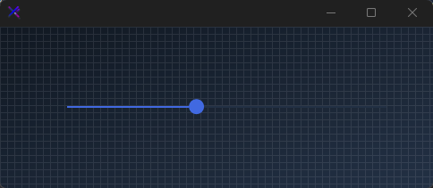
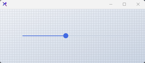
A thin track with an outline thumb. The elapsed portion is tinted with ElapsedColor while the remaining track uses SliderColor. Clean and unobtrusive for form layouts.
var panel = new FlowLayoutPanel
{
    Width = 400,
    Height = 120,
    Padding = new Padding(20),
    BackColor = Color.Transparent,
    AutoScroll = false,
    FlowDirection = FlowDirection.TopDown
};

var slider = new KtSlider
{
    Width = 360,
    Height = 31,
    Margin = new Padding(5),
    Value = 40,
    SliderColor = KtColor.BASE_3,
    ElapsedColor = KtColor.PRIMARY,
    ThumbColor = KtColor.PRIMARY,
    ThumbFillColor = KtColor.PRIMARY,
    ThumbStyle = KtSlider.ThumbStyles.Outline,
    SliderStyle = KtSlider.SliderStyles.Thin,
};

panel.Controls.Add(slider);

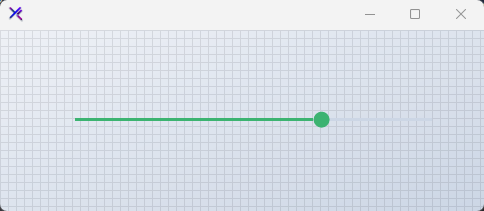
Fill / Bold Slider (ThumbStyle, SliderStyle)
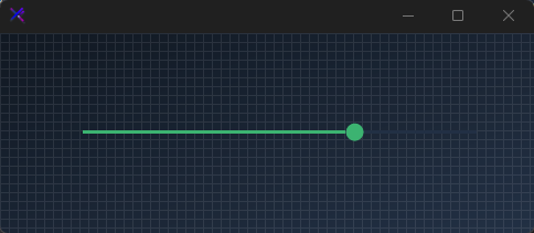
A thick track with a solid filled thumb. SliderStyle.Thick increases the track weight, and ThumbStyle.Fill removes the thumb border for a solid, modern appearance.
var panel = new FlowLayoutPanel
{
    Width = 400,
    Height = 120,
    Padding = new Padding(20),
    BackColor = Color.Transparent,
    AutoScroll = false,
    FlowDirection = FlowDirection.TopDown
};

var slider = new KtSlider
{
    Width = 360,
    Height = 31,
    Margin = new Padding(5),
    Value = 70,
    SliderColor = KtColor.BASE_3,
    ElapsedColor = KtColor.SUCCESS,
    ThumbColor = KtColor.SUCCESS,
    ThumbFillColor = KtColor.SUCCESS,
    ThumbStyle = KtSlider.ThumbStyles.Fill,
    SliderStyle = KtSlider.SliderStyles.Thick,
};

panel.Controls.Add(slider);

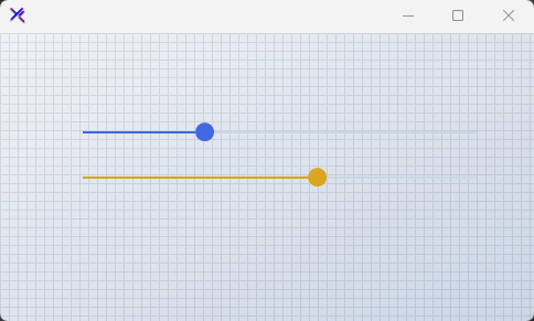
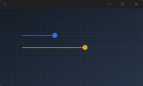
Color Themes (ElapsedColor, ThumbColor)
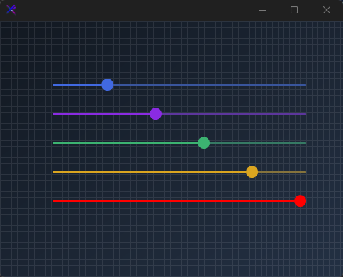
Swap the entire slider accent by changing ElapsedColor and ThumbColor together. Use semantic colors to indicate severity — primary for neutral, warning for caution, error for critical ranges.
var panel = new FlowLayoutPanel
{
    Width = 400,
    Height = 200,
    Padding = new Padding(20),
    BackColor = Color.Transparent,
    AutoScroll = false,
    FlowDirection = FlowDirection.TopDown
};

var primary = new KtSlider
{
    Width = 360,
    Height = 31,
    Margin = new Padding(5),
    Value = 30,
    SliderColor = KtColor.BASE_3,
    ElapsedColor = KtColor.PRIMARY,
    ThumbColor = KtColor.PRIMARY,
    ThumbFillColor = KtColor.PRIMARY,
    ThumbStyle = KtSlider.ThumbStyles.Outline,
    SliderStyle = KtSlider.SliderStyles.Thin,
};

var warning = new KtSlider
{
    Width = 360,
    Height = 31,
    Margin = new Padding(5),
    Value = 60,
    SliderColor = KtColor.BASE_3,
    ElapsedColor = KtColor.WARNING,
    ThumbColor = KtColor.WARNING,
    ThumbFillColor = KtColor.WARNING,
    ThumbStyle = KtSlider.ThumbStyles.Outline,
    SliderStyle = KtSlider.SliderStyles.Thin,
};

var error = new KtSlider
{
    Width = 360,
    Height = 31,
    Margin = new Padding(5),
    Value = 85,
    SliderColor = KtColor.BASE_3,
    ElapsedColor = KtColor.ERROR,
    ThumbColor = KtColor.ERROR,
    ThumbFillColor = KtColor.ERROR,
    ThumbStyle = KtSlider.ThumbStyles.Outline,
    SliderStyle = KtSlider.SliderStyles.Thin,
};

panel.Controls.Add(primary);
panel.Controls.Add(warning);
panel.Controls.Add(error);
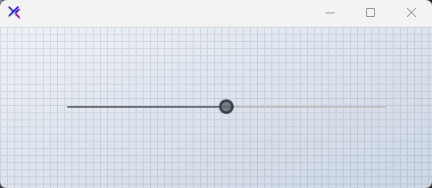
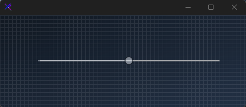
Disabled State
When Enabled = false, the slider falls back to muted state colors. All interactive feedback is suppressed, and the thumb and track are desaturated for clear non-interactive signaling.
var panel = new FlowLayoutPanel
{
    Width = 400,
    Height = 120,
    Padding = new Padding(20),
    BackColor = Color.Transparent,
    AutoScroll = false,
    FlowDirection = FlowDirection.TopDown
};

var slider = new KtSlider
{
    Width = 360,
    Height = 31,
    Margin = new Padding(5),
    Value = 50,
    Enabled = false,
    SliderColor = KtColor.CONTENT % 50,
    ElapsedColor = KtColor.CONTENT % 50,
    ThumbColor = KtColor.CONTENT % 50,
    ThumbFillColor = KtColor.CONTENT % 50,
    ThumbStyle = KtSlider.ThumbStyles.Outline,
    SliderStyle = KtSlider.SliderStyles.Thin,
};

panel.Controls.Add(slider);
API Reference
| SliderColor | Kt-Color | Sets the slider’s BackColor. |
| ElapsedColor | Kt-Color | Sets the slider’s elapsed region color. |
| ThumbFillColor | Kt-Color | Sets the thumb’s inner fill color. This is only necessary when the property ThumbStyle’ is set to ‘Outline’. |
| SliderStyle | SliderStyles | Sets the slider’s overral style. |
| ThumbStyle | ThumbStyles | Sets the slider’s thumb style. |