KimTools / Controls / Label
Kt Label
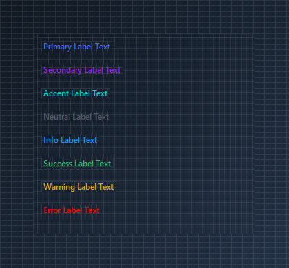
A theme-aware label control for Modern WinForms with intelligent foreground contrast generation and KtColor palette integration.

🟢 DESIGNER SUPPORT
This control has full Visual Studio design-time support.
Drag it from the Toolbox onto your form, customize its properties directly in the Properties window, and KimTools will generate the corresponding code for you.
Color
| Color | Kt-Color | Sets the Color. |
|---|
Background
| Background | Kt-Color | Sets the Background. |
|---|
Align
| Align | ContentAlignment | Sets the Align. |
|---|
Auto
| Auto | Boolean | Sets the Auto. |
|---|
Palette Color Variants
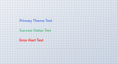
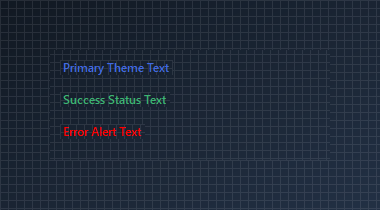
Use the Color property to set theme-aware text colors. Foreground contrast and shade variations automatically adapt based on font weight and active theme settings.
🔴 🟡 🟢
var panel = new Panel
{
    Width = 280,
    Height = 110,
    BackColor = Color.Transparent
};

var primaryLabel = new KtLabel
{
    Text = "Primary Theme Text",
    Color = KtColor.PRIMARY,
    Auto = true
};

var successLabel = new KtLabel
{
    Text = "Success Status Text",
    Color = KtColor.SUCCESS,
    Auto = true
};

var errorLabel = new KtLabel
{
    Text = "Error Alert Text",
    Color = KtColor.ERROR,
    Auto = true
};

panel.Controls.Add(primaryLabel);
panel.Controls.Add(successLabel);
panel.Controls.Add(errorLabel);

primaryLabel.Location = new Point(10, 10);
successLabel.Location = new Point(10, 42);
errorLabel.Location = new Point(10, 74);
Auto
Light
Dark
Text Alignment
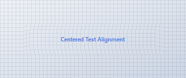
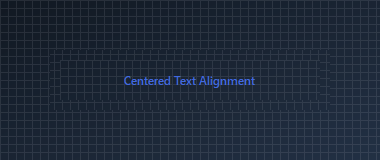
Set Auto = false to define a custom control size, then use Align to position text (ContentAlignment) within the bounds.
🔴 🟡 🟢
var panel = new Panel
{
    Width = 280,
    Height = 60,
    BackColor = Color.Transparent
};

var alignedLabel = new KtLabel
{
    Text = "Centered Text Alignment",
    Color = KtColor.PRIMARY,
    Auto = false,
    Size = new Size(260, 40),
    Align = ContentAlignment.MiddleCenter
};

panel.Controls.Add(alignedLabel);
alignedLabel.Location = new Point(10, 10);
Auto
Light
Dark
API Reference
| Color | Kt-Color | Sets the Color. |
| Background | Kt-Color | Sets the Background. |
| Auto | Boolean | Sets the Auto. |
| Align | ContentAlignment | Sets the Align. |
| Text | String | The text associated with the control. |