Kt Table
A fully themed data grid with per-region skinning, rounded cell corners, custom scrollbar overlays, and native-looking checkbox, button, and link rendering.

🟢 DESIGNER SUPPORT
This control has full Visual Studio design-time support.
Drag it from the Toolbox onto your form, customize its properties directly in the Properties window, and KimTools will generate the corresponding code for you.
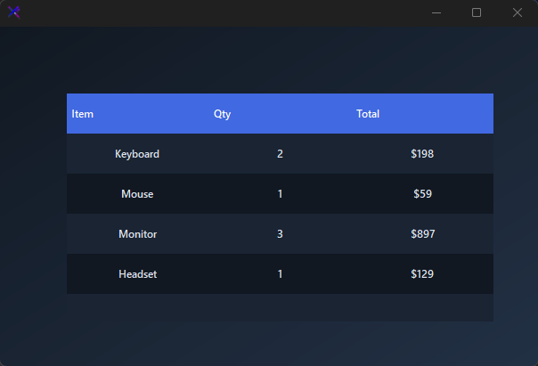
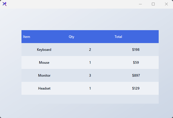
Flat / Minimal Table
A zero-border grid with a solid primary header and subtle alternating rows. Clean typography and no radius — ideal for dense data dashboards.
var panel = new FlowLayoutPanel
{
    Width = 520,
    Height = 320,
    Padding = new Padding(20),
    BackColor = Color.Transparent,
    AutoScroll = false
};

var table = new KtTable
{
    Width = 480,
    Height = 280,
    Margin = new Padding(5),
};

table.Style.Color = KtColor.PRIMARY;
table.Style.Background = KtColor.BASE;
table.Style.Foreground = KtColor.CONTENT;
table.Style.Header = new KtSkin(KtColor.White, KtColor.PRIMARY);
table.Style.Row = new KtSkin(KtColor.CONTENT, KtColor.BASE);
table.Style.RowAlt = new KtSkin(KtColor.CONTENT, KtColor.BASE_1);
table.Style.Border = 0;

table.Columns.Add(new DataGridViewTextBoxColumn { Name = "Item", HeaderText = "Item", Width = 150 });
table.Columns.Add(new DataGridViewTextBoxColumn { Name = "Qty", HeaderText = "Qty", Width = 80 });
table.Columns.Add(new DataGridViewTextBoxColumn { Name = "Total", HeaderText = "Total", Width = 100 });

table.Rows.Add("Keyboard", "2", "$198");
table.Rows.Add("Mouse", "1", "$59");
table.Rows.Add("Monitor", "3", "$897");
table.Rows.Add("Headset", "1", "$129");

panel.Controls.Add(table);

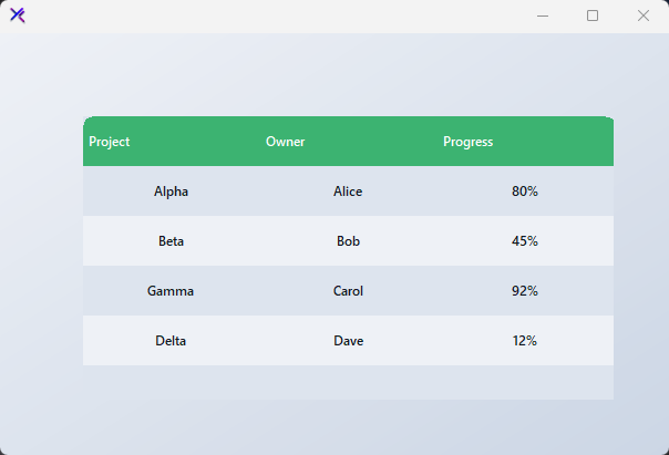
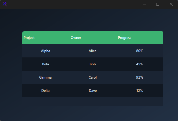
Rounded Cells (Border)
Set Border to apply a squircle mask to the outer corners of the grid. Cells paint flush against the rounded boundary, giving the table a card-like container appearance.
var panel = new FlowLayoutPanel
{
    Width = 520,
    Height = 320,
    Padding = new Padding(20),
    BackColor = Color.Transparent,
    AutoScroll = false
};

var table = new KtTable
{
    Width = 480,
    Height = 280,
    Margin = new Padding(5),
};

table.Style.Color = KtColor.SUCCESS;
table.Style.Background = KtColor.BASE;
table.Style.Foreground = KtColor.CONTENT;
table.Style.Header = new KtSkin(KtColor.White, KtColor.SUCCESS);
table.Style.Row = new KtSkin(KtColor.CONTENT, KtColor.BASE);
table.Style.RowAlt = new KtSkin(KtColor.CONTENT, KtColor.BASE_1);
table.Style.Border = 8;

table.Columns.Add(new DataGridViewTextBoxColumn { Name = "Project", HeaderText = "Project", Width = 140 });
table.Columns.Add(new DataGridViewTextBoxColumn { Name = "Owner", HeaderText = "Owner", Width = 100 });
table.Columns.Add(new DataGridViewTextBoxColumn { Name = "Progress", HeaderText = "Progress", Width = 90 });

table.Rows.Add("Alpha", "Alice", "80%");
table.Rows.Add("Beta", "Bob", "45%");
table.Rows.Add("Gamma", "Carol", "92%");
table.Rows.Add("Delta", "Dave", "12%");

panel.Controls.Add(table);
Theme Variants (Color, Header)
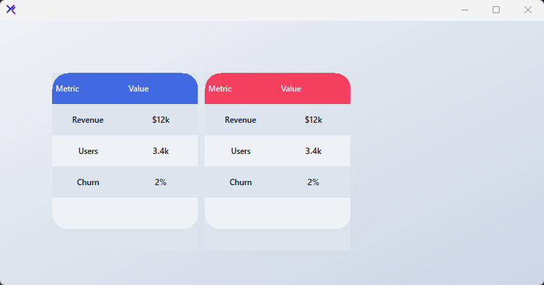
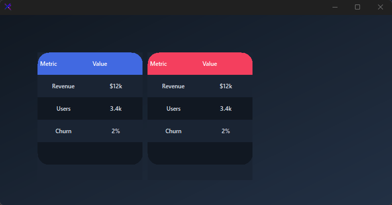
Swap the entire table accent by changing Style.Color. The header background follows automatically, and selection states derive their tint from the same source. No per-cell color management required.
var panel = new FlowLayoutPanel
{
    Width = 700,
    Height = 320,
    Padding = new Padding(20),
    BackColor = Color.Transparent,
    AutoScroll = false,
    FlowDirection = FlowDirection.LeftToRight
};

var primary = new KtTable
{
    Width = 210,
    Height = 260,
    Margin = new Padding(5),
};
primary.Style.Color = KtColor.PRIMARY;
primary.Style.Header = new KtSkin(KtColor.White, KtColor.PRIMARY);
primary.Style.Row = new KtSkin(KtColor.CONTENT, KtColor.BASE);
primary.Style.RowAlt = new KtSkin(KtColor.CONTENT, KtColor.BASE_1);

var rose = new KtTable
{
    Width = 210,
    Height = 260,
    Margin = new Padding(5),
};
rose.Style.Color = KtColor.Rose;
rose.Style.Header = new KtSkin(KtColor.White, KtColor.Rose);
rose.Style.Row = new KtSkin(KtColor.CONTENT, KtColor.BASE);
rose.Style.RowAlt = new KtSkin(KtColor.CONTENT, KtColor.BASE_1);

var emerald = new KtTable
{
    Width = 210,
    Height = 260,
    Margin = new Padding(5),
};
emerald.Style.Color = KtColor.Emerald;
emerald.Style.Header = new KtSkin(KtColor.White, KtColor.Emerald);
emerald.Style.Row = new KtSkin(KtColor.CONTENT, KtColor.BASE);
emerald.Style.RowAlt = new KtSkin(KtColor.CONTENT, KtColor.BASE_1);

foreach (var t in new[] { primary, rose, emerald })
{
    t.Columns.Add(new DataGridViewTextBoxColumn { Name = "Metric", HeaderText = "Metric", Width = 100 });
    t.Columns.Add(new DataGridViewTextBoxColumn { Name = "Value", HeaderText = "Value", Width = 80 });
    t.Rows.Add("Revenue", "$12k");
    t.Rows.Add("Users", "3.4k");
    t.Rows.Add("Churn", "2%");
}

panel.Controls.Add(primary);
panel.Controls.Add(rose);
panel.Controls.Add(emerald);
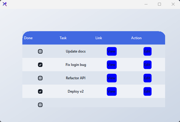
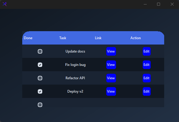
Native Cell Types (BorderButtons, BorderCheckBoxes)
Checkboxes, buttons, and links are owner-drawn with rounded corners. Set BorderButtons and BorderCheckBoxes independently to match your design language.
var panel = new FlowLayoutPanel
{
    Width = 520,
    Height = 320,
    Padding = new Padding(20),
    BackColor = Color.Transparent,
    AutoScroll = false
};

var table = new KtTable
{
    Width = 480,
    Height = 280,
    Margin = new Padding(5),
};

table.Style.Color = KtColor.PRIMARY;
table.Style.Background = KtColor.BASE;
table.Style.Foreground = KtColor.CONTENT;
table.Style.Header = new KtSkin(KtColor.White, KtColor.PRIMARY);
table.Style.Row = new KtSkin(KtColor.CONTENT, KtColor.BASE);
table.Style.RowAlt = new KtSkin(KtColor.CONTENT, KtColor.BASE_1);
table.Style.BorderButtons = 6;
table.Style.BorderCheckBoxes = 4;
table.DefaultCellStyle.Alignment = DataGridViewContentAlignment.MiddleCenter;

table.Columns.Add(new DataGridViewCheckBoxColumn { Name = "Done", HeaderText = "Done", Width = 50 });
table.Columns.Add(new DataGridViewTextBoxColumn { Name = "Task", HeaderText = "Task", Width = 140 });
table.Columns.Add(new DataGridViewLinkColumn { Name = "Link", HeaderText = "Link", Width = 80, });
table.Columns.Add(new DataGridViewLinkColumn { Name = "Action", HeaderText = "Action", Width = 90 });

table.Rows.Add(false, "Update docs", "View", "Edit");
table.Rows.Add(true, "Fix login bug", "View", "Edit");
table.Rows.Add(false, "Refactor API", "View", "Edit");
table.Rows.Add(true, "Deploy v2", "View", "Edit");

panel.Controls.Add(table);
Custom Scrollbar (ScrollBar, BorderScrollBar)
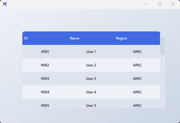
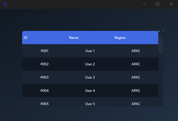
The grid scrollbar is overlaid with a themed track and thumb. ScrollBar.Foreground tints the thumb; ScrollBar.Background tints the track. BorderScrollBar controls the thumb radius independently from the cell border.
var panel = new FlowLayoutPanel
{
    Width = 520,
    Height = 320,
    Padding = new Padding(20),
    BackColor = Color.Transparent,
    AutoScroll = false
};

var table = new KtTable
{
    Width = 480,
    Height = 280,
    Margin = new Padding(5),
};

table.Style.Color = KtColor.PRIMARY;
table.Style.Background = KtColor.BASE;
table.Style.Foreground = KtColor.CONTENT;
table.Style.Header = new KtSkin(KtColor.White, KtColor.PRIMARY);
table.Style.Row = new KtSkin(KtColor.CONTENT, KtColor.BASE);
table.Style.RowAlt = new KtSkin(KtColor.CONTENT, KtColor.BASE_1);
table.Style.Border = 6;
table.Style.BorderScrollBar = 8;
table.Style.ScrollBar = new KtSkin(KtColor.BASE_3, KtColor.BASE_2);

table.Columns.Add(new DataGridViewTextBoxColumn { Name = "Id", HeaderText = "ID", Width = 60 });
table.Columns.Add(new DataGridViewTextBoxColumn { Name = "Name", HeaderText = "Name", Width = 120 });
table.Columns.Add(new DataGridViewTextBoxColumn { Name = "Region", HeaderText = "Region", Width = 100 });

for (int i = 1; i <= 20; i++)
    table.Rows.Add($"#{i:D3}", $"User {i}", "APAC");

panel.Controls.Add(table);
API Reference
| Style | DataGridViewSkin | Sets the Style. |
|---|
DataGridViewSkin
| Color | Kt-Color | Sets the Color. |
| Background | Kt-Color | Sets the Background. |
| Foreground | Kt-Color | Sets the Foreground. |
| Header | Kt-Skin | Sets the Header. |
| Row | Kt-Skin | Sets the Row. |
| ScrollBar | Kt-Skin | Sets the Scroll bar. |
| RowAlt | Kt-Skin | Sets the Row alt. |
| BorderHeader | float Nullable | Sets the Border header. |
| BorderButtons | float Nullable | Sets the Border buttons. |
| BorderCheckBoxes | float Nullable | Sets the Border check boxes. |
| BorderScrollBar | float Nullable | Sets the Border scroll bar. |
| Border | float | Sets the Border. |