Kt RadioButton
A themeable single-select control for WinForms, with independent checked and unchecked styling for background, border, icon and foreground.

🟢 DESIGNER SUPPORT
This control has full Visual Studio design-time support.
Drag it from the Toolbox onto your form, customize its properties directly in the Properties window, and KimTools will generate the corresponding code for you.
Background
| Background | Kt-Brush | Sets the Background. |
|---|
Border
| Border | Kt-Brush | Sets the panel’s border color. |
|---|
Icon
| Icon | String | Sets the Icon. |
|---|
Default Checked / Unchecked states
KtRadioButton supports both selected and unselected states. Set Checked to true to display the selected state.
// using KimTools.WinForms;

// KtRadioButton renders as an unselected option by default.
// Set Checked to true to display the selected state.
var unselected = new KtRadioButton
{
    Text = "Standard option",
    TextAlign = ContentAlignment.MiddleRight,
    Width = 140,
    Checked = false
};

var selected = new KtRadioButton
{
    Text = "Selected option",
    Width = 140,
    TextAlign = ContentAlignment.MiddleRight,
    Checked = true
};
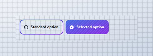
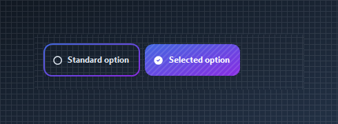
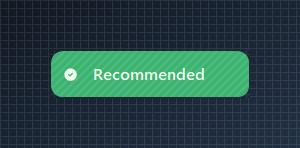
Solid Background_Checked
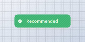
Use Background_Checked to give the selected option its own solid fill. The unchecked state can remain transparent or use a separate Background brush.
// using KimTools.WinForms;

var radio = new KtRadioButton
{
    Text = "Recommended",
    Width = 200,

    // Remove the default background and provide
    // an explicit selected-state fill.
    Background = KtBrush.None,
    Background_Checked = KtColor.SUCCESS,
    Checked = true
};
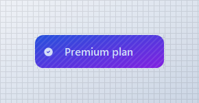
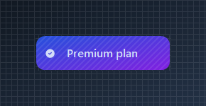
Gradient Background_Checked
Use a semantic color gradient for the selected state. Theme colors keep the selection styling consistent with the active application theme.
// using KimTools.WinForms;

var radio = new KtRadioButton
{
    Text = "Premium plan",
    Size = new Size(190, 50),

    Background_Checked =
    (
        startColor: KtColor.PRIMARY[50],
        stopColor: KtColor.SECONDARY[50],
        angle: 45
    ),

    Checked = true
};
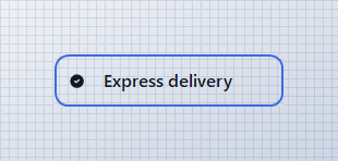
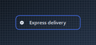
Border + Border_Checked
Keep both states transparent and use the border to communicate selection. Border_Checked controls the selected-state border independently.
// using KimTools.WinForms;

var radio = new KtRadioButton
{
    Text = "Express delivery",
    Width = 210,

    Background = KtBrush.None,
    Background_Checked = KtBrush.None,

    Border = KtColor.NEUTRAL,
    Border_Checked = KtColor.PRIMARY,

    BorderWidth = 2f,
    Checked = true
};
Icon + Icon_Checked
Use different icons for the unselected and selected states. IconColor_Checked lets the selected icon use its own semantic color.
// using KimTools.WinForms;

var radio = new KtRadioButton
{
    Text = "Verified account",
    TextAlign = ContentAlignment.MiddleCenter,
    Width = 200,
    Icon = "Tabler.outline.circle",
    Icon_Checked = "Tabler.solid.circle_check",
    Border = KtBrush.BASE,
    Background = KtColor.BASE,
    IconColor_Checked = KtColor.SUCCESS,

    Checked = true
};


Icon Size and Stroke
Tune the selected and unselected icon rendering with IconSize and IconStroke.
// using KimTools.WinForms;

var radio = new KtRadioButton
{
    Text = "Large selection",

    Icon = "tabler.outline.circle",
    Icon_Checked = "tabler.solid.circle_check_filled",

    IconSize = 22,
    IconStroke = 2.5,
    TextAlign = ContentAlignment.MiddleCenter,
    Width = 200,
    Checked = true
};


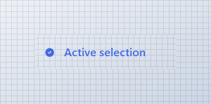
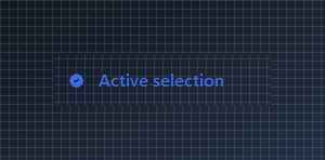
Foreground + Foreground_Checked
Change the text color independently for each selection state.
// using KimTools.WinForms;

var radio = new KtRadioButton
{
    Text = "Active selection",

    Background = KtBrush.None,
    Background_Checked = KtBrush.None,
    Border = KtBrush.None,

    Foreground = KtColor.NEUTRAL,
    Foreground_Checked = KtColor.PRIMARY,
    TextAlign = ContentAlignment.MiddleCenter,
    Width = 200,
    Checked = true
};
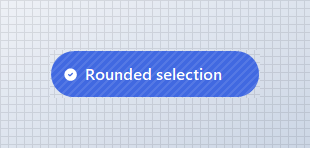
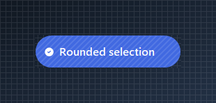
Rounded BorderRadius
Set BorderRadius to .99f for a pill-shaped selection or use a pixel value when you need a specific corner radius.
// using KimTools.WinForms;

var radio = new KtRadioButton
{
    Text = "Rounded selection",
    Width = 210,

    BorderRadius = .99f,
    Background_Checked = KtColor.PRIMARY,

    Checked = true
};
Outlined selection
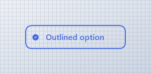
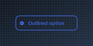
Build a minimal radio style by removing both backgrounds and changing the border and foreground when selected.
// using KimTools.WinForms;

var radio = new KtRadioButton
{
    Text = "Outlined option",
    Width = 200,

    Background = KtBrush.None,
    Background_Checked = KtBrush.None,

    Border = KtColor.NEUTRAL,
    Border_Checked = KtColor.PRIMARY,

    Foreground = KtColor.NEUTRAL,
    Foreground_Checked = KtColor.PRIMARY,

    BorderWidth = 2f,
    Checked = true
};
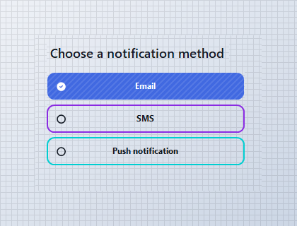
Single-selection Group
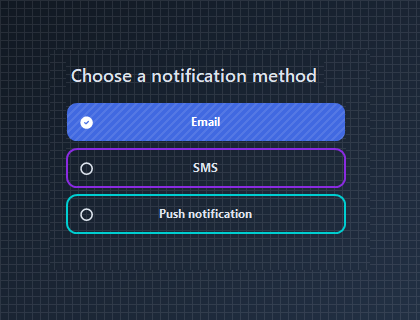
Use multiple KtRadioButton controls for mutually exclusive choices. When one option becomes checked, clear the other options in the same logical group.
// using KimTools.WinForms;

var emailOption = new KtRadioButton
{
    Text = "Email",
    Checked = true
};

var smsOption = new KtRadioButton
{
    Text = "SMS"
};

var pushOption = new KtRadioButton
{
    Text = "Push notification"
};

// Radio buttons in the same logical group should have
// only one selected option at a time.

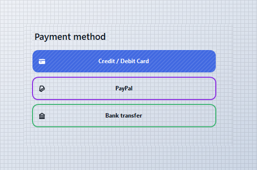
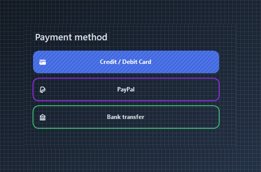
Payment method selector
Radio buttons work well for compact single-choice forms. Combine icons, semantic colors and selected-state backgrounds to make each option easy to scan.
// using KimTools.WinForms;

var payment = new KtRadioButton
{
    Text = "Credit / Debit Card",
    Icon = "hero.outline.credit-card",
    Icon_Checked = "hero.solid.credit-card",
    Checked = true
};
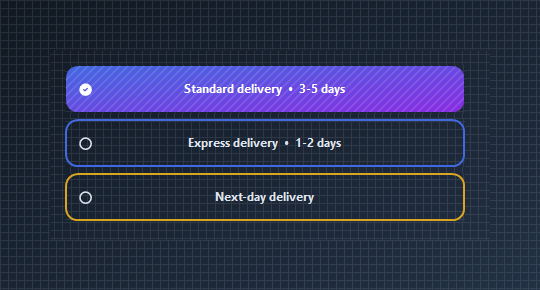
Shipping options
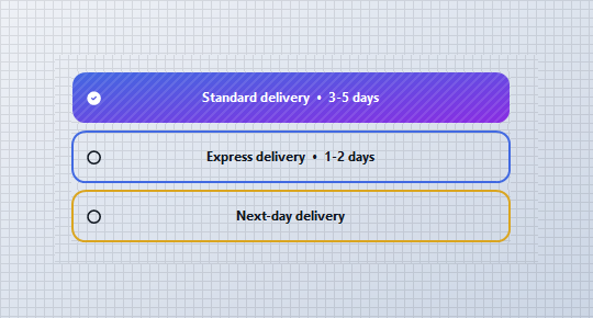
Use radio buttons for mutually exclusive choices where the option itself contains enough information to make the selection.
// using KimTools.WinForms;

var standardOption = new KtRadioButton
{
    Text = "Standard delivery  •  3-5 days",
    Checked = true
};

var expressOption = new KtRadioButton
{
    Text = "Express delivery  •  1-2 days"
};

Card-style selection
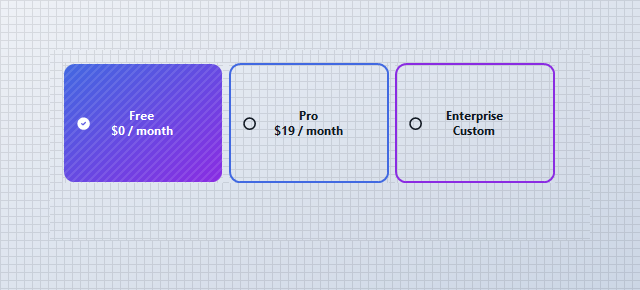
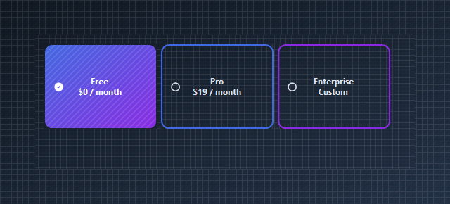
Increase the size and radius of a radio button to create selectable cards. This pattern works well for plans, subscription tiers and configuration presets.
// using KimTools.WinForms;

var plan = new KtRadioButton
{
    Text = "Pro\n$19 / month",
    Size = new Size(160, 120),
    TextAlign = ContentAlignment.MiddleCenter,
    Border = KtColor.PRIMARY,
    Background_Checked = KtColor.PRIMARY,
    BorderRadius = 10f,
    Checked = true
};
Icon-only KtRadioButton
Remove the label and center the icon to create a compact single-selection control.
// using KimTools.WinForms;

var radio = new KtRadioButton
{
    Text = string.Empty,
    Size = new Size(52, 52),
    Padding = Padding.Empty,
    ImageAlign = ContentAlignment.MiddleCenter,

    BorderRadius = .99f,

    Icon = "tabler.outline.circle",
    Icon_Checked = "tabler.solid.circle_check_filled",

    IconSize = 22,
    IconStroke = 2.5,

    IconColor_Checked = KtColor.White,

    Checked = true
};


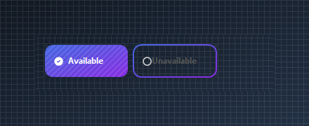
Enabled and disabled states
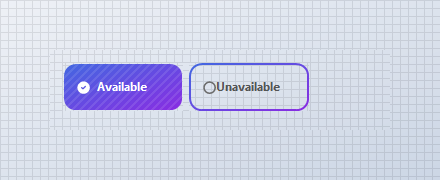
Use the standard WinForms Enabled property when an option should be visible but temporarily unavailable.
// using KimTools.WinForms;

var enabled = new KtRadioButton
{
    Text = "Available",
    Checked = true
};

var disabled = new KtRadioButton
{
    Text = "Unavailable",
    Enabled = false
};

var flow = new FlowLayoutPanel
{
    Width = 340,
    Height = 80,
    Padding = new Padding(10),
    BackColor = Color.Transparent
};

flow.Controls.Add(enabled);
flow.Controls.Add(disabled);
Reacting to selection changes
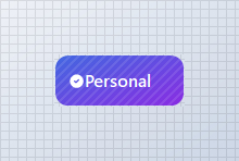
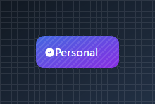
Use CheckedChanged when application logic needs to respond immediately when a radio button becomes selected or unselected.
// using KimTools.WinForms;

var personal = new KtRadioButton
{
    Text = "Personal",
    Checked = true
};

var business = new KtRadioButton
{
    Text = "Business"
};

personal.CheckedChanged += (_, _) =>
{
    if (personal.Checked)
        business.Checked = false;
};

business.CheckedChanged += (_, _) =>
{
    if (business.Checked)
        personal.Checked = false;
};

// React to the selected option from CheckedChanged.
personal.CheckedChanged += (_, _) =>
{
    if (personal.Checked)
    {
        // Handle personal selection.
    }
};
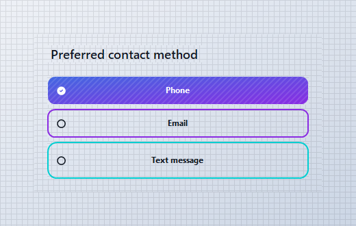
Payment Method Example
var panel = new TableLayoutPanel
{
    Width = 420,
    Height = 230,
    ColumnCount = 1,
    RowCount = 4,
    Padding = new Padding(16),
    BackColor = Color.Transparent
};

panel.RowStyles.Add(new RowStyle(SizeType.Absolute, 42));
panel.RowStyles.Add(new RowStyle(SizeType.Absolute, 48));
panel.RowStyles.Add(new RowStyle(SizeType.Absolute, 48));
panel.RowStyles.Add(new RowStyle(SizeType.Absolute, 48));

panel.Controls.Add(
    new Label
    {
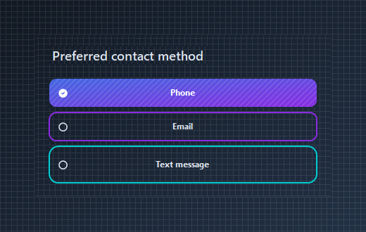
        Text = "Preferred contact method",
        AutoSize = true,
        Font = new Font(this.Font.FontFamily, 13f, FontStyle.Bold)
    },
    0,
    0);

var phone = new KtRadioButton
{
    Text = "Phone",
    Dock = DockStyle.Fill,
    Border = KtColor.PRIMARY,
    Checked = true
};

var email = new KtRadioButton
{
    Text = "Email",
    Dock = DockStyle.Fill,
    Border = KtColor.SECONDARY
};

var message = new KtRadioButton
{
    Text = "Text message",
    Dock = DockStyle.Fill,
    Border = KtColor.ACCENT
};

KtRadioButton[] options =
[
    phone,
    email,
    message
];

foreach (var option in options)
{
    option.CheckedChanged += (_, _) =>
    {
        if (!option.Checked)
            return;

        foreach (var other in options)
        {
            if (other != option)
                other.Checked = false;
        }
    };
}

panel.Controls.Add(phone, 0, 1);
panel.Controls.Add(email, 0, 2);
panel.Controls.Add(message, 0, 3);

API Reference
| Background | Kt-Brush | Sets the Background. |
| Background_Checked | Kt-Brush | Sets the Background Checked. |
| Border | Kt-Brush | Sets the panel’s border color. |
| Border_Checked | Kt-Brush | Sets the panel’s border color. |
| BorderEdges | Edges | Sets the Border edges. |
| Foreground | Kt-Color | Sets the Foreground. |
| Foreground_Checked | Kt-Color | Sets the Foreground Checked. |
| IconColor | Kt-Color | Sets the Icon color. |
| IconColor_Checked | Kt-Color | Sets the IconColor Checked. |
| Pattern | Kt-Pattern | Sets the Pattern. |
| IconStroke | Double | Sets the Icon stroke. |
| ImageAlign | ContentAlignment | The alignment of the image that will be displayed on the control. |
| TextAlign | ContentAlignment | The alignment of the text that will be displayed on the control. |
| BorderStyle | DashStyle | Sets the panel’s border style. |
| BorderStyle_Checked | DashStyle | Sets the BorderStyle Checked. |
| IconSize | Int32 | Sets the Icon size. |
| BorderRadius | float Nullable | Sets the Border radius. |
| BorderWidth | float | Sets the Border width. |
| Icon | String | Sets the Icon. |
| Icon_Checked | String | Sets the Icon Checked. |
| Value | String | Sets the Value. |
| Cursor | Cursor | The cursor that appears when the pointer moves over the control. |
| BorderMargin | Padding | Sets the border Margin. |
| Padding | Padding | Specifies the interior spacing of a control. |