Kt Button
A modern, fully customizable button control for WinForms, with built-in icon, gradient, and border support.

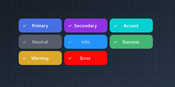
🟢 DESIGNER SUPPORT
This control has full Visual Studio design-time support.
Drag it from the Toolbox onto your form, customize its properties directly in the Properties window, and KimTools will generate the corresponding code for you.
Background
| Background | Kt-Brush | Sets the progress color. |
|---|
Gradient with Kt-Colors
Use KimTools Semantically named dynamic theme colors.
// using KimTools.WinForms;
var button = new KtButton();
button.Text = "Get Started";

// Use % operator to apply transparency to Kt-Color
button.Background = Color.BlueViolet;   // Color
                                        // button.Background = KtColor.SUCCESS;     // KtColor
                                        // button.Background = KtColor.PRIMARY % 50; // With Opacity
                                        // button.Background = KtColor.FromHex("#1E90FF"); // Hex


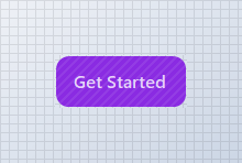
Gradient Background
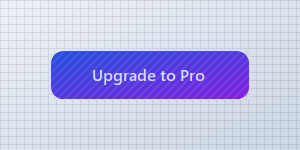
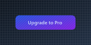
Use KimTools Semantic theme colors to match the current global theme.
// using KimTools.WinForms;
var button = new KtButton();
button.Text = "Upgrade to Pro";
button.Size = new Size(200, 50);
// Background supports Kt-Color gradients with an optional angle
button.Background =
(
    startColor: KtColor.PRIMARY[50],
    stopColor: KtColor.SECONDARY[50],
    angle: 45 // optional (0-360)
);
Border
| Border | Kt-Brush | Sets the panel’s border color. |
|---|
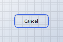
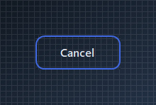
Outlined Border
Clear Background and set Border for a ghost/outline button.
// using KimTools.WinForms;
var button = new KtButton();
button.Text = "Cancel";

// Clear Background and set Border for a ghost/outline style
button.Background = KtBrush.None;
button.Border = KtColor.PRIMARY;
button.BorderWidth = 2f;
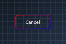
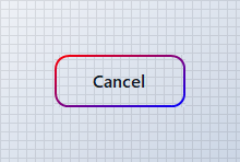
Outlined Gradient Border
Clear Background and set Border for a gradient outline button.
// using KimTools.WinForms;
var button = new KtButton();
button.Text = "Cancel";

// Clear Background and set Border for a ghost/outline style
button.Background = KtBrush.None;
button.Border =("red","blue");
button.BorderWidth = 2f;

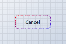
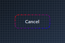
Dashed BorderStyle
Clear Background and set BorderStyle for a gradient Dash border.
// using KimTools.WinForms;
var button = new KtButton();
button.Text = "Cancel";

// Clear Background and set Border for a ghost/outline style
button.Background = KtBrush.None;
button.Border = ("red", "blue");
button.BorderWidth = 2f;
button.BorderStyle = DashStyle.DashDot;
Border Radius
Set BorderRadius from 0 (square) to .99f (pill) or >1 (int) for actual pixels.
// using KimTools.WinForms;
var button = new KtButton();
button.Text = "Subscribe";
button.Background = KtColor.PRIMARY;

// BorderRadius runs 0 (square) .. .99f (fully pill-shaped)
button.BorderRadius = .99f;
button.BorderRadius = 5f; // Actual pixels


SVG Icon
Set Icon to a Tabler icon name; IconSize and IconStroke control its rendering.
// using KimTools.WinForms;
var button = new KtButton();
button.Text = "Download";

// Icon accepts a Tabler icon name; IconSize / IconStroke tune its rendering
button.Icon = "download";
button.IconSize = 18;
button.IconStroke = 2.5;
button.Width = 150;


Rounded Icon Button
Set Icon to a Tabler icon name; IconSize and IconStroke control its rendering.
// using KimTools.WinForms;
var button = new KtButton();
button.Text = string.Empty;
button.ImageAlign = ContentAlignment.MiddleCenter;
button.Size = new Size(50, 50);
button.Padding = Padding.Empty;
// Icon accepts a Tabler icon name; IconSize / IconStroke tune its rendering
button.Icon = "sparkles";
button.IconSize = 18;
button.IconStroke = 2.5;
button.BorderRadius = .99f;
button.Height = 50;


TextAlign + ImageAlign
Move the icon to the trailing edge by pairing ImageAlign with TextAlign.
// using KimTools.WinForms;
var button = new KtButton();
button.Text = "Continue";
button.Icon = "check";
// button.Icon = "arrow-right";

// Reposition the icon and label independently
button.ImageAlign = ContentAlignment.MiddleRight;
button.TextAlign = ContentAlignment.MiddleLeft;


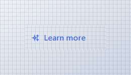
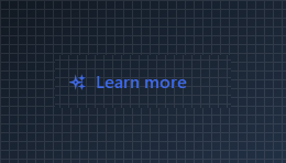
Foreground + IconColor
Override the label and icon color independently of the current theme.
// using KimTools.WinForms;
var button = new KtButton();
button.Text = "Learn more";
button.Icon = "sparkles";
button.Width = 160;
// Foreground and IconColor override the label/icon color independently of Background
button.Background = KtBrush.None;
button.Foreground = KtColor.PRIMARY;
button.IconColor = KtColor.PRIMARY;
API Reference
| Background | Kt-Brush | Sets the progress color. |
| Border | Kt-Brush | Sets the panel’s border color. |
| BorderEdges | Edges | Sets the Border edges. |
| Foreground | Kt-Color | Sets the Foreground. |
| IconColor | Kt-Color | Sets the Icon color. |
| Pattern | Kt-Pattern | Sets the Pattern. |
| IconStroke | Double | Sets the Icon stroke. |
| ImageAlign | ContentAlignment | The alignment of the image that will be displayed on the control. |
| TextAlign | ContentAlignment | The alignment of the text that will be displayed on the control. |
| BorderStyle | DashStyle | Sets the panel’s border style. |
| IconSize | Int32 | Sets the Icon size. |
| BorderRadius | float Nullable | Sets the Border radius. |
| BorderWidth | float | Sets the Border width. |
| Icon | String | Sets the Icon. |
| Value | String | Sets the Value. |
| Cursor | Cursor | The cursor that appears when the pointer moves over the control. |
| BorderMargin | Padding | Sets the border Margin. |
| Padding | Padding | Specifies the interior spacing of a control. |