KimTools / Components / Tooltips
Kt Tooltips
Provides enhanced ToolTips with rich customization including icons, HTML content, fade animations, auto-close timing, shadow effects, and extender provider support for associating tips with any control.

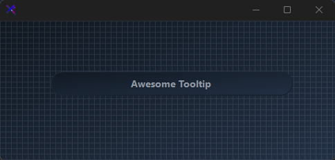
Icon & Title Support
- Enable
ShowIconsand associate an icon viaSetToolTipIcon(control, image). - Use the
Show(control, text, title, icon, location)overload to display a tooltip with an icon programmatically. - Icons render at 23×23 px with configurable
IconMargin.
🔴 🟡 🟢
var label = new KtLabel
{
    Text = "Keyboard Shortcut",
    Color = KtColor.CONTENT,
    Font = new Font("Segoe UI", 10F, FontStyle.Regular),
    AutoSize = true,
    Margin = new Padding(10)
};

var tooltip = new KtTooltips();
tooltip.ShowIcons = true;
tooltip.SetToolTip(label, "Press Ctrl+S to save instantly without opening the menu.");
Custom Styling
- Override
Background,Foreground, andBordercolors. - Toggle
ShowShadows,ShowBorders, andAllowFadingindependently. - Adjust animation speeds via
EntryAnimationSpeed(default 350 ms) andExitAnimationSpeed(default 200 ms).
🔴 🟡 🟢
var label = new KtLabel
{
    Text = @"Custom Styled Target",
    Color = KtColor.CONTENT,
    Font = new Font("Segoe UI", 10F, FontStyle.Regular),
    Auto = true,
    Margin = new Padding(10)
};

var tooltip = new KtTooltips();
tooltip.Background = KtColor.BASE_2;
tooltip.Border = KtColor.PRIMARY;
tooltip.ShowShadows = true;
tooltip.ShowBorders = true;
tooltip.AllowFading = true;
tooltip.SetToolTip(label, "This tooltip uses a primary accent border and fade animation.");
Extender Provider Pattern
KtTooltipsimplementsIExtenderProvider. CallSetToolTip(control, text)for each target.- The component auto-attaches hover/leave/click events.
- Call
Show(control, text)programmatically to display the tooltip without waiting for hover.
🔴 🟡 🟢
var label1 = new KtLabel
{
    Text = "Submit",
    Color = KtColor.CONTENT,
    Font = new Font("Segoe UI", 10F, FontStyle.Regular),
    AutoSize = true,
    Margin = new Padding(10)
};

var label2 = new KtLabel
{
    Text = "Cancel",
    Color = KtColor.CONTENT,
    Font = new Font("Segoe UI", 10F, FontStyle.Regular),
    AutoSize = true,
    Margin = new Padding(10)
};

var tooltip = new KtTooltips();
tooltip.SetToolTip(label1, "Click to submit the form.");
tooltip.SetToolTip(label2, "Click to discard changes and close.");
Programmatic Display
- Call
Show(control, text)to display a tooltip immediately without user interaction. - Control auto-close with
AllowAutoCloseandAutoCloseDuration. - Set
InitialDelay = 0to suppress the hover delay when mixing programmatic and automatic triggers.
🔴 🟡 🟢
var label = new KtLabel
{
    Text = "Programmatic Trigger",
    Color = KtColor.CONTENT,
    Font = new Font("Segoe UI", 10F, FontStyle.Regular),
    AutoSize = true,
    Margin = new Padding(10)
};

var tooltip = new KtTooltips();
tooltip.AllowAutoClose = true;
tooltip.AutoCloseDuration = 3000;
tooltip.InitialDelay = 0;
tooltip.SetToolTip(label, "This tooltip is shown via code, not hover.");

// Example of programmatic usage:
// tooltip.Show(label, "Saved!");
API Reference
| Background | Kt-Color | Sets the Background. |
| Foreground | Kt-Color | Sets the Foreground. |
| Border | Kt-Color | Sets the Border. |
| Active | Boolean | Determines if the ToolTip is active. Tooltips will only appear if this property is set to true. |
| ShowAlways | Boolean | Determines if the tool tip will be displayed always, even when the parent window is not active. |
| ShowIcons | Boolean | Sets a value indicating whether the ToolTip will display icons if the associated control or controls have specified one. |
| ShowShadows | Boolean | Sets a value indicating whether display-shadows will be provided around the ToolTip’s borders. |
| ShowBorders | Boolean | Sets a value indicating whether standard borders will be drawn around the ToolTip’s region. |
| AllowFading | Boolean | When set to true, a fade effect is used when ToolTips are shown or hidden. |
| AllowAutoClose | Boolean | When set to true, the ToolTip will be closed automatically when a set period of time provided by the property ‘AutoCloseDuration’, is given. However, when set to false, the ToolTip will be closed once the mouse leaves the associated control. |
| Opacity | Double | Sets the opacity of transparency-level of the ToolTip. |
| TextFont | Font | Sets the ToolTip’s Html FontDefault. |
| InitialDelay | Int32 | Gets or sets the length of time, in milliseconds, it takes before the ToolTip is shown. |
| ReshowDelay | Int32 | Gets or sets the length of time, in milliseconds, it takes before subsequent ToolTips are shown. |
| AutoCloseDuration | Int32 | Gets or sets the length of time, in milliseconds, that the ToolTip will be shown. This property is enabled whenever the property ‘AllowAutoClose’ is set to true. The minimum required duration should be greater-than or equal-to 100 (milliseconds). |
| EntryAnimationSpeed | Int32 | Sets the ToolTip’s entry animation speed in milliseconds. (Default is 350 milliseconds.) |
| ExitAnimationSpeed | Int32 | Sets the ToolTip’s exit animation speed in milliseconds. (Default is 200 milliseconds.) |
| IconMargin | Int32 | Sets the margin (distance) between the ToolTipIcon and ToolTipTitle. |
| TextMargin | Int32 | Sets the ToolTip’s Html margin, that is, the distance between the Title and the Html. (Default is 2.) |
| Tag | Object | Sets the object that contains programmer-supplied data associated with the ToolTip. |
| Padding | Padding | Sets the ToolTip’s inner padding between the container and its content, that is, the Title and Html information. Use the ‘TextMargin’ property to set the vertical distance between the ToolTip’s Title and Html. |