Kt Progress
A stylish progress indicator supporting dual-layer rendering, gradient fills, hatch patterns, rounded corners, per-edge border control, and animated spinner text.

🟢 DESIGNER SUPPORT
This control has full Visual Studio design-time support.
Drag it from the Toolbox onto your form, customize its properties directly in the Properties window, and KimTools will generate the corresponding code for you.
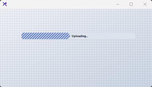
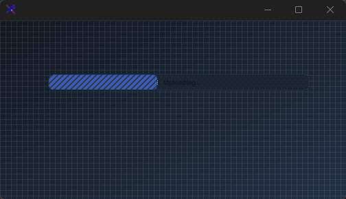
Flat / Minimal Progress
A clean, understated bar with a solid primary fill at 80% opacity. Thin border on the track, modest 6 px radius, and centered text. No gradients — just precise geometry and subtle contrast.
var panel = new FlowLayoutPanel
{
    Width = 420,
    Height = 200,
    Padding = new Padding(20),
    BackColor = Color.Transparent,
    AutoScroll = false,
    FlowDirection = FlowDirection.TopDown
};

var progress = new KtProgress
{
    Width = 380,
    Height = 24,
    Margin = new Padding(0, 8, 0, 8),
    Value = 42,
    Background = KtColor.BASE_2,
    Foreground = KtColor.PRIMARY % 80,
    BackgroundBorderRadius = 6,
    ForegroundBorderRadius = 6,
    BackgroundBorderWidth = 1,
    BackgroundBorder = KtColor.BASE_3,
    ForegroundText = KtColor.White,
    BackgroundText = KtColor.CONTENT,
    TextAlign = ContentAlignment.MiddleCenter,
    TextVisible = true,
    Text = "Uploading..."
};

panel.Controls.Add(progress);
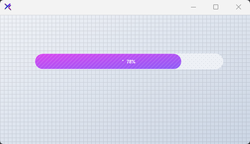
Gradient / Neon Progress
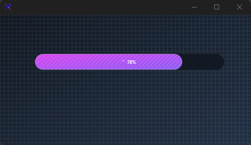
A vivid Fuchsia-to-Violet gradient fill at a 45° angle, wrapped in a full pill shape (16 px radius). A subtle white border on the foreground adds depth. The percentage is drawn with automatic contrast against both layers.
var panel = new FlowLayoutPanel
{
    Width = 420,
    Height = 200,
    Padding = new Padding(20),
    BackColor = Color.Transparent,
    AutoScroll = false,
    FlowDirection = FlowDirection.TopDown
};

var progress = new KtProgress
{
    Width = 380,
    Height = 32,
    Margin = new Padding(0, 8, 0, 8),
    Value = 78,
    Background = KtColor.BASE_1,
    Foreground = (KtColor.Fuchsia, KtColor.Violet, 45),
    BackgroundBorderRadius = 16,
    ForegroundBorderRadius = 16,
    BackgroundBorderWidth = 0,
    ForegroundBorderWidth = 1,
    ForegroundBorder = KtColor.White % 30,
    ForegroundText = KtColor.White,
    BackgroundText = KtColor.CONTENT,
    TextAlign = ContentAlignment.MiddleCenter,
    TextVisible = true,
    Text = "%"
};

panel.Controls.Add(progress);
Patterned / Textured Progress
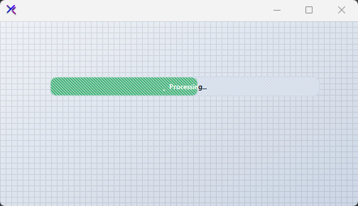
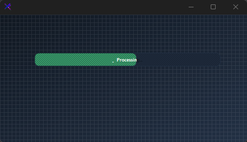
Both track and fill carry independent hatch patterns via BackgroundPattern and ForegroundPattern. Use *PatternColor to tint the texture. Great for indicating indeterminate or heavy-processing states with visual grit.
var panel = new FlowLayoutPanel
{
    Width = 420,
    Height = 200,
    Padding = new Padding(20),
    BackColor = Color.Transparent,
    AutoScroll = false,
    FlowDirection = FlowDirection.TopDown
};

var progress = new KtProgress
{
    Width = 380,
    Height = 28,
    Margin = new Padding(0, 8, 0, 8),
    Value = 55,
    Background = KtColor.BASE_2,
    Foreground = KtColor.SUCCESS,
    BackgroundPattern = HatchStyle.LightUpwardDiagonal,
    BackgroundPatternColor = KtColor.BASE_3,
    ForegroundPattern = HatchStyle.DarkDownwardDiagonal,
    ForegroundPatternColor = KtColor.SUCCESS % 40,
    BackgroundBorderRadius = 8,
    ForegroundBorderRadius = 8,
    BackgroundBorderWidth = 1,
    BackgroundBorder = KtColor.BASE_3,
    ForegroundText = KtColor.White,
    BackgroundText = KtColor.CONTENT,
    TextAlign = ContentAlignment.MiddleCenter,
    TextVisible = true,
    Text = "Processing..."
};

panel.Controls.Add(progress);
Per-Edge Border Control (ForegroundBorderEdges, BackgroundBorderEdges)
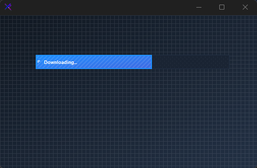
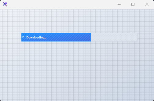
Round or sharpen individual corners using KtBrush.Edges. Here the foreground has a 2 px left-side border with squared-off right edges, giving the fill a directional, meter-like appearance. Useful for segmented or terminal-style progress visuals.
var panel = new FlowLayoutPanel
{
    Width = 420,
    Height = 240,
    Padding = new Padding(20),
    BackColor = Color.Transparent,
    AutoScroll = false,
    FlowDirection = FlowDirection.TopDown
};

var progress = new KtProgress
{
    Width = 380,
    Height = 28,
    Margin = new Padding(0, 8, 0, 8),
    Value = 60,
    Background = KtColor.BASE_2,
    Foreground = (KtColor.INFO, KtColor.PRIMARY),
    BackgroundBorderRadius = 0,
    ForegroundBorderRadius = 0,
    BackgroundBorderWidth = 1,
    BackgroundBorder = KtColor.BASE_3,
    ForegroundBorderWidth = 2,
    ForegroundBorder = KtColor.INFO,
    ForegroundText = KtColor.White,
    BackgroundText = KtColor.CONTENT,
    TextAlign = ContentAlignment.MiddleLeft,
    TextVisible = true,
    Text = "  Downloading..."
};
progress.ForegroundBorderEdges.TopLeft = true;
progress.ForegroundBorderEdges.BottomLeft = true;
progress.ForegroundBorderEdges.TopRight = false;
progress.ForegroundBorderEdges.BottomRight = false;

panel.Controls.Add(progress);

Animated Spinner Text (TextSpinner)
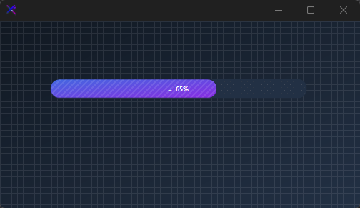
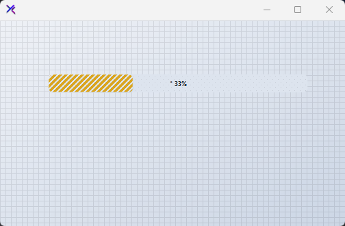
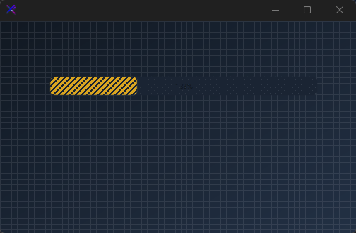
When TextSpinner = true and the value is strictly between min and max, a cycling braille spinner is prepended to the label. Set Text = "%" to auto-insert the current percentage. The spinner pauses automatically when the bar reaches ValueMax (Completed).
var panel = new FlowLayoutPanel
{
    Width = 420,
    Height = 240,
    Padding = new Padding(20),
    BackColor = Color.Transparent,
    AutoScroll = false,
    FlowDirection = FlowDirection.TopDown
};

var progress = new KtProgress
{
    Width = 380,
    Height = 28,
    Margin = new Padding(0, 8, 0, 8),
    Value = 33,
    ValueMin = 0,
    ValueMax = 100,
    Background = KtColor.BASE_2,
    Foreground = KtColor.WARNING,
    BackgroundBorderRadius = 6,
    ForegroundBorderRadius = 6,
    ForegroundText = KtColor.BASE_1,
    BackgroundText = KtColor.CONTENT,
    TextAlign = ContentAlignment.MiddleCenter,
    TextVisible = true,
    TextSpinner = true,
    Text = "%"
};

panel.Controls.Add(progress);
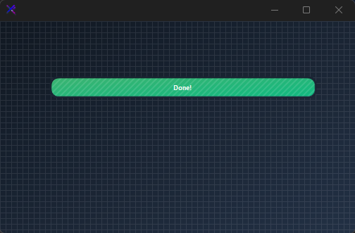
Completed State (Value, ValueMax, Completed)
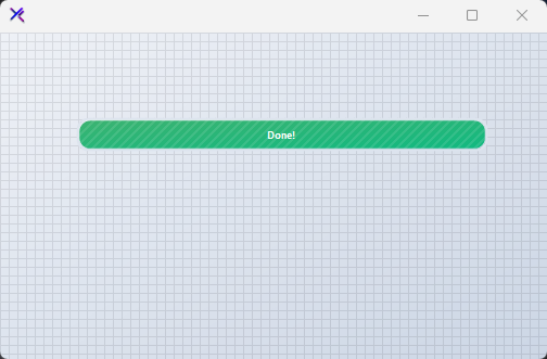
When Value >= ValueMax, the bar is full and the Completed property returns true, raising the Complete event. The spinner disappears and the fill spans the entire padded track. Use a Success-to-Emerald gradient to communicate completion clearly.
var panel = new FlowLayoutPanel
{
    Width = 420,
    Height = 240,
    Padding = new Padding(20),
    BackColor = Color.Transparent,
    AutoScroll = false,
    FlowDirection = FlowDirection.TopDown
};

var progress = new KtProgress
{
    Width = 380,
    Height = 32,
    Margin = new Padding(0, 8, 0, 8),
    Value = 100,
    ValueMin = 0,
    ValueMax = 100,
    Background = KtColor.BASE_2,
    Foreground = (KtColor.SUCCESS, KtColor.Emerald),
    BackgroundBorderRadius = 10,
    ForegroundBorderRadius = 10,
    BackgroundPad = new Padding(2),
    ForegroundText = KtColor.White,
    BackgroundText = KtColor.CONTENT,
    TextAlign = ContentAlignment.MiddleCenter,
    TextVisible = true,
    TextSpinner = true,
    Text = "Done!"
};

panel.Controls.Add(progress);
API Reference
| Background | Kt-Brush | Sets the Background. |
| BackgroundBorder | Kt-Brush | Sets the Background border. |
| Foreground | Kt-Brush | Sets the Foreground. |
| ForegroundBorder | Kt-Brush | Sets the Foreground border. |
| ForegroundBorderEdges | Edges | Sets the Foreground border edges. |
| BackgroundBorderEdges | Edges | Sets the Background border edges. |
| BackgroundPatternColor | Kt-Color | Sets the Background pattern color. |
| ForegroundPatternColor | Kt-Color | Sets the Foreground pattern color. |
| ForegroundText | Kt-Color | Sets the Foreground text. |
| BackgroundText | Kt-Color | Sets the Background text. |
| TextVisible | Boolean | Sets the Text visible. |
| TextSpinner | Boolean | Sets the Text spinner. |
| TextAlign | ContentAlignment | Sets the Text align. |
| Value | Int32 | Sets the Value. |
| ValueMin | Int32 | Sets the Value min. |
| ValueMax | Int32 | Sets the Value max. |
| BackgroundPattern | HatchStyle Nullable | Sets the Background pattern. |
| ForegroundPattern | HatchStyle Nullable | Sets the Foreground pattern. |
| BackgroundBorderRadius | float | Sets the Background border radius. |
| ForegroundBorderRadius | float | Sets the Foreground border radius. |
| ForegroundBorderWidth | float | Sets the Foreground border width. |
| BackgroundBorderWidth | float | Sets the Background border width. |
| Text_ | String | Sets the Text . |
| BackgroundPad | Padding | Sets the Background pad. |