KimTools / Components / Toasts
Kt Toasts
Deliver stunningly neat, time-bound, and brief messages about application processes. Supports multiple message types, custom positioning, action buttons, drag interaction, and per-type visual customization.

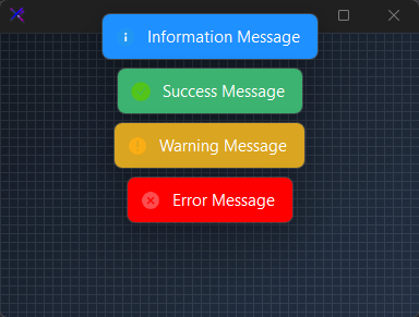
🔴 🟡 🟢
// using KimTools.WinForms;
var toast = new KtToasts()
Information Message
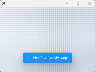
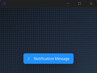
Displays a standard Information toast notification. Used to convey neutral Information updates or general Information to the user.
🔴 🟡 🟢
toast.Show(
    owner: this, // Owning form
    message: "Notification Message",
    type: KtToasts.MessageTypes.Information);
Auto
Light
Dark
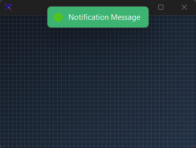
Success Message
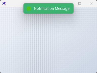
Displays a standard Success toast notification. Used to convey neutral Success updates or general Success to the user.
🔴 🟡 🟢
toast.Show(
    owner: this, // Owning form
    message: "Notification Message",
    type: KtToasts.MessageTypes.Success);
Auto
Light
Dark
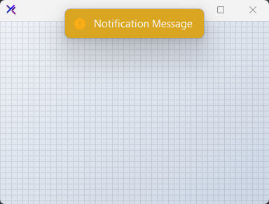
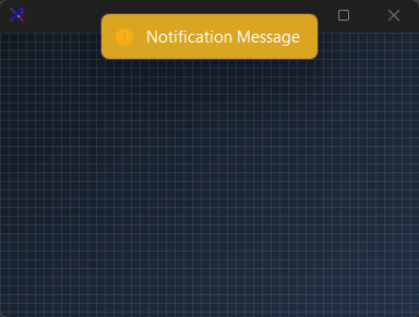
Warning Message
Displays a standard Warning toast notification. Used to convey neutral Warning updates or general Warning to the user.
🔴 🟡 🟢
toast.Show(
    owner: this, // Owning form
    message: "Notification Message",
    type: KtToasts.MessageTypes.Warning);
Auto
Light
Dark
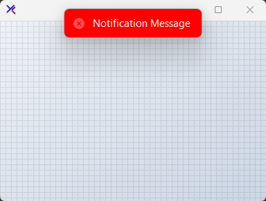
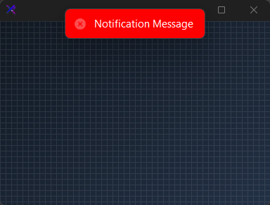
Error Message
Displays a standard Error toast notification. Used to convey neutral Error updates or general Error to the user.
🔴 🟡 🟢
toast.Show(
    owner: this, // Owning form
    message: "Notification Message",
    type: KtToasts.MessageTypes.Error);
Auto
Light
Dark
API Reference
| InformationOptions | CustomizationOptions | Sets the list of customization options provided for the Snackbar’s informational messages. |
| SuccessOptions | CustomizationOptions | Sets the list of customization options provided for the Snackbar’s success messages. |
| WarningOptions | CustomizationOptions | Sets the list of customization options provided for the Snackbar’s warning messages. |
| ErrorOptions | CustomizationOptions | Sets the list of customization options provided for the Snackbar’s error messages. |
| Host | Hosts | Sets the host that will be used to contain the Snackbar. |
| AllowDragging | Boolean | Sets a value indicating whether the Snackbar will be draggable once displayed. |
| ClickToClose | Boolean | Sets a value indicating whether the Snackbar will be closed once clicked by the user. |
| DoubleClickToClose | Boolean | Sets a value indicating whether the Snackbar will be closed once double-clicked by the user. |
| AllowMultipleViews | Boolean | Sets a value indicating whether multiple instances of the Snackbar will be displayed at a time. |
| ShowCloseIcon | Boolean | Sets a value indicating whether the close icon will be displayed. |
| ShowIcon | Boolean | Sets a value indicating whether the Snackbar icon will be displayed. |
| ShowBorders | Boolean | Sets a value indicating whether the Snackbar will display its borders rather than shadows. |
| ShowShadows | Boolean | Sets a value indicating whether the Snackbar will display its shadows rather than borders. |
| FadeCloseIcon | Boolean | Sets a value indicating whether the close icon will fade when inactive. |
| ZoomCloseIcon | Boolean | Sets a value indicating whether the close icon will zoom-in when hovered onto. |
| MinimumSize | Size | Sets the minimum size the Snackbar can be auto-resized to. |
| MaximumSize | Size | Sets the maximum size the Snackbar can be auto-resized to. |
| Margin | Int32 | Sets the overall Snackbar’s overall distance between its host and its edges. |
| ViewsMargin | Int32 | Sets the distance between Snackbars whenever multiple views are enabled using the property ‘AllowMultipleViews’. |
| MaximumViews | Int32 | Sets the maximum number of Snackbars that can be visible at a given time. |
| DurationAfterIdle | Int32 | Sets the duration the Snackbar will remain visible after it receives and then loses mouse focus. |
| MessageRightMargin | Int32 | Sets the Snackbar’s message right margin, or distance between the message and the closing icon. Please note that the minimum size for display will be established beyond the user-provided margin. |