Kt Divider
A visual separator control for Modern WinForms providing styled divider lines, customizable orientations, dash caps, and gradient edge fading.

🟢 DESIGNER SUPPORT
This control has full Visual Studio design-time support.
Drag it from the Toolbox onto your form, customize its properties directly in the Properties window, and KimTools will generate the corresponding code for you.
Visual Layout Separators
Use KtDivider to establish clear visual hierarchy and organize controls into distinct sections.
- Add Divider Control
Drag aKtDividerfrom the toolbox onto your form or panel. - Set Line Orientation
ChooseHorizontalfor top/bottom content split orVerticalfor inline column separations. - Configure Style & Cap
Select aLineStyle(Solid,Dash,DoubleEdgeFaded, etc.) and optionalDashCaprounding. - Apply Theme Color
Assign a dynamicKtColorscheme (such asKtColor.PRIMARYorKtColor.BASE_3) to maintain consistent application themes.
// 1. Solid Line - Primary Color
var dividerPrimary = new KtDivider
{
    Height = 30,
    Dock = DockStyle.Top,
    Orientation = KtDivider.LineOrientation.Horizontal,
    LineStyle = KtDivider.LineStyles.Solid,
    LineColor = KtColor.PRIMARY,
    LineThickness = 2f
};

// 2. Dashed Line with Round Caps - Secondary Color
var dividerSecondary = new KtDivider
{
    Height = 30,
    Dock = DockStyle.Top,
    Orientation = KtDivider.LineOrientation.Horizontal,
    LineStyle = KtDivider.LineStyles.Dash,
    DashCap = KtDivider.CapStyles.Round,
    LineColor = KtColor.SECONDARY,
    LineThickness = 3f
};

// 3. Double Edge Faded - Success Color
var dividerSuccess = new KtDivider
{
    Height = 30,
    Dock = DockStyle.Top,
    Orientation = KtDivider.LineOrientation.Horizontal,
    LineStyle = KtDivider.LineStyles.DoubleEdgeFaded,
    LineColor = KtColor.SUCCESS,
    LineThickness = 2f
};

// 4. Left Edge Faded - Warning Color
var dividerWarning = new KtDivider
{
    Height = 30,
    Dock = DockStyle.Top,
    Orientation = KtDivider.LineOrientation.Horizontal,
    LineStyle = KtDivider.LineStyles.LeftEdgeFaded,
    LineColor = KtColor.WARNING,
    LineThickness = 2f
};

// 5. Right Edge Faded - Danger/Error Color
var dividerDanger = new KtDivider
{
    Height = 30,
    Dock = DockStyle.Top,
    Orientation = KtDivider.LineOrientation.Horizontal,
    LineStyle = KtDivider.LineStyles.RightEdgeFaded,
    LineColor = KtColor.ERROR,
    LineThickness = 2f
};
| LineStyle | LineStyles | Sets the line’s style format. |
|---|
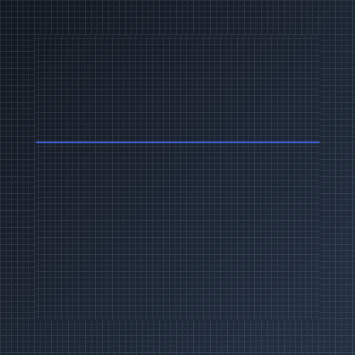
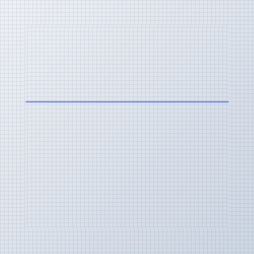
Solid Line Style
Draws a standard continuous line across the divider bounds.
var divider = new KtDivider
{
    Height = 20,
    Dock = DockStyle.Top,
    Orientation = KtDivider.LineOrientation.Horizontal,
    LineStyle = KtDivider.LineStyles.Solid,
    LineColor = KtColor.PRIMARY,
    LineThickness = 2f
};

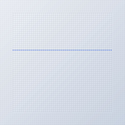
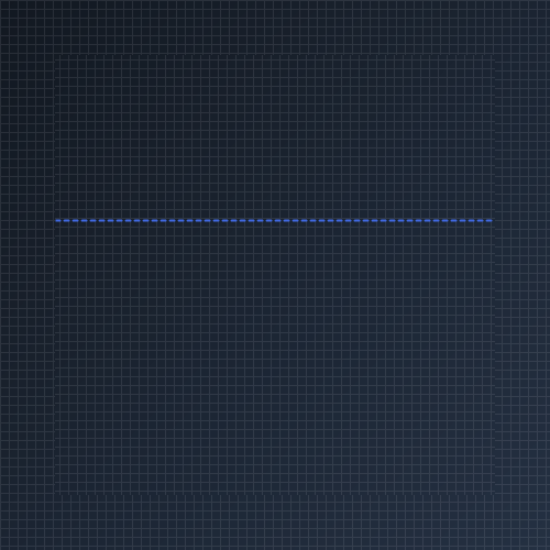
Dashed Line Style
Renders a repeating dashed line pattern. Pair with DashCap for rounded or angled segment ends.
var divider = new KtDivider
{
    Height = 20,
    Dock = DockStyle.Top,
    Orientation = KtDivider.LineOrientation.Horizontal,
    LineStyle = KtDivider.LineStyles.Dash,
    DashCap = KtDivider.CapStyles.Round,
    LineColor = KtColor.PRIMARY,
    LineThickness = 2f
};
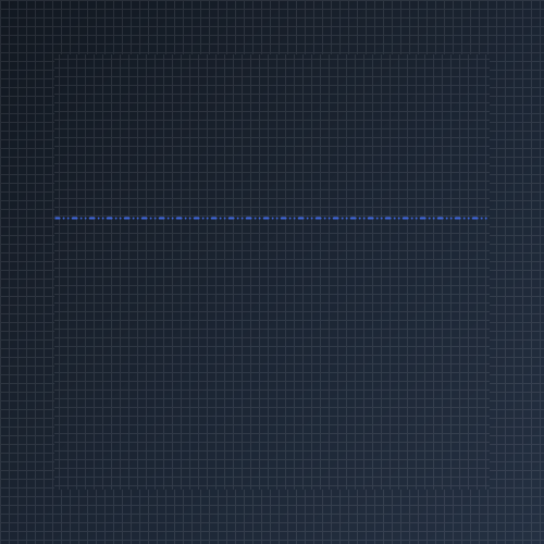
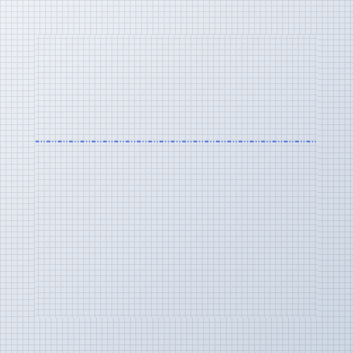
Dotted Line Style
Displays alternating dots and dashes using styles like DashDot or DashDotDot.
var divider = new KtDivider
{
    Height = 20,
    Dock = DockStyle.Top,
    Orientation = KtDivider.LineOrientation.Horizontal,
    LineStyle = KtDivider.LineStyles.DashDotDot,
    DashCap = KtDivider.CapStyles.Round,
    LineColor = KtColor.PRIMARY,
    LineThickness = 2f
};

| DashCap | CapStyles | Sets the line’s dash cap style. |
|---|
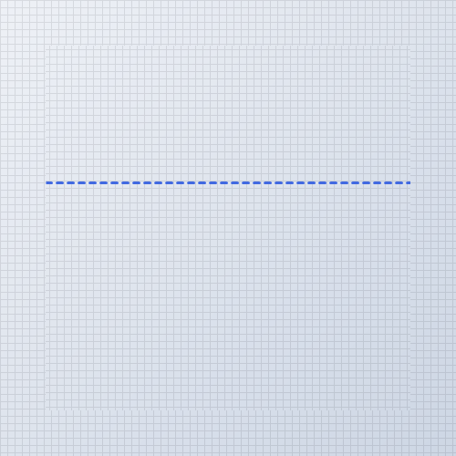
DashCap End Formatting
Customize line dash termination points with CapStyles.Flat, CapStyles.Round, or CapStyles.Triangle.
var divider = new KtDivider
{
    Height = 20,
    Dock = DockStyle.Top,
    Orientation = KtDivider.LineOrientation.Horizontal,
    LineStyle = KtDivider.LineStyles.Dash,
    DashCap = KtDivider.CapStyles.Round,
    LineColor = KtColor.PRIMARY,
    LineThickness = 3f
};
| LineColor | Kt-Color | Sets the line’s color. |
|---|
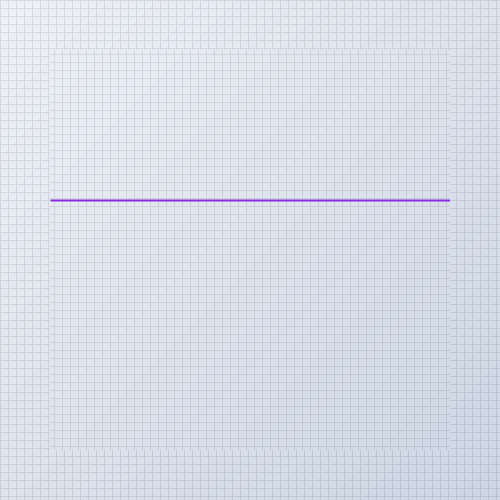
LineColor Customization
Assign theme colors using KtColor or standard System.Drawing.Color values.
var divider = new KtDivider
{
    Height = 20,
    Dock = DockStyle.Top,
    Orientation = KtDivider.LineOrientation.Horizontal,
    LineStyle = KtDivider.LineStyles.Solid,
    LineColor = KtColor.SECONDARY,
    LineThickness = 2f
};
| LineThickness | float | Sets the line’s thickness. |
|---|
LineThickness Control
Adjust stroke width in floating-point pixels to emphasize structural section separations.
var divider = new KtDivider
{
    Height = 20,
    Dock = DockStyle.Top,
    Orientation = KtDivider.LineOrientation.Horizontal,
    LineStyle = KtDivider.LineStyles.Solid,
    LineColor = KtColor.PRIMARY,
    LineThickness = 4f
};
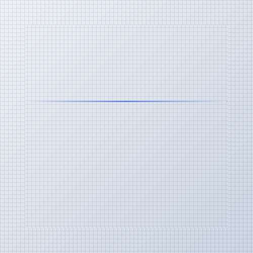
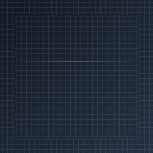
Double Edge Faded
Fades both line ends smoothly into transparency using LineStyles.DoubleEdgeFaded.
var divider = new KtDivider
{
    Height = 20,
    Dock = DockStyle.Top,
    Orientation = KtDivider.LineOrientation.Horizontal,
    LineStyle = KtDivider.LineStyles.DoubleEdgeFaded,
    LineColor = KtColor.PRIMARY,
    LineThickness = 2f
};
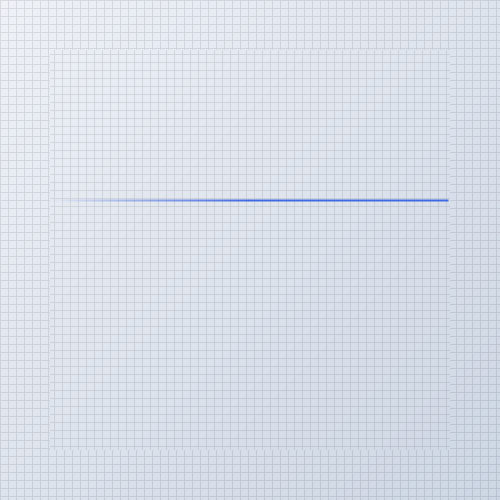
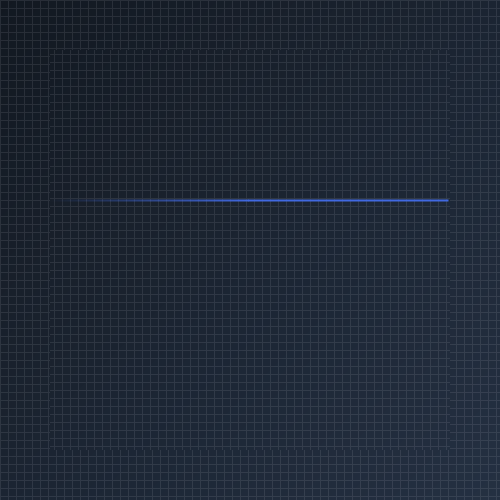
Left Edge Faded
Transitions the line from completely transparent on the left to solid on the right.
var divider = new KtDivider
{
    Height = 20,
    Dock = DockStyle.Top,
    Orientation = KtDivider.LineOrientation.Horizontal,
    LineStyle = KtDivider.LineStyles.LeftEdgeFaded,
    LineColor = KtColor.PRIMARY,
    LineThickness = 2f
};
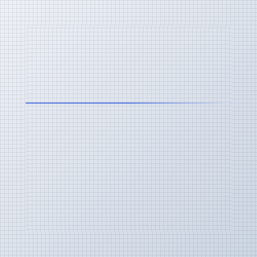
Right Edge Faded
Transitions the line from solid on the left to transparent on the right edge.
var divider = new KtDivider
{
    Height = 20,
    Dock = DockStyle.Top,
    Orientation = KtDivider.LineOrientation.Horizontal,
    LineStyle = KtDivider.LineStyles.RightEdgeFaded,
    LineColor = KtColor.PRIMARY,
    LineThickness = 2f
};
| Orientation | LineOrientation | Sets the line’s orientation. |
|---|
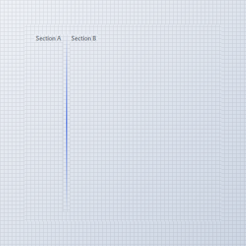
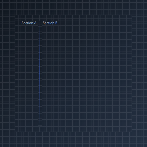
Vertical Orientation
Set Orientation = LineOrientation.Vertical to separate side-by-side elements, sidebars, or toolbar buttons.
var leftLabel = new KtLabel
{
    Text = @"Section A",
    Auto = true,
    Dock = DockStyle.Left
};

var verticalDivider = new KtDivider
{
    Width = 20,
    Dock = DockStyle.Left,
    Orientation = KtDivider.LineOrientation.Vertical,
    LineStyle = KtDivider.LineStyles.DoubleEdgeFaded,
    LineColor = KtColor.PRIMARY,
    LineThickness = 2f
};

var rightLabel = new KtLabel
{
    Text = @"Section B",
    Auto = true,
    Dock = DockStyle.Fill
};