Kt Panel
A modern, fully customizable panel control for WinForms. It acts as an advanced container for grouping and styling related content.

🟢 DESIGNER SUPPORT
This control has full Visual Studio design-time support.
Drag it from the Toolbox onto your form, customize its properties directly in the Properties window, and KimTools will generate the corresponding code for you.
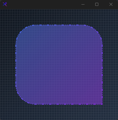
var panel = new KtPanel
{
    Background = (
        KtColor.PRIMARY % 50,
        KtColor.SECONDARY % 50
    ),
    Border = (
        KtColor.PRIMARY,
        KtColor.SECONDARY,
        45
    ),
    BorderRadius = .5f,
    BorderWidth = 3,
    BorderEdges =
    {
        TopLeft = true,
        TopRight = true,
        BottomLeft = true,
        BottomRight = false
    },
    BorderStyle = DashStyle.DashDotDot,
    PatternStyle = HatchStyle.LargeConfetti,
    PatternColor = KtColor.CONTENT % 10
};
| Background | Kt-Brush | Sets the panel’s background color. |
|---|
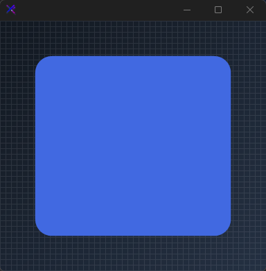
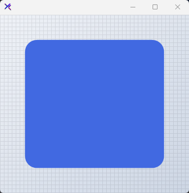
Solid Background
Supports plain System.Drawing.Color, dynamic KtColor, hex values (#1E90FF), or web-formatted colors (rgb / hsl).
var panel = new KtPanel
{
    Background = KtColor.PRIMARY,
    Border = KtBrush.None
};

| BackgroundMargin | Padding | Sets the panel’s border Margin. |
|---|
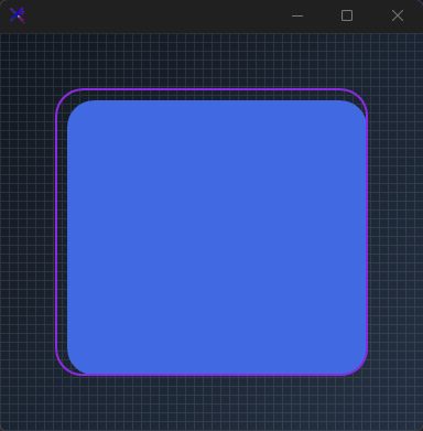
Background Margin
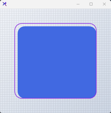
Defines internal padding offsets applied exclusively to the background fill brush.
var panel = new KtPanel
{
    Background = KtColor.PRIMARY,
    BackgroundMargin = new Padding(10, 10, 0, 0),
    Border = KtColor.SECONDARY,
    BorderWidth = 2
};

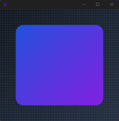
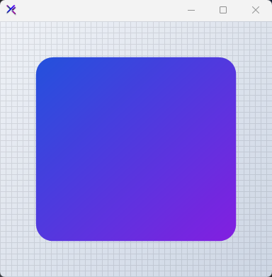
Gradient Background with KtColor
Pass a tuple defining start color, stop color, and an optional gradient angle (0-360 degrees).
var panel = new KtPanel
{
    Background = (
        startColor: KtColor.PRIMARY[50],
        stopColor: KtColor.SECONDARY[50],
        angle: 45
    ),
    Border = KtBrush.None
};

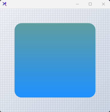
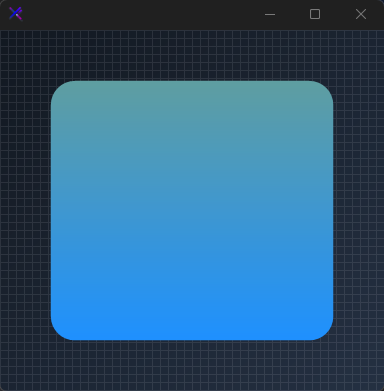
Gradient Background with System.Drawing.Color
Mix standard GDI system colors or combine them with semantic KtColor instances.
var panel = new KtPanel
{
    Background = (
        startColor: Color.CadetBlue,
        stopColor: Color.DodgerBlue,
        angle: 90
    ),
    Border = KtBrush.None
};
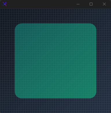
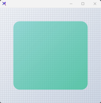
Translucent Gradient Background
Apply transparency to colors using the % operator on KtColor instances within gradient tuples.
var panel = new KtPanel
{
    Background = (
        startColor: KtColor.Teal % 40,  // 40% Opacity
        stopColor: KtColor.Emerald % 60 // 60% Opacity
    ),
    Border = KtBrush.None
};

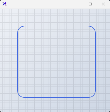
| Border | Kt-Brush | Sets the panel’s border color. |
|---|
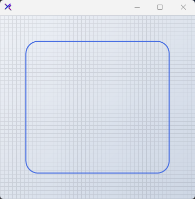
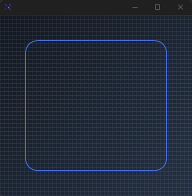
Solid Border Color
Assign a single KtColor or Color to the Border property for a uniform outline.
var panel = new KtPanel
{
    Background = KtColor.Transparent,
    Border = KtColor.PRIMARY,
    BorderWidth = 2
};
| BorderWidth | float | Sets the panel’s border thickness. |
|---|
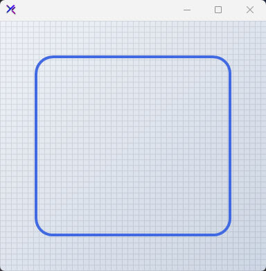
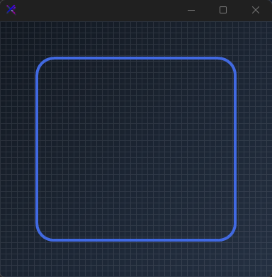
BorderWidth
Defines the thickness of the panel border stroke.
var panel = new KtPanel
{
    Background = KtColor.Transparent,
    Border = KtColor.PRIMARY,
    BorderWidth = 4
};
| BorderMargin | Padding | Sets the panel’s border Margin. |
|---|
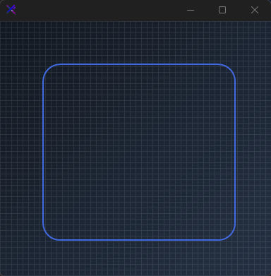
BorderMargin
Applies positional offsets to the border rendering area relative to the control bounds.
var panel = new KtPanel
{
    Background = KtColor.Transparent,
    Border = KtColor.PRIMARY,
    BorderWidth = 2,
    BorderMargin = new Padding(10, 10, 0, 0)
};

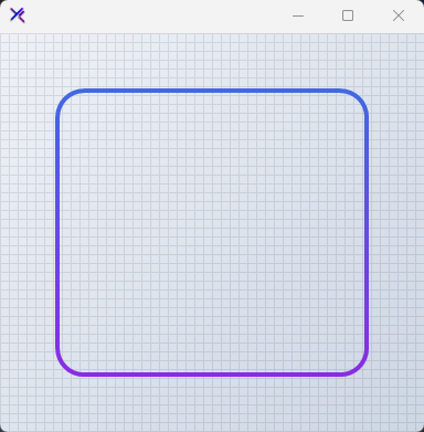
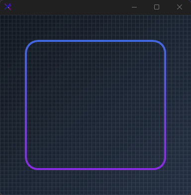
Gradient Border Brush
Construct multi-tone borders using tuple definitions containing start color, stop color, and angle.
var panel = new KtPanel
{
    Background = KtColor.Transparent,
    Border = (
        startColor: KtColor.PRIMARY,
        stopColor: KtColor.SECONDARY,
        angle: 90
    ),
    BorderWidth = 4
};
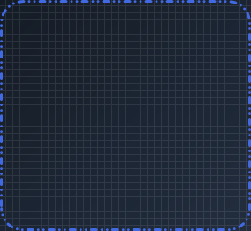
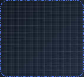
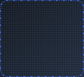
| BorderStyle | DashStyle | Sets the panel’s border style. |
|---|
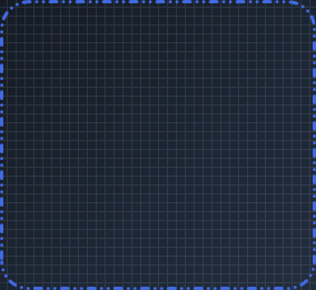
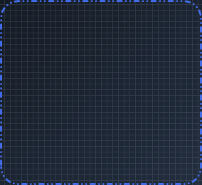
BorderStyle Variants
Configure standard GDI dash patterns using System.Drawing.Drawing2D.DashStyle.
var panel = new KtPanel
{
    Background = KtColor.Transparent,
    Border = KtColor.PRIMARY,
    BorderWidth = 3,
    BorderStyle = DashStyle.DashDot
};
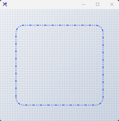
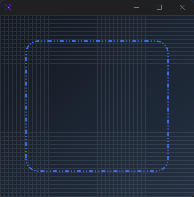
Dash Styles Gallery





| BorderEdges | Edges | Sets the Border edges. |
|---|
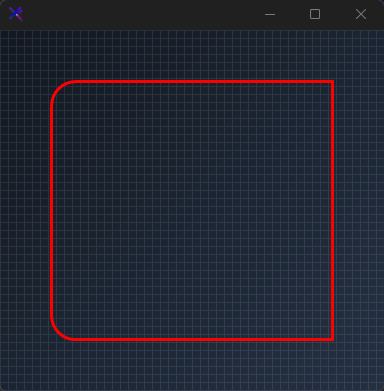
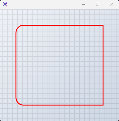
Selective BorderEdges
Toggle visibility for specific border edges individually using the BorderEdges sub-properties.
var panel = new KtPanel
{
    Background = KtColor.Transparent,
    Border = KtColor.ERROR,
    BorderWidth = 3,
    BorderEdges =
    {
        TopLeft = true,
        TopRight = false,
        BottomLeft = true,
        BottomRight = false
    }
};

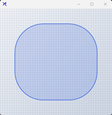
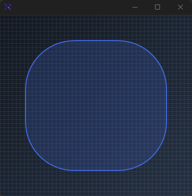
| BorderRadius | float | Sets the panel’s border radius. |
|---|
Corner Rounding with BorderRadius
Control relative corner rounding with a floating point ratio value.
var panel = new KtPanel
{
    Background = KtColor.PRIMARY % 20,
    Border = KtColor.PRIMARY,
    BorderWidth = 2,
    BorderRadius = 0.75f // Fractional rounding scale
};
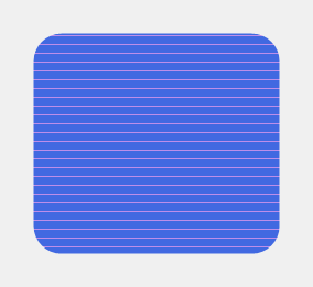
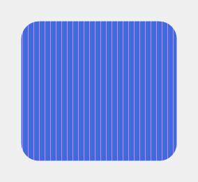
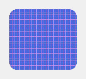
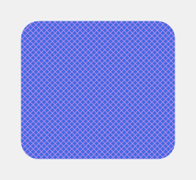
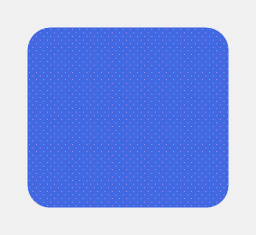
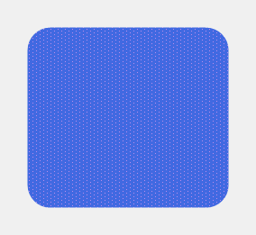
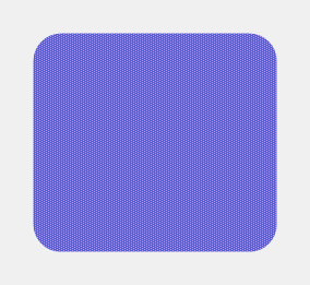
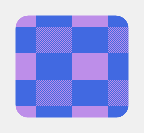
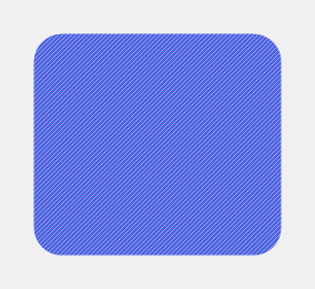
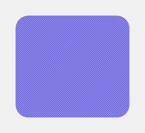
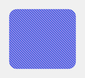
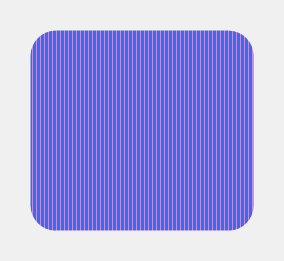
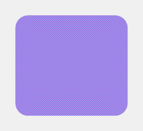
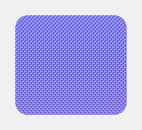
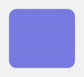
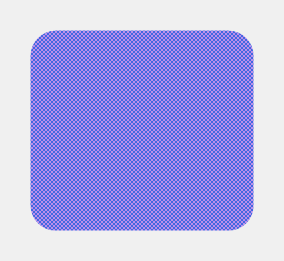
| PatternStyle | HatchStyle Nullable | Sets the Pattern style. |
|---|
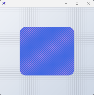
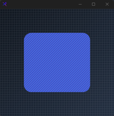
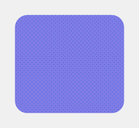
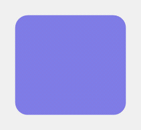
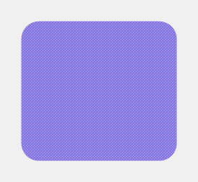
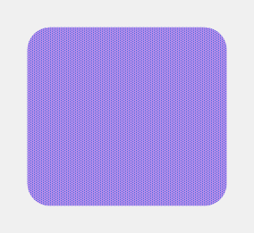
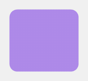
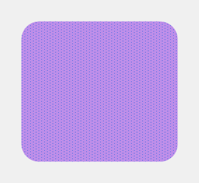
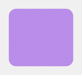
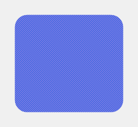
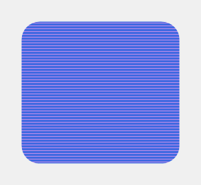
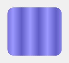
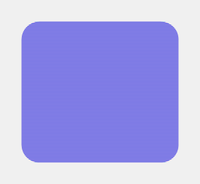
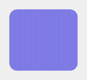
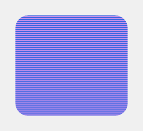
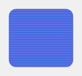
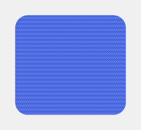
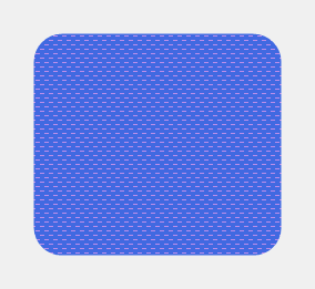
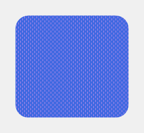
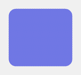
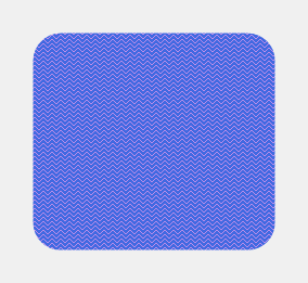
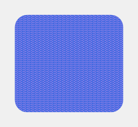
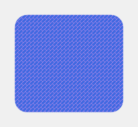
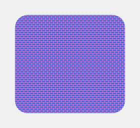
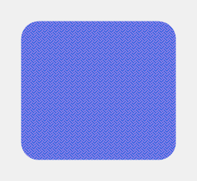
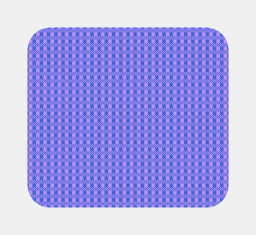
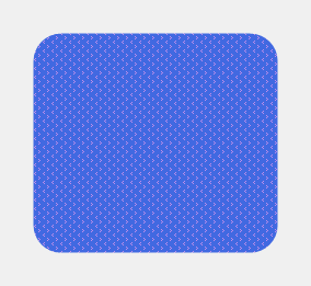
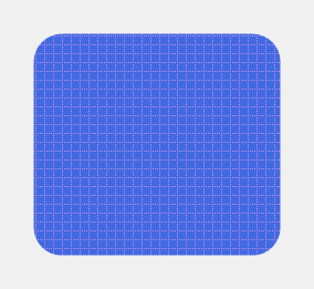
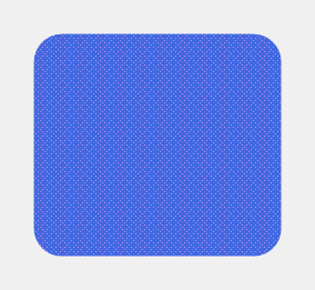
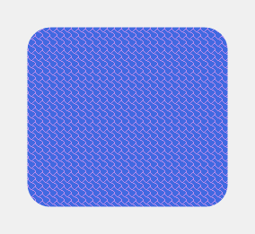
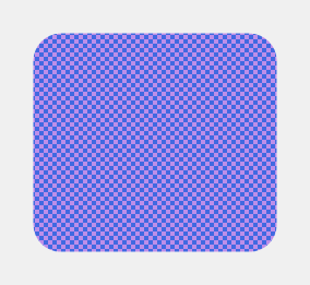
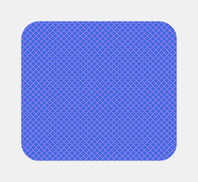
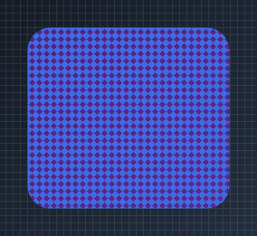
Pattern Style & Color
Overlay HatchStyle patterns over solid or gradient background fills. Set PatternStyle to null to disable.
var panel = new KtPanel
{
    Background = KtColor.PRIMARY,
    PatternColor = KtColor.SECONDARY % 50,
    PatternStyle = HatchStyle.LargeConfetti,
    Border = KtBrush.Solid,
    BorderRadius = 0f
};
Pattern styles





























































API Reference
| Background | Kt-Brush | Sets the panel’s background color. |
| Border | Kt-Brush | Sets the panel’s border color. |
| BorderEdges | Edges | Sets the Border edges. |
| PatternColor | Kt-Color | Sets the Pattern color. |
| Foreground | Kt-Color | Sets the Foreground. |
| BorderStyle | DashStyle | Sets the panel’s border style. |
| PatternStyle | HatchStyle Nullable | Sets the Pattern style. |
| BorderRadius | float | Sets the panel’s border radius. |
| BorderWidth | float | Sets the panel’s border thickness. |
| BackgroundMargin | Padding | Sets the panel’s border Margin. |
| BorderMargin | Padding | Sets the panel’s border Margin. |