# KimTools.WinForms - Full Context
> Generated by docmd
---
## [KimTools / AI & LLM Context](https://kimtoo.net/ai-llm/)
---
title: "KimTools / AI & LLM Context"
description: "Machine-readable documentation context for AI coding assistants and LLM agents."
keywords: ["KimTools", "AI", "LLM", "llms.txt", "llms-full.txt", "Model Context Protocol", "MCP", "AI agents", "AI coding assistant", "RAG", "machine-readable documentation", "AI-ready", "LLM context", "ChatGPT", "Claude", "Anthropic", "OpenAI", "GPT", "Copilot", "GitHub Copilot", "Gemini", "Cursor", "Windsurf", "WinForms", ".NET", "C#"]
layout: "full"
toc: false
---
::: hero layout:split glow:true
# AI / LLM `Context`
KimTools.WinForms publishes a complete, machine-readable context file so AI coding assistants and LLM agents can understand the entire component API in a single fetch.
::: button "llms-full.txt" external:https://kimtoo.net/llms-full.txt icon:external-link
== side
{ .with-shadow}
:::
::: callout tip "MCP Support Coming Soon"
We're actively building native Model Context Protocol (MCP) support, so AI agents will be able to search, read, and query KimTools documentation interactively instead of fetching a static file. Until then, the `llms.txt` files below give any AI tool full context in one request.
:::
## Full context
Here's the fastest way to get an AI assistant up to speed on KimTools - copy one of the two links below into any tool that accepts a URL for context (Claude, ChatGPT, Cursor, and most others support this).
> Paste the URL into Claude, ChatGPT, Cursor, or any tool that accepts a context URL, and the model will have full knowledge of KimTools controls, properties, and usage patterns for that session.
```
https://kimtoo.net/llms-full.txt
```
### Quick index
> just page titles, descriptions, and links, for when the assistant only needs an overview:
```
https://kimtoo.net/llms.txt
```
Not sure which one to use? Start with `llms-full.txt` - it's larger, but it means the assistant already has everything it needs without asking it to fetch individual pages afterward. Reach for the lighter `llms.txt` only if you're working with a tool that has a small context window, or you just want a table of contents.
## General
::: collapsible "What is llms-full.txt?"
`llms-full.txt` is a single Markdown document containing every KimTools.WinForms component, property, and code example from these docs, concatenated and optimized for ingestion by large language models.
It follows the emerging `llms.txt` convention adopted across the developer tooling ecosystem, making KimTools discoverable to AI agents without any custom integration work.
:::
::: collapsible "How do I use it with an AI assistant?"
Point any LLM tool at the file directly:
```
https://kimtoo.net/llms-full.txt
```
Paste the URL into Claude, ChatGPT, Cursor, or any tool that accepts a context URL, and the model will have full knowledge of KimTools controls, properties, and usage patterns for that session.
:::
::: collapsible "Is there a shorter summary version?"
Yes.
`llms.txt` provides a condensed index of page titles, descriptions, and links, useful when an agent only needs an overview before fetching specific pages.
```
https://kimtoo.net/llms.txt
```
:::
::: collapsible "Does KimTools support interactive AI agent access (MCP)?"
Not yet - it's on the way.
We're actively developing native MCP support so AI agents can search, read, and query the KimTools documentation interactively instead of relying on a static context file. In the meantime, `llms-full.txt` is the recommended way for outside tools to get full context today.
:::
::: collapsible "How current is the context file?"
`llms-full.txt` is regenerated automatically on every documentation build, so it always reflects the latest published components and API references.
:::
---
## [KimTools / Components / PopOver](https://kimtoo.net/components/kt-pop-over/)
---
title: "KimTools / Components / PopOver"
description: "An extender provider that turns any control into a popover trigger, showing a target control in a dropdown with configurable direction, shadow, and lifecycle events."
keywords: ["KimTools", "Components", "KtPopOver", "PopOver", "Component"]
toc: false
layout: "full"
---
::: hero layout:split glow:true
# Kt `PopOver`
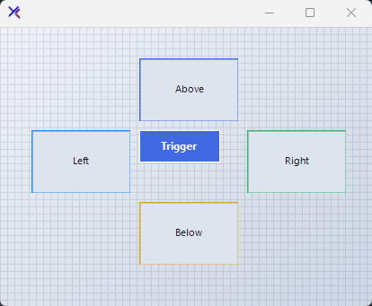
An extender provider that turns any control into a popover trigger, showing a target control in a dropdown with configurable direction, shadow, and lifecycle events.
::: callout tip
#### 🟣 PREMIUM
This component is only available in the Premium version of KimTools.
::: button "Get KimTools" external:https://kimtoo.net/#pricinghttps://kimtoo.net/#pricing icon:external-link
:::
== side
{ .light .snapshot} 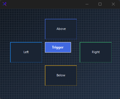{.dark .snapshot}
:::
::: hero layout:split glow:true
## Direction Control (`SetDirection`)
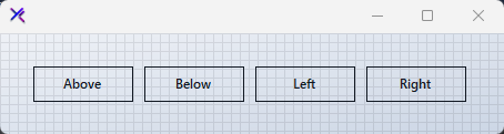
Call `SetDirection(trigger, direction)` to position the dropdown relative to each trigger. Directions include `AboveRight`, `BelowRight`, `Left`, `Right`, and `Default`. Each trigger control can have its own direction independent of the component default.
```csharp "🔴 🟡 🟢"
var panel = new FlowLayoutPanel
{
Width = 460,
Height = 120,
Padding = new Padding(20),
BackColor = Color.Transparent,
AutoScroll = false,
FlowDirection = FlowDirection.LeftToRight
};
var popOver = new KtPopOver { Shadow = true, Direction = ToolStripDropDownDirection.Default };
var btnAbove = new Button { Text = "Above", Width = 90, Height = 32, Margin = new Padding(5), FlatStyle = FlatStyle.Flat };
var btnBelow = new Button { Text = "Below", Width = 90, Height = 32, Margin = new Padding(5), FlatStyle = FlatStyle.Flat };
var btnLeft = new Button { Text = "Left", Width = 90, Height = 32, Margin = new Padding(5), FlatStyle = FlatStyle.Flat };
var btnRight = new Button { Text = "Right", Width = 90, Height = 32, Margin = new Padding(5), FlatStyle = FlatStyle.Flat };
popOver.SetDirection(btnAbove, ToolStripDropDownDirection.AboveRight);
popOver.SetDirection(btnBelow, ToolStripDropDownDirection.BelowRight);
popOver.SetDirection(btnLeft, ToolStripDropDownDirection.Left);
popOver.SetDirection(btnRight, ToolStripDropDownDirection.Right);
panel.Controls.Add(btnAbove);
panel.Controls.Add(btnBelow);
panel.Controls.Add(btnLeft);
panel.Controls.Add(btnRight);
```
== side
::: tabs
== tab "Auto" icon:app-window
{ .light .snapshot} 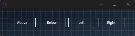{.dark .snapshot}
== tab "Light" icon:sun
{ .snapshot}
== tab "Dark" icon:moon
{ .snapshot}
:::
:::
::: hero layout:split glow:true
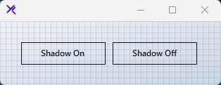
## Drop Shadow (`Shadow`)
Toggle `Shadow = true` to add a system drop shadow to the popover dropdown. When `false`, the popover appears flat against the parent form.
```csharp "🔴 🟡 🟢"
var panel = new FlowLayoutPanel
{
Width = 320,
Height = 120,
Padding = new Padding(20),
BackColor = Color.Transparent,
AutoScroll = false,
FlowDirection = FlowDirection.LeftToRight
};
var withShadow = new KtPopOver { Shadow = true };
var withoutShadow = new KtPopOver { Shadow = false };
var btnShadow = new Button { Text = "Shadow On", Width = 120, Height = 32, Margin = new Padding(5), FlatStyle = FlatStyle.Flat };
var btnNoShadow = new Button { Text = "Shadow Off", Width = 120, Height = 32, Margin = new Padding(5), FlatStyle = FlatStyle.Flat };
panel.Controls.Add(btnShadow);
panel.Controls.Add(btnNoShadow);
```
== side
::: tabs
== tab "Auto" icon:app-window
{ .light .snapshot} 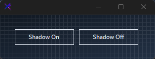{.dark .snapshot}
== tab "Light" icon:sun
{ .snapshot}
== tab "Dark" icon:moon
{ .snapshot}
:::
:::
::: hero layout:split glow:true
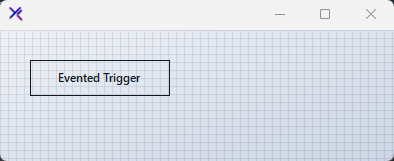
## Lifecycle Events (`Opened`, `Opening`, `Closed`, `Closing`)
Subscribe to `Opened` / `Closed` for side effects after the dropdown shows or hides. Use `Opening` and `Closing` (both `CancelEventArgs`) to intercept and prevent the action when conditions aren't met.
```csharp "🔴 🟡 🟢"
var panel = new FlowLayoutPanel
{
Width = 400,
Height = 160,
Padding = new Padding(20),
BackColor = Color.Transparent,
AutoScroll = false,
FlowDirection = FlowDirection.TopDown
};
var popOver = new KtPopOver { Shadow = true };
popOver.Opened += (s, e) => { /* popover opened */ };
popOver.Closed += (s, e) => { /* popover closed */ };
popOver.Opening += (s, e) => { /* cancel via e.Cancel = true */ };
popOver.Closing += (s, e) => { /* cancel via e.Cancel = true */ };
var btn = new Button { Text = "Evented Trigger", Width = 140, Height = 36, Margin = new Padding(5), FlatStyle = FlatStyle.Flat };
panel.Controls.Add(btn);
```
== side
::: tabs
== tab "Auto" icon:app-window
{ .light .snapshot} 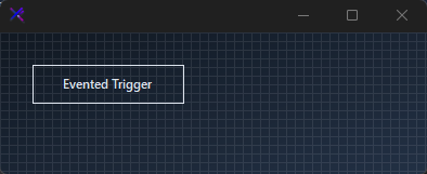{.dark .snapshot}
== tab "Light" icon:sun
{ .snapshot}
== tab "Dark" icon:moon
{ .snapshot}
:::
:::
## API `Reference`
| | | |
| -------- | ------- | ----------- |
| ::: tag "Shadow" icon:wrench | ::: tag "Boolean" color:#0B64F4 icon:external-link url:external:https://learn.microsoft.com/en-us/dotnet/api/system.boolean?view=netframework-4.8 | *Sets the Shadow.* |
| ::: tag "Direction" icon:wrench | ::: tag "ToolStripDropDownDirection" color:#0B64F4 icon:external-link url:external:https://learn.microsoft.com/en-us/dotnet/api/system.windows.forms.toolstripdropdowndirection?view=netframework-4.8 | *Sets the Direction.* |
---
## [KimTools / Components / Toasts](https://kimtoo.net/components/kt-toasts/)
---
title: "KimTools / Components / Toasts"
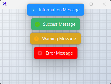
description: "Deliver stunningly neat, time-bound, and brief messages about application processes. Supports multiple message types, custom positioning, action buttons, drag interaction, and per-type visual customization."
keywords: ["KimTools", "Components", "KtToasts", "Toasts", "Component"]
toc: false
layout: "full"
---
::: hero layout:split glow:true
# Kt `Toasts`
Deliver stunningly neat, time-bound, and brief messages about application processes. Supports multiple message types, custom positioning, action buttons, drag interaction, and per-type visual customization.
::: callout tip
#### 🟣 PREMIUM
This component is only available in the Premium version of KimTools.
::: button "Get KimTools" external:https://kimtoo.net/#pricinghttps://kimtoo.net/#pricing icon:external-link
:::
== side
{ .light .snapshot} 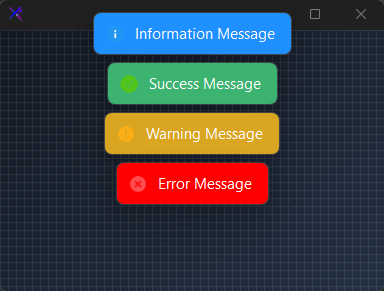{.dark .snapshot}
:::
```csharp "🔴 🟡 🟢"
// using KimTools.WinForms;
var toast = new KtToasts()
```
::: hero layout:split glow:true
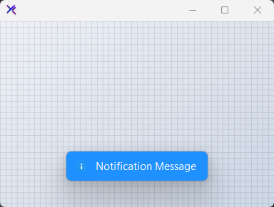
## Information Message
Displays a standard Information toast notification. Used to convey neutral Information updates or general Information to the user.
```csharp "🔴 🟡 🟢"
toast.Show(
owner: this, // Owning form
message: "Notification Message",
type: KtToasts.MessageTypes.Information);
```
== side
::: tabs
== tab "Auto" icon:app-window
{ .light .snapshot} 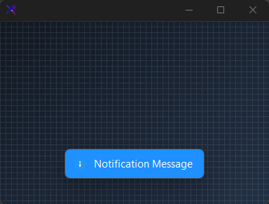{.dark .snapshot}
== tab "Light" icon:sun
{ .snapshot}
== tab "Dark" icon:moon
{ .snapshot}
:::
:::
::: hero layout:split glow:true
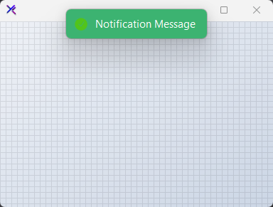
## Success Message
Displays a standard Success toast notification. Used to convey neutral Success updates or general Success to the user.
```csharp "🔴 🟡 🟢"
toast.Show(
owner: this, // Owning form
message: "Notification Message",
type: KtToasts.MessageTypes.Success);
```
== side
::: tabs
== tab "Auto" icon:app-window
{ .light .snapshot} 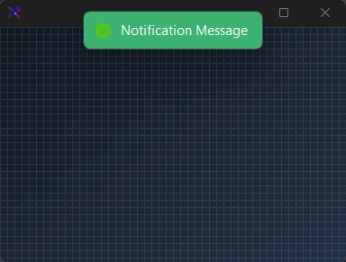{.dark .snapshot}
== tab "Light" icon:sun
{ .snapshot}
== tab "Dark" icon:moon
{ .snapshot}
:::
:::
::: hero layout:split glow:true
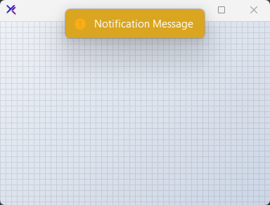
## Warning Message
Displays a standard Warning toast notification. Used to convey neutral Warning updates or general Warning to the user.
```csharp "🔴 🟡 🟢"
toast.Show(
owner: this, // Owning form
message: "Notification Message",
type: KtToasts.MessageTypes.Warning);
```
== side
::: tabs
== tab "Auto" icon:app-window
{ .light .snapshot} 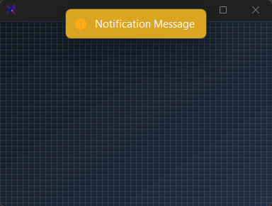{.dark .snapshot}
== tab "Light" icon:sun
{ .snapshot}
== tab "Dark" icon:moon
{ .snapshot}
:::
:::
::: hero layout:split glow:true
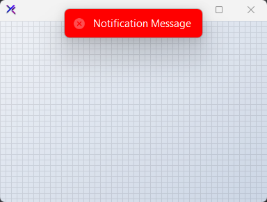
## Error Message
Displays a standard Error toast notification. Used to convey neutral Error updates or general Error to the user.
```csharp "🔴 🟡 🟢"
toast.Show(
owner: this, // Owning form
message: "Notification Message",
type: KtToasts.MessageTypes.Error);
```
== side
::: tabs
== tab "Auto" icon:app-window
{ .light .snapshot} 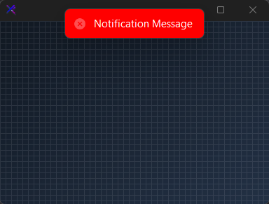{.dark .snapshot}
== tab "Light" icon:sun
{ .snapshot}
== tab "Dark" icon:moon
{ .snapshot}
:::
:::
## API `Reference`
| | | |
| -------- | ------- | ----------- |
| ::: tag "InformationOptions" icon:wrench | ::: tag "CustomizationOptions" color:#6B7C94 icon:check-check | *Sets the list of customization options provided for the Snackbar's informational messages.* |
| ::: tag "SuccessOptions" icon:wrench | ::: tag "CustomizationOptions" color:#6B7C94 icon:check-check | *Sets the list of customization options provided for the Snackbar's success messages.* |
| ::: tag "WarningOptions" icon:wrench | ::: tag "CustomizationOptions" color:#6B7C94 icon:check-check | *Sets the list of customization options provided for the Snackbar's warning messages.* |
| ::: tag "ErrorOptions" icon:wrench | ::: tag "CustomizationOptions" color:#6B7C94 icon:check-check | *Sets the list of customization options provided for the Snackbar's error messages.* |
| ::: tag "Host" icon:wrench | ::: tag "Hosts" color:#6B7C94 icon:check-check | *Sets the host that will be used to contain the Snackbar.* |
| ::: tag "AllowDragging" icon:wrench | ::: tag "Boolean" color:#0B64F4 icon:external-link url:external:https://learn.microsoft.com/en-us/dotnet/api/system.boolean?view=netframework-4.8 | *Sets a value indicating whether the Snackbar will be draggable once displayed.* |
| ::: tag "ClickToClose" icon:wrench | ::: tag "Boolean" color:#0B64F4 icon:external-link url:external:https://learn.microsoft.com/en-us/dotnet/api/system.boolean?view=netframework-4.8 | *Sets a value indicating whether the Snackbar will be closed once clicked by the user.* |
| ::: tag "DoubleClickToClose" icon:wrench | ::: tag "Boolean" color:#0B64F4 icon:external-link url:external:https://learn.microsoft.com/en-us/dotnet/api/system.boolean?view=netframework-4.8 | *Sets a value indicating whether the Snackbar will be closed once double-clicked by the user.* |
| ::: tag "AllowMultipleViews" icon:wrench | ::: tag "Boolean" color:#0B64F4 icon:external-link url:external:https://learn.microsoft.com/en-us/dotnet/api/system.boolean?view=netframework-4.8 | *Sets a value indicating whether multiple instances of the Snackbar will be displayed at a time.* |
| ::: tag "ShowCloseIcon" icon:wrench | ::: tag "Boolean" color:#0B64F4 icon:external-link url:external:https://learn.microsoft.com/en-us/dotnet/api/system.boolean?view=netframework-4.8 | *Sets a value indicating whether the close icon will be displayed.* |
| ::: tag "ShowIcon" icon:wrench | ::: tag "Boolean" color:#0B64F4 icon:external-link url:external:https://learn.microsoft.com/en-us/dotnet/api/system.boolean?view=netframework-4.8 | *Sets a value indicating whether the Snackbar icon will be displayed.* |
| ::: tag "ShowBorders" icon:wrench | ::: tag "Boolean" color:#0B64F4 icon:external-link url:external:https://learn.microsoft.com/en-us/dotnet/api/system.boolean?view=netframework-4.8 | *Sets a value indicating whether the Snackbar will display its borders rather than shadows.* |
| ::: tag "ShowShadows" icon:wrench | ::: tag "Boolean" color:#0B64F4 icon:external-link url:external:https://learn.microsoft.com/en-us/dotnet/api/system.boolean?view=netframework-4.8 | *Sets a value indicating whether the Snackbar will display its shadows rather than borders.* |
| ::: tag "FadeCloseIcon" icon:wrench | ::: tag "Boolean" color:#0B64F4 icon:external-link url:external:https://learn.microsoft.com/en-us/dotnet/api/system.boolean?view=netframework-4.8 | *Sets a value indicating whether the close icon will fade when inactive.* |
| ::: tag "ZoomCloseIcon" icon:wrench | ::: tag "Boolean" color:#0B64F4 icon:external-link url:external:https://learn.microsoft.com/en-us/dotnet/api/system.boolean?view=netframework-4.8 | *Sets a value indicating whether the close icon will zoom-in when hovered onto.* |
| ::: tag "MinimumSize" icon:wrench | ::: tag "Size" color:#0B64F4 icon:external-link url:external:https://learn.microsoft.com/en-us/dotnet/api/system.drawing.size?view=netframework-4.8 | *Sets the minimum size the Snackbar can be auto-resized to.* |
| ::: tag "MaximumSize" icon:wrench | ::: tag "Size" color:#0B64F4 icon:external-link url:external:https://learn.microsoft.com/en-us/dotnet/api/system.drawing.size?view=netframework-4.8 | *Sets the maximum size the Snackbar can be auto-resized to.* |
| ::: tag "Margin" icon:wrench | ::: tag "Int32" color:#0B64F4 icon:external-link url:external:https://learn.microsoft.com/en-us/dotnet/api/system.int32?view=netframework-4.8 | *Sets the overall Snackbar's overall distance between its host and its edges.* |
| ::: tag "ViewsMargin" icon:wrench | ::: tag "Int32" color:#0B64F4 icon:external-link url:external:https://learn.microsoft.com/en-us/dotnet/api/system.int32?view=netframework-4.8 | *Sets the distance between Snackbars whenever multiple views are enabled using the property 'AllowMultipleViews'.* |
| ::: tag "MaximumViews" icon:wrench | ::: tag "Int32" color:#0B64F4 icon:external-link url:external:https://learn.microsoft.com/en-us/dotnet/api/system.int32?view=netframework-4.8 | *Sets the maximum number of Snackbars that can be visible at a given time.* |
| ::: tag "DurationAfterIdle" icon:wrench | ::: tag "Int32" color:#0B64F4 icon:external-link url:external:https://learn.microsoft.com/en-us/dotnet/api/system.int32?view=netframework-4.8 | *Sets the duration the Snackbar will remain visible after it receives and then loses mouse focus.* |
| ::: tag "MessageRightMargin" icon:wrench | ::: tag "Int32" color:#0B64F4 icon:external-link url:external:https://learn.microsoft.com/en-us/dotnet/api/system.int32?view=netframework-4.8 | *Sets the Snackbar's message right margin, or distance between the message and the closing icon. Please note that the minimum size for display will be established beyond the user-provided margin.* |
---
## [KimTools / Components / Tooltips](https://kimtoo.net/components/kt-tooltips/)
---
title: "KimTools / Components / Tooltips"
description: "Provides enhanced ToolTips with rich customization including icons, HTML content, fade animations, auto-close timing, shadow effects, and extender provider support for associating tips with any control."
keywords: ["KimTools", "Components", "KtTooltips", "Tooltips", "Component"]
toc: false
layout: "full"
---
::: hero layout:split glow:true
# Kt `Tooltips`
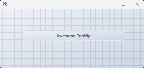
Provides enhanced ToolTips with rich customization including icons, HTML content, fade animations, auto-close timing, shadow effects, and extender provider support for associating tips with any control.
::: callout tip
#### 🟣 PREMIUM
This component is only available in the Premium version of KimTools.
::: button "Get KimTools" external:https://kimtoo.net/#pricinghttps://kimtoo.net/#pricing icon:external-link
:::
== side
{ .light .snapshot} 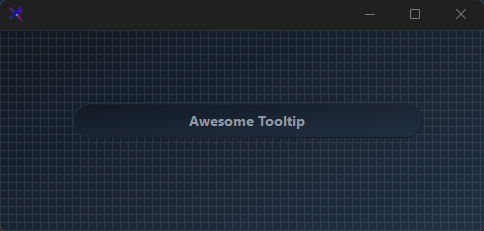{.dark .snapshot}
:::
## Icon & Title Support
- Enable `ShowIcons` and associate an icon via `SetToolTipIcon(control, image)`.
- Use the `Show(control, text, title, icon, location)` overload to display a tooltip with an icon programmatically.
- Icons render at 23×23 px with configurable `IconMargin`.
```csharp "🔴 🟡 🟢"
var label = new KtLabel
{
Text = "Keyboard Shortcut",
Color = KtColor.CONTENT,
Font = new Font("Segoe UI", 10F, FontStyle.Regular),
AutoSize = true,
Margin = new Padding(10)
};
var tooltip = new KtTooltips();
tooltip.ShowIcons = true;
tooltip.SetToolTip(label, "Press Ctrl+S to save instantly without opening the menu.");
```
## Custom Styling
- Override `Background`, `Foreground`, and `Border` colors.
- Toggle `ShowShadows`, `ShowBorders`, and `AllowFading` independently.
- Adjust animation speeds via `EntryAnimationSpeed` (default 350 ms) and `ExitAnimationSpeed` (default 200 ms).
```csharp "🔴 🟡 🟢"
var label = new KtLabel
{
Text = @"Custom Styled Target",
Color = KtColor.CONTENT,
Font = new Font("Segoe UI", 10F, FontStyle.Regular),
Auto = true,
Margin = new Padding(10)
};
var tooltip = new KtTooltips();
tooltip.Background = KtColor.BASE_2;
tooltip.Border = KtColor.PRIMARY;
tooltip.ShowShadows = true;
tooltip.ShowBorders = true;
tooltip.AllowFading = true;
tooltip.SetToolTip(label, "This tooltip uses a primary accent border and fade animation.");
```
## Extender Provider Pattern
- `KtTooltips` implements `IExtenderProvider`. Call `SetToolTip(control, text)` for each target.
- The component auto-attaches hover/leave/click events.
- Call `Show(control, text)` programmatically to display the tooltip without waiting for hover.
```csharp "🔴 🟡 🟢"
var label1 = new KtLabel
{
Text = "Submit",
Color = KtColor.CONTENT,
Font = new Font("Segoe UI", 10F, FontStyle.Regular),
AutoSize = true,
Margin = new Padding(10)
};
var label2 = new KtLabel
{
Text = "Cancel",
Color = KtColor.CONTENT,
Font = new Font("Segoe UI", 10F, FontStyle.Regular),
AutoSize = true,
Margin = new Padding(10)
};
var tooltip = new KtTooltips();
tooltip.SetToolTip(label1, "Click to submit the form.");
tooltip.SetToolTip(label2, "Click to discard changes and close.");
```
## Programmatic Display
- Call `Show(control, text)` to display a tooltip immediately without user interaction.
- Control auto-close with `AllowAutoClose` and `AutoCloseDuration`.
- Set `InitialDelay = 0` to suppress the hover delay when mixing programmatic and automatic triggers.
```csharp "🔴 🟡 🟢"
var label = new KtLabel
{
Text = "Programmatic Trigger",
Color = KtColor.CONTENT,
Font = new Font("Segoe UI", 10F, FontStyle.Regular),
AutoSize = true,
Margin = new Padding(10)
};
var tooltip = new KtTooltips();
tooltip.AllowAutoClose = true;
tooltip.AutoCloseDuration = 3000;
tooltip.InitialDelay = 0;
tooltip.SetToolTip(label, "This tooltip is shown via code, not hover.");
// Example of programmatic usage:
// tooltip.Show(label, "Saved!");
```
## API `Reference`
| | | |
| -------- | ------- | ----------- |
| ::: tag "Background" icon:wrench | ::: tag "Kt-Color" color:#820BF4 icon:corner-down-right url:/utilities/kt-color | *Sets the Background.* |
| ::: tag "Foreground" icon:wrench | ::: tag "Kt-Color" color:#820BF4 icon:corner-down-right url:/utilities/kt-color | *Sets the Foreground.* |
| ::: tag "Border" icon:wrench | ::: tag "Kt-Color" color:#820BF4 icon:corner-down-right url:/utilities/kt-color | *Sets the Border.* |
| ::: tag "Active" icon:wrench | ::: tag "Boolean" color:#0B64F4 icon:external-link url:external:https://learn.microsoft.com/en-us/dotnet/api/system.boolean?view=netframework-4.8 | *Determines if the ToolTip is active. Tooltips will only appear if this property is set to true.* |
| ::: tag "ShowAlways" icon:wrench | ::: tag "Boolean" color:#0B64F4 icon:external-link url:external:https://learn.microsoft.com/en-us/dotnet/api/system.boolean?view=netframework-4.8 | *Determines if the tool tip will be displayed always, even when the parent window is not active.* |
| ::: tag "ShowIcons" icon:wrench | ::: tag "Boolean" color:#0B64F4 icon:external-link url:external:https://learn.microsoft.com/en-us/dotnet/api/system.boolean?view=netframework-4.8 | *Sets a value indicating whether the ToolTip will display icons if the associated control or controls have specified one.* |
| ::: tag "ShowShadows" icon:wrench | ::: tag "Boolean" color:#0B64F4 icon:external-link url:external:https://learn.microsoft.com/en-us/dotnet/api/system.boolean?view=netframework-4.8 | *Sets a value indicating whether display-shadows will be provided around the ToolTip's borders.* |
| ::: tag "ShowBorders" icon:wrench | ::: tag "Boolean" color:#0B64F4 icon:external-link url:external:https://learn.microsoft.com/en-us/dotnet/api/system.boolean?view=netframework-4.8 | *Sets a value indicating whether standard borders will be drawn around the ToolTip's region.* |
| ::: tag "AllowFading" icon:wrench | ::: tag "Boolean" color:#0B64F4 icon:external-link url:external:https://learn.microsoft.com/en-us/dotnet/api/system.boolean?view=netframework-4.8 | *When set to true, a fade effect is used when ToolTips are shown or hidden.* |
| ::: tag "AllowAutoClose" icon:wrench | ::: tag "Boolean" color:#0B64F4 icon:external-link url:external:https://learn.microsoft.com/en-us/dotnet/api/system.boolean?view=netframework-4.8 | *When set to true, the ToolTip will be closed automatically when a set period of time provided by the property 'AutoCloseDuration', is given. However, when set to false, the ToolTip will be closed once the mouse leaves the associated control.* |
| ::: tag "Opacity" icon:wrench | ::: tag "Double" color:#0B64F4 icon:external-link url:external:https://learn.microsoft.com/en-us/dotnet/api/system.double?view=netframework-4.8 | *Sets the opacity of transparency-level of the ToolTip.* |
| ::: tag "TextFont" icon:wrench | ::: tag "Font" color:#0B64F4 icon:external-link url:external:https://learn.microsoft.com/en-us/dotnet/api/system.drawing.font?view=netframework-4.8 | *Sets the ToolTip's Html FontDefault.* |
| ::: tag "InitialDelay" icon:wrench | ::: tag "Int32" color:#0B64F4 icon:external-link url:external:https://learn.microsoft.com/en-us/dotnet/api/system.int32?view=netframework-4.8 | *Gets or sets the length of time, in milliseconds, it takes before the ToolTip is shown.* |
| ::: tag "ReshowDelay" icon:wrench | ::: tag "Int32" color:#0B64F4 icon:external-link url:external:https://learn.microsoft.com/en-us/dotnet/api/system.int32?view=netframework-4.8 | *Gets or sets the length of time, in milliseconds, it takes before subsequent ToolTips are shown.* |
| ::: tag "AutoCloseDuration" icon:wrench | ::: tag "Int32" color:#0B64F4 icon:external-link url:external:https://learn.microsoft.com/en-us/dotnet/api/system.int32?view=netframework-4.8 | *Gets or sets the length of time, in milliseconds, that the ToolTip will be shown. This property is enabled whenever the property 'AllowAutoClose' is set to true. The minimum required duration should be greater-than or equal-to 100 (milliseconds).* |
| ::: tag "EntryAnimationSpeed" icon:wrench | ::: tag "Int32" color:#0B64F4 icon:external-link url:external:https://learn.microsoft.com/en-us/dotnet/api/system.int32?view=netframework-4.8 | *Sets the ToolTip's entry animation speed in milliseconds. (Default is 350 milliseconds.)* |
| ::: tag "ExitAnimationSpeed" icon:wrench | ::: tag "Int32" color:#0B64F4 icon:external-link url:external:https://learn.microsoft.com/en-us/dotnet/api/system.int32?view=netframework-4.8 | *Sets the ToolTip's exit animation speed in milliseconds. (Default is 200 milliseconds.)* |
| ::: tag "IconMargin" icon:wrench | ::: tag "Int32" color:#0B64F4 icon:external-link url:external:https://learn.microsoft.com/en-us/dotnet/api/system.int32?view=netframework-4.8 | *Sets the margin (distance) between the ToolTipIcon and ToolTipTitle.* |
| ::: tag "TextMargin" icon:wrench | ::: tag "Int32" color:#0B64F4 icon:external-link url:external:https://learn.microsoft.com/en-us/dotnet/api/system.int32?view=netframework-4.8 | *Sets the ToolTip's Html margin, that is, the distance between the Title and the Html. (Default is 2.)* |
| ::: tag "Tag" icon:wrench | ::: tag "Object" color:#0B64F4 icon:external-link url:external:https://learn.microsoft.com/en-us/dotnet/api/system.object?view=netframework-4.8 | *Sets the object that contains programmer-supplied data associated with the ToolTip.* |
| ::: tag "Padding" icon:wrench | ::: tag "Padding" color:#0B64F4 icon:external-link url:external:https://learn.microsoft.com/en-us/dotnet/api/system.windows.forms.padding?view=netframework-4.8 | *Sets the ToolTip's inner padding between the container and its content, that is, the Title and Html information. Use the 'TextMargin' property to set the vertical distance between the ToolTip's Title and Html.* |
---
## [KimTools / Controls / Button](https://kimtoo.net/controls/kt-button/)
---
title: "KimTools / Controls / Button"
description: "A modern, fully customizable button control for WinForms, with built-in icon, gradient, and border support."
keywords: ["KimTools", "Controls", "KtButton", "Button"]
toc: false
layout: "full"
---
::: hero layout:split glow:true
# Kt `Button`
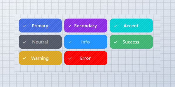
A modern, fully customizable button control for WinForms, with built-in icon, gradient, and border support.
::: callout tip
#### 🟣 PREMIUM
This component is only available in the Premium version of KimTools.
::: button "Get KimTools" external:https://kimtoo.net/#pricinghttps://kimtoo.net/#pricing icon:external-link
:::
== side
{ .light .snapshot} 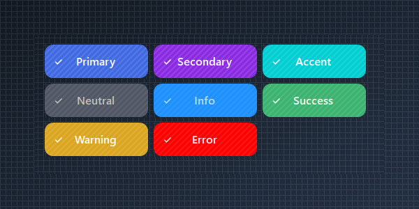{.dark .snapshot}
:::
::: callout success
#### 🟢 DESIGNER SUPPORT
**This control has full Visual Studio design-time support.**
Drag it from the Toolbox onto your form, customize its properties directly in the Properties window, and KimTools will generate the corresponding code for you.
:::
# Background
| ::: tag "Background" icon:wrench | ::: tag "Kt-Brush" color:#820BF4 icon:corner-down-right url:/utilities/kt-brush | *Sets the progress color.* |
| -------- | ------- | ----------- |
::: hero layout:split glow:true
## Gradient with `Kt-Colors`
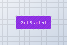
Use KimTools Semantically named dynamic theme colors.
```csharp "🔴 🟡 🟢"
// using KimTools.WinForms;
var button = new KtButton();
button.Text = "Get Started";
// Use % operator to apply transparency to Kt-Color
button.Background = Color.BlueViolet; // Color
// button.Background = KtColor.SUCCESS; // KtColor
// button.Background = KtColor.PRIMARY % 50; // With Opacity
// button.Background = KtColor.FromHex("#1E90FF"); // Hex
```
== side
::: tabs
== tab "Auto" icon:app-window
{ .light .snapshot} 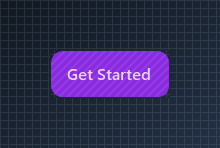{.dark .snapshot}
== tab "Light" icon:sun
{ .snapshot}
== tab "Dark" icon:moon
{ .snapshot}
:::
:::
::: hero layout:split glow:true
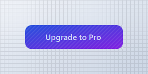
## Gradient `Background`
Use KimTools Semantic theme colors to match the current global theme.
```csharp "🔴 🟡 🟢"
// using KimTools.WinForms;
var button = new KtButton();
button.Text = "Upgrade to Pro";
button.Size = new Size(200, 50);
// Background supports Kt-Color gradients with an optional angle
button.Background =
(
startColor: KtColor.PRIMARY[50],
stopColor: KtColor.SECONDARY[50],
angle: 45 // optional (0-360)
);
```
== side
::: tabs
== tab "Auto" icon:app-window
{ .light .snapshot} 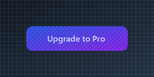{.dark .snapshot}
== tab "Light" icon:sun
{ .snapshot}
== tab "Dark" icon:moon
{ .snapshot}
:::
:::
# Border
| ::: tag "Border" icon:wrench | ::: tag "Kt-Brush" color:#820BF4 icon:corner-down-right url:/utilities/kt-brush | *Sets the panel's border color.* |
| -------- | ------- | ----------- |
::: hero layout:split glow:true
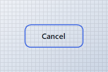
## Outlined `Border`
Clear `Background` and set `Border` for a ghost/outline button.
```csharp "🔴 🟡 🟢"
// using KimTools.WinForms;
var button = new KtButton();
button.Text = "Cancel";
// Clear Background and set Border for a ghost/outline style
button.Background = KtBrush.None;
button.Border = KtColor.PRIMARY;
button.BorderWidth = 2f;
```
== side
::: tabs
== tab "Auto" icon:app-window
{ .light .snapshot} 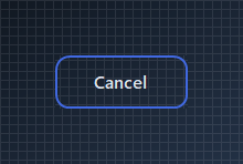{.dark .snapshot}
== tab "Light" icon:sun
{ .snapshot}
== tab "Dark" icon:moon
{ .snapshot}
:::
:::
::: hero layout:split glow:true
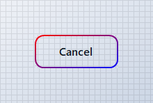
## Outlined Gradient `Border`
Clear `Background` and set `Border` for a gradient outline button.
```csharp "🔴 🟡 🟢"
// using KimTools.WinForms;
var button = new KtButton();
button.Text = "Cancel";
// Clear Background and set Border for a ghost/outline style
button.Background = KtBrush.None;
button.Border =("red","blue");
button.BorderWidth = 2f;
```
== side
::: tabs
== tab "Auto" icon:app-window
{ .light .snapshot} 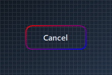{.dark .snapshot}
== tab "Light" icon:sun
{ .snapshot}
== tab "Dark" icon:moon
{ .snapshot}
:::
:::
::: hero layout:split glow:true
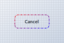
## Dashed `BorderStyle`
Clear `Background` and set `BorderStyle` for a gradient `Dash` border.
```csharp "🔴 🟡 🟢"
// using KimTools.WinForms;
var button = new KtButton();
button.Text = "Cancel";
// Clear Background and set Border for a ghost/outline style
button.Background = KtBrush.None;
button.Border = ("red", "blue");
button.BorderWidth = 2f;
button.BorderStyle = DashStyle.DashDot;
```
== side
::: tabs
== tab "Auto" icon:app-window
{ .light .snapshot} 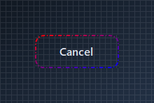{.dark .snapshot}
== tab "Light" icon:sun
{ .snapshot}
== tab "Dark" icon:moon
{ .snapshot}
:::
:::
::: hero layout:split glow:true
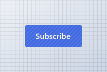
## Border `Radius`
Set `BorderRadius` from `0` (square) to `.99f` (pill) or >1 (int) for actual pixels.
```csharp "🔴 🟡 🟢"
// using KimTools.WinForms;
var button = new KtButton();
button.Text = "Subscribe";
button.Background = KtColor.PRIMARY;
// BorderRadius runs 0 (square) .. .99f (fully pill-shaped)
button.BorderRadius = .99f;
button.BorderRadius = 5f; // Actual pixels
```
== side
::: tabs
== tab "Auto" icon:app-window
{ .light .snapshot} 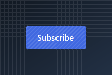{.dark .snapshot}
== tab "Light" icon:sun
{ .snapshot}
== tab "Dark" icon:moon
{ .snapshot}
:::
:::
::: hero layout:split glow:true
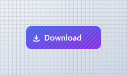
## SVG `Icon`
Set `Icon` to a Tabler icon name; `IconSize` and `IconStroke` control its rendering.
```csharp "🔴 🟡 🟢"
// using KimTools.WinForms;
var button = new KtButton();
button.Text = "Download";
// Icon accepts a Tabler icon name; IconSize / IconStroke tune its rendering
button.Icon = "download";
button.IconSize = 18;
button.IconStroke = 2.5;
button.Width = 150;
```
== side
::: tabs
== tab "Auto" icon:app-window
{ .light .snapshot} 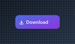{.dark .snapshot}
== tab "Light" icon:sun
{ .snapshot}
== tab "Dark" icon:moon
{ .snapshot}
:::
:::
::: hero layout:split glow:true
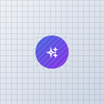
## Rounded `Icon Button`
Set `Icon` to a Tabler icon name; `IconSize` and `IconStroke` control its rendering.
```csharp "🔴 🟡 🟢"
// using KimTools.WinForms;
var button = new KtButton();
button.Text = string.Empty;
button.ImageAlign = ContentAlignment.MiddleCenter;
button.Size = new Size(50, 50);
button.Padding = Padding.Empty;
// Icon accepts a Tabler icon name; IconSize / IconStroke tune its rendering
button.Icon = "sparkles";
button.IconSize = 18;
button.IconStroke = 2.5;
button.BorderRadius = .99f;
button.Height = 50;
```
== side
::: tabs
== tab "Auto" icon:app-window
{ .light .snapshot} 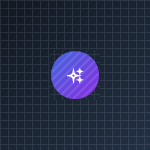{.dark .snapshot}
== tab "Light" icon:sun
{ .snapshot}
== tab "Dark" icon:moon
{ .snapshot}
:::
:::
::: hero layout:split glow:true
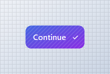
## `TextAlign` + `ImageAlign`
Move the icon to the trailing edge by pairing `ImageAlign` with `TextAlign`.
```csharp "🔴 🟡 🟢"
// using KimTools.WinForms;
var button = new KtButton();
button.Text = "Continue";
button.Icon = "check";
// button.Icon = "arrow-right";
// Reposition the icon and label independently
button.ImageAlign = ContentAlignment.MiddleRight;
button.TextAlign = ContentAlignment.MiddleLeft;
```
== side
::: tabs
== tab "Auto" icon:app-window
{ .light .snapshot} 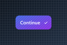{.dark .snapshot}
== tab "Light" icon:sun
{ .snapshot}
== tab "Dark" icon:moon
{ .snapshot}
:::
:::
::: hero layout:split glow:true
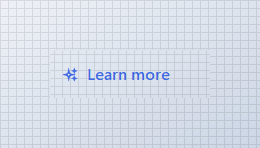
## `Foreground` + `IconColor`
Override the label and icon color independently of the current theme.
```csharp "🔴 🟡 🟢"
// using KimTools.WinForms;
var button = new KtButton();
button.Text = "Learn more";
button.Icon = "sparkles";
button.Width = 160;
// Foreground and IconColor override the label/icon color independently of Background
button.Background = KtBrush.None;
button.Foreground = KtColor.PRIMARY;
button.IconColor = KtColor.PRIMARY;
```
== side
::: tabs
== tab "Auto" icon:app-window
{ .light .snapshot} 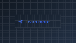{.dark .snapshot}
== tab "Light" icon:sun
{ .snapshot}
== tab "Dark" icon:moon
{ .snapshot}
:::
:::
## API `Reference`
| | | |
| -------- | ------- | ----------- |
| ::: tag "Background" icon:wrench | ::: tag "Kt-Brush" color:#820BF4 icon:corner-down-right url:/utilities/kt-brush | *Sets the progress color.* |
| ::: tag "Border" icon:wrench | ::: tag "Kt-Brush" color:#820BF4 icon:corner-down-right url:/utilities/kt-brush | *Sets the panel's border color.* |
| ::: tag "BorderEdges" icon:wrench | ::: tag "Edges" color:#6B7C94 icon:check-check | *Sets the Border edges.* |
| ::: tag "Foreground" icon:wrench | ::: tag "Kt-Color" color:#820BF4 icon:corner-down-right url:/utilities/kt-color | *Sets the Foreground.* |
| ::: tag "IconColor" icon:wrench | ::: tag "Kt-Color" color:#820BF4 icon:corner-down-right url:/utilities/kt-color | *Sets the Icon color.* |
| ::: tag "Pattern" icon:wrench | ::: tag "Kt-Pattern" color:#6B7C94 icon:check-check | *Sets the Pattern.* |
| ::: tag "IconStroke" icon:wrench | ::: tag "Double" color:#0B64F4 icon:external-link url:external:https://learn.microsoft.com/en-us/dotnet/api/system.double?view=netframework-4.8 | *Sets the Icon stroke.* |
| ::: tag "ImageAlign" icon:wrench | ::: tag "ContentAlignment" color:#0B64F4 icon:external-link url:external:https://learn.microsoft.com/en-us/dotnet/api/system.drawing.contentalignment?view=netframework-4.8 | *The alignment of the image that will be displayed on the control.* |
| ::: tag "TextAlign" icon:wrench | ::: tag "ContentAlignment" color:#0B64F4 icon:external-link url:external:https://learn.microsoft.com/en-us/dotnet/api/system.drawing.contentalignment?view=netframework-4.8 | *The alignment of the text that will be displayed on the control.* |
| ::: tag "BorderStyle" icon:wrench | ::: tag "DashStyle" color:#0B64F4 icon:external-link url:external:https://learn.microsoft.com/en-us/dotnet/api/system.drawing.drawing2d.dashstyle?view=netframework-4.8 | *Sets the panel's border style.* |
| ::: tag "IconSize" icon:wrench | ::: tag "Int32" color:#0B64F4 icon:external-link url:external:https://learn.microsoft.com/en-us/dotnet/api/system.int32?view=netframework-4.8 | *Sets the Icon size.* |
| ::: tag "BorderRadius" icon:wrench | ::: tag "float" color:#0B64F4 icon:external-link url:external:https://learn.microsoft.com/en-us/dotnet/api/system.single?view=netframework-4.8 ::: tag "Nullable" color:#F96A06 icon:circle-alert url:external:https://learn.microsoft.com/en-us/dotnet/csharp/language-reference/builtin-types/nullable-value-types | *Sets the Border radius.* |
| ::: tag "BorderWidth" icon:wrench | ::: tag "float" color:#0B64F4 icon:external-link url:external:https://learn.microsoft.com/en-us/dotnet/api/system.single?view=netframework-4.8 | *Sets the Border width.* |
| ::: tag "Icon" icon:wrench | ::: tag "String" color:#0B64F4 icon:external-link url:external:https://learn.microsoft.com/en-us/dotnet/api/system.string?view=netframework-4.8 | *Sets the Icon.* |
| ::: tag "Value" icon:wrench | ::: tag "String" color:#0B64F4 icon:external-link url:external:https://learn.microsoft.com/en-us/dotnet/api/system.string?view=netframework-4.8 | *Sets the Value.* |
| ::: tag "Cursor" icon:wrench | ::: tag "Cursor" color:#0B64F4 icon:external-link url:external:https://learn.microsoft.com/en-us/dotnet/api/system.windows.forms.cursor?view=netframework-4.8 | *The cursor that appears when the pointer moves over the control.* |
| ::: tag "BorderMargin" icon:wrench | ::: tag "Padding" color:#0B64F4 icon:external-link url:external:https://learn.microsoft.com/en-us/dotnet/api/system.windows.forms.padding?view=netframework-4.8 | *Sets the border Margin.* |
| ::: tag "Padding" icon:wrench | ::: tag "Padding" color:#0B64F4 icon:external-link url:external:https://learn.microsoft.com/en-us/dotnet/api/system.windows.forms.padding?view=netframework-4.8 | *Specifies the interior spacing of a control.* |
---
## [KimTools / Controls / CheckBox](https://kimtoo.net/controls/kt-check-box/)
---
title: "KimTools / Controls / CheckBox"
description: "A themeable, better-looking checkbox for WinForms, inspired by iCheck, with per-state color control."
keywords: ["KimTools", "Controls", "KtCheckBox", "CheckBox", "UserControl"]
toc: false
layout: "full"
---
::: hero layout:split glow:true
# Kt `CheckBox`
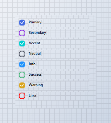
A themeable, better-looking checkbox for WinForms, inspired by iCheck, with per-state color control.
::: callout tip
#### 🟣 PREMIUM
This component is only available in the Premium version of KimTools.
::: button "Get KimTools" external:https://kimtoo.net/#pricinghttps://kimtoo.net/#pricing icon:external-link
:::
== side
{ .light .snapshot} 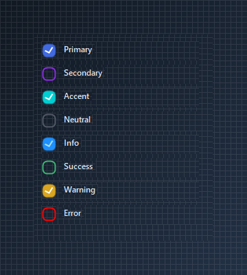{.dark .snapshot}
:::
::: callout success
#### 🟢 DESIGNER SUPPORT
**This control has full Visual Studio design-time support.**
Drag it from the Toolbox onto your form, customize its properties directly in the Properties window, and KimTools will generate the corresponding code for you.
:::
| ::: tag "ColorScheme" icon:wrench | ::: tag "Kt-Color" color:#820BF4 icon:corner-down-right url:/utilities/kt-color | *Sets the Color scheme.* |
| -------- | ------- | ----------- |
::: hero layout:split glow:true
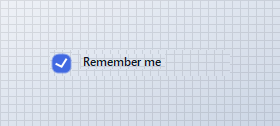
## Anchoring a `Label`
`KtCheckBox` aligns relative to external `Label` controls when positioned inside the same parent container.
```csharp "🔴 🟡 🟢"
var row = new Panel
{
Width = 180,
Height = 26,
BackColor = Color.Transparent
};
var checkbox = new KtCheckBox
{
Size = new Size(22, 22),
ColorScheme = KtColor.PRIMARY
};
var label = new Label
{
Text = "Remember me",
AutoSize = true,
Cursor = Cursors.Hand
};
label.Click += (s, e) => checkbox.Checked = !checkbox.Checked;
// Add to container first
row.Controls.Add(checkbox);
row.Controls.Add(label);
// Configure positions after adding to container
checkbox.Location = new Point(0, 2);
label.Location = new Point(checkbox.Right + 8, 4);
```
== side
::: tabs
== tab "Auto" icon:app-window
{ .light .snapshot} 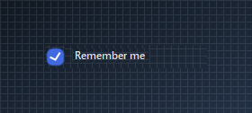{.dark .snapshot}
== tab "Light" icon:sun
{ .snapshot}
== tab "Dark" icon:moon
{ .snapshot}
:::
:::
::: hero layout:split glow:true
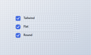
## `Style`
Switch between `Tailwind`, `Flat`, and `Round` presets. `Round` pairs well with a higher `BorderRadius` for a fully pill-shaped box.
```csharp "🔴 🟡 🟢"
var tailwindPanel = new Panel
{
Width = 230,
Height = 28,
Location = new Point(10, 10),
BackColor = Color.Transparent
};
var tailwind = new KtCheckBox
{
Size = new Size(22, 22),
BorderRadius = 6,
Checked = true
};
var tailwindLabel = new Label
{
Text = "Tailwind",
AutoSize = true
};
tailwindPanel.Controls.Add(tailwind);
tailwindPanel.Controls.Add(tailwindLabel);
tailwind.Location = new Point(0, 2);
tailwindLabel.Location = new Point(tailwind.Right + 8, 4);
var flatPanel = new Panel
{
Width = 230,
Height = 28,
Location = new Point(10, 44),
BackColor = Color.Transparent
};
var flat = new KtCheckBox
{
Size = new Size(22, 22),
BorderRadius = 0,
Checked = true
};
var flatLabel = new Label
{
Text = "Flat",
AutoSize = true
};
flatPanel.Controls.Add(flat);
flatPanel.Controls.Add(flatLabel);
flat.Location = new Point(0, 2);
flatLabel.Location = new Point(flat.Right + 8, 4);
var roundPanel = new Panel
{
Width = 230,
Height = 28,
Location = new Point(10, 78),
BackColor = Color.Transparent
};
var round = new KtCheckBox
{
Size = new Size(22, 22),
BorderRadius = 10,
Checked = true
};
var roundLabel = new Label
{
Text = "Round",
AutoSize = true
};
roundPanel.Controls.Add(round);
roundPanel.Controls.Add(roundLabel);
round.Location = new Point(0, 2);
roundLabel.Location = new Point(round.Right + 8, 4);
container.Controls.Add(tailwindPanel);
container.Controls.Add(flatPanel);
container.Controls.Add(roundPanel);
```
== side
::: tabs
== tab "Auto" icon:app-window
{ .light .snapshot} 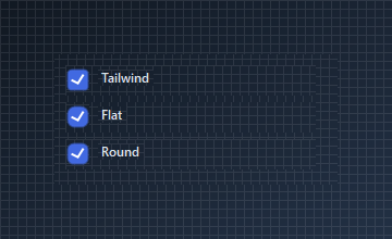{.dark .snapshot}
== tab "Light" icon:sun
{ .snapshot}
== tab "Dark" icon:moon
{ .snapshot}
:::
:::
::: hero layout:split glow:true
## `ThreeState` + `CheckState`
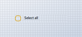
Set `ThreeState` to `true` and use `Indeterminate` for parent checkboxes whose children are only partially selected.
```csharp "🔴 🟡 🟢"
var row = new Panel
{
Width = 180,
Height = 28,
BackColor = Color.Transparent
};
var checkbox = new KtCheckBox
{
Size = new Size(22, 22),
ColorScheme = KtColor.WARNING,
ThreeState = true,
CheckState = KtCheckBox.CheckStates.Indeterminate
};
var label = new Label
{
Text = "Select all",
AutoSize = true
};
// Add to container first
row.Controls.Add(checkbox);
row.Controls.Add(label);
// Set coordinates after adding to container
checkbox.Location = new Point(0, 2);
label.Location = new Point(checkbox.Right + 8, 4);
```
== side
::: tabs
== tab "Auto" icon:app-window
{ .light .snapshot} 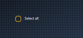{.dark .snapshot}
== tab "Light" icon:sun
{ .snapshot}
== tab "Dark" icon:moon
{ .snapshot}
:::
:::
::: hero layout:split glow:true
## Custom `OnCheck` / `OnUncheck` colors
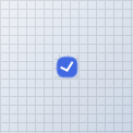
For finer control than `ColorScheme` provides, configure `BorderColor`, `CheckBoxColor`, and `CheckmarkColor` directly on `OnCheck` and `OnUncheck`.
```csharp "🔴 🟡 🟢"
var checkbox = new KtCheckBox
{
Size = new Size(22, 22),
Checked = true
};
checkbox.OnCheck.CheckBoxColor = KtColor.SUCCESS;
checkbox.OnCheck.BorderColor = KtColor.SUCCESS;
checkbox.OnCheck.CheckmarkColor = Color.White;
checkbox.OnUncheck.BorderColor = KtColor.NEUTRAL % 60;
```
== side
::: tabs
== tab "Auto" icon:app-window
{ .light .snapshot} {.dark .snapshot}
== tab "Light" icon:sun
{ .snapshot}
== tab "Dark" icon:moon
{ .snapshot}
:::
:::
::: hero layout:split glow:true
## Checklist
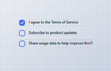
Pair `KtCheckBox` with labels inside simple `Panel` containers to create a vertical checklist.
```csharp "🔴 🟡 🟢"
var terms = new Panel
{
Width = 240,
Height = 28,
Location = new Point(10, 10),
BackColor = Color.Transparent
};
var termsCheckbox = new KtCheckBox
{
Size = new Size(22, 22),
ColorScheme = KtColor.PRIMARY,
Checked = true
};
var termsLabel = new Label
{
Text = "I agree to the Terms of Service",
AutoSize = true
};
terms.Controls.Add(termsCheckbox);
terms.Controls.Add(termsLabel);
termsCheckbox.Location = new Point(0, 2);
termsLabel.Location = new Point(termsCheckbox.Right + 8, 4);
var updates = new Panel
{
Width = 240,
Height = 28,
Location = new Point(10, 44),
BackColor = Color.Transparent
};
var updatesCheckbox = new KtCheckBox
{
Size = new Size(22, 22),
ColorScheme = KtColor.PRIMARY,
Checked = false
};
var updatesLabel = new Label
{
Text = "Subscribe to product updates",
AutoSize = true
};
updates.Controls.Add(updatesCheckbox);
updates.Controls.Add(updatesLabel);
updatesCheckbox.Location = new Point(0, 2);
updatesLabel.Location = new Point(updatesCheckbox.Right + 8, 4);
var usage = new Panel
{
Width = 240,
Height = 28,
Location = new Point(10, 78),
BackColor = Color.Transparent
};
var usageCheckbox = new KtCheckBox
{
Size = new Size(22, 22),
ColorScheme = KtColor.PRIMARY,
Checked = false
};
var usageLabel = new Label
{
Text = "Share usage data to help improve KimTools",
AutoSize = true
};
usage.Controls.Add(usageCheckbox);
usage.Controls.Add(usageLabel);
usageCheckbox.Location = new Point(0, 2);
usageLabel.Location = new Point(usageCheckbox.Right + 8, 4);
container.Controls.Add(terms);
container.Controls.Add(updates);
container.Controls.Add(usage);
```
== side
::: tabs
== tab "Auto" icon:app-window
{ .light .snapshot} 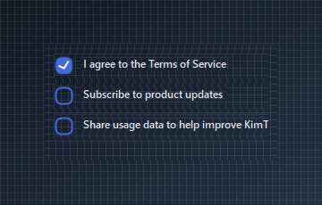{.dark .snapshot}
== tab "Light" icon:sun
{ .snapshot}
== tab "Dark" icon:moon
{ .snapshot}
:::
:::
## API `Reference`
| | | |
| -------- | ------- | ----------- |
| ::: tag "LabelPosition" icon:wrench | ::: tag "BindingControlPositions" color:#6B7C94 icon:check-check | *Gets or sets the position of the bound control in relation to the CheckBox.* |
| ::: tag "Style" icon:wrench | ::: tag "CheckBoxStyles" color:#6B7C94 icon:check-check | *[Deprecated] Gets or sets the standard CheckBox style to be applied.* |
| ::: tag "ColorScheme" icon:wrench | ::: tag "Kt-Color" color:#820BF4 icon:corner-down-right url:/utilities/kt-color | *Sets the Color scheme.* |
| ::: tag "Checked" icon:wrench | ::: tag "Boolean" color:#0B64F4 icon:external-link url:external:https://learn.microsoft.com/en-us/dotnet/api/system.boolean?view=netframework-4.8 | *Sets the CheckBox check-state to true or false.* |
| ::: tag "AnimateCheckMark" icon:wrench | ::: tag "Boolean" color:#0B64F4 icon:external-link url:external:https://learn.microsoft.com/en-us/dotnet/api/system.boolean?view=netframework-4.8 | *Indicates whether the Checkmark will allow check-state-change animations/transitions at runtime.* |
| ::: tag "AnimateCheckBox" icon:wrench | ::: tag "Boolean" color:#0B64F4 icon:external-link url:external:https://learn.microsoft.com/en-us/dotnet/api/system.boolean?view=netframework-4.8 | *Indicates whether the CheckBox will allow standard animations at runtime.* |
| ::: tag "AllowBindingControlLocation" icon:wrench | ::: tag "Boolean" color:#0B64F4 icon:external-link url:external:https://learn.microsoft.com/en-us/dotnet/api/system.boolean?view=netframework-4.8 | *Indicates whether the CheckBox will allow the bound control's location to be positioned based on it's own location.* |
| ::: tag "ToolTip" icon:wrench | ::: tag "String" color:#0B64F4 icon:external-link url:external:https://learn.microsoft.com/en-us/dotnet/api/system.string?view=netframework-4.8 | *Allows you to easily set some ToolTip information to be displayed to the user on mouse-hovering over the control.* |
| ::: tag "Cursor" icon:wrench | ::: tag "Cursor" color:#0B64F4 icon:external-link url:external:https://learn.microsoft.com/en-us/dotnet/api/system.windows.forms.cursor?view=netframework-4.8 | *The cursor that appears when the pointer moves over the control.* |
| ::: tag "Label" icon:wrench | ::: tag "Label" color:#0B64F4 icon:external-link url:external:https://learn.microsoft.com/en-us/dotnet/api/system.windows.forms.label?view=netframework-4.8 | *Gets or sets the control to bind directly with the CheckBox; this in most cases is a Label. This setting also binds the most appropriate events of the CheckBox to the control selected.* |
---
## [KimTools / Controls / CheckButton](https://kimtoo.net/controls/kt-check-button/)
---
title: "KimTools / Controls / CheckButton"
description: "A themeable multi-select toggle control for WinForms, with independent Checked/Unchecked styling for background, border and icon."
keywords: ["KimTools", "Controls", "KtCheckButton", "CheckButton", "CheckBox"]
toc: false
layout: "full"
---
::: hero layout:split glow:true
# Kt `CheckButton`
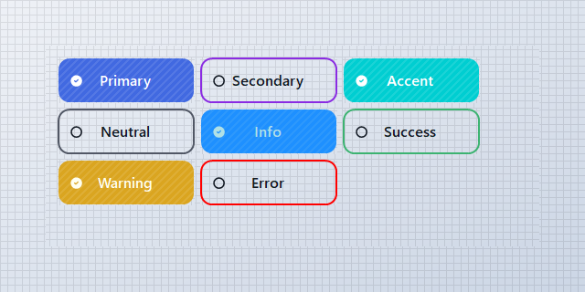
A themeable multi-select toggle control for WinForms, with independent Checked/Unchecked styling for background, border and icon.
::: callout tip
#### 🟣 PREMIUM
This component is only available in the Premium version of KimTools.
::: button "Get KimTools" external:https://kimtoo.net/#pricinghttps://kimtoo.net/#pricing icon:external-link
:::
== side
{ .light .snapshot} 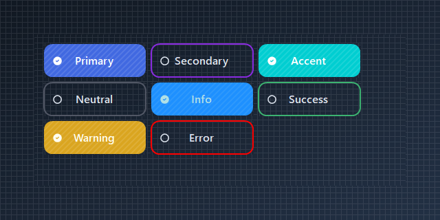{.dark .snapshot}
:::
::: callout success
#### 🟢 DESIGNER SUPPORT
**This control has full Visual Studio design-time support.**
Drag it from the Toolbox onto your form, customize its properties directly in the Properties window, and KimTools will generate the corresponding code for you.
:::
# Background
| ::: tag "Background" icon:wrench | ::: tag "Kt-Brush" color:#820BF4 icon:corner-down-right url:/utilities/kt-brush | *Sets the Background.* |
| -------- | ------- | ----------- |
# Border
| ::: tag "Border" icon:wrench | ::: tag "Kt-Brush" color:#820BF4 icon:corner-down-right url:/utilities/kt-brush | *Sets the panel's border color.* |
| -------- | ------- | ----------- |
# Icon
| ::: tag "Icon" icon:wrench | ::: tag "String" color:#0B64F4 icon:external-link url:external:https://learn.microsoft.com/en-us/dotnet/api/system.string?view=netframework-4.8 | *Sets the Icon.* |
| -------- | ------- | ----------- |
::: hero layout:split glow:true
## Default `Checked` / `Unchecked` states
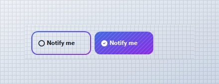
`Border` defaults to a `Primary`/`Secondary` gradient outline; `Background_Checked` fills that same gradient solid once `Checked` is `true`. `Icon` swaps from an outline circle to a filled check automatically.
```csharp "🔴 🟡 🟢"
// using KimTools.WinForms;
// Out of the box, KtCheckButton is a gradient-outlined toggle that
// fills solid on Checked, no configuration required.
var unchecked_ = new KtCheckButton { Text = "Notify me", Checked = false };
var checked_ = new KtCheckButton { Text = "Notify me", Checked = true };
```
== side
::: tabs
== tab "Auto" icon:app-window
{ .light .snapshot} 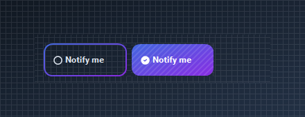{.dark .snapshot}
== tab "Light" icon:sun
{ .snapshot}
== tab "Dark" icon:moon
{ .snapshot}
:::
:::
::: hero layout:split glow:true
## Solid `Background_Checked`
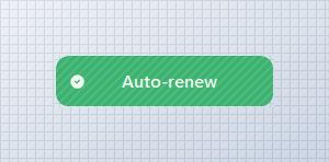
Style the checked state independently of the unchecked state with a solid `Kt-Color` instead of the default gradient.
```csharp "🔴 🟡 🟢"
// using KimTools.WinForms;
var check = new KtCheckButton();
check.Text = " Auto-renew";
check.Width = 200;
// Clear the default gradient border and give Checked its own solid fill
check.Border = KtBrush.None;
check.Background_Checked = KtColor.SUCCESS;
check.Checked = true;
```
== side
::: tabs
== tab "Auto" icon:app-window
{ .light .snapshot} 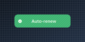{.dark .snapshot}
== tab "Light" icon:sun
{ .snapshot}
== tab "Dark" icon:moon
{ .snapshot}
:::
:::
::: hero layout:split glow:true
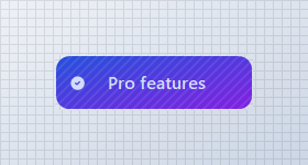
## Gradient `Background_Checked`
Use semantic theme colors so the checked fill tracks the current global theme.
```csharp "🔴 🟡 🟢"
// using KimTools.WinForms;
var check = new KtCheckButton();
check.Text = " Pro features";
check.Width = 200;
check.Size = new Size(180, 50);
// Background_Checked supports Kt-Color gradients with an optional angle
check.Background_Checked =
(
startColor: KtColor.PRIMARY[50],
stopColor: KtColor.SECONDARY[50],
angle: 45 // optional (0-360)
);
check.Checked = true;
```
== side
::: tabs
== tab "Auto" icon:app-window
{ .light .snapshot} {.dark .snapshot}
== tab "Light" icon:sun
{ .snapshot}
== tab "Dark" icon:moon
{ .snapshot}
:::
:::
::: hero layout:split glow:true
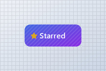
## `Icon` + `Icon_Checked`
Pair an unchecked and checked icon, and tint the checked icon independently with `IconColor_Checked`.
```csharp "🔴 🟡 🟢"
// using KimTools.WinForms;
var check = new KtCheckButton();
check.Text = "Starred";
// Icon / Icon_Checked accept Tabler icon names independently
check.Icon = "Tabler.outline.star";
check.Icon_Checked = "Tabler.solid.star_filled";
check.IconColor_Checked = KtColor.WARNING;
check.Checked = true;
```
== side
::: tabs
== tab "Auto" icon:app-window
{ .light .snapshot} 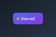{.dark .snapshot}
== tab "Light" icon:sun
{ .snapshot}
== tab "Dark" icon:moon
{ .snapshot}
:::
:::
::: hero layout:split glow:true
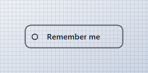
## Outlined `Border` / `Border_Checked`
Clear both backgrounds and give `Border_Checked` its own color for a ghost toggle that only changes outline color on check.
```csharp "🔴 🟡 🟢"
// using KimTools.WinForms;
var check = new KtCheckButton();
check.Text = "Remember me";
check.TextAlign = ContentAlignment.MiddleCenter;
check.Width = 200;
// Keep both states as outlines, no fill in either
check.Background = KtBrush.None;
check.Background_Checked = KtBrush.None;
check.Border = KtColor.NEUTRAL;
check.Border_Checked = KtColor.PRIMARY;
check.BorderWidth = 2f;
```
== side
::: tabs
== tab "Auto" icon:app-window
{ .light .snapshot} 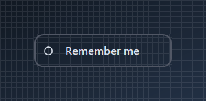{.dark .snapshot}
== tab "Light" icon:sun
{ .snapshot}
== tab "Dark" icon:moon
{ .snapshot}
:::
:::
::: hero layout:split glow:true
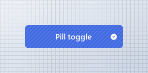
## Border `Radius`
Set `BorderRadius` from `0` (square) to `.99f` (pill) or >1 (int) for actual pixels.
```csharp "🔴 🟡 🟢"
// using KimTools.WinForms;
var check = new KtCheckButton();
check.Text = "Pill toggle";
check.Width = 200;
check.ImageAlign = ContentAlignment.MiddleRight;
check.Background_Checked = KtColor.PRIMARY;
// BorderRadius runs 0 (square) .. .99f (fully pill-shaped)
check.BorderRadius = .99f;
check.BorderRadius = 5f; // Actual pixels
check.Checked = true;
```
== side
::: tabs
== tab "Auto" icon:app-window
{ .light .snapshot} 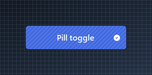{.dark .snapshot}
== tab "Light" icon:sun
{ .snapshot}
== tab "Dark" icon:moon
{ .snapshot}
:::
:::
::: hero layout:split glow:true
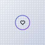
## Rounded `Icon` `CheckButton`
Drop the label, center the icon and pair `Icon` / `Icon_Checked` for a favorite-style toggle.
```csharp "🔴 🟡 🟢"
// using KimTools.WinForms;
var check = new KtCheckButton();
check.Text = string.Empty;
check.ImageAlign = ContentAlignment.MiddleCenter;
check.Size = new Size(50, 50);
check.Padding = Padding.Empty;
check.BorderRadius = .99f;
// Icon / Icon_Checked accept a Tabler icon name; IconSize / IconStroke tune rendering
check.Icon = "heart";
check.Icon_Checked = "heart-filled";
check.IconColor_Checked = KtColor.ERROR;
check.IconSize = 20;
check.IconStroke = 2.5;
```
== side
::: tabs
== tab "Auto" icon:app-window
{ .light .snapshot} 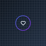{.dark .snapshot}
== tab "Light" icon:sun
{ .snapshot}
== tab "Dark" icon:moon
{ .snapshot}
:::
:::
::: hero layout:split glow:true
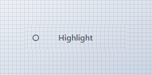
## `Foreground` + `Foreground_Checked`
Override the label color for each state independently of the current theme.
```csharp "🔴 🟡 🟢"
// using KimTools.WinForms;
var check = new KtCheckButton();
check.Text = "Highlight";
check.Width = 200;
check.TextAlign = ContentAlignment.MiddleCenter;
check.Background = KtBrush.None;
check.Background_Checked = KtBrush.None;
check.Border = KtBrush.None;
// Foreground / Foreground_Checked override label color independently of Background
check.Foreground = KtColor.NEUTRAL;
check.Foreground_Checked = KtColor.PRIMARY;
```
== side
::: tabs
== tab "Auto" icon:app-window
{ .light .snapshot} 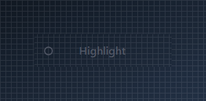{.dark .snapshot}
== tab "Light" icon:sun
{ .snapshot}
== tab "Dark" icon:moon
{ .snapshot}
:::
:::
::: hero layout:split glow:true
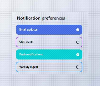
## Multi-select `Panel`
`KtCheckButton` has no built-in grouping, so any number of them can be checked at once inside a `Panel`, `FlowLayoutPanel`, or `TableLayoutPanel` - ideal for settings and permission lists.
```csharp "🔴 🟡 🟢"
// using KimTools.WinForms;
// Each KtCheckButton toggles independently, no group container required
// for multiselect behavior - just stack them in any panel or layout.
var email = new KtCheckButton { Text = "Email updates", Checked = true };
var sms = new KtCheckButton { Text = "SMS alerts", Checked = false };
var push = new KtCheckButton { Text = "Push notifications", Checked = true };
```
== side
::: tabs
== tab "Auto" icon:app-window
{ .light .snapshot} 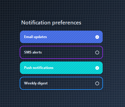{.dark .snapshot}
== tab "Light" icon:sun
{ .snapshot}
== tab "Dark" icon:moon
{ .snapshot}
:::
:::
::: hero layout:split glow:true
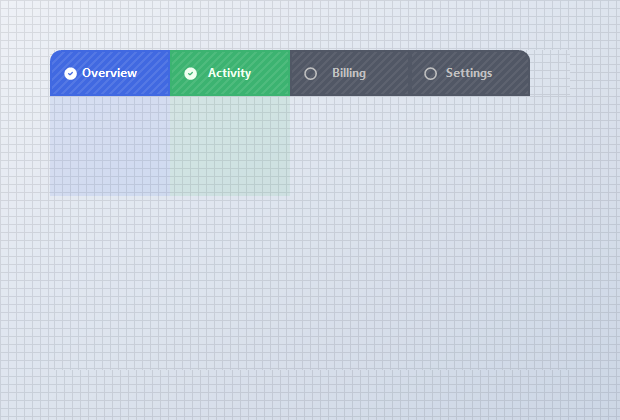
## Multi-select `Tabbed Pages` with `BorderEdges`
Toggle `BorderEdges` per state so a checked tab drops its bottom border and fuses with the pane beneath it, while unchecked tabs fall back to a quiet bottom underline. Since `KtCheckButton` isn't grouped, more than one tab - and its page - can stay active at the same time.
```csharp "🔴 🟡 🟢"
// using KimTools.WinForms;
var overview = new KtCheckButton { Text = "Overview", Checked = true };
overview.Border = KtColor.PRIMARY;
overview.Background_Checked = KtColor.PRIMARY;
overview.BorderRadius = 10f;
// A checked tab draws only its top/left/right edge and fuses with
// the pane below it;
overview.BorderEdges.TopLeft
= overview.BorderEdges.TopRight
= overview.BorderEdges.BottomLeft = true;
overview.BorderEdges.BottomRight = false;
```
== side
::: tabs
== tab "Auto" icon:app-window
{ .light .snapshot} 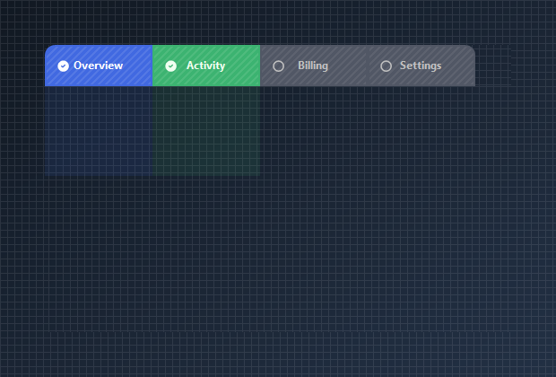{.dark .snapshot}
== tab "Light" icon:sun
{ .snapshot}
== tab "Dark" icon:moon
{ .snapshot}
:::
:::
## API `Reference`
| | | |
| -------- | ------- | ----------- |
| ::: tag "Background" icon:wrench | ::: tag "Kt-Brush" color:#820BF4 icon:corner-down-right url:/utilities/kt-brush | *Sets the Background.* |
| ::: tag "Background_Checked" icon:wrench | ::: tag "Kt-Brush" color:#820BF4 icon:corner-down-right url:/utilities/kt-brush | *Sets the Background Checked.* |
| ::: tag "Border" icon:wrench | ::: tag "Kt-Brush" color:#820BF4 icon:corner-down-right url:/utilities/kt-brush | *Sets the panel's border color.* |
| ::: tag "Border_Checked" icon:wrench | ::: tag "Kt-Brush" color:#820BF4 icon:corner-down-right url:/utilities/kt-brush | *Sets the panel's border color.* |
| ::: tag "BorderEdges" icon:wrench | ::: tag "Edges" color:#6B7C94 icon:check-check | *Sets the Border edges.* |
| ::: tag "Foreground" icon:wrench | ::: tag "Kt-Color" color:#820BF4 icon:corner-down-right url:/utilities/kt-color | *Sets the Foreground.* |
| ::: tag "Foreground_Checked" icon:wrench | ::: tag "Kt-Color" color:#820BF4 icon:corner-down-right url:/utilities/kt-color | *Sets the Foreground Checked.* |
| ::: tag "IconColor" icon:wrench | ::: tag "Kt-Color" color:#820BF4 icon:corner-down-right url:/utilities/kt-color | *Sets the Icon color.* |
| ::: tag "IconColor_Checked" icon:wrench | ::: tag "Kt-Color" color:#820BF4 icon:corner-down-right url:/utilities/kt-color | *Sets the IconColor Checked.* |
| ::: tag "Pattern" icon:wrench | ::: tag "Kt-Pattern" color:#6B7C94 icon:check-check | *Sets the Pattern.* |
| ::: tag "IconStroke" icon:wrench | ::: tag "Double" color:#0B64F4 icon:external-link url:external:https://learn.microsoft.com/en-us/dotnet/api/system.double?view=netframework-4.8 | *Sets the Icon stroke.* |
| ::: tag "ImageAlign" icon:wrench | ::: tag "ContentAlignment" color:#0B64F4 icon:external-link url:external:https://learn.microsoft.com/en-us/dotnet/api/system.drawing.contentalignment?view=netframework-4.8 | *The alignment of the image that will be displayed on the control.* |
| ::: tag "TextAlign" icon:wrench | ::: tag "ContentAlignment" color:#0B64F4 icon:external-link url:external:https://learn.microsoft.com/en-us/dotnet/api/system.drawing.contentalignment?view=netframework-4.8 | *The alignment of the text that will be displayed on the control.* |
| ::: tag "BorderStyle" icon:wrench | ::: tag "DashStyle" color:#0B64F4 icon:external-link url:external:https://learn.microsoft.com/en-us/dotnet/api/system.drawing.drawing2d.dashstyle?view=netframework-4.8 | *Sets the panel's border style.* |
| ::: tag "BorderStyle_Checked" icon:wrench | ::: tag "DashStyle" color:#0B64F4 icon:external-link url:external:https://learn.microsoft.com/en-us/dotnet/api/system.drawing.drawing2d.dashstyle?view=netframework-4.8 | *Sets the BorderStyle Checked.* |
| ::: tag "IconSize" icon:wrench | ::: tag "Int32" color:#0B64F4 icon:external-link url:external:https://learn.microsoft.com/en-us/dotnet/api/system.int32?view=netframework-4.8 | *Sets the Icon size.* |
| ::: tag "BorderRadius" icon:wrench | ::: tag "float" color:#0B64F4 icon:external-link url:external:https://learn.microsoft.com/en-us/dotnet/api/system.single?view=netframework-4.8 ::: tag "Nullable" color:#F96A06 icon:circle-alert url:external:https://learn.microsoft.com/en-us/dotnet/csharp/language-reference/builtin-types/nullable-value-types | *Sets the Border radius.* |
| ::: tag "BorderWidth" icon:wrench | ::: tag "float" color:#0B64F4 icon:external-link url:external:https://learn.microsoft.com/en-us/dotnet/api/system.single?view=netframework-4.8 | *Sets the Border width.* |
| ::: tag "Icon" icon:wrench | ::: tag "String" color:#0B64F4 icon:external-link url:external:https://learn.microsoft.com/en-us/dotnet/api/system.string?view=netframework-4.8 | *Sets the Icon.* |
| ::: tag "Icon_Checked" icon:wrench | ::: tag "String" color:#0B64F4 icon:external-link url:external:https://learn.microsoft.com/en-us/dotnet/api/system.string?view=netframework-4.8 | *Sets the Icon Checked.* |
| ::: tag "Value" icon:wrench | ::: tag "String" color:#0B64F4 icon:external-link url:external:https://learn.microsoft.com/en-us/dotnet/api/system.string?view=netframework-4.8 | *Sets the Value.* |
| ::: tag "Cursor" icon:wrench | ::: tag "Cursor" color:#0B64F4 icon:external-link url:external:https://learn.microsoft.com/en-us/dotnet/api/system.windows.forms.cursor?view=netframework-4.8 | *The cursor that appears when the pointer moves over the control.* |
| ::: tag "Padding" icon:wrench | ::: tag "Padding" color:#0B64F4 icon:external-link url:external:https://learn.microsoft.com/en-us/dotnet/api/system.windows.forms.padding?view=netframework-4.8 | *Specifies the interior spacing of a control.* |
| ::: tag "BorderMargin" icon:wrench | ::: tag "Padding" color:#0B64F4 icon:external-link url:external:https://learn.microsoft.com/en-us/dotnet/api/system.windows.forms.padding?view=netframework-4.8 | *Sets the border Margin.* |
---
## [KimTools / Controls / Date](https://kimtoo.net/controls/kt-date/)
---
title: "KimTools / Controls / Date"
description: "A modern, highly customizable Date Picker control for WinForms supporting custom icons, border radius, theme color styling, and alignment modes."
keywords: ["KimTools", "Controls", "KtDate", "Date", "DateTimePicker"]
toc: false
layout: "full"
---
::: hero layout:split glow:true
# Kt `Date`
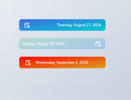
A modern, highly customizable Date Picker control for WinForms supporting custom icons, border radius, theme color styling, and alignment modes.
::: callout tip
#### 🟣 PREMIUM
This component is only available in the Premium version of KimTools.
::: button "Get KimTools" external:https://kimtoo.net/#pricinghttps://kimtoo.net/#pricing icon:external-link
:::
== side
{ .light .snapshot} 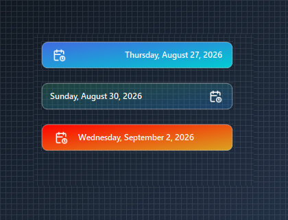{.dark .snapshot}
:::
::: callout success
#### 🟢 DESIGNER SUPPORT
**This control has full Visual Studio design-time support.**
Drag it from the Toolbox onto your form, customize its properties directly in the Properties window, and KimTools will generate the corresponding code for you.
:::
::: hero layout:split glow:true
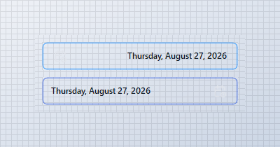
## Icon & Text Alignment
Configure `IconAlign` to place the calendar icon on the left or right side of the picker while automatically syncing text alignment.
```csharp "🔴 🟡 🟢"
var panel = new Panel
{
Width = 300,
Height = 110,
BackColor = Color.Transparent
};
var dateLeft = new KtDate
{
Width = 280,
Height = 40,
IconAlign = HorizontalAlignment.Left,
Border = KtColor.INFO,
BorderRadius = 6f
};
var dateRight = new KtDate
{
Width = 280,
Height = 40,
IconAlign = HorizontalAlignment.Right,
Border = KtColor.PRIMARY,
BorderRadius = 6f
};
panel.Controls.Add(dateLeft);
panel.Controls.Add(dateRight);
dateLeft.Location = new Point(10, 10);
dateRight.Location = new Point(10, 60);
```
== side
::: tabs
== tab "Auto" icon:app-window
{ .light .snapshot} 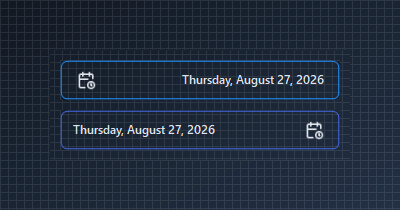{.dark .snapshot}
== tab "Light" icon:sun
{ .snapshot}
== tab "Dark" icon:moon
{ .snapshot}
:::
:::
::: hero layout:split glow:true
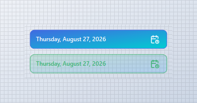
## Gradient Backgrounds (`KtBrush` Expressions)
Leverage implicit tuple conversions `(start, stop, angle)` and `KtColor` opacity modifiers (`%`) to easily assign smooth linear gradients and subtle background surfaces.
```csharp "🔴 🟡 🟢"
var panel = new Panel
{
Width = 300,
Height = 110,
BackColor = Color.Transparent
};
// Linear Gradient Background created using a 3-tuple (StartColor, StopColor, Angle)
var tupleGradientPicker = new KtDate
{
Width = 280,
Height = 40,
Border = KtColor.PRIMARY,
BorderRadius = 8f,
TextColor = KtColor.White,
IconColor = KtColor.White,
Background = (KtColor.PRIMARY, KtColor.ACCENT, 45) // Implicit 3-tuple conversion
};
// Glassmorphic/Semi-Transparent Gradient with KtColor Opacity Modifiers (%)
var subtleGradientPicker = new KtDate
{
Width = 280,
Height = 40,
Border = KtColor.SUCCESS,
BorderRadius = 8f,
TextColor = KtColor.SUCCESS,
IconColor = KtColor.SUCCESS,
Background = (KtColor.SUCCESS % 20, KtColor.INFO % 20) // Implicit 2-tuple conversion
};
panel.Controls.Add(tupleGradientPicker);
panel.Controls.Add(subtleGradientPicker);
tupleGradientPicker.Location = new Point(10, 10);
subtleGradientPicker.Location = new Point(10, 60);
```
== side
::: tabs
== tab "Auto" icon:app-window
{ .light .snapshot} 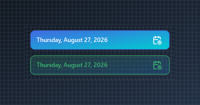{.dark .snapshot}
== tab "Light" icon:sun
{ .snapshot}
== tab "Dark" icon:moon
{ .snapshot}
:::
:::
::: hero layout:split glow:true
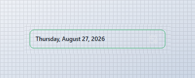
## Display Week Numbers
Enable `DisplayWeekNumbers = true` to inject week numbers into the drop-down calendar view.
```csharp "🔴 🟡 🟢"
var panel = new Panel
{
Width = 300,
Height = 60,
BackColor = Color.Transparent
};
var datePicker = new KtDate
{
Width = 280,
Height = 40,
DisplayWeekNumbers = true,
Border = KtColor.SUCCESS,
BorderRadius = 8f
};
panel.Controls.Add(datePicker);
datePicker.Location = new Point(10, 10);
```
== side
::: tabs
== tab "Auto" icon:app-window
{ .light .snapshot} 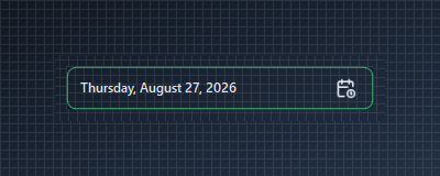{.dark .snapshot}
== tab "Light" icon:sun
{ .snapshot}
== tab "Dark" icon:moon
{ .snapshot}
:::
:::
## API `Reference`
| | | |
| -------- | ------- | ----------- |
| ::: tag "Background" icon:wrench | ::: tag "Kt-Brush" color:#820BF4 icon:corner-down-right url:/utilities/kt-brush | *Sets the indicator icon.* |
| ::: tag "Border" icon:wrench | ::: tag "Kt-Color" color:#820BF4 icon:corner-down-right url:/utilities/kt-color | *Sets the border/background color.* |
| ::: tag "IconColor" icon:wrench | ::: tag "Kt-Color" color:#820BF4 icon:corner-down-right url:/utilities/kt-color | *Sets the date picker icon color.* |
| ::: tag "TextColor" icon:wrench | ::: tag "Kt-Color" color:#820BF4 icon:corner-down-right url:/utilities/kt-color | *Sets the foreground color.* |
| ::: tag "DisplayWeekNumbers" icon:wrench | ::: tag "Boolean" color:#0B64F4 icon:external-link url:external:https://learn.microsoft.com/en-us/dotnet/api/system.boolean?view=netframework-4.8 | *Sets a value indicating whether the week numbers will be displayed.* |
| ::: tag "Icon" icon:wrench | ::: tag "Image" color:#0B64F4 icon:external-link url:external:https://learn.microsoft.com/en-us/dotnet/api/system.drawing.image?view=netframework-4.8 | *Sets the date picker icon.* |
| ::: tag "Height" icon:wrench | ::: tag "Int32" color:#0B64F4 icon:external-link url:external:https://learn.microsoft.com/en-us/dotnet/api/system.int32?view=netframework-4.8 | *Sets minimum height of the date picker.* |
| ::: tag "TextMargin" icon:wrench | ::: tag "Int32" color:#0B64F4 icon:external-link url:external:https://learn.microsoft.com/en-us/dotnet/api/system.int32?view=netframework-4.8 | *Sets the left text margin.* |
| ::: tag "BorderRadius" icon:wrench | ::: tag "float" color:#0B64F4 icon:external-link url:external:https://learn.microsoft.com/en-us/dotnet/api/system.single?view=netframework-4.8 ::: tag "Nullable" color:#F96A06 icon:circle-alert url:external:https://learn.microsoft.com/en-us/dotnet/csharp/language-reference/builtin-types/nullable-value-types | *Sets the border radius.* |
| ::: tag "BorderWidth" icon:wrench | ::: tag "float" color:#0B64F4 icon:external-link url:external:https://learn.microsoft.com/en-us/dotnet/api/system.single?view=netframework-4.8 | *Sets the border thickness.* |
| ::: tag "IconAlign" icon:wrench | ::: tag "HorizontalAlignment" color:#0B64F4 icon:external-link url:external:https://learn.microsoft.com/en-us/dotnet/api/system.windows.forms.horizontalalignment?view=netframework-4.8 | *Sets the indicator location.* |
---
## [KimTools / Controls / Divider](https://kimtoo.net/controls/kt-divider/)
---
title: "KimTools / Controls / Divider"
description: "A visual separator control for Modern WinForms providing styled divider lines, customizable orientations, dash caps, and gradient edge fading."
keywords: ["KimTools", "Controls", "KtDivider", "Divider", "UserControl"]
toc: false
layout: "full"
---
::: hero layout:split glow:true
# Kt `Divider`
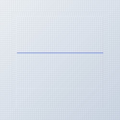
A visual separator control for Modern WinForms providing styled divider lines, customizable orientations, dash caps, and gradient edge fading.
::: callout tip
#### 🟣 PREMIUM
This component is only available in the Premium version of KimTools.
::: button "Get KimTools" external:https://kimtoo.net/#pricinghttps://kimtoo.net/#pricing icon:external-link
:::
== side
{ .light .snapshot} 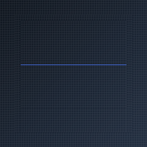{.dark .snapshot}
:::
::: callout success
#### 🟢 DESIGNER SUPPORT
**This control has full Visual Studio design-time support.**
Drag it from the Toolbox onto your form, customize its properties directly in the Properties window, and KimTools will generate the corresponding code for you.
:::
## Visual Layout Separators
Use `KtDivider` to establish clear visual hierarchy and organize controls into distinct sections.
::: steps
1. **Add Divider Control**
Drag a `KtDivider` from the toolbox onto your form or panel.
2. **Set Line Orientation**
Choose `Horizontal` for top/bottom content split or `Vertical` for inline column separations.
3. **Configure Style & Cap**
Select a `LineStyle` (`Solid`, `Dash`, `DoubleEdgeFaded`, etc.) and optional `DashCap` rounding.
4. **Apply Theme Color**
Assign a dynamic `KtColor` scheme (such as `KtColor.PRIMARY` or `KtColor.BASE_3`) to maintain consistent application themes.
:::
```csharp "🔴 🟡 🟢"
// 1. Solid Line - Primary Color
var dividerPrimary = new KtDivider
{
Height = 30,
Dock = DockStyle.Top,
Orientation = KtDivider.LineOrientation.Horizontal,
LineStyle = KtDivider.LineStyles.Solid,
LineColor = KtColor.PRIMARY,
LineThickness = 2f
};
// 2. Dashed Line with Round Caps - Secondary Color
var dividerSecondary = new KtDivider
{
Height = 30,
Dock = DockStyle.Top,
Orientation = KtDivider.LineOrientation.Horizontal,
LineStyle = KtDivider.LineStyles.Dash,
DashCap = KtDivider.CapStyles.Round,
LineColor = KtColor.SECONDARY,
LineThickness = 3f
};
// 3. Double Edge Faded - Success Color
var dividerSuccess = new KtDivider
{
Height = 30,
Dock = DockStyle.Top,
Orientation = KtDivider.LineOrientation.Horizontal,
LineStyle = KtDivider.LineStyles.DoubleEdgeFaded,
LineColor = KtColor.SUCCESS,
LineThickness = 2f
};
// 4. Left Edge Faded - Warning Color
var dividerWarning = new KtDivider
{
Height = 30,
Dock = DockStyle.Top,
Orientation = KtDivider.LineOrientation.Horizontal,
LineStyle = KtDivider.LineStyles.LeftEdgeFaded,
LineColor = KtColor.WARNING,
LineThickness = 2f
};
// 5. Right Edge Faded - Danger/Error Color
var dividerDanger = new KtDivider
{
Height = 30,
Dock = DockStyle.Top,
Orientation = KtDivider.LineOrientation.Horizontal,
LineStyle = KtDivider.LineStyles.RightEdgeFaded,
LineColor = KtColor.ERROR,
LineThickness = 2f
};
```
| ::: tag "LineStyle" icon:wrench | ::: tag "LineStyles" color:#6B7C94 icon:check-check | *Sets the line's style format.* |
| -------- | ------- | ----------- |
::: hero layout:split glow:true
## Solid Line Style
Draws a standard continuous line across the divider bounds.
```csharp "🔴 🟡 🟢"
var divider = new KtDivider
{
Height = 20,
Dock = DockStyle.Top,
Orientation = KtDivider.LineOrientation.Horizontal,
LineStyle = KtDivider.LineStyles.Solid,
LineColor = KtColor.PRIMARY,
LineThickness = 2f
};
```
== side
::: tabs
== tab "Auto" icon:app-window
{ .light .snapshot} {.dark .snapshot}
== tab "Light" icon:sun
{ .snapshot}
== tab "Dark" icon:moon
{ .snapshot}
:::
:::
::: hero layout:split glow:true
## Dashed Line Style
Renders a repeating dashed line pattern. Pair with `DashCap` for rounded or angled segment ends.
```csharp "🔴 🟡 🟢"
var divider = new KtDivider
{
Height = 20,
Dock = DockStyle.Top,
Orientation = KtDivider.LineOrientation.Horizontal,
LineStyle = KtDivider.LineStyles.Dash,
DashCap = KtDivider.CapStyles.Round,
LineColor = KtColor.PRIMARY,
LineThickness = 2f
};
```
== side
::: tabs
== tab "Auto" icon:app-window
{ .light .snapshot} {.dark .snapshot}
== tab "Light" icon:sun
{ .snapshot}
== tab "Dark" icon:moon
{ .snapshot}
:::
:::
::: hero layout:split glow:true
## Dotted Line Style
Displays alternating dots and dashes using styles like `DashDot` or `DashDotDot`.
```csharp "🔴 🟡 🟢"
var divider = new KtDivider
{
Height = 20,
Dock = DockStyle.Top,
Orientation = KtDivider.LineOrientation.Horizontal,
LineStyle = KtDivider.LineStyles.DashDotDot,
DashCap = KtDivider.CapStyles.Round,
LineColor = KtColor.PRIMARY,
LineThickness = 2f
};
```
== side
::: tabs
== tab "Auto" icon:app-window
{ .light .snapshot} {.dark .snapshot}
== tab "Light" icon:sun
{ .snapshot}
== tab "Dark" icon:moon
{ .snapshot}
:::
:::
| ::: tag "DashCap" icon:wrench | ::: tag "CapStyles" color:#6B7C94 icon:check-check | *Sets the line's dash cap style.* |
| -------- | ------- | ----------- |
::: hero layout:split glow:true
## `DashCap` End Formatting
Customize line dash termination points with `CapStyles.Flat`, `CapStyles.Round`, or `CapStyles.Triangle`.
```csharp "🔴 🟡 🟢"
var divider = new KtDivider
{
Height = 20,
Dock = DockStyle.Top,
Orientation = KtDivider.LineOrientation.Horizontal,
LineStyle = KtDivider.LineStyles.Dash,
DashCap = KtDivider.CapStyles.Round,
LineColor = KtColor.PRIMARY,
LineThickness = 3f
};
```
== side
::: tabs
== tab "Auto" icon:app-window
{ .light .snapshot} {.dark .snapshot}
== tab "Light" icon:sun
{ .snapshot}
== tab "Dark" icon:moon
{ .snapshot}
:::
:::
| ::: tag "LineColor" icon:wrench | ::: tag "Kt-Color" color:#820BF4 icon:corner-down-right url:/utilities/kt-color | *Sets the line's color.* |
| -------- | ------- | ----------- |
::: hero layout:split glow:true
## `LineColor` Customization
Assign theme colors using `KtColor` or standard `System.Drawing.Color` values.
```csharp "🔴 🟡 🟢"
var divider = new KtDivider
{
Height = 20,
Dock = DockStyle.Top,
Orientation = KtDivider.LineOrientation.Horizontal,
LineStyle = KtDivider.LineStyles.Solid,
LineColor = KtColor.SECONDARY,
LineThickness = 2f
};
```
== side
::: tabs
== tab "Auto" icon:app-window
{ .light .snapshot} {.dark .snapshot}
== tab "Light" icon:sun
{ .snapshot}
== tab "Dark" icon:moon
{ .snapshot}
:::
:::
| ::: tag "LineThickness" icon:wrench | ::: tag "float" color:#0B64F4 icon:external-link url:external:https://learn.microsoft.com/en-us/dotnet/api/system.single?view=netframework-4.8 | *Sets the line's thickness.* |
| -------- | ------- | ----------- |
::: hero layout:split glow:true
## `LineThickness` Control
Adjust stroke width in floating-point pixels to emphasize structural section separations.
```csharp "🔴 🟡 🟢"
var divider = new KtDivider
{
Height = 20,
Dock = DockStyle.Top,
Orientation = KtDivider.LineOrientation.Horizontal,
LineStyle = KtDivider.LineStyles.Solid,
LineColor = KtColor.PRIMARY,
LineThickness = 4f
};
```
== side
::: tabs
== tab "Auto" icon:app-window
{ .light .snapshot} {.dark .snapshot}
== tab "Light" icon:sun
{ .snapshot}
== tab "Dark" icon:moon
{ .snapshot}
:::
:::
::: hero layout:split glow:true
## Double Edge Faded
Fades both line ends smoothly into transparency using `LineStyles.DoubleEdgeFaded`.
```csharp "🔴 🟡 🟢"
var divider = new KtDivider
{
Height = 20,
Dock = DockStyle.Top,
Orientation = KtDivider.LineOrientation.Horizontal,
LineStyle = KtDivider.LineStyles.DoubleEdgeFaded,
LineColor = KtColor.PRIMARY,
LineThickness = 2f
};
```
== side
::: tabs
== tab "Auto" icon:app-window
{ .light .snapshot} {.dark .snapshot}
== tab "Light" icon:sun
{ .snapshot}
== tab "Dark" icon:moon
{ .snapshot}
:::
:::
::: hero layout:split glow:true
## Left Edge Faded
Transitions the line from completely transparent on the left to solid on the right.
```csharp "🔴 🟡 🟢"
var divider = new KtDivider
{
Height = 20,
Dock = DockStyle.Top,
Orientation = KtDivider.LineOrientation.Horizontal,
LineStyle = KtDivider.LineStyles.LeftEdgeFaded,
LineColor = KtColor.PRIMARY,
LineThickness = 2f
};
```
== side
::: tabs
== tab "Auto" icon:app-window
{ .light .snapshot} {.dark .snapshot}
== tab "Light" icon:sun
{ .snapshot}
== tab "Dark" icon:moon
{ .snapshot}
:::
:::
::: hero layout:split glow:true
## Right Edge Faded
Transitions the line from solid on the left to transparent on the right edge.
```csharp "🔴 🟡 🟢"
var divider = new KtDivider
{
Height = 20,
Dock = DockStyle.Top,
Orientation = KtDivider.LineOrientation.Horizontal,
LineStyle = KtDivider.LineStyles.RightEdgeFaded,
LineColor = KtColor.PRIMARY,
LineThickness = 2f
};
```
== side
::: tabs
== tab "Auto" icon:app-window
{ .light .snapshot} {.dark .snapshot}
== tab "Light" icon:sun
{ .snapshot}
== tab "Dark" icon:moon
{ .snapshot}
:::
:::
| ::: tag "Orientation" icon:wrench | ::: tag "LineOrientation" color:#6B7C94 icon:check-check | *Sets the line's orientation.* |
| -------- | ------- | ----------- |
::: hero layout:split glow:true
## Vertical Orientation
Set `Orientation = LineOrientation.Vertical` to separate side-by-side elements, sidebars, or toolbar buttons.
```csharp "🔴 🟡 🟢"
var leftLabel = new KtLabel
{
Text = @"Section A",
Auto = true,
Dock = DockStyle.Left
};
var verticalDivider = new KtDivider
{
Width = 20,
Dock = DockStyle.Left,
Orientation = KtDivider.LineOrientation.Vertical,
LineStyle = KtDivider.LineStyles.DoubleEdgeFaded,
LineColor = KtColor.PRIMARY,
LineThickness = 2f
};
var rightLabel = new KtLabel
{
Text = @"Section B",
Auto = true,
Dock = DockStyle.Fill
};
```
== side
::: tabs
== tab "Auto" icon:app-window
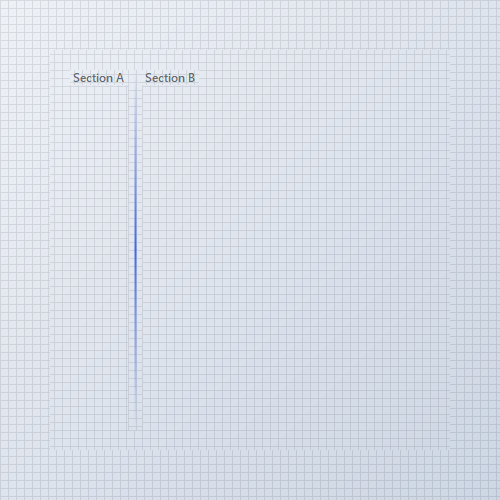{ .light .snapshot} 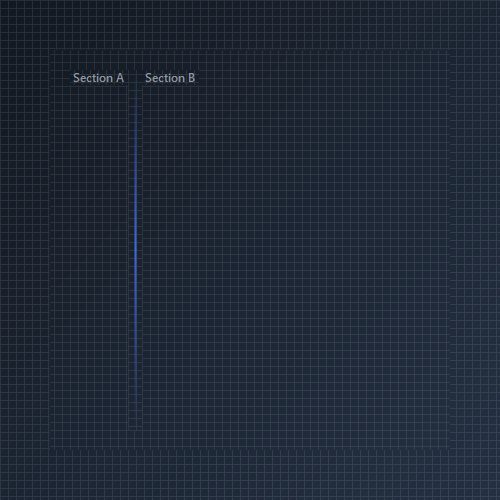{.dark .snapshot}
== tab "Light" icon:sun
{ .snapshot}
== tab "Dark" icon:moon
{ .snapshot}
:::
:::
## API `Reference`
| | | |
| -------- | ------- | ----------- |
| ::: tag "LineColor" icon:wrench | ::: tag "Kt-Color" color:#820BF4 icon:corner-down-right url:/utilities/kt-color | *Sets the line's color.* |
| ::: tag "DashCap" icon:wrench | ::: tag "CapStyles" color:#6B7C94 icon:check-check | *Sets the line's dash cap style.* |
| ::: tag "Orientation" icon:wrench | ::: tag "LineOrientation" color:#6B7C94 icon:check-check | *Sets the line's orientation.* |
| ::: tag "LineStyle" icon:wrench | ::: tag "LineStyles" color:#6B7C94 icon:check-check | *Sets the line's style format.* |
| ::: tag "LineThickness" icon:wrench | ::: tag "float" color:#0B64F4 icon:external-link url:external:https://learn.microsoft.com/en-us/dotnet/api/system.single?view=netframework-4.8 | *Sets the line's thickness.* |
---
## [KimTools / Controls / Label](https://kimtoo.net/controls/kt-label/)
---
title: "KimTools / Controls / Label"
description: "A theme-aware label control for Modern WinForms with intelligent foreground contrast generation and KtColor palette integration."
keywords: ["KimTools", "Controls", "KtLabel", "Label"]
toc: false
layout: "full"
---
::: hero layout:split glow:true
# Kt `Label`
A theme-aware label control for Modern WinForms with intelligent foreground contrast generation and KtColor palette integration.
::: callout tip
#### 🟣 PREMIUM
This component is only available in the Premium version of KimTools.
::: button "Get KimTools" external:https://kimtoo.net/#pricinghttps://kimtoo.net/#pricing icon:external-link
:::
== side
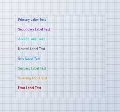{ .light .snapshot} 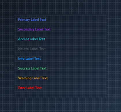{.dark .snapshot}
:::
::: callout success
#### 🟢 DESIGNER SUPPORT
**This control has full Visual Studio design-time support.**
Drag it from the Toolbox onto your form, customize its properties directly in the Properties window, and KimTools will generate the corresponding code for you.
:::
## Color
| ::: tag "Color" icon:wrench | ::: tag "Kt-Color" color:#820BF4 icon:corner-down-right url:/utilities/kt-color | *Sets the Color.* |
| -------- | ------- | ----------- |
## Background
| ::: tag "Background" icon:wrench | ::: tag "Kt-Color" color:#820BF4 icon:corner-down-right url:/utilities/kt-color | *Sets the Background.* |
| -------- | ------- | ----------- |
## Align
| ::: tag "Align" icon:wrench | ::: tag "ContentAlignment" color:#0B64F4 icon:external-link url:external:https://learn.microsoft.com/en-us/dotnet/api/system.drawing.contentalignment?view=netframework-4.8 | *Sets the Align.* |
| -------- | ------- | ----------- |
## Auto
| ::: tag "Auto" icon:wrench | ::: tag "Boolean" color:#0B64F4 icon:external-link url:external:https://learn.microsoft.com/en-us/dotnet/api/system.boolean?view=netframework-4.8 | *Sets the Auto.* |
| -------- | ------- | ----------- |
::: hero layout:split glow:true
## Palette Color Variants
Use the `Color` property to set theme-aware text colors. Foreground contrast and shade variations automatically adapt based on font weight and active theme settings.
```csharp "🔴 🟡 🟢"
var panel = new Panel
{
Width = 280,
Height = 110,
BackColor = Color.Transparent
};
var primaryLabel = new KtLabel
{
Text = "Primary Theme Text",
Color = KtColor.PRIMARY,
Auto = true
};
var successLabel = new KtLabel
{
Text = "Success Status Text",
Color = KtColor.SUCCESS,
Auto = true
};
var errorLabel = new KtLabel
{
Text = "Error Alert Text",
Color = KtColor.ERROR,
Auto = true
};
panel.Controls.Add(primaryLabel);
panel.Controls.Add(successLabel);
panel.Controls.Add(errorLabel);
primaryLabel.Location = new Point(10, 10);
successLabel.Location = new Point(10, 42);
errorLabel.Location = new Point(10, 74);
```
== side
::: tabs
== tab "Auto" icon:app-window
{ .light .snapshot} {.dark .snapshot}
== tab "Light" icon:sun
{ .snapshot}
== tab "Dark" icon:moon
{ .snapshot}
:::
:::
::: hero layout:split glow:true
## Text Alignment
Set `Auto = false` to define a custom control size, then use `Align` to position text (`ContentAlignment`) within the bounds.
```csharp "🔴 🟡 🟢"
var panel = new Panel
{
Width = 280,
Height = 60,
BackColor = Color.Transparent
};
var alignedLabel = new KtLabel
{
Text = "Centered Text Alignment",
Color = KtColor.PRIMARY,
Auto = false,
Size = new Size(260, 40),
Align = ContentAlignment.MiddleCenter
};
panel.Controls.Add(alignedLabel);
alignedLabel.Location = new Point(10, 10);
```
== side
::: tabs
== tab "Auto" icon:app-window
{ .light .snapshot} {.dark .snapshot}
== tab "Light" icon:sun
{ .snapshot}
== tab "Dark" icon:moon
{ .snapshot}
:::
:::
## API `Reference`
| | | |
| -------- | ------- | ----------- |
| ::: tag "Color" icon:wrench | ::: tag "Kt-Color" color:#820BF4 icon:corner-down-right url:/utilities/kt-color | *Sets the Color.* |
| ::: tag "Background" icon:wrench | ::: tag "Kt-Color" color:#820BF4 icon:corner-down-right url:/utilities/kt-color | *Sets the Background.* |
| ::: tag "Auto" icon:wrench | ::: tag "Boolean" color:#0B64F4 icon:external-link url:external:https://learn.microsoft.com/en-us/dotnet/api/system.boolean?view=netframework-4.8 | *Sets the Auto.* |
| ::: tag "Align" icon:wrench | ::: tag "ContentAlignment" color:#0B64F4 icon:external-link url:external:https://learn.microsoft.com/en-us/dotnet/api/system.drawing.contentalignment?view=netframework-4.8 | *Sets the Align.* |
| ::: tag "Text" icon:wrench | ::: tag "String" color:#0B64F4 icon:external-link url:external:https://learn.microsoft.com/en-us/dotnet/api/system.string?view=netframework-4.8 | *The text associated with the control.* |
---
## [KimTools / Controls / Menu](https://kimtoo.net/controls/kt-menu/)
---
title: "KimTools / Controls / Menu"
description: "An expandable tree-style navigation menu supporting independently themeable state styles, gradient highlights, custom connector lines, checkboxes, and inline badge tags."
keywords: ["KimTools", "Controls", "KtMenu", "Menu", "TreeView"]
toc: false
layout: "full"
---
::: hero layout:split glow:true
# Kt `Menu`
An expandable tree-style navigation menu supporting independently themeable state styles, gradient highlights, custom connector lines, checkboxes, and inline badge tags.
::: callout tip
#### 🟣 PREMIUM
This component is only available in the Premium version of KimTools.
::: button "Get KimTools" external:https://kimtoo.net/#pricinghttps://kimtoo.net/#pricing icon:external-link
:::
== side
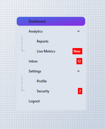{ .light .snapshot} {.dark .snapshot}
:::
::: callout success
#### 🟢 DESIGNER SUPPORT
**This control has full Visual Studio design-time support.**
Drag it from the Toolbox onto your form, customize its properties directly in the Properties window, and KimTools will generate the corresponding code for you.
:::
::: hero layout:split glow:true
## Flat / Minimal Design System
Soft tinted selection with no gradients. The selected state uses a low-opacity primary wash (`PRIMARY % 15`) with primary-colored text and a modest 6 px radius. No border, no shadow — just clean hierarchy through spacing and subtle color.
```csharp "🔴 🟡 🟢"
var panel = new FlowLayoutPanel
{
Width = 260,
Height = 340,
Padding = new Padding(10),
BackColor = Color.Transparent,
AutoScroll = false
};
var menu = new KtMenu
{
Width = 240,
Height = 320,
Margin = new Padding(5),
ItemHeight = 34,
Indent = 18,
Menu = { Background = KtColor.BASE },
MenuItem = { TextColor = KtColor.CONTENT },
MenuItemSelected =
{
Background = (KtColor.PRIMARY,KtColor.SECONDARY),
TextColor =Color.White,
BorderRadius = 6
}
};
menu.Nodes.AddRange(BuildNodes());
menu.ExpandAll();
menu.SelectedNode = menu.Nodes[0];
panel.Controls.Add(menu);
```
== side
::: tabs
== tab "Auto" icon:app-window
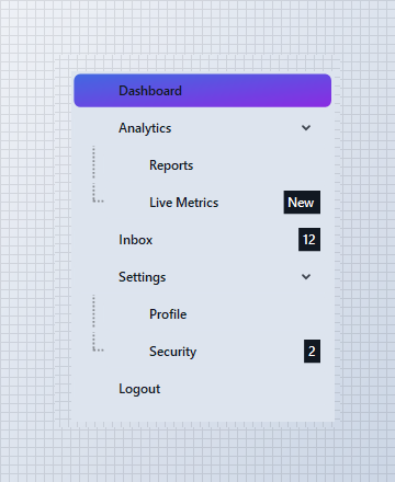{ .light .snapshot} {.dark .snapshot}
== tab "Light" icon:sun
{ .snapshot}
== tab "Dark" icon:moon
{ .snapshot}
:::
:::
::: hero layout:split glow:true
## Neon / Dark Design System
A deep `BASE_1` background with pure white text. The active row pops with a vivid Fuchsia-to-Violet gradient at a 45° angle, wrapped in a 10 px rounded pill. High contrast and saturated accents give the UI an electric, modern feel.
```csharp "🔴 🟡 🟢"
var panel = new FlowLayoutPanel
{
Width = 260,
Height = 340,
Padding = new Padding(10),
BackColor = Color.Transparent,
AutoScroll = false
};
var menu = new KtMenu
{
Width = 240,
Height = 320,
Margin = new Padding(5),
ItemHeight = 34,
Indent = 18,
Background = KtColor.BASE_1,
Foreground = KtColor.CONTENT,
MenuItemChecked =
{
Background = (KtColor.Fuchsia, KtColor.Violet),
TextColor = Color.White,
BorderRadius = 10
},
MenuItemSelected =
{
Background = (KtColor.Fuchsia, KtColor.Violet ),
TextColor =Color.White,
BorderRadius = 10
}
};
menu.Nodes.AddRange(BuildNodes());
menu.ExpandAll();
menu.SelectedNode = menu.Nodes[2];
panel.Controls.Add(menu);
```
== side
::: tabs
== tab "Auto" icon:app-window
{ .light .snapshot} {.dark .snapshot}
== tab "Light" icon:sun
{ .snapshot}
== tab "Dark" icon:moon
{ .snapshot}
:::
:::
::: hero layout:split glow:true
## Pill / Rounded Design System
Fully capsule-shaped active rows with a 20 px border radius. The selection uses a calm Success-to-Info gradient on the default base background. Solid connector lines (`DashStyle.Solid`) reinforce the structured, friendly aesthetic.
```csharp "🔴 🟡 🟢"
var panel = new FlowLayoutPanel
{
Width = 260,
Height = 340,
Padding = new Padding(10),
BackColor = Color.Transparent,
AutoScroll = false
};
var menu = new KtMenu
{
Width = 240,
Height = 320,
Margin = new Padding(5),
ItemHeight = 34,
Indent = 18,
LineStyle = DashStyle.Solid,
LineWidth = 1f,
Foreground = KtColor.CONTENT,
Background = KtColor.BASE,
MenuItemSelected =
{
Background = (KtColor.SUCCESS, KtColor.INFO),
TextColor =Color.White,
BorderRadius = 20
}
};
menu.Nodes.AddRange(BuildNodes());
menu.ExpandAll();
menu.SelectedNode = menu.Nodes[3];
panel.Controls.Add(menu);
```
== side
::: tabs
== tab "Auto" icon:app-window
{ .light .snapshot} {.dark .snapshot}
== tab "Light" icon:sun
{ .snapshot}
== tab "Dark" icon:moon
{ .snapshot}
:::
:::
::: hero layout:split glow:true
## Inline Badges (`Tag`, `TagBackground`, `TagColor`, `TagVisible`)
Set a plain `string` on `TreeNode.Tag` and it renders as a compact badge next to the item label, styled through the owning `KtMenuStyle`'s `Tag*` properties. Useful for unread counts, "New" flags, or status chips — no custom cell renderer required.
```csharp "🔴 🟡 🟢"
var panel = new FlowLayoutPanel
{
Width = 260,
Height = 200,
Padding = new Padding(10),
BackColor = Color.Transparent,
AutoScroll = false
};
var menu = new KtMenu
{
Width = 240,
Height = 180,
Margin = new Padding(5),
Foreground = KtColor.CONTENT,
Background = KtColor.BASE,
MenuItem =
{
TextColor = KtColor.CONTENT,
TagBackground = KtColor.ERROR,
TagColor =Color.White
}
};
menu.Nodes.Add(new TreeNode("Inbox") { Tag = "12" });
menu.Nodes.Add(new TreeNode("Notifications") { Tag = "New" });
menu.Nodes.Add(new TreeNode("Billing") { Tag = "Beta" });
menu.Nodes.Add(new TreeNode("Archive"));
panel.Controls.Add(menu);
```
== side
::: tabs
== tab "Auto" icon:app-window
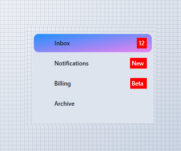{ .light .snapshot} {.dark .snapshot}
== tab "Light" icon:sun
{ .snapshot}
== tab "Dark" icon:moon
{ .snapshot}
:::
:::
::: hero layout:split glow:true
## Selection & Check States (`MenuItemSelected`, `MenuItemChecked`)
The active row (`MenuItemSelected`) and any checked row (`MenuItemChecked`, with `CheckBoxes = true`) each carry their own independent style, so a highlighted selection and a completed/checked item read as visually distinct states within the same tree.
```csharp "🔴 🟡 🟢"
var panel = new FlowLayoutPanel
{
Width = 260,
Height = 260,
Padding = new Padding(10),
BackColor = Color.Transparent,
AutoScroll = false
};
var menu = new KtMenu
{
Width = 240,
Height = 240,
Margin = new Padding(5),
CheckBoxes = true,
Foreground = KtColor.CONTENT,
Background = KtColor.BASE,
MenuItem = { TextColor = KtColor.CONTENT },
MenuItemSelected =
{
Background = (KtColor.PRIMARY, KtColor.SECONDARY, 45),
TextColor =Color.White
},
MenuItemChecked =
{
Background = KtColor.SUCCESS % 20,
TextColor = KtColor.SUCCESS
}
};
var billing = new TreeNode("Billing") { Checked = true };
var security = new TreeNode("Security");
menu.Nodes.Add(new TreeNode("Dashboard"));
menu.Nodes.Add(billing);
menu.Nodes.Add(security);
menu.Nodes.Add(new TreeNode("Logout"));
menu.SelectedNode = security;
panel.Controls.Add(menu);
```
== side
::: tabs
== tab "Auto" icon:app-window
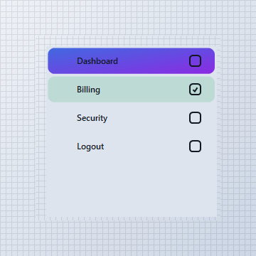{ .light .snapshot} {.dark .snapshot}
== tab "Light" icon:sun
{ .snapshot}
== tab "Dark" icon:moon
{ .snapshot}
:::
:::
### KtMenuStyle
| | | |
| -------- | ------- | ----------- |
| ::: tag "Background" icon:wrench | ::: tag "Kt-Brush" color:#820BF4 icon:corner-down-right url:/utilities/kt-brush | *Sets the Background.* |
| ::: tag "Border" icon:wrench | ::: tag "Kt-Brush" color:#820BF4 icon:corner-down-right url:/utilities/kt-brush | *Sets the Border.* |
| ::: tag "ImageFilter" icon:wrench | ::: tag "Kt-Brush" color:#820BF4 icon:corner-down-right url:/utilities/kt-brush | *Sets the Image filter.* |
| ::: tag "TagBackground" icon:wrench | ::: tag "Kt-Brush" color:#820BF4 icon:corner-down-right url:/utilities/kt-brush | *Sets the Tag background.* |
| ::: tag "TagColor" icon:wrench | ::: tag "Kt-Color" color:#820BF4 icon:corner-down-right url:/utilities/kt-color | *Sets the Tag color.* |
| ::: tag "TextColor" icon:wrench | ::: tag "Kt-Color" color:#820BF4 icon:corner-down-right url:/utilities/kt-color | *Sets the Text color.* |
| ::: tag "TagFont" icon:wrench | ::: tag "Font" color:#0B64F4 icon:external-link url:external:https://learn.microsoft.com/en-us/dotnet/api/system.drawing.font?view=netframework-4.8 | *Sets the Tag font.* |
| ::: tag "TextFont" icon:wrench | ::: tag "Font" color:#0B64F4 icon:external-link url:external:https://learn.microsoft.com/en-us/dotnet/api/system.drawing.font?view=netframework-4.8 | *Sets the Text font.* |
| ::: tag "ImageOffset" icon:wrench | ::: tag "Point" color:#0B64F4 icon:external-link url:external:https://learn.microsoft.com/en-us/dotnet/api/system.drawing.point?view=netframework-4.8 | *Sets the Image offset.* |
| ::: tag "TagOffset" icon:wrench | ::: tag "Point" color:#0B64F4 icon:external-link url:external:https://learn.microsoft.com/en-us/dotnet/api/system.drawing.point?view=netframework-4.8 | *Sets the Tag offset.* |
| ::: tag "TextOffset" icon:wrench | ::: tag "Point" color:#0B64F4 icon:external-link url:external:https://learn.microsoft.com/en-us/dotnet/api/system.drawing.point?view=netframework-4.8 | *Sets the Text offset.* |
| ::: tag "ImageVisible" icon:wrench | ::: tag "Boolean" color:#0B64F4 icon:external-link url:external:https://learn.microsoft.com/en-us/dotnet/api/system.boolean?view=netframework-4.8 ::: tag "Nullable" color:#F96A06 icon:circle-alert url:external:https://learn.microsoft.com/en-us/dotnet/csharp/language-reference/builtin-types/nullable-value-types | *Sets the Image visible.* |
| ::: tag "TagVisible" icon:wrench | ::: tag "Boolean" color:#0B64F4 icon:external-link url:external:https://learn.microsoft.com/en-us/dotnet/api/system.boolean?view=netframework-4.8 ::: tag "Nullable" color:#F96A06 icon:circle-alert url:external:https://learn.microsoft.com/en-us/dotnet/csharp/language-reference/builtin-types/nullable-value-types | *Sets the Tag visible.* |
| ::: tag "TextVisible" icon:wrench | ::: tag "Boolean" color:#0B64F4 icon:external-link url:external:https://learn.microsoft.com/en-us/dotnet/api/system.boolean?view=netframework-4.8 ::: tag "Nullable" color:#F96A06 icon:circle-alert url:external:https://learn.microsoft.com/en-us/dotnet/csharp/language-reference/builtin-types/nullable-value-types | *Sets the Text visible.* |
| ::: tag "TextEllipsis" icon:wrench | ::: tag "Boolean" color:#0B64F4 icon:external-link url:external:https://learn.microsoft.com/en-us/dotnet/api/system.boolean?view=netframework-4.8 ::: tag "Nullable" color:#F96A06 icon:circle-alert url:external:https://learn.microsoft.com/en-us/dotnet/csharp/language-reference/builtin-types/nullable-value-types | *Sets the Text ellipsis.* |
| ::: tag "BorderRadius" icon:wrench | ::: tag "Double" color:#0B64F4 icon:external-link url:external:https://learn.microsoft.com/en-us/dotnet/api/system.double?view=netframework-4.8 ::: tag "Nullable" color:#F96A06 icon:circle-alert url:external:https://learn.microsoft.com/en-us/dotnet/csharp/language-reference/builtin-types/nullable-value-types | *Sets the Border radius.* |
| ::: tag "BorderWidth" icon:wrench | ::: tag "Double" color:#0B64F4 icon:external-link url:external:https://learn.microsoft.com/en-us/dotnet/api/system.double?view=netframework-4.8 ::: tag "Nullable" color:#F96A06 icon:circle-alert url:external:https://learn.microsoft.com/en-us/dotnet/csharp/language-reference/builtin-types/nullable-value-types | *Sets the Border width.* |
| ::: tag "TextAlign" icon:wrench | ::: tag "ContentAlignment" color:#0B64F4 icon:external-link url:external:https://learn.microsoft.com/en-us/dotnet/api/system.drawing.contentalignment?view=netframework-4.8 ::: tag "Nullable" color:#F96A06 icon:circle-alert url:external:https://learn.microsoft.com/en-us/dotnet/csharp/language-reference/builtin-types/nullable-value-types | *Sets the Text align.* |
| ::: tag "BorderStyle" icon:wrench | ::: tag "DashStyle" color:#0B64F4 icon:external-link url:external:https://learn.microsoft.com/en-us/dotnet/api/system.drawing.drawing2d.dashstyle?view=netframework-4.8 ::: tag "Nullable" color:#F96A06 icon:circle-alert url:external:https://learn.microsoft.com/en-us/dotnet/csharp/language-reference/builtin-types/nullable-value-types | *Sets the Border style.* |
## API `Reference`
| | | |
| -------- | ------- | ----------- |
| ::: tag "Background" icon:wrench | ::: tag "Kt-Color" color:#820BF4 icon:corner-down-right url:/utilities/kt-color | *Sets the background color.* |
| ::: tag "Foreground" icon:wrench | ::: tag "Kt-Color" color:#820BF4 icon:corner-down-right url:/utilities/kt-color | *Sets the Foreground color.* |
| ::: tag "Menu" icon:wrench | ::: tag "Kt-MenuStyle" color:#6B7C94 icon:check-check | *Sets the Menu.* |
| ::: tag "MenuItem" icon:wrench | ::: tag "Kt-MenuStyle" color:#6B7C94 icon:check-check | *Sets the Menu item.* |
| ::: tag "MenuItemChecked" icon:wrench | ::: tag "Kt-MenuStyle" color:#6B7C94 icon:check-check | *Sets the Menu item checked.* |
| ::: tag "MenuItemSelected" icon:wrench | ::: tag "Kt-MenuStyle" color:#6B7C94 icon:check-check | *Sets the Menu item selected.* |
| ::: tag "SubMenu" icon:wrench | ::: tag "Kt-MenuStyle" color:#6B7C94 icon:check-check | *Sets the Sub menu.* |
| ::: tag "SubMenuExpanded" icon:wrench | ::: tag "Kt-MenuStyle" color:#6B7C94 icon:check-check | *Sets the Sub menu expanded.* |
| ::: tag "LineStyle" icon:wrench | ::: tag "DashStyle" color:#0B64F4 icon:external-link url:external:https://learn.microsoft.com/en-us/dotnet/api/system.drawing.drawing2d.dashstyle?view=netframework-4.8 | *Sets the Line style.* |
| ::: tag "LineWidth" icon:wrench | ::: tag "float" color:#0B64F4 icon:external-link url:external:https://learn.microsoft.com/en-us/dotnet/api/system.single?view=netframework-4.8 | *Sets the Line width.* |
---
## [KimTools / Controls / Pages](https://kimtoo.net/controls/kt-pages/)
---
title: "KimTools / Controls / Pages"
description: "An invisible tab-based navigation container for Modern WinForms that provides SPA-style routing, custom page transitions, navigation history, and design-time extenders."
keywords: ["KimTools", "Controls", "KtPages", "Pages", "TabControl"]
toc: false
layout: "full"
---
::: hero layout:split glow:true
# Kt `Pages`
An invisible tab-based navigation container for Modern WinForms that provides SPA-style routing, custom page transitions, navigation history, and design-time extenders.
::: callout tip
#### 🟣 PREMIUM
This component is only available in the Premium version of KimTools.
::: button "Get KimTools" external:https://kimtoo.net/#pricinghttps://kimtoo.net/#pricing icon:external-link
:::
== side
{ .light .snapshot} {.dark .snapshot}
:::
::: callout success
#### 🟢 DESIGNER SUPPORT
**This control has full Visual Studio design-time support.**
Drag it from the Toolbox onto your form, customize its properties directly in the Properties window, and KimTools will generate the corresponding code for you.
:::
## Extender Integration
When designing forms in Visual Studio, `KtPages` acts as an **Extender Provider** for `ButtonBase` controls (including `KtRadioButton` and standard WinForms buttons).
::: steps
1. **Select Target Control**
Choose your navigation control (e.g., `KtRadioButton` or `KtButton`) in the Visual Studio designer surface.
2. **Locate Extender Property**
In the **Properties Window**, find the `Page on [KtPagesName]` extender property provided by the `KtPages` container.
3. **Assign Target Page**
Select or enter the target `TabPage` key/name you want to navigate to when the control is clicked.
:::
### AllowTransitions
| ::: tag "AllowTransitions" icon:wrench | ::: tag "Boolean" color:#0B64F4 icon:external-link url:external:https://learn.microsoft.com/en-us/dotnet/api/system.boolean?view=netframework-4.8 | *Sets a value indicating whether transitions are enabled.* |
| -------- | ------- | ----------- |
### TransitionType
| ::: tag "TransitionType" icon:wrench | ::: tag "AnimationType" color:#6B7C94 icon:check-check | *Sets the type of transition to be used when moving from one page to another.* |
| -------- | ------- | ----------- |
### Background
| ::: tag "Background" icon:wrench | ::: tag "Kt-Color" color:#820BF4 icon:corner-down-right url:/utilities/kt-color | *Sets the Background.* |
| -------- | ------- | ----------- |
::: hero layout:split glow:true
## Radio Button Tab Navigation
Use `KtRadioButton` controls with `Icon = null` as custom tab headers by linking them with `pages.Set_Page(radioButton, pageKey)`. Transition background colors between `KtColor.PRIMARY` (checked) and `KtColor.BASE_3` (unchecked) to highlight active tabs.
```csharp "🔴 🟡 🟢"
var container = new Panel
{
Width = 340,
Height = 230,
BackColor = Color.Transparent
};
var pages = new KtPages
{
Width = 320,
Height = 150,
Background = KtColor.BASE
};
var tabOverview = new TabPage("Overview") { Text = "Overview" };
var tabSettings = new TabPage("Settings") { Text = "Settings" };
tabOverview.Controls.Add(new KtLabel { Text = "Overview Content", Auto = true, Location = new Point(15, 15) });
tabSettings.Controls.Add(new KtLabel { Text = "Settings Content", Auto = true, Location = new Point(15, 15) });
pages.TabPages.Add(tabOverview);
pages.TabPages.Add(tabSettings);
var rbOverview = new KtRadioButton
{
Text = "Overview",
Checked = true,
Icon = null,
Icon_Checked = null,
AutoSize = true,
Background = KtColor.PRIMARY,
Location = new Point(10, 10)
};
var rbSettings = new KtRadioButton
{
Text = "Settings",
Checked = false,
Icon = null,
Icon_Checked = null,
AutoSize = true,
Background = KtColor.BASE_3,
Location = new Point(120, 10)
};
// Link radio buttons directly to target page keys using the extender provider
pages.Set_Page(rbOverview, "Overview");
pages.Set_Page(rbSettings, "Settings");
// Toggle visual tab states on selection change for all radio tabs
rbOverview.CheckedChanged += (s, e) =>
{
rbOverview.Background = rbOverview.Checked ? KtColor.PRIMARY : KtColor.BASE_3;
};
rbSettings.CheckedChanged += (s, e) =>
{
rbSettings.Background = rbSettings.Checked ? KtColor.PRIMARY : KtColor.BASE_3;
};
container.Controls.Add(rbOverview);
container.Controls.Add(rbSettings);
container.Controls.Add(pages);
pages.Location = new Point(10, 50);
```
== side
::: tabs
== tab "Auto" icon:app-window
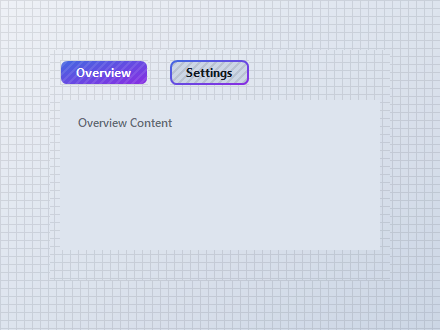{ .light .snapshot} 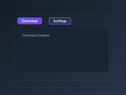{.dark .snapshot}
== tab "Light" icon:sun
{ .snapshot}
== tab "Dark" icon:moon
{ .snapshot}
:::
:::
::: hero layout:split glow:true
## Programmatic Navigation & History
Use `Navigate()` to transition between pages and `GoBack()` to pop the built-in stack navigation history.
```csharp "🔴 🟡 🟢"
var container = new Panel
{
Width = 340,
Height = 240,
BackColor = Color.Transparent
};
var pages = new KtPages
{
Width = 320,
Height = 160,
Background = KtColor.BASE
};
var tabDashboard = new TabPage("Dashboard") { Text = "Dashboard" };
var tabProfile = new TabPage("Profile") { Text = "Profile" };
tabDashboard.Controls.Add(new KtLabel { Text = "Dashboard Content", Auto = true, Location = new Point(15, 15) });
tabProfile.Controls.Add(new KtLabel { Text = "Profile Content", Auto = true, Location = new Point(15, 15) });
pages.TabPages.Add(tabDashboard);
pages.TabPages.Add(tabProfile);
var btnDash = new KtButton { Text = "Dashboard", Width = 90, Height = 30, Location = new Point(10, 180) };
var btnProf = new KtButton { Text = "Profile", Width = 90, Height = 30, Location = new Point(110, 180) };
var btnBack = new KtButton { Text = "Back", Width = 70, Height = 30, Location = new Point(210, 180) };
btnDash.Click += (s, e) => pages.Navigate(tabDashboard);
btnProf.Click += (s, e) => pages.Navigate(tabProfile);
btnBack.Click += (s, e) => pages.GoBack();
container.Controls.Add(pages);
container.Controls.Add(btnDash);
container.Controls.Add(btnProf);
container.Controls.Add(btnBack);
pages.Location = new Point(10, 10);
```
== side
::: tabs
== tab "Auto" icon:app-window
{ .light .snapshot} {.dark .snapshot}
== tab "Light" icon:sun
{ .snapshot}
== tab "Dark" icon:moon
{ .snapshot}
:::
:::
::: hero layout:split glow:true
## Wizard Step Operators
Advance or rewind pages easily using overloaded increment (`pages++`) and decrement (`pages--`) operators.
```csharp "🔴 🟡 🟢"
var container = new Panel
{
Width = 340,
Height = 220,
BackColor = Color.Transparent
};
var pages = new KtPages
{
Width = 320,
Height = 150,
Background = KtColor.BASE
};
pages.TabPages.Add(new TabPage("Step1") { Text = "Step 1" });
pages.TabPages.Add(new TabPage("Step2") { Text = "Step 2" });
pages.TabPages.Add(new TabPage("Step3") { Text = "Step 3" });
var btnPrev = new KtButton { Text = "Previous", Width = 90, Height = 30, Location = new Point(10, 170) };
var btnNext = new KtButton { Text = "Next", Width = 90, Height = 30, Location = new Point(110, 170) };
// Increment (++) advances to next page; Decrement (--) retreats to previous page
btnPrev.Click += (s, e) => { _ = pages--; };
btnNext.Click += (s, e) => { _ = pages++; };
container.Controls.Add(pages);
container.Controls.Add(btnPrev);
container.Controls.Add(btnNext);
pages.Location = new Point(10, 10);
```
== side
::: tabs
== tab "Auto" icon:app-window
{ .light .snapshot} {.dark .snapshot}
== tab "Light" icon:sun
{ .snapshot}
== tab "Dark" icon:moon
{ .snapshot}
:::
:::
## API `Reference`
| | | |
| -------- | ------- | ----------- |
| ::: tag "Background" icon:wrench | ::: tag "Kt-Color" color:#820BF4 icon:corner-down-right url:/utilities/kt-color | *Sets the Background.* |
| ::: tag "Transition" icon:wrench | ::: tag "Animation" color:#6B7C94 icon:check-check | *Sets the transition options to be applied when moving between pages.* |
| ::: tag "TransitionType" icon:wrench | ::: tag "AnimationType" color:#6B7C94 icon:check-check | *Sets the type of transition to be used when moving from one page to another.* |
| ::: tag "AllowTransitions" icon:wrench | ::: tag "Boolean" color:#0B64F4 icon:external-link url:external:https://learn.microsoft.com/en-us/dotnet/api/system.boolean?view=netframework-4.8 | *Sets a value indicating whether transitions are enabled.* |
---
## [KimTools / Controls / Panel](https://kimtoo.net/controls/kt-panel/)
---
title: "KimTools / Controls / Panel"
description: "A modern, fully customizable panel control for WinForms. It acts as an advanced container for grouping and styling related content."
keywords: ["KimTools", "Controls", "KtPanel", "Panel"]
toc: false
layout: "full"
---
::: hero layout:split glow:true
# Kt `Panel`
A modern, fully customizable panel control for WinForms. It acts as an advanced container for grouping and styling related content.
::: callout tip
#### 🟣 PREMIUM
This component is only available in the Premium version of KimTools.
::: button "Get KimTools" external:https://kimtoo.net/#pricinghttps://kimtoo.net/#pricing icon:external-link
:::
== side
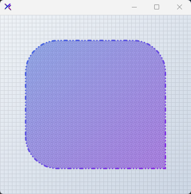{ .light .snapshot} 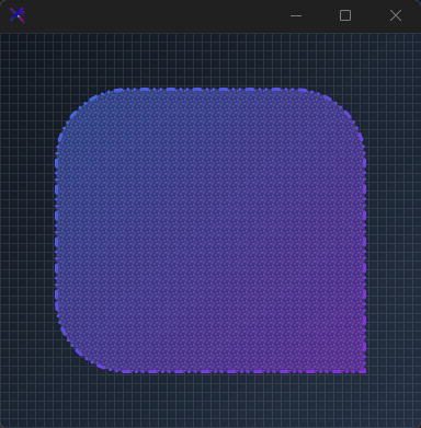{.dark .snapshot}
:::
::: callout success
#### 🟢 DESIGNER SUPPORT
**This control has full Visual Studio design-time support.**
Drag it from the Toolbox onto your form, customize its properties directly in the Properties window, and KimTools will generate the corresponding code for you.
:::
```csharp "🔴 🟡 🟢"
var panel = new KtPanel
{
Background = (
KtColor.PRIMARY % 50,
KtColor.SECONDARY % 50
),
Border = (
KtColor.PRIMARY,
KtColor.SECONDARY,
45
),
BorderRadius = .5f,
BorderWidth = 3,
BorderEdges =
{
TopLeft = true,
TopRight = true,
BottomLeft = true,
BottomRight = false
},
BorderStyle = DashStyle.DashDotDot,
PatternStyle = HatchStyle.LargeConfetti,
PatternColor = KtColor.CONTENT % 10
};
```
| ::: tag "Background" icon:wrench | ::: tag "Kt-Brush" color:#820BF4 icon:corner-down-right url:/utilities/kt-brush | *Sets the panel's background color.* |
| -------- | ------- | ----------- |
::: hero layout:split glow:true
## Solid `Background`
Supports plain `System.Drawing.Color`, dynamic `KtColor`, hex values (`#1E90FF`), or web-formatted colors (`rgb` / `hsl`).
```csharp "🔴 🟡 🟢"
var panel = new KtPanel
{
Background = KtColor.PRIMARY,
Border = KtBrush.None
};
```
== side
::: tabs
== tab "Auto" icon:app-window
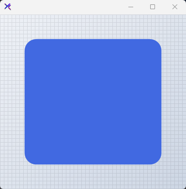{ .light .snapshot} {.dark .snapshot}
== tab "Light" icon:sun
{ .snapshot}
== tab "Dark" icon:moon
{ .snapshot}
:::
:::
| ::: tag "BackgroundMargin" icon:wrench | ::: tag "Padding" color:#0B64F4 icon:external-link url:external:https://learn.microsoft.com/en-us/dotnet/api/system.windows.forms.padding?view=netframework-4.8 | *Sets the panel's border Margin.* |
| -------- | ------- | ----------- |
::: hero layout:split glow:true
## `Background Margin`
Defines internal padding offsets applied exclusively to the background fill brush.
```csharp "🔴 🟡 🟢"
var panel = new KtPanel
{
Background = KtColor.PRIMARY,
BackgroundMargin = new Padding(10, 10, 0, 0),
Border = KtColor.SECONDARY,
BorderWidth = 2
};
```
== side
::: tabs
== tab "Auto" icon:app-window
{ .light .snapshot} {.dark .snapshot}
== tab "Light" icon:sun
{ .snapshot}
== tab "Dark" icon:moon
{ .snapshot}
:::
:::
::: hero layout:split glow:true
## Gradient `Background` with `KtColor`
Pass a tuple defining start color, stop color, and an optional gradient angle (0-360 degrees).
```csharp "🔴 🟡 🟢"
var panel = new KtPanel
{
Background = (
startColor: KtColor.PRIMARY[50],
stopColor: KtColor.SECONDARY[50],
angle: 45
),
Border = KtBrush.None
};
```
== side
::: tabs
== tab "Auto" icon:app-window
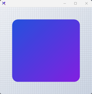{ .light .snapshot} 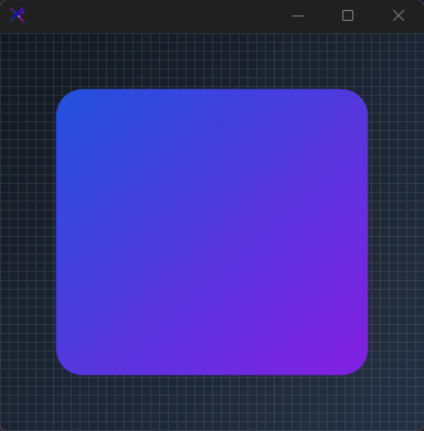{.dark .snapshot}
== tab "Light" icon:sun
{ .snapshot}
== tab "Dark" icon:moon
{ .snapshot}
:::
:::
::: hero layout:split glow:true
## Gradient `Background` with `System.Drawing.Color`
Mix standard GDI system colors or combine them with semantic `KtColor` instances.
```csharp "🔴 🟡 🟢"
var panel = new KtPanel
{
Background = (
startColor: Color.CadetBlue,
stopColor: Color.DodgerBlue,
angle: 90
),
Border = KtBrush.None
};
```
== side
::: tabs
== tab "Auto" icon:app-window
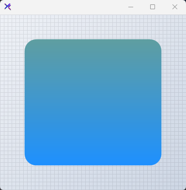{ .light .snapshot} 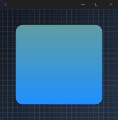{.dark .snapshot}
== tab "Light" icon:sun
{ .snapshot}
== tab "Dark" icon:moon
{ .snapshot}
:::
:::
::: hero layout:split glow:true
## Translucent Gradient `Background`
Apply transparency to colors using the `%` operator on `KtColor` instances within gradient tuples.
```csharp "🔴 🟡 🟢"
var panel = new KtPanel
{
Background = (
startColor: KtColor.Teal % 40, // 40% Opacity
stopColor: KtColor.Emerald % 60 // 60% Opacity
),
Border = KtBrush.None
};
```
== side
::: tabs
== tab "Auto" icon:app-window
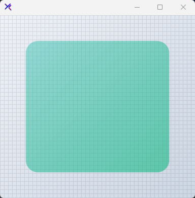{ .light .snapshot} {.dark .snapshot}
== tab "Light" icon:sun
{ .snapshot}
== tab "Dark" icon:moon
{ .snapshot}
:::
:::
| ::: tag "Border" icon:wrench | ::: tag "Kt-Brush" color:#820BF4 icon:corner-down-right url:/utilities/kt-brush | *Sets the panel's border color.* |
| -------- | ------- | ----------- |
::: hero layout:split glow:true
## Solid `Border` Color
Assign a single `KtColor` or `Color` to the `Border` property for a uniform outline.
```csharp "🔴 🟡 🟢"
var panel = new KtPanel
{
Background = KtColor.Transparent,
Border = KtColor.PRIMARY,
BorderWidth = 2
};
```
== side
::: tabs
== tab "Auto" icon:app-window
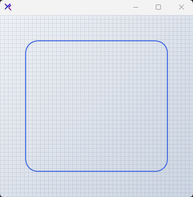{ .light .snapshot} 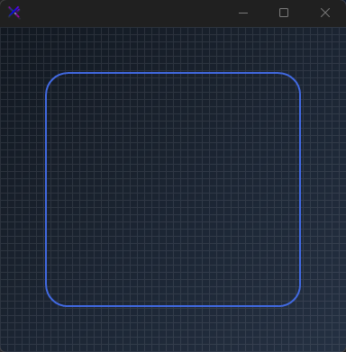{.dark .snapshot}
== tab "Light" icon:sun
{ .snapshot}
== tab "Dark" icon:moon
{ .snapshot}
:::
:::
| ::: tag "BorderWidth" icon:wrench | ::: tag "float" color:#0B64F4 icon:external-link url:external:https://learn.microsoft.com/en-us/dotnet/api/system.single?view=netframework-4.8 | *Sets the panel's border thickness.* |
| -------- | ------- | ----------- |
::: hero layout:split glow:true
## `BorderWidth`
Defines the thickness of the panel border stroke.
```csharp "🔴 🟡 🟢"
var panel = new KtPanel
{
Background = KtColor.Transparent,
Border = KtColor.PRIMARY,
BorderWidth = 4
};
```
== side
::: tabs
== tab "Auto" icon:app-window
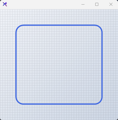{ .light .snapshot} {.dark .snapshot}
== tab "Light" icon:sun
{ .snapshot}
== tab "Dark" icon:moon
{ .snapshot}
:::
:::
| ::: tag "BorderMargin" icon:wrench | ::: tag "Padding" color:#0B64F4 icon:external-link url:external:https://learn.microsoft.com/en-us/dotnet/api/system.windows.forms.padding?view=netframework-4.8 | *Sets the panel's border Margin.* |
| -------- | ------- | ----------- |
::: hero layout:split glow:true
## `BorderMargin`
Applies positional offsets to the border rendering area relative to the control bounds.
```csharp "🔴 🟡 🟢"
var panel = new KtPanel
{
Background = KtColor.Transparent,
Border = KtColor.PRIMARY,
BorderWidth = 2,
BorderMargin = new Padding(10, 10, 0, 0)
};
```
== side
::: tabs
== tab "Auto" icon:app-window
{ .light .snapshot} {.dark .snapshot}
== tab "Light" icon:sun
{ .snapshot}
== tab "Dark" icon:moon
{ .snapshot}
:::
:::
::: hero layout:split glow:true
## Gradient `Border` Brush
Construct multi-tone borders using tuple definitions containing start color, stop color, and angle.
```csharp "🔴 🟡 🟢"
var panel = new KtPanel
{
Background = KtColor.Transparent,
Border = (
startColor: KtColor.PRIMARY,
stopColor: KtColor.SECONDARY,
angle: 90
),
BorderWidth = 4
};
```
== side
::: tabs
== tab "Auto" icon:app-window
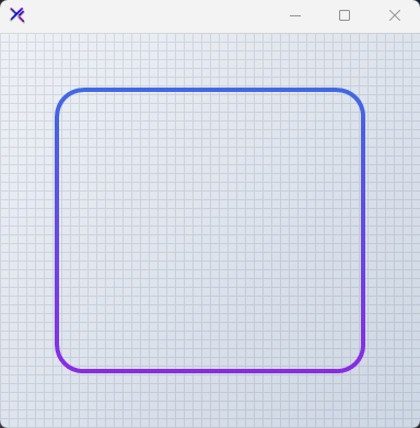{ .light .snapshot} 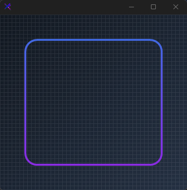{.dark .snapshot}
== tab "Light" icon:sun
{ .snapshot}
== tab "Dark" icon:moon
{ .snapshot}
:::
:::
| ::: tag "BorderStyle" icon:wrench | ::: tag "DashStyle" color:#0B64F4 icon:external-link url:external:https://learn.microsoft.com/en-us/dotnet/api/system.drawing.drawing2d.dashstyle?view=netframework-4.8 | *Sets the panel's border style.* |
| -------- | ------- | ----------- |
::: hero layout:split glow:true
## `BorderStyle` Variants
Configure standard GDI dash patterns using `System.Drawing.Drawing2D.DashStyle`.
```csharp "🔴 🟡 🟢"
var panel = new KtPanel
{
Background = KtColor.Transparent,
Border = KtColor.PRIMARY,
BorderWidth = 3,
BorderStyle = DashStyle.DashDot
};
```
== side
::: tabs
== tab "Auto" icon:app-window
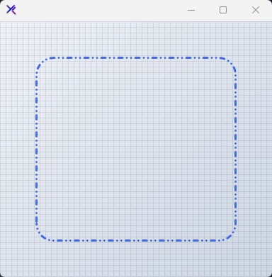{ .light .snapshot} 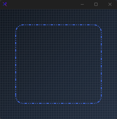{.dark .snapshot}
== tab "Light" icon:sun
{ .snapshot}
== tab "Dark" icon:moon
{ .snapshot}
:::
:::
::: collapsible "Dash Styles Gallery"
::: grids
::: grid
::: card "Solid"
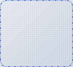{ .light .snapshot} {.dark .snapshot}
:::
:::
::: grid
::: card "Dash"
{ .light .snapshot} {.dark .snapshot}
:::
:::
::: grid
::: card "Dot"
{ .light .snapshot} {.dark .snapshot}
:::
:::
::: grid
::: card "DashDot"
{ .light .snapshot} {.dark .snapshot}
:::
:::
::: grid
::: card "DashDotDot"
{ .light .snapshot} 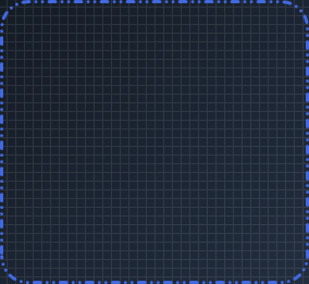{.dark .snapshot}
:::
:::
:::
:::
| ::: tag "BorderEdges" icon:wrench | ::: tag "Edges" color:#6B7C94 icon:check-check | *Sets the Border edges.* |
| -------- | ------- | ----------- |
::: hero layout:split glow:true
## Selective `BorderEdges`
Toggle visibility for specific border edges individually using the `BorderEdges` sub-properties.
```csharp "🔴 🟡 🟢"
var panel = new KtPanel
{
Background = KtColor.Transparent,
Border = KtColor.ERROR,
BorderWidth = 3,
BorderEdges =
{
TopLeft = true,
TopRight = false,
BottomLeft = true,
BottomRight = false
}
};
```
== side
::: tabs
== tab "Auto" icon:app-window
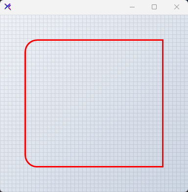{ .light .snapshot} 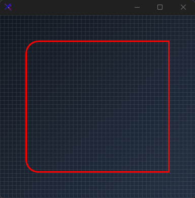{.dark .snapshot}
== tab "Light" icon:sun
{ .snapshot}
== tab "Dark" icon:moon
{ .snapshot}
:::
:::
| ::: tag "BorderRadius" icon:wrench | ::: tag "float" color:#0B64F4 icon:external-link url:external:https://learn.microsoft.com/en-us/dotnet/api/system.single?view=netframework-4.8 | *Sets the panel's border radius.* |
| -------- | ------- | ----------- |
::: hero layout:split glow:true
## Corner Rounding with `BorderRadius`
Control relative corner rounding with a floating point ratio value.
```csharp "🔴 🟡 🟢"
var panel = new KtPanel
{
Background = KtColor.PRIMARY % 20,
Border = KtColor.PRIMARY,
BorderWidth = 2,
BorderRadius = 0.75f // Fractional rounding scale
};
```
== side
::: tabs
== tab "Auto" icon:app-window
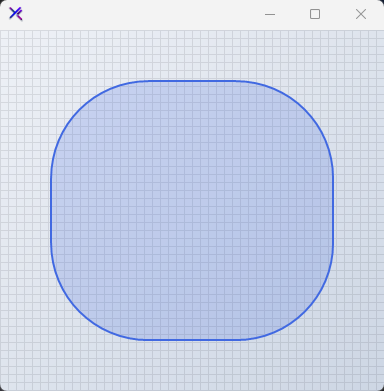{ .light .snapshot} 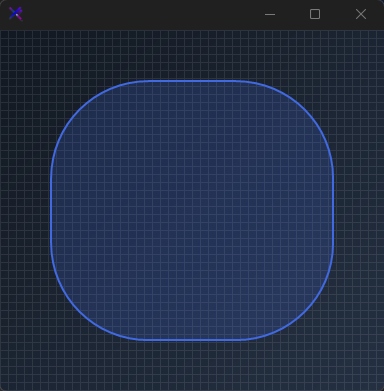{.dark .snapshot}
== tab "Light" icon:sun
{ .snapshot}
== tab "Dark" icon:moon
{ .snapshot}
:::
:::
| ::: tag "PatternStyle" icon:wrench | ::: tag "HatchStyle" color:#0B64F4 icon:external-link url:external:https://learn.microsoft.com/en-us/dotnet/api/system.drawing.drawing2d.hatchstyle?view=netframework-4.8 ::: tag "Nullable" color:#F96A06 icon:circle-alert url:external:https://learn.microsoft.com/en-us/dotnet/csharp/language-reference/builtin-types/nullable-value-types | *Sets the Pattern style.* |
| -------- | ------- | ----------- |
::: hero layout:split glow:true
## Pattern `Style` & `Color`
Overlay `HatchStyle` patterns over solid or gradient background fills. Set `PatternStyle` to `null` to disable.
```csharp "🔴 🟡 🟢"
var panel = new KtPanel
{
Background = KtColor.PRIMARY,
PatternColor = KtColor.SECONDARY % 50,
PatternStyle = HatchStyle.LargeConfetti,
Border = KtBrush.Solid,
BorderRadius = 0f
};
```
== side
::: tabs
== tab "Auto" icon:app-window
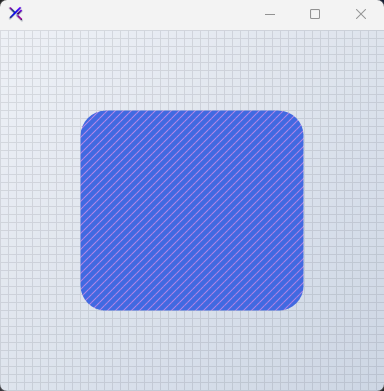{ .light .snapshot} 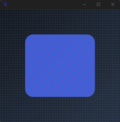{.dark .snapshot}
== tab "Light" icon:sun
{ .snapshot}
== tab "Dark" icon:moon
{ .snapshot}
:::
:::
::: collapsible "Pattern styles"
::: grids
::: grid
::: card "Horizontal"
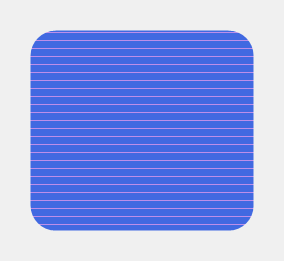{ .light .snapshot} {.dark .snapshot}
:::
:::
::: grid
::: card "Horizontal"
{ .light .snapshot} {.dark .snapshot}
:::
:::
::: grid
::: card "Vertical"
{ .light .snapshot} {.dark .snapshot}
:::
:::
::: grid
::: card "ForwardDiagonal"
{ .light .snapshot} {.dark .snapshot}
:::
:::
::: grid
::: card "BackwardDiagonal"
{ .light .snapshot} {.dark .snapshot}
:::
:::
::: grid
::: card "LargeGrid"
{ .light .snapshot} {.dark .snapshot}
:::
:::
::: grid
::: card "LargeGrid"
{ .light .snapshot} {.dark .snapshot}
:::
:::
::: grid
::: card "LargeGrid"
{ .light .snapshot} {.dark .snapshot}
:::
:::
::: grid
::: card "DiagonalCross"
{ .light .snapshot} {.dark .snapshot}
:::
:::
::: grid
::: card "Percent05"
{ .light .snapshot} {.dark .snapshot}
:::
:::
::: grid
::: card "Percent10"
{ .light .snapshot} {.dark .snapshot}
:::
:::
::: grid
::: card "Percent20"
{ .light .snapshot} {.dark .snapshot}
:::
:::
::: grid
::: card "Percent25"
{ .light .snapshot} {.dark .snapshot}
:::
:::
::: grid
::: card "Percent30"
{ .light .snapshot} {.dark .snapshot}
:::
:::
::: grid
::: card "Percent40"
{ .light .snapshot} {.dark .snapshot}
:::
:::
::: grid
::: card "Percent50"
{ .light .snapshot} {.dark .snapshot}
:::
:::
::: grid
::: card "Percent60"
{ .light .snapshot} {.dark .snapshot}
:::
:::
::: grid
::: card "Percent70"
{ .light .snapshot} {.dark .snapshot}
:::
:::
::: grid
::: card "Percent75"
{ .light .snapshot} {.dark .snapshot}
:::
:::
::: grid
::: card "Percent80"
{ .light .snapshot} {.dark .snapshot}
:::
:::
::: grid
::: card "Percent90"
{ .light .snapshot} {.dark .snapshot}
:::
:::
::: grid
::: card "LightDownwardDiagonal"
{ .light .snapshot} {.dark .snapshot}
:::
:::
::: grid
::: card "LightUpwardDiagonal"
{ .light .snapshot} {.dark .snapshot}
:::
:::
::: grid
::: card "DarkDownwardDiagonal"
{ .light .snapshot} {.dark .snapshot}
:::
:::
::: grid
::: card "DarkUpwardDiagonal"
{ .light .snapshot} {.dark .snapshot}
:::
:::
::: grid
::: card "WideDownwardDiagonal"
{ .light .snapshot} {.dark .snapshot}
:::
:::
::: grid
::: card "WideUpwardDiagonal"
{ .light .snapshot} {.dark .snapshot}
:::
:::
::: grid
::: card "LightVertical"
{ .light .snapshot} {.dark .snapshot}
:::
:::
::: grid
::: card "LightHorizontal"
{ .light .snapshot} {.dark .snapshot}
:::
:::
::: grid
::: card "NarrowVertical"
{ .light .snapshot} {.dark .snapshot}
:::
:::
::: grid
::: card "NarrowHorizontal"
{ .light .snapshot} {.dark .snapshot}
:::
:::
::: grid
::: card "DarkVertical"
{ .light .snapshot} {.dark .snapshot}
:::
:::
::: grid
::: card "DarkHorizontal"
{ .light .snapshot} {.dark .snapshot}
:::
:::
::: grid
::: card "DashedDownwardDiagonal"
{ .light .snapshot} {.dark .snapshot}
:::
:::
::: grid
::: card "DashedUpwardDiagonal"
{ .light .snapshot} {.dark .snapshot}
:::
:::
::: grid
::: card "DashedHorizontal"
{ .light .snapshot} {.dark .snapshot}
:::
:::
::: grid
::: card "DashedVertical"
{ .light .snapshot} {.dark .snapshot}
:::
:::
::: grid
::: card "SmallConfetti"
{ .light .snapshot} {.dark .snapshot}
:::
:::
::: grid
::: card "LargeConfetti"
{ .light .snapshot} {.dark .snapshot}
:::
:::
::: grid
::: card "ZigZag"
{ .light .snapshot} {.dark .snapshot}
:::
:::
::: grid
::: card "Wave"
{ .light .snapshot} {.dark .snapshot}
:::
:::
::: grid
::: card "DiagonalBrick"
{ .light .snapshot} {.dark .snapshot}
:::
:::
::: grid
::: card "HorizontalBrick"
{ .light .snapshot} {.dark .snapshot}
:::
:::
::: grid
::: card "Weave"
{ .light .snapshot} {.dark .snapshot}
:::
:::
::: grid
::: card "Plaid"
{ .light .snapshot} {.dark .snapshot}
:::
:::
::: grid
::: card "Divot"
{ .light .snapshot} {.dark .snapshot}
:::
:::
::: grid
::: card "DottedGrid"
{ .light .snapshot} {.dark .snapshot}
:::
:::
::: grid
::: card "DottedDiamond"
{ .light .snapshot} {.dark .snapshot}
:::
:::
::: grid
::: card "Shingle"
{ .light .snapshot} {.dark .snapshot}
:::
:::
::: grid
::: card "Trellis"
{ .light .snapshot} {.dark .snapshot}
:::
:::
::: grid
::: card "Sphere"
{ .light .snapshot} {.dark .snapshot}
:::
:::
::: grid
::: card "SmallGrid"
{ .light .snapshot} {.dark .snapshot}
:::
:::
::: grid
::: card "SmallCheckerBoard"
{ .light .snapshot} {.dark .snapshot}
:::
:::
::: grid
::: card "LargeCheckerBoard"
{ .light .snapshot} {.dark .snapshot}
:::
:::
::: grid
::: card "OutlinedDiamond"
{ .light .snapshot} {.dark .snapshot}
:::
:::
::: grid
::: card "SolidDiamond"
{ .light .snapshot} {.dark .snapshot}
:::
:::
:::
:::
## API `Reference`
| | | |
| -------- | ------- | ----------- |
| ::: tag "Background" icon:wrench | ::: tag "Kt-Brush" color:#820BF4 icon:corner-down-right url:/utilities/kt-brush | *Sets the panel's background color.* |
| ::: tag "Border" icon:wrench | ::: tag "Kt-Brush" color:#820BF4 icon:corner-down-right url:/utilities/kt-brush | *Sets the panel's border color.* |
| ::: tag "BorderEdges" icon:wrench | ::: tag "Edges" color:#6B7C94 icon:check-check | *Sets the Border edges.* |
| ::: tag "PatternColor" icon:wrench | ::: tag "Kt-Color" color:#820BF4 icon:corner-down-right url:/utilities/kt-color | *Sets the Pattern color.* |
| ::: tag "Foreground" icon:wrench | ::: tag "Kt-Color" color:#820BF4 icon:corner-down-right url:/utilities/kt-color | *Sets the Foreground.* |
| ::: tag "BorderStyle" icon:wrench | ::: tag "DashStyle" color:#0B64F4 icon:external-link url:external:https://learn.microsoft.com/en-us/dotnet/api/system.drawing.drawing2d.dashstyle?view=netframework-4.8 | *Sets the panel's border style.* |
| ::: tag "PatternStyle" icon:wrench | ::: tag "HatchStyle" color:#0B64F4 icon:external-link url:external:https://learn.microsoft.com/en-us/dotnet/api/system.drawing.drawing2d.hatchstyle?view=netframework-4.8 ::: tag "Nullable" color:#F96A06 icon:circle-alert url:external:https://learn.microsoft.com/en-us/dotnet/csharp/language-reference/builtin-types/nullable-value-types | *Sets the Pattern style.* |
| ::: tag "BorderRadius" icon:wrench | ::: tag "float" color:#0B64F4 icon:external-link url:external:https://learn.microsoft.com/en-us/dotnet/api/system.single?view=netframework-4.8 | *Sets the panel's border radius.* |
| ::: tag "BorderWidth" icon:wrench | ::: tag "float" color:#0B64F4 icon:external-link url:external:https://learn.microsoft.com/en-us/dotnet/api/system.single?view=netframework-4.8 | *Sets the panel's border thickness.* |
| ::: tag "BackgroundMargin" icon:wrench | ::: tag "Padding" color:#0B64F4 icon:external-link url:external:https://learn.microsoft.com/en-us/dotnet/api/system.windows.forms.padding?view=netframework-4.8 | *Sets the panel's border Margin.* |
| ::: tag "BorderMargin" icon:wrench | ::: tag "Padding" color:#0B64F4 icon:external-link url:external:https://learn.microsoft.com/en-us/dotnet/api/system.windows.forms.padding?view=netframework-4.8 | *Sets the panel's border Margin.* |
---
## [KimTools / Controls / PictureBox](https://kimtoo.net/controls/kt-picture-box/)
---
title: "KimTools / Controls / PictureBox"
description: "A modern, customizable PictureBox control supporting rounded corners, custom border styles, image filters, and dynamic gradient/brush masking."
keywords: ["KimTools", "Controls", "KtPictureBox", "PictureBox"]
toc: false
layout: "full"
---
::: hero layout:split glow:true
# Kt `PictureBox`
A modern, customizable PictureBox control supporting rounded corners, custom border styles, image filters, and dynamic gradient/brush masking.
::: callout tip
#### 🟣 PREMIUM
This component is only available in the Premium version of KimTools.
::: button "Get KimTools" external:https://kimtoo.net/#pricinghttps://kimtoo.net/#pricing icon:external-link
:::
== side
{ .light .snapshot} {.dark .snapshot}
:::
::: callout success
#### 🟢 DESIGNER SUPPORT
**This control has full Visual Studio design-time support.**
Drag it from the Toolbox onto your form, customize its properties directly in the Properties window, and KimTools will generate the corresponding code for you.
:::
::: hero layout:split glow:true
## Gradient Brushes & Alpha Filtering (`ImageBrush`)
Assign a `KtBrush` alongside `Image = Image.FromFile("logo.png")` to act as an alpha filter or mask overlay. Expressions support implicit tuple conversions `(start, stop, angle)` and opacity modifiers (`%`).
```csharp "🔴 🟡 🟢"
var panel = new FlowLayoutPanel
{
Width = 340,
Height = 170,
Padding = new Padding(10),
BackColor = Color.Transparent,
AutoScroll = false
};
var sampleImage = Image.FromFile("../logo.png");
// Angled gradient mask overlay on image using 3-tuple (Start, Stop, Angle)
var gradientPic = new KtPictureBox
{
Width = 150,
Height = 150,
Margin = new Padding(5),
BorderRadius = 10f,
Image = sampleImage,
ImageBrush = (KtColor.PRIMARY % 50, KtColor.ACCENT % 50, 45)
};
// Subtle translucent tint filter on image using 2-tuple + opacity operator (%)
var glassPic = new KtPictureBox
{
Width = 150,
Height = 150,
Margin = new Padding(5),
BorderRadius = 10f,
Image = sampleImage,
ImageBrush = (KtColor.SUCCESS % 30, KtColor.INFO % 30)
};
panel.Controls.Add(gradientPic);
panel.Controls.Add(glassPic);
```
== side
::: tabs
== tab "Auto" icon:app-window
{ .light .snapshot} {.dark .snapshot}
== tab "Light" icon:sun
{ .snapshot}
== tab "Dark" icon:moon
{ .snapshot}
:::
:::
::: hero layout:split glow:true
## Border Radius
Specify pixel values or fractional values (e.g., `0.5f` for a capsule/pill shape) on `BorderRadius` to automatically mask both the image and the applied brush layer.
```csharp "🔴 🟡 🟢"
var panel = new FlowLayoutPanel
{
Width = 340,
Height = 170,
Padding = new Padding(10),
BackColor = Color.Transparent,
AutoScroll = false
};
var sampleImage = Image.FromFile("../logo.png");
var subtleRound = new KtPictureBox
{
Width = 150,
Height = 150,
Margin = new Padding(5),
BorderRadius = 12f,
Image = sampleImage,
ImageBrush = (KtColor.INFO % 40, KtColor.PRIMARY % 40)
};
var fullPill = new KtPictureBox
{
Width = 150,
Height = 150,
Margin = new Padding(5),
BorderRadius = 0.5f, // Fractional radius creates a circle shape for square control
Image = sampleImage,
ImageBrush = (KtColor.Purple % 40, KtColor.Pink % 40)
};
panel.Controls.Add(subtleRound);
panel.Controls.Add(fullPill);
```
== side
::: tabs
== tab "Auto" icon:app-window
{ .light .snapshot} {.dark .snapshot}
== tab "Light" icon:sun
{ .snapshot}
== tab "Dark" icon:moon
{ .snapshot}
:::
:::
## API `Reference`
| | | |
| -------- | ------- | ----------- |
| ::: tag "ImageBrush" icon:wrench | ::: tag "Kt-Brush" color:#820BF4 icon:corner-down-right url:/utilities/kt-brush | *Sets the Image brush.* |
| ::: tag "Image" icon:wrench | ::: tag "Image" color:#0B64F4 icon:external-link url:external:https://learn.microsoft.com/en-us/dotnet/api/system.drawing.image?view=netframework-4.8 | *The image displayed in the PictureBox.* |
| ::: tag "BorderRadius" icon:wrench | ::: tag "float" color:#0B64F4 icon:external-link url:external:https://learn.microsoft.com/en-us/dotnet/api/system.single?view=netframework-4.8 ::: tag "Nullable" color:#F96A06 icon:circle-alert url:external:https://learn.microsoft.com/en-us/dotnet/csharp/language-reference/builtin-types/nullable-value-types | *Sets the control's border radius.* |
---
## [KimTools / Controls / PopOver](https://kimtoo.net/controls/kt-pop-over/)
---
title: "KimTools / Controls / PopOver"
description: "An extender provider that turns any control into a popover trigger, showing a target control in a dropdown with configurable direction, shadow, and lifecycle events."
keywords: ["KimTools", "Controls", "KtPopOver", "PopOver", "Component"]
toc: false
layout: "full"
---
::: hero layout:split glow:true
# Kt `PopOver`
An extender provider that turns any control into a popover trigger, showing a target control in a dropdown with configurable direction, shadow, and lifecycle events.
::: callout tip
#### 🟣 PREMIUM
This component is only available in the Premium version of KimTools.
::: button "Get KimTools" external:https://kimtoo.net/#pricinghttps://kimtoo.net/#pricing icon:external-link
:::
== side
{ .light .snapshot} {.dark .snapshot}
:::
::: hero layout:split glow:true
## Direction Control (`SetDirection`)
Call `SetDirection(trigger, direction)` to position the dropdown relative to each trigger. Directions include `AboveRight`, `BelowRight`, `Left`, `Right`, and `Default`. Each trigger control can have its own direction independent of the component default.
```csharp "🔴 🟡 🟢"
var panel = new FlowLayoutPanel
{
Width = 460,
Height = 120,
Padding = new Padding(20),
BackColor = Color.Transparent,
AutoScroll = false,
FlowDirection = FlowDirection.LeftToRight
};
var popOver = new KtPopOver { Shadow = true, Direction = ToolStripDropDownDirection.Default };
var btnAbove = new Button { Text = "Above", Width = 90, Height = 32, Margin = new Padding(5), FlatStyle = FlatStyle.Flat };
var btnBelow = new Button { Text = "Below", Width = 90, Height = 32, Margin = new Padding(5), FlatStyle = FlatStyle.Flat };
var btnLeft = new Button { Text = "Left", Width = 90, Height = 32, Margin = new Padding(5), FlatStyle = FlatStyle.Flat };
var btnRight = new Button { Text = "Right", Width = 90, Height = 32, Margin = new Padding(5), FlatStyle = FlatStyle.Flat };
popOver.SetDirection(btnAbove, ToolStripDropDownDirection.AboveRight);
popOver.SetDirection(btnBelow, ToolStripDropDownDirection.BelowRight);
popOver.SetDirection(btnLeft, ToolStripDropDownDirection.Left);
popOver.SetDirection(btnRight, ToolStripDropDownDirection.Right);
panel.Controls.Add(btnAbove);
panel.Controls.Add(btnBelow);
panel.Controls.Add(btnLeft);
panel.Controls.Add(btnRight);
```
== side
::: tabs
== tab "Auto" icon:app-window
{ .light .snapshot} {.dark .snapshot}
== tab "Light" icon:sun
{ .snapshot}
== tab "Dark" icon:moon
{ .snapshot}
:::
:::
::: hero layout:split glow:true
## Drop Shadow (`Shadow`)
Toggle `Shadow = true` to add a system drop shadow to the popover dropdown. When `false`, the popover appears flat against the parent form.
```csharp "🔴 🟡 🟢"
var panel = new FlowLayoutPanel
{
Width = 320,
Height = 120,
Padding = new Padding(20),
BackColor = Color.Transparent,
AutoScroll = false,
FlowDirection = FlowDirection.LeftToRight
};
var withShadow = new KtPopOver { Shadow = true };
var withoutShadow = new KtPopOver { Shadow = false };
var btnShadow = new Button { Text = "Shadow On", Width = 120, Height = 32, Margin = new Padding(5), FlatStyle = FlatStyle.Flat };
var btnNoShadow = new Button { Text = "Shadow Off", Width = 120, Height = 32, Margin = new Padding(5), FlatStyle = FlatStyle.Flat };
panel.Controls.Add(btnShadow);
panel.Controls.Add(btnNoShadow);
```
== side
::: tabs
== tab "Auto" icon:app-window
{ .light .snapshot} {.dark .snapshot}
== tab "Light" icon:sun
{ .snapshot}
== tab "Dark" icon:moon
{ .snapshot}
:::
:::
::: hero layout:split glow:true
## Lifecycle Events (`Opened`, `Opening`, `Closed`, `Closing`)
Subscribe to `Opened` / `Closed` for side effects after the dropdown shows or hides. Use `Opening` and `Closing` (both `CancelEventArgs`) to intercept and prevent the action when conditions aren't met.
```csharp "🔴 🟡 🟢"
var panel = new FlowLayoutPanel
{
Width = 400,
Height = 160,
Padding = new Padding(20),
BackColor = Color.Transparent,
AutoScroll = false,
FlowDirection = FlowDirection.TopDown
};
var popOver = new KtPopOver { Shadow = true };
popOver.Opened += (s, e) => { /* popover opened */ };
popOver.Closed += (s, e) => { /* popover closed */ };
popOver.Opening += (s, e) => { /* cancel via e.Cancel = true */ };
popOver.Closing += (s, e) => { /* cancel via e.Cancel = true */ };
var btn = new Button { Text = "Evented Trigger", Width = 140, Height = 36, Margin = new Padding(5), FlatStyle = FlatStyle.Flat };
panel.Controls.Add(btn);
```
== side
::: tabs
== tab "Auto" icon:app-window
{ .light .snapshot} {.dark .snapshot}
== tab "Light" icon:sun
{ .snapshot}
== tab "Dark" icon:moon
{ .snapshot}
:::
:::
## API `Reference`
| | | |
| -------- | ------- | ----------- |
| ::: tag "Shadow" icon:wrench | ::: tag "Boolean" color:#0B64F4 icon:external-link url:external:https://learn.microsoft.com/en-us/dotnet/api/system.boolean?view=netframework-4.8 | *Sets the Shadow.* |
| ::: tag "Direction" icon:wrench | ::: tag "ToolStripDropDownDirection" color:#0B64F4 icon:external-link url:external:https://learn.microsoft.com/en-us/dotnet/api/system.windows.forms.toolstripdropdowndirection?view=netframework-4.8 | *Sets the Direction.* |
---
## [KimTools / Controls / ProgressGauge](https://kimtoo.net/controls/kt-progress-gauge/)
---
title: "KimTools / Controls / ProgressGauge"
description: "An arc-based gauge meter with dual-range color support, automatic background generation, cap style control, and smooth value transitions."
keywords: ["KimTools", "Controls", "KtProgressGauge", "ProgressGauge", "UserControl"]
toc: false
layout: "full"
---
::: hero layout:split glow:true
# Kt `ProgressGauge`
An arc-based gauge meter with dual-range color support, automatic background generation, cap style control, and smooth value transitions.
::: callout tip
#### 🟣 PREMIUM
This component is only available in the Premium version of KimTools.
::: button "Get KimTools" external:https://kimtoo.net/#pricinghttps://kimtoo.net/#pricing icon:external-link
:::
== side
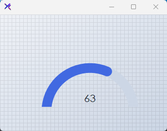{ .light .snapshot} 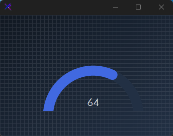{.dark .snapshot}
:::
::: callout success
#### 🟢 DESIGNER SUPPORT
**This control has full Visual Studio design-time support.**
Drag it from the Toolbox onto your form, customize its properties directly in the Properties window, and KimTools will generate the corresponding code for you.
:::
::: hero layout:split glow:true
## Flat / Minimal Gauge
A clean semicircular arc with flat line caps and a uniform success color. No range labels — just the value arc and a subtle track for uncluttered dashboards.
```csharp "🔴 🟡 🟢"
var panel = new FlowLayoutPanel
{
Width = 260,
Height = 180,
Padding = new Padding(20),
BackColor = Color.Transparent,
AutoScroll = false,
FlowDirection = FlowDirection.TopDown
};
var gauge = new KtProgressGauge
{
Width = 220,
Height = 140,
Margin = new Padding(5),
Value = 55,
Minimum = 0,
Maximum = 100,
Thickness = 16,
ProgressColorLow = KtColor.SUCCESS,
ProgressColorHigh = KtColor.SUCCESS,
ProgressBackColor = KtColor.BASE_3,
ProgressCap = KtProgressGauge.CapStyles.Flat,
ShowValueLabel = true,
ShowRangeLabels = false,
TextValueColor = KtColor.CONTENT,
};
panel.Controls.Add(gauge);
```
== side
::: tabs
== tab "Auto" icon:app-window
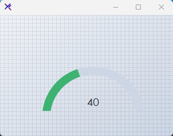{ .light .snapshot} 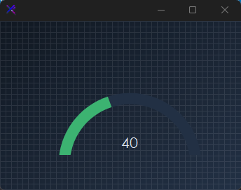{.dark .snapshot}
== tab "Light" icon:sun
{ .snapshot}
== tab "Dark" icon:moon
{ .snapshot}
:::
:::
::: hero layout:split glow:true
## Dual-Range Colors (`ProgressColorLow`, `ProgressColorHigh`, `WarningMark`)
Set `WarningMark` to define the threshold between low and high ranges. Below the mark the arc renders `ProgressColorLow`; above it switches to `ProgressColorHigh`. Useful for health, load, or risk indicators that need immediate visual state changes.
```csharp "🔴 🟡 🟢"
var panel = new FlowLayoutPanel
{
Width = 260,
Height = 180,
Padding = new Padding(20),
BackColor = Color.Transparent,
AutoScroll = false,
FlowDirection = FlowDirection.TopDown
};
var gauge = new KtProgressGauge
{
Width = 220,
Height = 140,
Margin = new Padding(5),
Value = 82,
Minimum = 0,
Maximum = 100,
Thickness = 20,
ProgressColorLow = KtColor.SUCCESS,
ProgressColorHigh = KtColor.ERROR,
ProgressBackColor = KtColor.BASE_3,
ProgressCap = KtProgressGauge.CapStyles.Round,
WarningMark = 70,
ShowValueLabel = true,
ShowRangeLabels = true,
TextValueColor = KtColor.CONTENT,
TextRangeColor = KtColor.CONTENT % 50,
};
panel.Controls.Add(gauge);
```
== side
::: tabs
== tab "Auto" icon:app-window
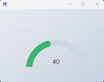{ .light .snapshot} 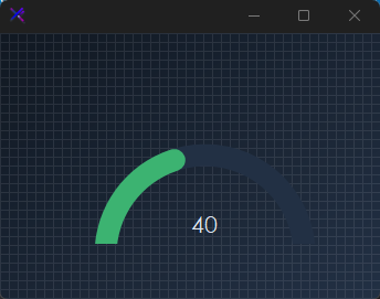{.dark .snapshot}
== tab "Light" icon:sun
{ .snapshot}
== tab "Dark" icon:moon
{ .snapshot}
:::
:::
::: hero layout:split glow:true
## Arc Thickness (`Thickness`)
Scale the gauge weight from a hairline 8 px to a bold 28 px. Thicker arcs feel more prominent and tactile; thinner arcs suit dense dashboard grids.
```csharp "🔴 🟡 🟢"
var panel = new FlowLayoutPanel
{
Width = 320,
Height = 180,
Padding = new Padding(20),
BackColor = Color.Transparent,
AutoScroll = false,
FlowDirection = FlowDirection.LeftToRight
};
var thin = new KtProgressGauge
{
Width = 90,
Height = 120,
Margin = new Padding(5),
Value = 60,
Minimum = 0,
Maximum = 100,
Thickness = 8,
ProgressColorLow = KtColor.PRIMARY,
ProgressColorHigh = KtColor.PRIMARY,
ProgressBackColor = KtColor.BASE_3,
ProgressCap = KtProgressGauge.CapStyles.Round,
ShowValueLabel = false,
ShowRangeLabels = false,
};
var medium = new KtProgressGauge
{
Width = 90,
Height = 120,
Margin = new Padding(5),
Value = 60,
Minimum = 0,
Maximum = 100,
Thickness = 16,
ProgressColorLow = KtColor.PRIMARY,
ProgressColorHigh = KtColor.PRIMARY,
ProgressBackColor = KtColor.BASE_3,
ProgressCap = KtProgressGauge.CapStyles.Round,
ShowValueLabel = false,
ShowRangeLabels = false,
};
var thick = new KtProgressGauge
{
Width = 90,
Height = 120,
Margin = new Padding(5),
Value = 60,
Minimum = 0,
Maximum = 100,
Thickness = 28,
ProgressColorLow = KtColor.PRIMARY,
ProgressColorHigh = KtColor.PRIMARY,
ProgressBackColor = KtColor.BASE_3,
ProgressCap = KtProgressGauge.CapStyles.Round,
ShowValueLabel = false,
ShowRangeLabels = false,
};
panel.Controls.Add(thin);
panel.Controls.Add(medium);
panel.Controls.Add(thick);
```
== side
::: tabs
== tab "Auto" icon:app-window
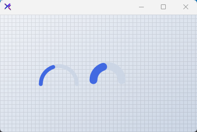{ .light .snapshot} 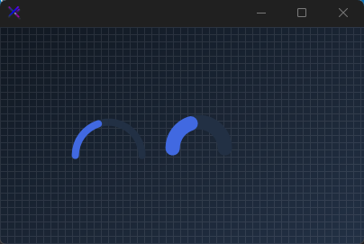{.dark .snapshot}
== tab "Light" icon:sun
{ .snapshot}
== tab "Dark" icon:moon
{ .snapshot}
:::
:::
::: hero layout:split glow:true
## Value & Range Labels (`ShowValueLabel`, `ShowRangeLabels`, `Prefix`, `Suffix`)
Toggle the center value label and the min/max range labels independently. Use `Prefix` and `Suffix` to format the reading (e.g., `$`, `%`, `°C`).
```csharp "🔴 🟡 🟢"
var panel = new FlowLayoutPanel
{
Width = 320,
Height = 200,
Padding = new Padding(20),
BackColor = Color.Transparent,
AutoScroll = false,
FlowDirection = FlowDirection.LeftToRight
};
var valueOnly = new KtProgressGauge
{
Width = 130,
Height = 140,
Margin = new Padding(5),
Value = 45,
Minimum = 0,
Maximum = 100,
Thickness = 18,
ProgressColorLow = KtColor.INFO,
ProgressColorHigh = KtColor.INFO,
ProgressBackColor = KtColor.BASE_3,
ProgressCap = KtProgressGauge.CapStyles.Round,
ShowValueLabel = true,
ShowRangeLabels = false,
Prefix = "",
Suffix = "%",
TextValueColor = KtColor.CONTENT,
};
var fullLabels = new KtProgressGauge
{
Width = 130,
Height = 140,
Margin = new Padding(5),
Value = 78,
Minimum = 0,
Maximum = 100,
Thickness = 18,
ProgressColorLow = KtColor.WARNING,
ProgressColorHigh = KtColor.WARNING,
ProgressBackColor = KtColor.BASE_3,
ProgressCap = KtProgressGauge.CapStyles.Round,
ShowValueLabel = true,
ShowRangeLabels = true,
Prefix = "",
Suffix = "",
TextValueColor = KtColor.CONTENT,
TextRangeColor = KtColor.CONTENT % 50,
};
panel.Controls.Add(valueOnly);
panel.Controls.Add(fullLabels);
```
== side
::: tabs
== tab "Auto" icon:app-window
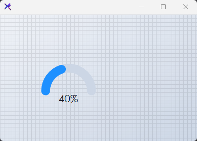{ .light .snapshot} 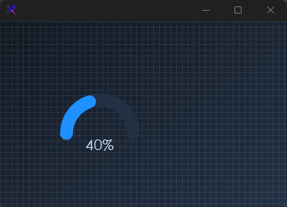{.dark .snapshot}
== tab "Light" icon:sun
{ .snapshot}
== tab "Dark" icon:moon
{ .snapshot}
:::
:::
::: hero layout:split glow:true
## Auto-Generated Track (`AutoGenerateProgressColorWhenLow`, `LighteningFactor`)
When `AutoGenerateProgressColorWhenLow = true`, the background track is automatically tinted from `ProgressColorLow` using `LighteningFactor` (default 70). This keeps the track visually related to the fill without manual color management.
```csharp "🔴 🟡 🟢"
var panel = new FlowLayoutPanel
{
Width = 260,
Height = 180,
Padding = new Padding(20),
BackColor = Color.Transparent,
AutoScroll = false,
FlowDirection = FlowDirection.TopDown
};
var gauge = new KtProgressGauge
{
Width = 220,
Height = 140,
Margin = new Padding(5),
Value = 35,
Minimum = 0,
Maximum = 100,
Thickness = 20,
ProgressColorLow = KtColor.PRIMARY,
ProgressColorHigh = KtColor.ERROR,
ProgressBackColor = KtColor.BASE_3,
ProgressCap = KtProgressGauge.CapStyles.Round,
WarningMark = 70,
AutoGenerateProgressColorWhenLow = true,
AutoGenerateProgressColorWhenHigh = false,
LighteningFactor = 70,
ShowValueLabel = true,
ShowRangeLabels = true,
TextValueColor = KtColor.CONTENT,
TextRangeColor = KtColor.CONTENT % 50,
};
panel.Controls.Add(gauge);
```
== side
::: tabs
== tab "Auto" icon:app-window
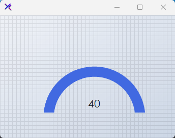{ .light .snapshot} 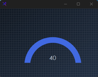{.dark .snapshot}
== tab "Light" icon:sun
{ .snapshot}
== tab "Dark" icon:moon
{ .snapshot}
:::
:::
::: hero layout:split glow:true
## Cap Styles (`ProgressCap`)
`Flat` produces a hard-edged arc termination; `Round` softens the ends with circular caps. Round caps feel friendlier and more modern; flat caps read as precise and technical.
```csharp "🔴 🟡 🟢"
var panel = new FlowLayoutPanel
{
Width = 260,
Height = 180,
Padding = new Padding(20),
BackColor = Color.Transparent,
AutoScroll = false,
FlowDirection = FlowDirection.LeftToRight
};
var flat = new KtProgressGauge
{
Width = 100,
Height = 120,
Margin = new Padding(5),
Value = 60,
Minimum = 0,
Maximum = 100,
Thickness = 18,
ProgressColorLow = KtColor.SUCCESS,
ProgressColorHigh = KtColor.SUCCESS,
ProgressBackColor = KtColor.BASE_3,
ProgressCap = KtProgressGauge.CapStyles.Flat,
ShowValueLabel = false,
ShowRangeLabels = false,
};
var round = new KtProgressGauge
{
Width = 100,
Height = 120,
Margin = new Padding(5),
Value = 60,
Minimum = 0,
Maximum = 100,
Thickness = 18,
ProgressColorLow = KtColor.SUCCESS,
ProgressColorHigh = KtColor.SUCCESS,
ProgressBackColor = KtColor.BASE_3,
ProgressCap = KtProgressGauge.CapStyles.Round,
ShowValueLabel = false,
ShowRangeLabels = false,
};
panel.Controls.Add(flat);
panel.Controls.Add(round);
```
== side
::: tabs
== tab "Auto" icon:app-window
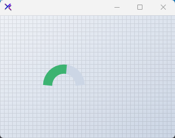{ .light .snapshot} 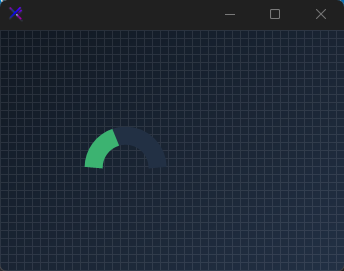{.dark .snapshot}
== tab "Light" icon:sun
{ .snapshot}
== tab "Dark" icon:moon
{ .snapshot}
:::
:::
## API `Reference`
| | | |
| -------- | ------- | ----------- |
| ::: tag "ProgressColorLow" icon:wrench | ::: tag "Kt-Color" color:#820BF4 icon:corner-down-right url:/utilities/kt-color | *Sets the Gauge's progress color whenever it is within the low or minimum value ranges.* |
| ::: tag "ProgressColorHigh" icon:wrench | ::: tag "Kt-Color" color:#820BF4 icon:corner-down-right url:/utilities/kt-color | *Sets the gauge's progress color whenever it is within the high or maximum value ranges as specified by the property 'ProgressHighValueMark'.* |
| ::: tag "TextRangeColor" icon:wrench | ::: tag "Kt-Color" color:#820BF4 icon:corner-down-right url:/utilities/kt-color | *Sets the gauge's range labels' color.* |
| ::: tag "TextValueColor" icon:wrench | ::: tag "Kt-Color" color:#820BF4 icon:corner-down-right url:/utilities/kt-color | *Sets the gauge's value label color.* |
| ::: tag "ProgressBackColor" icon:wrench | ::: tag "Kt-Color" color:#820BF4 icon:corner-down-right url:/utilities/kt-color | *Sets the gauge's progress bakcground color.* |
| ::: tag "ProgressCap" icon:wrench | ::: tag "CapStyles" color:#6B7C94 icon:check-check | *Sets the rendering style of the progress edges.* |
| ::: tag "ShowRangeLabels" icon:wrench | ::: tag "Boolean" color:#0B64F4 icon:external-link url:external:https://learn.microsoft.com/en-us/dotnet/api/system.boolean?view=netframework-4.8 | *Sets a value indicating whether the gauge's range labels will be displayed.* |
| ::: tag "ShowValueLabel" icon:wrench | ::: tag "Boolean" color:#0B64F4 icon:external-link url:external:https://learn.microsoft.com/en-us/dotnet/api/system.boolean?view=netframework-4.8 | *Sets a value indicating whether the gauge's value label will be displayed.* |
| ::: tag "AutoGenerateProgressColorWhenLow" icon:wrench | ::: tag "Boolean" color:#0B64F4 icon:external-link url:external:https://learn.microsoft.com/en-us/dotnet/api/system.boolean?view=netframework-4.8 | *When set to true, a lighter background color will be automatically generated for the progress background color that is based on the set 'ProgressColorLow' color.* |
| ::: tag "AutoGenerateProgressColorWhenHigh" icon:wrench | ::: tag "Boolean" color:#0B64F4 icon:external-link url:external:https://learn.microsoft.com/en-us/dotnet/api/system.boolean?view=netframework-4.8 | *When set to true, a lighter background color will be automatically generated for the progress background color that is based on the set 'ProgressColorHigh' color.* |
| ::: tag "Font" icon:wrench | ::: tag "Font" color:#0B64F4 icon:external-link url:external:https://learn.microsoft.com/en-us/dotnet/api/system.drawing.font?view=netframework-4.8 | *Sets the gauge's standard font.* |
| ::: tag "RangeLabelsFont" icon:wrench | ::: tag "Font" color:#0B64F4 icon:external-link url:external:https://learn.microsoft.com/en-us/dotnet/api/system.drawing.font?view=netframework-4.8 | *Sets the Range labels font.* |
| ::: tag "Value" icon:wrench | ::: tag "Int32" color:#0B64F4 icon:external-link url:external:https://learn.microsoft.com/en-us/dotnet/api/system.int32?view=netframework-4.8 | *Sets the gauge's pointer value.* |
| ::: tag "Minimum" icon:wrench | ::: tag "Int32" color:#0B64F4 icon:external-link url:external:https://learn.microsoft.com/en-us/dotnet/api/system.int32?view=netframework-4.8 | *Sets the minimum range value.* |
| ::: tag "Maximum" icon:wrench | ::: tag "Int32" color:#0B64F4 icon:external-link url:external:https://learn.microsoft.com/en-us/dotnet/api/system.int32?view=netframework-4.8 | *Sets the maximum range value.* |
| ::: tag "WarningMark" icon:wrench | ::: tag "Int32" color:#0B64F4 icon:external-link url:external:https://learn.microsoft.com/en-us/dotnet/api/system.int32?view=netframework-4.8 | *Sets the point at which the gauge should mark as the beginning of high value ranges.* |
| ::: tag "LighteningFactor" icon:wrench | ::: tag "Int32" color:#0B64F4 icon:external-link url:external:https://learn.microsoft.com/en-us/dotnet/api/system.int32?view=netframework-4.8 | *Applies a lightening value/factor that will be used to generate the progress background color when the value set is either high or low. (Default is 70)* |
| ::: tag "Thickness" icon:wrench | ::: tag "Int32" color:#0B64F4 icon:external-link url:external:https://learn.microsoft.com/en-us/dotnet/api/system.int32?view=netframework-4.8 | *Sets the gauge's progress thickness.* |
| ::: tag "RangeEnd" icon:wrench | ::: tag "Int32" color:#0B64F4 icon:external-link url:external:https://learn.microsoft.com/en-us/dotnet/api/system.int32?view=netframework-4.8 | *Sets the Range end.* |
| ::: tag "RangeStart" icon:wrench | ::: tag "Int32" color:#0B64F4 icon:external-link url:external:https://learn.microsoft.com/en-us/dotnet/api/system.int32?view=netframework-4.8 | *Sets the Range start.* |
| ::: tag "ProgressHighValueMark" icon:wrench | ::: tag "Int32" color:#0B64F4 icon:external-link url:external:https://learn.microsoft.com/en-us/dotnet/api/system.int32?view=netframework-4.8 | *Sets the Progress high value mark.* |
| ::: tag "Prefix" icon:wrench | ::: tag "String" color:#0B64F4 icon:external-link url:external:https://learn.microsoft.com/en-us/dotnet/api/system.string?view=netframework-4.8 | *Sets the gauge's prefix text that precedes the gauge value.* |
| ::: tag "Suffix" icon:wrench | ::: tag "String" color:#0B64F4 icon:external-link url:external:https://learn.microsoft.com/en-us/dotnet/api/system.string?view=netframework-4.8 | *Sets the gauge's suffix text that is displayed besides the gauge value.* |
---
## [KimTools / Controls / ProgressRadial](https://kimtoo.net/controls/kt-progress-radial/)
---
title: "KimTools / Controls / ProgressRadial"
description: "A customizable circular progress indicator with gradient arcs, independent cap styles, sub/superscript annotations, and smooth animation support."
keywords: ["KimTools", "Controls", "KtProgressRadial", "ProgressRadial", "ProgressBar"]
toc: false
layout: "full"
---
::: hero layout:split glow:true
# Kt `ProgressRadial`
A customizable circular progress indicator with gradient arcs, independent cap styles, sub/superscript annotations, and smooth animation support.
::: callout tip
#### 🟣 PREMIUM
This component is only available in the Premium version of KimTools.
::: button "Get KimTools" external:https://kimtoo.net/#pricinghttps://kimtoo.net/#pricing icon:external-link
:::
== side
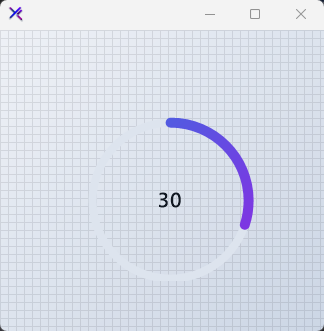{ .light .snapshot} 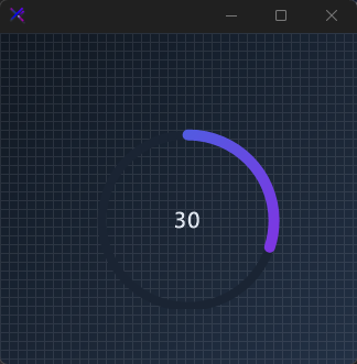{.dark .snapshot}
:::
::: callout success
#### 🟢 DESIGNER SUPPORT
**This control has full Visual Studio design-time support.**
Drag it from the Toolbox onto your form, customize its properties directly in the Properties window, and KimTools will generate the corresponding code for you.
:::
::: hero layout:split glow:true
## Flat / Minimal Radial
A clean solid-color ring with uniform track thickness and flat caps. No gradients, no ornamentation — just a precise arc against a subtle track.
```csharp "🔴 🟡 🟢"
var panel = new FlowLayoutPanel
{
Width = 240,
Height = 240,
Padding = new Padding(20),
BackColor = Color.Transparent,
AutoScroll = false,
FlowDirection = FlowDirection.TopDown
};
var radial = new KtProgressRadial
{
Width = 180,
Height = 180,
Margin = new Padding(10),
Value = 42,
Minimum = 0,
Maximum = 100,
Background = KtColor.BASE_2,
Foreground = KtColor.PRIMARY % 80,
Thickness = 6,
CircleMargin = 10,
CapStart = KtProgressRadial.CapStyles.Flat,
CapEnd = KtProgressRadial.CapStyles.Flat,
ValueColor = KtColor.CONTENT,
ValueMargin = new Padding(0)
};
panel.Controls.Add(radial);
```
== side
::: tabs
== tab "Auto" icon:app-window
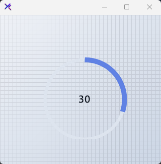{ .light .snapshot} 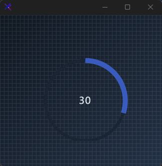{.dark .snapshot}
== tab "Light" icon:sun
{ .snapshot}
== tab "Dark" icon:moon
{ .snapshot}
:::
:::
::: hero layout:split glow:true
## Gradient / Neon Radial
A vivid Fuchsia-to-Violet gradient sweep with a thick, rounded progress arc. High contrast against a deep base makes the ring feel electric and modern.
```csharp "🔴 🟡 🟢"
var panel = new FlowLayoutPanel
{
Width = 240,
Height = 240,
Padding = new Padding(20),
BackColor = Color.Transparent,
AutoScroll = false,
FlowDirection = FlowDirection.TopDown
};
var radial = new KtProgressRadial
{
Width = 180,
Height = 180,
Margin = new Padding(10),
Value = 78,
Minimum = 0,
Maximum = 100,
Background = KtColor.BASE_1,
Foreground = (KtColor.Fuchsia, KtColor.Violet, 45),
Thickness = 6,
CircleMargin = 10,
CapStart = KtProgressRadial.CapStyles.Round,
CapEnd = KtProgressRadial.CapStyles.Round,
ValueColor = KtColor.White,
ValueMargin = new Padding(0)
};
panel.Controls.Add(radial);
```
== side
::: tabs
== tab "Auto" icon:app-window
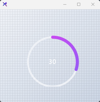{ .light .snapshot} 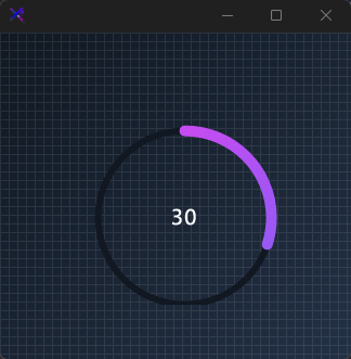{.dark .snapshot}
== tab "Light" icon:sun
{ .snapshot}
== tab "Dark" icon:moon
{ .snapshot}
:::
:::
::: hero layout:split glow:true
## Cap Styles (`CapStart`, `CapEnd`)
Individual control over the start and end line caps: `Flat`, `Round`, `Arrow`, or `Triangle`. Here the arc begins with an arrow and terminates in a triangle for a directional, gauge-like read.
```csharp "🔴 🟡 🟢"
var panel = new FlowLayoutPanel
{
Width = 240,
Height = 240,
Padding = new Padding(20),
BackColor = Color.Transparent,
AutoScroll = false,
FlowDirection = FlowDirection.TopDown
};
var radial = new KtProgressRadial
{
Width = 180,
Height = 180,
Margin = new Padding(10),
Value = 60,
Minimum = 0,
Maximum = 100,
Background = KtColor.BASE_2,
Foreground = KtColor.WARNING,
Thickness = 6,
CircleMargin = 10,
CapStart = KtProgressRadial.CapStyles.Arrow,
CapEnd = KtProgressRadial.CapStyles.Triangle,
ValueColor = KtColor.CONTENT,
ValueMargin = new Padding(0)
};
panel.Controls.Add(radial);
```
== side
::: tabs
== tab "Auto" icon:app-window
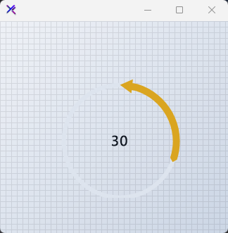{ .light .snapshot} 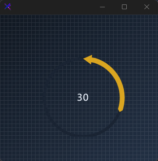{.dark .snapshot}
== tab "Light" icon:sun
{ .snapshot}
== tab "Dark" icon:moon
{ .snapshot}
:::
:::
::: hero layout:split glow:true
## Track Thickness (`Thickness`)
Control the background track weight independently. A thin 3 px track beneath the default bold fill creates strong hierarchical focus on the current value.
```csharp "🔴 🟡 🟢"
var panel = new FlowLayoutPanel
{
Width = 240,
Height = 240,
Padding = new Padding(20),
BackColor = Color.Transparent,
AutoScroll = false,
FlowDirection = FlowDirection.TopDown
};
var radial = new KtProgressRadial
{
Width = 180,
Height = 180,
Margin = new Padding(10),
Value = 55,
Minimum = 0,
Maximum = 100,
Background = KtColor.BASE_2,
Foreground = (KtColor.INFO, KtColor.PRIMARY),
Thickness = 3,
CircleMargin = 10,
CapStart = KtProgressRadial.CapStyles.Round,
CapEnd = KtProgressRadial.CapStyles.Round,
ValueColor = KtColor.CONTENT,
ValueMargin = new Padding(0)
};
panel.Controls.Add(radial);
```
== side
::: tabs
== tab "Auto" icon:app-window
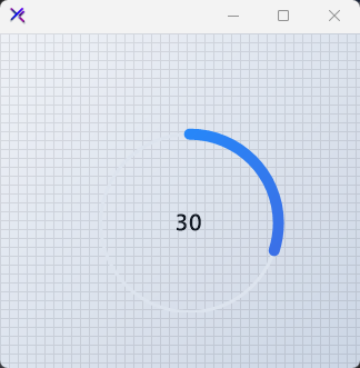{ .light .snapshot} 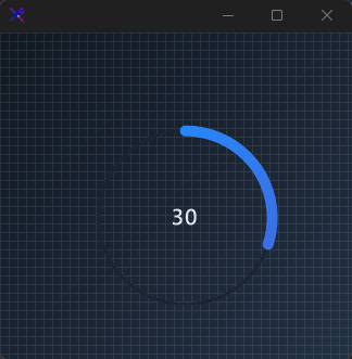{.dark .snapshot}
== tab "Light" icon:sun
{ .snapshot}
== tab "Dark" icon:moon
{ .snapshot}
:::
:::
::: hero layout:split glow:true
## Percentage Mode (`IsPercentage`)
Set `IsPercentage = true` to display the value as a percent with a `%` superscript. The superscript is automatically positioned and tinted via `SuperScriptColor`.
```csharp "🔴 🟡 🟢"
var panel = new FlowLayoutPanel
{
Width = 240,
Height = 240,
Padding = new Padding(20),
BackColor = Color.Transparent,
AutoScroll = false,
FlowDirection = FlowDirection.TopDown
};
var radial = new KtProgressRadial
{
Width = 180,
Height = 180,
Margin = new Padding(10),
Value = 65,
Minimum = 0,
Maximum = 100,
IsPercentage = true,
Background = KtColor.BASE_2,
Foreground = KtColor.SUCCESS,
Thickness = 8,
CircleMargin = 10,
CapStart = KtProgressRadial.CapStyles.Round,
CapEnd = KtProgressRadial.CapStyles.Round,
ValueColor = KtColor.CONTENT,
SuperScriptColor = KtColor.CONTENT % 70,
ValueMargin = new Padding(0)
};
panel.Controls.Add(radial);
```
== side
::: tabs
== tab "Auto" icon:app-window
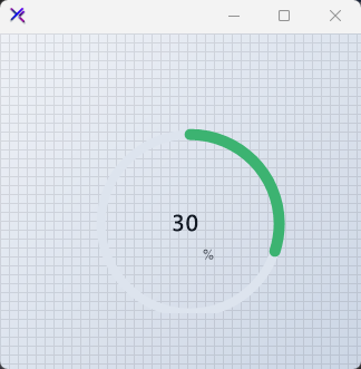{ .light .snapshot} 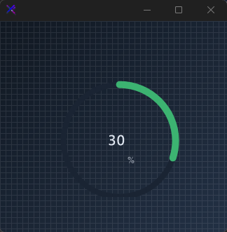{.dark .snapshot}
== tab "Light" icon:sun
{ .snapshot}
== tab "Dark" icon:moon
{ .snapshot}
:::
:::
::: hero layout:split glow:true
## Subscript & Superscript (`SubScriptText`, `SuperScriptText`)
Annotate the center value with secondary labels. `SuperScriptText` sits above-right, `SubScriptText` sits below-right — each with independent margins, colors, and a shared `SecondaryFont`.
```csharp "🔴 🟡 🟢"
var panel = new FlowLayoutPanel
{
Width = 260,
Height = 260,
Padding = new Padding(20),
BackColor = Color.Transparent,
AutoScroll = false,
FlowDirection = FlowDirection.TopDown
};
var radial = new KtProgressRadial
{
Width = 200,
Height = 200,
Margin = new Padding(10),
Value = 12,
Minimum = 0,
Maximum = 32,
Background = KtColor.BASE_2,
Foreground = (KtColor.Rose, KtColor.Pink),
Thickness = 6,
CircleMargin = 10,
CapStart = KtProgressRadial.CapStyles.Round,
CapEnd = KtProgressRadial.CapStyles.Round,
ValueColor = KtColor.CONTENT,
SuperScriptText = "GB",
SuperScriptColor = KtColor.CONTENT % 70,
SuperScriptMargin = new Padding(5, 20, 0, 0),
SubScriptText = "used",
SubScriptColor = KtColor.CONTENT % 50,
SubScriptMargin = new Padding(5, -20, 0, 0),
SecondaryFont = new Font("Segoe UI", 8f),
ValueMargin = new Padding(0)
};
panel.Controls.Add(radial);
```
== side
::: tabs
== tab "Auto" icon:app-window
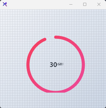{ .light .snapshot} 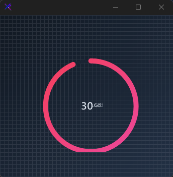{.dark .snapshot}
== tab "Light" icon:sun
{ .snapshot}
== tab "Dark" icon:moon
{ .snapshot}
:::
:::
::: hero layout:split glow:true
## Animated / Indeterminate (`Animated`, `AnimationInterval`, `AnimationSpeed`)
When `Animated = true` and the value is between min and max, the arc continuously rotates. Control the spin speed with `AnimationInterval` (degrees per tick) and `AnimationSpeed` (timer interval in ms).
```csharp "🔴 🟡 🟢"
var panel = new FlowLayoutPanel
{
Width = 240,
Height = 240,
Padding = new Padding(20),
BackColor = Color.Transparent,
AutoScroll = false,
FlowDirection = FlowDirection.TopDown
};
var radial = new KtProgressRadial
{
Width = 180,
Height = 180,
Margin = new Padding(10),
Value = 50,
Minimum = 0,
Maximum = 100,
Animated = true,
AnimationInterval = 4,
AnimationSpeed = 30,
Background = KtColor.BASE_2,
Foreground = KtColor.WARNING,
Thickness = 6,
CircleMargin = 10,
CapStart = KtProgressRadial.CapStyles.Round,
CapEnd = KtProgressRadial.CapStyles.Round,
ValueColor = KtColor.CONTENT,
ValueMargin = new Padding(0)
};
panel.Controls.Add(radial);
```
== side
::: tabs
== tab "Auto" icon:app-window
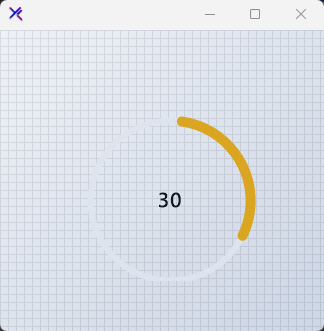{ .light .snapshot} 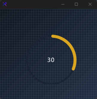{.dark .snapshot}
== tab "Light" icon:sun
{ .snapshot}
== tab "Dark" icon:moon
{ .snapshot}
:::
:::
## API `Reference`
| | | |
| -------- | ------- | ----------- |
| ::: tag "Foreground" icon:wrench | ::: tag "Kt-Brush" color:#820BF4 icon:corner-down-right url:/utilities/kt-brush | *Sets the progress color.* |
| ::: tag "SubScriptColor" icon:wrench | ::: tag "Kt-Color" color:#820BF4 icon:corner-down-right url:/utilities/kt-color | *Sets the subscript color.* |
| ::: tag "SuperScriptColor" icon:wrench | ::: tag "Kt-Color" color:#820BF4 icon:corner-down-right url:/utilities/kt-color | *Sets the superscript color.* |
| ::: tag "Background" icon:wrench | ::: tag "Kt-Color" color:#820BF4 icon:corner-down-right url:/utilities/kt-color | *Sets the progress background color.* |
| ::: tag "ValueColor" icon:wrench | ::: tag "Kt-Color" color:#820BF4 icon:corner-down-right url:/utilities/kt-color | *Sets the progress background color.* |
| ::: tag "CapStart" icon:wrench | ::: tag "CapStyles" color:#6B7C94 icon:check-check | *Sets the rendering style of the progress starting point.* |
| ::: tag "CapEnd" icon:wrench | ::: tag "CapStyles" color:#6B7C94 icon:check-check | *Sets the rendering style of the progress ending point.* |
| ::: tag "Animated" icon:wrench | ::: tag "Boolean" color:#0B64F4 icon:external-link url:external:https://learn.microsoft.com/en-us/dotnet/api/system.boolean?view=netframework-4.8 | *Sets a value indicating whether the progress movement will be animated.* |
| ::: tag "IsPercentage" icon:wrench | ::: tag "Boolean" color:#0B64F4 icon:external-link url:external:https://learn.microsoft.com/en-us/dotnet/api/system.boolean?view=netframework-4.8 | *Sets a value indicating whether the progress value will be in percentage format.* |
| ::: tag "Font" icon:wrench | ::: tag "Font" color:#0B64F4 icon:external-link url:external:https://learn.microsoft.com/en-us/dotnet/api/system.drawing.font?view=netframework-4.8 | *Sets the control's primary font.* |
| ::: tag "SecondaryFont" icon:wrench | ::: tag "Font" color:#0B64F4 icon:external-link url:external:https://learn.microsoft.com/en-us/dotnet/api/system.drawing.font?view=netframework-4.8 | *Sets the secondary font.* |
| ::: tag "Value" icon:wrench | ::: tag "Int32" color:#0B64F4 icon:external-link url:external:https://learn.microsoft.com/en-us/dotnet/api/system.int32?view=netframework-4.8 | *Sets the progress value.* |
| ::: tag "Minimum" icon:wrench | ::: tag "Int32" color:#0B64F4 icon:external-link url:external:https://learn.microsoft.com/en-us/dotnet/api/system.int32?view=netframework-4.8 | *Sets the minimum progress value.* |
| ::: tag "Maximum" icon:wrench | ::: tag "Int32" color:#0B64F4 icon:external-link url:external:https://learn.microsoft.com/en-us/dotnet/api/system.int32?view=netframework-4.8 | *Sets the maximum progress value.* |
| ::: tag "CircleMargin" icon:wrench | ::: tag "Int32" color:#0B64F4 icon:external-link url:external:https://learn.microsoft.com/en-us/dotnet/api/system.int32?view=netframework-4.8 | *Sets the circle margin.* |
| ::: tag "Thickness" icon:wrench | ::: tag "Int32" color:#0B64F4 icon:external-link url:external:https://learn.microsoft.com/en-us/dotnet/api/system.int32?view=netframework-4.8 | *Sets the line thickness.* |
| ::: tag "AnimationInterval" icon:wrench | ::: tag "Int32" color:#0B64F4 icon:external-link url:external:https://learn.microsoft.com/en-us/dotnet/api/system.int32?view=netframework-4.8 | *Sets the animation interval.* |
| ::: tag "AnimationSpeed" icon:wrench | ::: tag "Int32" color:#0B64F4 icon:external-link url:external:https://learn.microsoft.com/en-us/dotnet/api/system.int32?view=netframework-4.8 | *Sets the animation speed.* |
| ::: tag "SubScriptText" icon:wrench | ::: tag "String" color:#0B64F4 icon:external-link url:external:https://learn.microsoft.com/en-us/dotnet/api/system.string?view=netframework-4.8 | *Sets the subscript text.* |
| ::: tag "SuperScriptText" icon:wrench | ::: tag "String" color:#0B64F4 icon:external-link url:external:https://learn.microsoft.com/en-us/dotnet/api/system.string?view=netframework-4.8 | *Sets the superscript text.* |
| ::: tag "ValueMargin" icon:wrench | ::: tag "Padding" color:#0B64F4 icon:external-link url:external:https://learn.microsoft.com/en-us/dotnet/api/system.windows.forms.padding?view=netframework-4.8 | *Sets the value text margin.* |
| ::: tag "SuperScriptMargin" icon:wrench | ::: tag "Padding" color:#0B64F4 icon:external-link url:external:https://learn.microsoft.com/en-us/dotnet/api/system.windows.forms.padding?view=netframework-4.8 | *Sets the superscript margin.* |
| ::: tag "SubScriptMargin" icon:wrench | ::: tag "Padding" color:#0B64F4 icon:external-link url:external:https://learn.microsoft.com/en-us/dotnet/api/system.windows.forms.padding?view=netframework-4.8 | *Sets the subscript margin.* |
---
## [KimTools / Controls / Progress](https://kimtoo.net/controls/kt-progress/)
---
title: "KimTools / Controls / Progress"
description: "A stylish progress indicator supporting dual-layer rendering, gradient fills, hatch patterns, rounded corners, per-edge border control, and animated spinner text."
keywords: ["KimTools", "Controls", "KtProgress", "Progress", "UserControl"]
toc: false
layout: "full"
---
::: hero layout:split glow:true
# Kt `Progress`
A stylish progress indicator supporting dual-layer rendering, gradient fills, hatch patterns, rounded corners, per-edge border control, and animated spinner text.
::: callout tip
#### 🟣 PREMIUM
This component is only available in the Premium version of KimTools.
::: button "Get KimTools" external:https://kimtoo.net/#pricinghttps://kimtoo.net/#pricing icon:external-link
:::
== side
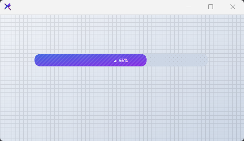{ .light .snapshot} 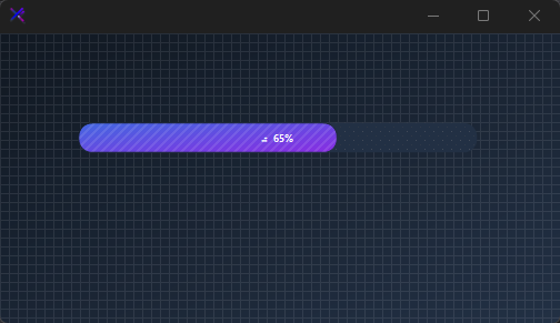{.dark .snapshot}
:::
::: callout success
#### 🟢 DESIGNER SUPPORT
**This control has full Visual Studio design-time support.**
Drag it from the Toolbox onto your form, customize its properties directly in the Properties window, and KimTools will generate the corresponding code for you.
:::
::: hero layout:split glow:true
## Flat / Minimal Progress
A clean, understated bar with a solid primary fill at 80% opacity. Thin border on the track, modest 6 px radius, and centered text. No gradients — just precise geometry and subtle contrast.
```csharp "🔴 🟡 🟢"
var panel = new FlowLayoutPanel
{
Width = 420,
Height = 200,
Padding = new Padding(20),
BackColor = Color.Transparent,
AutoScroll = false,
FlowDirection = FlowDirection.TopDown
};
var progress = new KtProgress
{
Width = 380,
Height = 24,
Margin = new Padding(0, 8, 0, 8),
Value = 42,
Background = KtColor.BASE_2,
Foreground = KtColor.PRIMARY % 80,
BackgroundBorderRadius = 6,
ForegroundBorderRadius = 6,
BackgroundBorderWidth = 1,
BackgroundBorder = KtColor.BASE_3,
ForegroundText = KtColor.White,
BackgroundText = KtColor.CONTENT,
TextAlign = ContentAlignment.MiddleCenter,
TextVisible = true,
Text = "Uploading..."
};
panel.Controls.Add(progress);
```
== side
::: tabs
== tab "Auto" icon:app-window
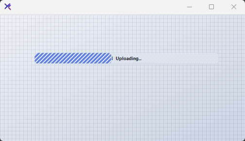{ .light .snapshot} 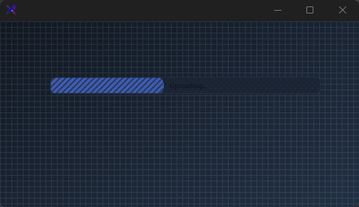{.dark .snapshot}
== tab "Light" icon:sun
{ .snapshot}
== tab "Dark" icon:moon
{ .snapshot}
:::
:::
::: hero layout:split glow:true
## Gradient / Neon Progress
A vivid Fuchsia-to-Violet gradient fill at a 45° angle, wrapped in a full pill shape (16 px radius). A subtle white border on the foreground adds depth. The percentage is drawn with automatic contrast against both layers.
```csharp "🔴 🟡 🟢"
var panel = new FlowLayoutPanel
{
Width = 420,
Height = 200,
Padding = new Padding(20),
BackColor = Color.Transparent,
AutoScroll = false,
FlowDirection = FlowDirection.TopDown
};
var progress = new KtProgress
{
Width = 380,
Height = 32,
Margin = new Padding(0, 8, 0, 8),
Value = 78,
Background = KtColor.BASE_1,
Foreground = (KtColor.Fuchsia, KtColor.Violet, 45),
BackgroundBorderRadius = 16,
ForegroundBorderRadius = 16,
BackgroundBorderWidth = 0,
ForegroundBorderWidth = 1,
ForegroundBorder = KtColor.White % 30,
ForegroundText = KtColor.White,
BackgroundText = KtColor.CONTENT,
TextAlign = ContentAlignment.MiddleCenter,
TextVisible = true,
Text = "%"
};
panel.Controls.Add(progress);
```
== side
::: tabs
== tab "Auto" icon:app-window
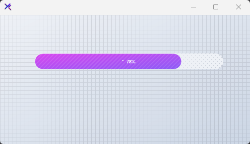{ .light .snapshot} 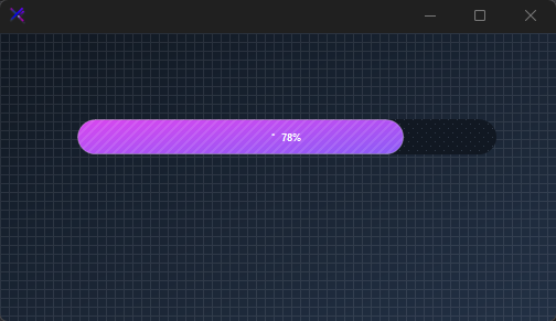{.dark .snapshot}
== tab "Light" icon:sun
{ .snapshot}
== tab "Dark" icon:moon
{ .snapshot}
:::
:::
::: hero layout:split glow:true
## Patterned / Textured Progress
Both track and fill carry independent hatch patterns via `BackgroundPattern` and `ForegroundPattern`. Use `*PatternColor` to tint the texture. Great for indicating indeterminate or heavy-processing states with visual grit.
```csharp "🔴 🟡 🟢"
var panel = new FlowLayoutPanel
{
Width = 420,
Height = 200,
Padding = new Padding(20),
BackColor = Color.Transparent,
AutoScroll = false,
FlowDirection = FlowDirection.TopDown
};
var progress = new KtProgress
{
Width = 380,
Height = 28,
Margin = new Padding(0, 8, 0, 8),
Value = 55,
Background = KtColor.BASE_2,
Foreground = KtColor.SUCCESS,
BackgroundPattern = HatchStyle.LightUpwardDiagonal,
BackgroundPatternColor = KtColor.BASE_3,
ForegroundPattern = HatchStyle.DarkDownwardDiagonal,
ForegroundPatternColor = KtColor.SUCCESS % 40,
BackgroundBorderRadius = 8,
ForegroundBorderRadius = 8,
BackgroundBorderWidth = 1,
BackgroundBorder = KtColor.BASE_3,
ForegroundText = KtColor.White,
BackgroundText = KtColor.CONTENT,
TextAlign = ContentAlignment.MiddleCenter,
TextVisible = true,
Text = "Processing..."
};
panel.Controls.Add(progress);
```
== side
::: tabs
== tab "Auto" icon:app-window
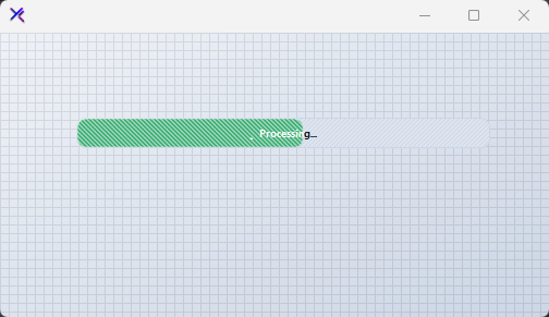{ .light .snapshot} 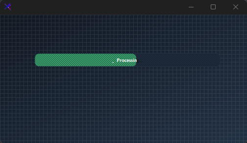{.dark .snapshot}
== tab "Light" icon:sun
{ .snapshot}
== tab "Dark" icon:moon
{ .snapshot}
:::
:::
::: hero layout:split glow:true
## Per-Edge Border Control (`ForegroundBorderEdges`, `BackgroundBorderEdges`)
Round or sharpen individual corners using `KtBrush.Edges`. Here the foreground has a 2 px left-side border with squared-off right edges, giving the fill a directional, meter-like appearance. Useful for segmented or terminal-style progress visuals.
```csharp "🔴 🟡 🟢"
var panel = new FlowLayoutPanel
{
Width = 420,
Height = 240,
Padding = new Padding(20),
BackColor = Color.Transparent,
AutoScroll = false,
FlowDirection = FlowDirection.TopDown
};
var progress = new KtProgress
{
Width = 380,
Height = 28,
Margin = new Padding(0, 8, 0, 8),
Value = 60,
Background = KtColor.BASE_2,
Foreground = (KtColor.INFO, KtColor.PRIMARY),
BackgroundBorderRadius = 0,
ForegroundBorderRadius = 0,
BackgroundBorderWidth = 1,
BackgroundBorder = KtColor.BASE_3,
ForegroundBorderWidth = 2,
ForegroundBorder = KtColor.INFO,
ForegroundText = KtColor.White,
BackgroundText = KtColor.CONTENT,
TextAlign = ContentAlignment.MiddleLeft,
TextVisible = true,
Text = " Downloading..."
};
progress.ForegroundBorderEdges.TopLeft = true;
progress.ForegroundBorderEdges.BottomLeft = true;
progress.ForegroundBorderEdges.TopRight = false;
progress.ForegroundBorderEdges.BottomRight = false;
panel.Controls.Add(progress);
```
== side
::: tabs
== tab "Auto" icon:app-window
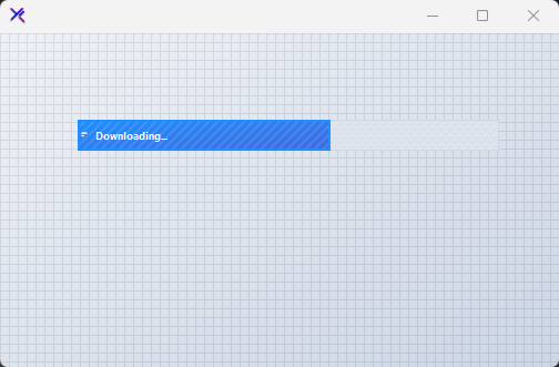{ .light .snapshot} 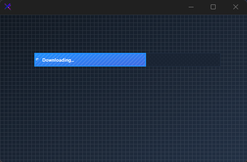{.dark .snapshot}
== tab "Light" icon:sun
{ .snapshot}
== tab "Dark" icon:moon
{ .snapshot}
:::
:::
::: hero layout:split glow:true
## Animated Spinner Text (`TextSpinner`)
When `TextSpinner = true` and the value is strictly between min and max, a cycling braille spinner is prepended to the label. Set `Text = "%"` to auto-insert the current percentage. The spinner pauses automatically when the bar reaches `ValueMax` (Completed).
```csharp "🔴 🟡 🟢"
var panel = new FlowLayoutPanel
{
Width = 420,
Height = 240,
Padding = new Padding(20),
BackColor = Color.Transparent,
AutoScroll = false,
FlowDirection = FlowDirection.TopDown
};
var progress = new KtProgress
{
Width = 380,
Height = 28,
Margin = new Padding(0, 8, 0, 8),
Value = 33,
ValueMin = 0,
ValueMax = 100,
Background = KtColor.BASE_2,
Foreground = KtColor.WARNING,
BackgroundBorderRadius = 6,
ForegroundBorderRadius = 6,
ForegroundText = KtColor.BASE_1,
BackgroundText = KtColor.CONTENT,
TextAlign = ContentAlignment.MiddleCenter,
TextVisible = true,
TextSpinner = true,
Text = "%"
};
panel.Controls.Add(progress);
```
== side
::: tabs
== tab "Auto" icon:app-window
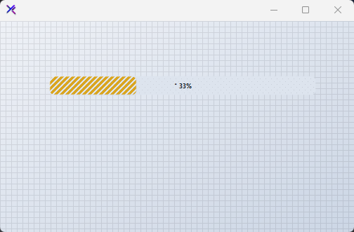{ .light .snapshot} 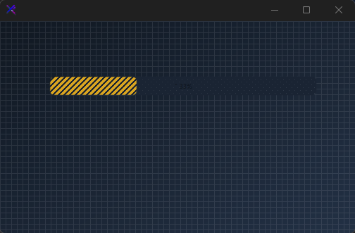{.dark .snapshot}
== tab "Light" icon:sun
{ .snapshot}
== tab "Dark" icon:moon
{ .snapshot}
:::
:::
::: hero layout:split glow:true
## Completed State (`Value`, `ValueMax`, `Completed`)
When `Value >= ValueMax`, the bar is full and the `Completed` property returns `true`, raising the `Complete` event. The spinner disappears and the fill spans the entire padded track. Use a Success-to-Emerald gradient to communicate completion clearly.
```csharp "🔴 🟡 🟢"
var panel = new FlowLayoutPanel
{
Width = 420,
Height = 240,
Padding = new Padding(20),
BackColor = Color.Transparent,
AutoScroll = false,
FlowDirection = FlowDirection.TopDown
};
var progress = new KtProgress
{
Width = 380,
Height = 32,
Margin = new Padding(0, 8, 0, 8),
Value = 100,
ValueMin = 0,
ValueMax = 100,
Background = KtColor.BASE_2,
Foreground = (KtColor.SUCCESS, KtColor.Emerald),
BackgroundBorderRadius = 10,
ForegroundBorderRadius = 10,
BackgroundPad = new Padding(2),
ForegroundText = KtColor.White,
BackgroundText = KtColor.CONTENT,
TextAlign = ContentAlignment.MiddleCenter,
TextVisible = true,
TextSpinner = true,
Text = "Done!"
};
panel.Controls.Add(progress);
```
== side
::: tabs
== tab "Auto" icon:app-window
{ .light .snapshot} {.dark .snapshot}
== tab "Light" icon:sun
{ .snapshot}
== tab "Dark" icon:moon
{ .snapshot}
:::
:::
## API `Reference`
| | | |
| -------- | ------- | ----------- |
| ::: tag "Background" icon:wrench | ::: tag "Kt-Brush" color:#820BF4 icon:corner-down-right url:/utilities/kt-brush | *Sets the Background.* |
| ::: tag "BackgroundBorder" icon:wrench | ::: tag "Kt-Brush" color:#820BF4 icon:corner-down-right url:/utilities/kt-brush | *Sets the Background border.* |
| ::: tag "Foreground" icon:wrench | ::: tag "Kt-Brush" color:#820BF4 icon:corner-down-right url:/utilities/kt-brush | *Sets the Foreground.* |
| ::: tag "ForegroundBorder" icon:wrench | ::: tag "Kt-Brush" color:#820BF4 icon:corner-down-right url:/utilities/kt-brush | *Sets the Foreground border.* |
| ::: tag "ForegroundBorderEdges" icon:wrench | ::: tag "Edges" color:#6B7C94 icon:check-check | *Sets the Foreground border edges.* |
| ::: tag "BackgroundBorderEdges" icon:wrench | ::: tag "Edges" color:#6B7C94 icon:check-check | *Sets the Background border edges.* |
| ::: tag "BackgroundPatternColor" icon:wrench | ::: tag "Kt-Color" color:#820BF4 icon:corner-down-right url:/utilities/kt-color | *Sets the Background pattern color.* |
| ::: tag "ForegroundPatternColor" icon:wrench | ::: tag "Kt-Color" color:#820BF4 icon:corner-down-right url:/utilities/kt-color | *Sets the Foreground pattern color.* |
| ::: tag "ForegroundText" icon:wrench | ::: tag "Kt-Color" color:#820BF4 icon:corner-down-right url:/utilities/kt-color | *Sets the Foreground text.* |
| ::: tag "BackgroundText" icon:wrench | ::: tag "Kt-Color" color:#820BF4 icon:corner-down-right url:/utilities/kt-color | *Sets the Background text.* |
| ::: tag "TextVisible" icon:wrench | ::: tag "Boolean" color:#0B64F4 icon:external-link url:external:https://learn.microsoft.com/en-us/dotnet/api/system.boolean?view=netframework-4.8 | *Sets the Text visible.* |
| ::: tag "TextSpinner" icon:wrench | ::: tag "Boolean" color:#0B64F4 icon:external-link url:external:https://learn.microsoft.com/en-us/dotnet/api/system.boolean?view=netframework-4.8 | *Sets the Text spinner.* |
| ::: tag "TextAlign" icon:wrench | ::: tag "ContentAlignment" color:#0B64F4 icon:external-link url:external:https://learn.microsoft.com/en-us/dotnet/api/system.drawing.contentalignment?view=netframework-4.8 | *Sets the Text align.* |
| ::: tag "Value" icon:wrench | ::: tag "Int32" color:#0B64F4 icon:external-link url:external:https://learn.microsoft.com/en-us/dotnet/api/system.int32?view=netframework-4.8 | *Sets the Value.* |
| ::: tag "ValueMin" icon:wrench | ::: tag "Int32" color:#0B64F4 icon:external-link url:external:https://learn.microsoft.com/en-us/dotnet/api/system.int32?view=netframework-4.8 | *Sets the Value min.* |
| ::: tag "ValueMax" icon:wrench | ::: tag "Int32" color:#0B64F4 icon:external-link url:external:https://learn.microsoft.com/en-us/dotnet/api/system.int32?view=netframework-4.8 | *Sets the Value max.* |
| ::: tag "BackgroundPattern" icon:wrench | ::: tag "HatchStyle" color:#0B64F4 icon:external-link url:external:https://learn.microsoft.com/en-us/dotnet/api/system.drawing.drawing2d.hatchstyle?view=netframework-4.8 ::: tag "Nullable" color:#F96A06 icon:circle-alert url:external:https://learn.microsoft.com/en-us/dotnet/csharp/language-reference/builtin-types/nullable-value-types | *Sets the Background pattern.* |
| ::: tag "ForegroundPattern" icon:wrench | ::: tag "HatchStyle" color:#0B64F4 icon:external-link url:external:https://learn.microsoft.com/en-us/dotnet/api/system.drawing.drawing2d.hatchstyle?view=netframework-4.8 ::: tag "Nullable" color:#F96A06 icon:circle-alert url:external:https://learn.microsoft.com/en-us/dotnet/csharp/language-reference/builtin-types/nullable-value-types | *Sets the Foreground pattern.* |
| ::: tag "BackgroundBorderRadius" icon:wrench | ::: tag "float" color:#0B64F4 icon:external-link url:external:https://learn.microsoft.com/en-us/dotnet/api/system.single?view=netframework-4.8 | *Sets the Background border radius.* |
| ::: tag "ForegroundBorderRadius" icon:wrench | ::: tag "float" color:#0B64F4 icon:external-link url:external:https://learn.microsoft.com/en-us/dotnet/api/system.single?view=netframework-4.8 | *Sets the Foreground border radius.* |
| ::: tag "ForegroundBorderWidth" icon:wrench | ::: tag "float" color:#0B64F4 icon:external-link url:external:https://learn.microsoft.com/en-us/dotnet/api/system.single?view=netframework-4.8 | *Sets the Foreground border width.* |
| ::: tag "BackgroundBorderWidth" icon:wrench | ::: tag "float" color:#0B64F4 icon:external-link url:external:https://learn.microsoft.com/en-us/dotnet/api/system.single?view=netframework-4.8 | *Sets the Background border width.* |
| ::: tag "Text_" icon:wrench | ::: tag "String" color:#0B64F4 icon:external-link url:external:https://learn.microsoft.com/en-us/dotnet/api/system.string?view=netframework-4.8 | *Sets the Text .* |
| ::: tag "BackgroundPad" icon:wrench | ::: tag "Padding" color:#0B64F4 icon:external-link url:external:https://learn.microsoft.com/en-us/dotnet/api/system.windows.forms.padding?view=netframework-4.8 | *Sets the Background pad.* |
---
## [KimTools / Controls / RadioBox](https://kimtoo.net/controls/kt-radio-box/)
---
title: "KimTools / Controls / RadioBox"
description: "A customizable, stylish radio button control for WinForms with built-in binding and color states."
keywords: ["KimTools", "Controls", "KtRadioBox", "RadioBox", "Control"]
toc: false
layout: "full"
---
::: hero layout:split glow:true
# Kt `RadioBox`
A customizable, stylish radio button control for WinForms with built-in binding and color states.
::: callout tip
#### 🟣 PREMIUM
This component is only available in the Premium version of KimTools.
::: button "Get KimTools" external:https://kimtoo.net/#pricinghttps://kimtoo.net/#pricing icon:external-link
:::
== side
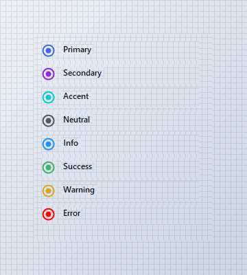{ .light .snapshot} 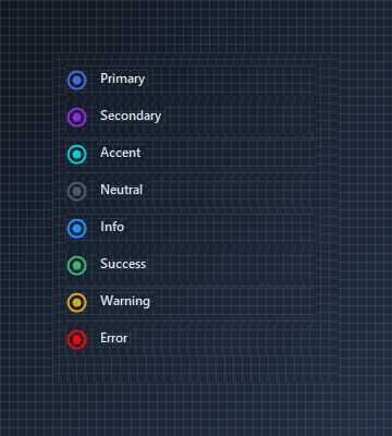{.dark .snapshot}
:::
::: callout success
#### 🟢 DESIGNER SUPPORT
**This control has full Visual Studio design-time support.**
Drag it from the Toolbox onto your form, customize its properties directly in the Properties window, and KimTools will generate the corresponding code for you.
:::
# RadioColor
| ::: tag "RadioColor" icon:wrench | ::: tag "Kt-Color" color:#820BF4 icon:corner-down-right url:/utilities/kt-color | *Sets the radio color.* |
| -------- | ------- | ----------- |
# OutlineColor
| ::: tag "OutlineColor" icon:wrench | ::: tag "Kt-Color" color:#820BF4 icon:corner-down-right url:/utilities/kt-color | *Sets the outline color.* |
| -------- | ------- | ----------- |
# BorderThickness
| ::: tag "BorderThickness" icon:wrench | ::: tag "Int32" color:#0B64F4 icon:external-link url:external:https://learn.microsoft.com/en-us/dotnet/api/system.int32?view=netframework-4.8 | *Sets the outline's border thickness.* |
| -------- | ------- | ----------- |
::: hero layout:split glow:true
## Binding a `Label` Control
`KtRadioBox` supports direct binding to external controls (such as `Label`) via the `BindingControl` property. Clicking the bound label automatically toggles the radio button and handles position placement.
```csharp "🔴 🟡 🟢"
var row = new Panel
{
Width = 180,
Height = 26,
BackColor = Color.Transparent
};
var radio = new KtRadioBox
{
Size = new Size(21, 21),
RadioColor = KtColor.PRIMARY,
OutlineColor = KtColor.PRIMARY,
AllowBindingControlLocation = true
};
var label = new Label
{
Text = "Enable notifications",
AutoSize = true,
Cursor = Cursors.Hand
};
// Add to container first
row.Controls.Add(radio);
row.Controls.Add(label);
// Assign binding control after container addition
radio.BindingControl = label;
radio.BindingControlPosition = KtRadioBox.BindingControlPositions.Right;
```
== side
::: tabs
== tab "Auto" icon:app-window
{ .light .snapshot} {.dark .snapshot}
== tab "Light" icon:sun
{ .snapshot}
== tab "Dark" icon:moon
{ .snapshot}
:::
:::
::: hero layout:split glow:true
## Radio Group
Multiple `KtRadioBox` instances sharing the same parent container automatically handle mutual exclusion, ensuring only one option in the group is selected at a time.
```csharp "🔴 🟡 🟢"
var row1 = new Panel
{
Width = 240,
Height = 28,
Location = new Point(10, 10),
BackColor = Color.Transparent
};
var radio1 = new KtRadioBox
{
Size = new Size(21, 21),
RadioColor = KtColor.PRIMARY,
OutlineColor = KtColor.PRIMARY,
Checked = true
};
var label1 = new Label
{
Text = "Credit / Debit Card",
AutoSize = true
};
row1.Controls.Add(radio1);
row1.Controls.Add(label1);
radio1.Location = new Point(0, 3);
label1.Location = new Point(radio1.Right + 8, 4);
var row2 = new Panel
{
Width = 240,
Height = 28,
Location = new Point(10, 44),
BackColor = Color.Transparent
};
var radio2 = new KtRadioBox
{
Size = new Size(21, 21),
RadioColor = KtColor.PRIMARY,
OutlineColor = KtColor.PRIMARY,
Checked = false
};
var label2 = new Label
{
Text = "PayPal",
AutoSize = true
};
row2.Controls.Add(radio2);
row2.Controls.Add(label2);
radio2.Location = new Point(0, 3);
label2.Location = new Point(radio2.Right + 8, 4);
var row3 = new Panel
{
Width = 240,
Height = 28,
Location = new Point(10, 78),
BackColor = Color.Transparent
};
var radio3 = new KtRadioBox
{
Size = new Size(21, 21),
RadioColor = KtColor.PRIMARY,
OutlineColor = KtColor.PRIMARY,
Checked = false
};
var label3 = new Label
{
Text = "Bank Transfer",
AutoSize = true
};
row3.Controls.Add(radio3);
row3.Controls.Add(label3);
radio3.Location = new Point(0, 3);
label3.Location = new Point(radio3.Right + 8, 4);
container.Controls.Add(row1);
container.Controls.Add(row2);
container.Controls.Add(row3);
```
== side
::: tabs
== tab "Auto" icon:app-window
{ .light .snapshot} 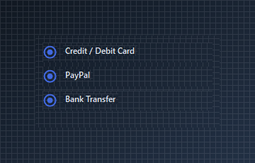{.dark .snapshot}
== tab "Light" icon:sun
{ .snapshot}
== tab "Dark" icon:moon
{ .snapshot}
:::
:::
::: hero layout:split glow:true
## Custom State Colors and Borders
Customize individual states using `RadioColor`, `OutlineColor`, `OutlineColorUnchecked`, and `BorderThickness`.
```csharp "🔴 🟡 🟢"
var row = new Panel
{
Width = 180,
Height = 28,
BackColor = Color.Transparent
};
var radio = new KtRadioBox
{
Size = new Size(21, 21),
RadioColor = KtColor.SUCCESS,
OutlineColor = KtColor.SUCCESS,
OutlineColorUnchecked = KtColor.NEUTRAL,
BorderThickness = 3,
Checked = true
};
var label = new Label
{
Text = "Custom theme option",
AutoSize = true
};
row.Controls.Add(radio);
row.Controls.Add(label);
radio.Location = new Point(0, 3);
label.Location = new Point(radio.Right + 8, 4);
```
== side
::: tabs
== tab "Auto" icon:app-window
{ .light .snapshot} {.dark .snapshot}
== tab "Light" icon:sun
{ .snapshot}
== tab "Dark" icon:moon
{ .snapshot}
:::
:::
## API `Reference`
| | | |
| -------- | ------- | ----------- |
| ::: tag "RadioColor" icon:wrench | ::: tag "Kt-Color" color:#820BF4 icon:corner-down-right url:/utilities/kt-color | *Sets the radio color.* |
| ::: tag "RadioColorTabFocused" icon:wrench | ::: tag "Kt-Color" color:#820BF4 icon:corner-down-right url:/utilities/kt-color | *Sets the radio color on focus.* |
| ::: tag "OutlineColorUnchecked" icon:wrench | ::: tag "Kt-Color" color:#820BF4 icon:corner-down-right url:/utilities/kt-color | *Sets the radio's outline color when unchecked.* |
| ::: tag "OutlineColorTabFocused" icon:wrench | ::: tag "Kt-Color" color:#820BF4 icon:corner-down-right url:/utilities/kt-color | *Sets the radio's color when focused.* |
| ::: tag "OutlineColor" icon:wrench | ::: tag "Kt-Color" color:#820BF4 icon:corner-down-right url:/utilities/kt-color | *Sets the outline color.* |
| ::: tag "BindingControlPosition" icon:wrench | ::: tag "BindingControlPositions" color:#6B7C94 icon:check-check | *Sets the position of the bound control in relation to the radio button.* |
| ::: tag "Checked" icon:wrench | ::: tag "Boolean" color:#0B64F4 icon:external-link url:external:https://learn.microsoft.com/en-us/dotnet/api/system.boolean?view=netframework-4.8 | *Sets a value indicating whether the radio is checked.* |
| ::: tag "AllowBindingControlLocation" icon:wrench | ::: tag "Boolean" color:#0B64F4 icon:external-link url:external:https://learn.microsoft.com/en-us/dotnet/api/system.boolean?view=netframework-4.8 | *Indicates whether the control will allow the bound control's location to be positioned based on it's own location.* |
| ::: tag "BorderThickness" icon:wrench | ::: tag "Int32" color:#0B64F4 icon:external-link url:external:https://learn.microsoft.com/en-us/dotnet/api/system.int32?view=netframework-4.8 | *Sets the outline's border thickness.* |
| ::: tag "BindingControl" icon:wrench | ::: tag "Control" color:#0B64F4 icon:external-link url:external:https://learn.microsoft.com/en-us/dotnet/api/system.windows.forms.control?view=netframework-4.8 | *Sets the control to bind directly with; this in most cases is a Label. This setting also binds with the most appropriate events for the control selected.* |
---
## [KimTools / Controls / RadioButton](https://kimtoo.net/controls/kt-radio-button/)
---
title: "KimTools / Controls / RadioButton"
description: "A themeable single-select control for WinForms, with independent checked and unchecked styling for background, border, icon and foreground."
keywords: ["KimTools", "Controls", "KtRadioButton", "RadioButton"]
toc: false
layout: "full"
---
::: hero layout:split glow:true
# Kt `RadioButton`
A themeable single-select control for WinForms, with independent checked and unchecked styling for background, border, icon and foreground.
::: callout tip
#### 🟣 PREMIUM
This component is only available in the Premium version of KimTools.
::: button "Get KimTools" external:https://kimtoo.net/#pricinghttps://kimtoo.net/#pricing icon:external-link
:::
== side
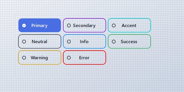{ .light .snapshot} 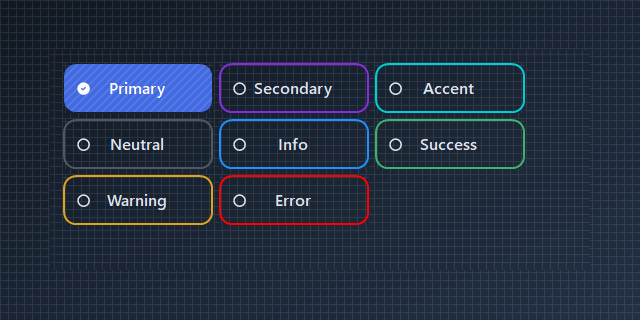{.dark .snapshot}
:::
::: callout success
#### 🟢 DESIGNER SUPPORT
**This control has full Visual Studio design-time support.**
Drag it from the Toolbox onto your form, customize its properties directly in the Properties window, and KimTools will generate the corresponding code for you.
:::
# Background
| ::: tag "Background" icon:wrench | ::: tag "Kt-Brush" color:#820BF4 icon:corner-down-right url:/utilities/kt-brush | *Sets the Background.* |
| -------- | ------- | ----------- |
# Border
| ::: tag "Border" icon:wrench | ::: tag "Kt-Brush" color:#820BF4 icon:corner-down-right url:/utilities/kt-brush | *Sets the panel's border color.* |
| -------- | ------- | ----------- |
# Icon
| ::: tag "Icon" icon:wrench | ::: tag "String" color:#0B64F4 icon:external-link url:external:https://learn.microsoft.com/en-us/dotnet/api/system.string?view=netframework-4.8 | *Sets the Icon.* |
| -------- | ------- | ----------- |
::: hero layout:split glow:true
## Default `Checked` / `Unchecked` states
`KtRadioButton` supports both selected and unselected states. Set `Checked` to `true` to display the selected state.
```csharp "🔴 🟡 🟢"
// using KimTools.WinForms;
// KtRadioButton renders as an unselected option by default.
// Set Checked to true to display the selected state.
var unselected = new KtRadioButton
{
Text = "Standard option",
TextAlign = ContentAlignment.MiddleRight,
Width = 140,
Checked = false
};
var selected = new KtRadioButton
{
Text = "Selected option",
Width = 140,
TextAlign = ContentAlignment.MiddleRight,
Checked = true
};
```
== side
::: tabs
== tab "Auto" icon:app-window
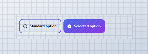{ .light .snapshot} 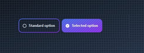{.dark .snapshot}
== tab "Light" icon:sun
{ .snapshot}
== tab "Dark" icon:moon
{ .snapshot}
:::
:::
::: hero layout:split glow:true
## Solid `Background_Checked`
Use `Background_Checked` to give the selected option its own solid fill. The unchecked state can remain transparent or use a separate `Background` brush.
```csharp "🔴 🟡 🟢"
// using KimTools.WinForms;
var radio = new KtRadioButton
{
Text = "Recommended",
Width = 200,
// Remove the default background and provide
// an explicit selected-state fill.
Background = KtBrush.None,
Background_Checked = KtColor.SUCCESS,
Checked = true
};
```
== side
::: tabs
== tab "Auto" icon:app-window
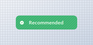{ .light .snapshot} {.dark .snapshot}
== tab "Light" icon:sun
{ .snapshot}
== tab "Dark" icon:moon
{ .snapshot}
:::
:::
::: hero layout:split glow:true
## Gradient `Background_Checked`
Use a semantic color gradient for the selected state. Theme colors keep the selection styling consistent with the active application theme.
```csharp "🔴 🟡 🟢"
// using KimTools.WinForms;
var radio = new KtRadioButton
{
Text = "Premium plan",
Size = new Size(190, 50),
Background_Checked =
(
startColor: KtColor.PRIMARY[50],
stopColor: KtColor.SECONDARY[50],
angle: 45
),
Checked = true
};
```
== side
::: tabs
== tab "Auto" icon:app-window
{ .light .snapshot} {.dark .snapshot}
== tab "Light" icon:sun
{ .snapshot}
== tab "Dark" icon:moon
{ .snapshot}
:::
:::
::: hero layout:split glow:true
## `Border` + `Border_Checked`
Keep both states transparent and use the border to communicate selection. `Border_Checked` controls the selected-state border independently.
```csharp "🔴 🟡 🟢"
// using KimTools.WinForms;
var radio = new KtRadioButton
{
Text = "Express delivery",
Width = 210,
Background = KtBrush.None,
Background_Checked = KtBrush.None,
Border = KtColor.NEUTRAL,
Border_Checked = KtColor.PRIMARY,
BorderWidth = 2f,
Checked = true
};
```
== side
::: tabs
== tab "Auto" icon:app-window
{ .light .snapshot} {.dark .snapshot}
== tab "Light" icon:sun
{ .snapshot}
== tab "Dark" icon:moon
{ .snapshot}
:::
:::
::: hero layout:split glow:true
## `Icon` + `Icon_Checked`
Use different icons for the unselected and selected states. `IconColor_Checked` lets the selected icon use its own semantic color.
```csharp "🔴 🟡 🟢"
// using KimTools.WinForms;
var radio = new KtRadioButton
{
Text = "Verified account",
TextAlign = ContentAlignment.MiddleCenter,
Width = 200,
Icon = "Tabler.outline.circle",
Icon_Checked = "Tabler.solid.circle_check",
Border = KtBrush.BASE,
Background = KtColor.BASE,
IconColor_Checked = KtColor.SUCCESS,
Checked = true
};
```
== side
::: tabs
== tab "Auto" icon:app-window
{ .light .snapshot} {.dark .snapshot}
== tab "Light" icon:sun
{ .snapshot}
== tab "Dark" icon:moon
{ .snapshot}
:::
:::
::: hero layout:split glow:true
## Icon `Size` and `Stroke`
Tune the selected and unselected icon rendering with `IconSize` and `IconStroke`.
```csharp "🔴 🟡 🟢"
// using KimTools.WinForms;
var radio = new KtRadioButton
{
Text = "Large selection",
Icon = "tabler.outline.circle",
Icon_Checked = "tabler.solid.circle_check_filled",
IconSize = 22,
IconStroke = 2.5,
TextAlign = ContentAlignment.MiddleCenter,
Width = 200,
Checked = true
};
```
== side
::: tabs
== tab "Auto" icon:app-window
{ .light .snapshot} {.dark .snapshot}
== tab "Light" icon:sun
{ .snapshot}
== tab "Dark" icon:moon
{ .snapshot}
:::
:::
::: hero layout:split glow:true
## `Foreground` + `Foreground_Checked`
Change the text color independently for each selection state.
```csharp "🔴 🟡 🟢"
// using KimTools.WinForms;
var radio = new KtRadioButton
{
Text = "Active selection",
Background = KtBrush.None,
Background_Checked = KtBrush.None,
Border = KtBrush.None,
Foreground = KtColor.NEUTRAL,
Foreground_Checked = KtColor.PRIMARY,
TextAlign = ContentAlignment.MiddleCenter,
Width = 200,
Checked = true
};
```
== side
::: tabs
== tab "Auto" icon:app-window
{ .light .snapshot} {.dark .snapshot}
== tab "Light" icon:sun
{ .snapshot}
== tab "Dark" icon:moon
{ .snapshot}
:::
:::
::: hero layout:split glow:true
## Rounded `BorderRadius`
Set `BorderRadius` to `.99f` for a pill-shaped selection or use a pixel value when you need a specific corner radius.
```csharp "🔴 🟡 🟢"
// using KimTools.WinForms;
var radio = new KtRadioButton
{
Text = "Rounded selection",
Width = 210,
BorderRadius = .99f,
Background_Checked = KtColor.PRIMARY,
Checked = true
};
```
== side
::: tabs
== tab "Auto" icon:app-window
{ .light .snapshot} 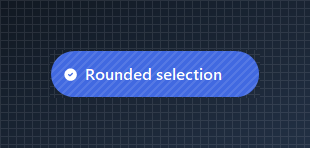{.dark .snapshot}
== tab "Light" icon:sun
{ .snapshot}
== tab "Dark" icon:moon
{ .snapshot}
:::
:::
::: hero layout:split glow:true
## Outlined selection
Build a minimal radio style by removing both backgrounds and changing the border and foreground when selected.
```csharp "🔴 🟡 🟢"
// using KimTools.WinForms;
var radio = new KtRadioButton
{
Text = "Outlined option",
Width = 200,
Background = KtBrush.None,
Background_Checked = KtBrush.None,
Border = KtColor.NEUTRAL,
Border_Checked = KtColor.PRIMARY,
Foreground = KtColor.NEUTRAL,
Foreground_Checked = KtColor.PRIMARY,
BorderWidth = 2f,
Checked = true
};
```
== side
::: tabs
== tab "Auto" icon:app-window
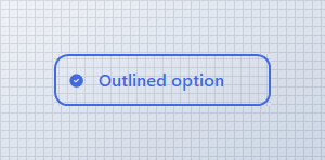{ .light .snapshot} 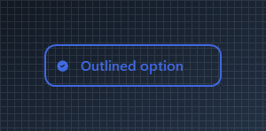{.dark .snapshot}
== tab "Light" icon:sun
{ .snapshot}
== tab "Dark" icon:moon
{ .snapshot}
:::
:::
::: hero layout:split glow:true
## Single-selection `Group`
Use multiple `KtRadioButton` controls for mutually exclusive choices. When one option becomes checked, clear the other options in the same logical group.
```csharp "🔴 🟡 🟢"
// using KimTools.WinForms;
var emailOption = new KtRadioButton
{
Text = "Email",
Checked = true
};
var smsOption = new KtRadioButton
{
Text = "SMS"
};
var pushOption = new KtRadioButton
{
Text = "Push notification"
};
// Radio buttons in the same logical group should have
// only one selected option at a time.
```
== side
::: tabs
== tab "Auto" icon:app-window
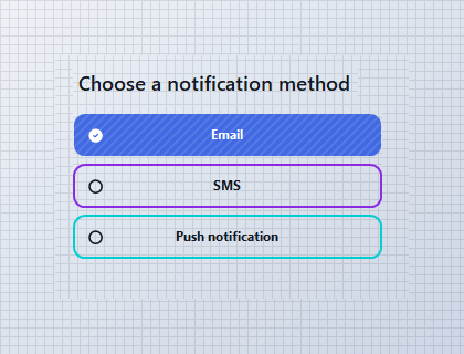{ .light .snapshot} 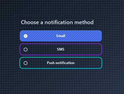{.dark .snapshot}
== tab "Light" icon:sun
{ .snapshot}
== tab "Dark" icon:moon
{ .snapshot}
:::
:::
::: hero layout:split glow:true
## Payment method selector
Radio buttons work well for compact single-choice forms. Combine icons, semantic colors and selected-state backgrounds to make each option easy to scan.
```csharp "🔴 🟡 🟢"
// using KimTools.WinForms;
var payment = new KtRadioButton
{
Text = "Credit / Debit Card",
Icon = "hero.outline.credit-card",
Icon_Checked = "hero.solid.credit-card",
Checked = true
};
```
== side
::: tabs
== tab "Auto" icon:app-window
{ .light .snapshot} {.dark .snapshot}
== tab "Light" icon:sun
{ .snapshot}
== tab "Dark" icon:moon
{ .snapshot}
:::
:::
::: hero layout:split glow:true
## Shipping options
Use radio buttons for mutually exclusive choices where the option itself contains enough information to make the selection.
```csharp "🔴 🟡 🟢"
// using KimTools.WinForms;
var standardOption = new KtRadioButton
{
Text = "Standard delivery • 3-5 days",
Checked = true
};
var expressOption = new KtRadioButton
{
Text = "Express delivery • 1-2 days"
};
```
== side
::: tabs
== tab "Auto" icon:app-window
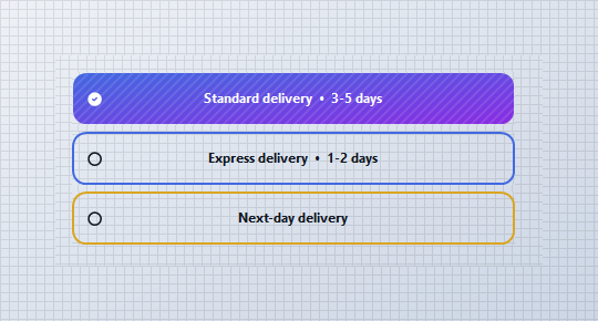{ .light .snapshot} {.dark .snapshot}
== tab "Light" icon:sun
{ .snapshot}
== tab "Dark" icon:moon
{ .snapshot}
:::
:::
::: hero layout:split glow:true
## Card-style selection
Increase the size and radius of a radio button to create selectable cards. This pattern works well for plans, subscription tiers and configuration presets.
```csharp "🔴 🟡 🟢"
// using KimTools.WinForms;
var plan = new KtRadioButton
{
Text = "Pro\n$19 / month",
Size = new Size(160, 120),
TextAlign = ContentAlignment.MiddleCenter,
Border = KtColor.PRIMARY,
Background_Checked = KtColor.PRIMARY,
BorderRadius = 10f,
Checked = true
};
```
== side
::: tabs
== tab "Auto" icon:app-window
{ .light .snapshot} {.dark .snapshot}
== tab "Light" icon:sun
{ .snapshot}
== tab "Dark" icon:moon
{ .snapshot}
:::
:::
::: hero layout:split glow:true
## Icon-only `KtRadioButton`
Remove the label and center the icon to create a compact single-selection control.
```csharp "🔴 🟡 🟢"
// using KimTools.WinForms;
var radio = new KtRadioButton
{
Text = string.Empty,
Size = new Size(52, 52),
Padding = Padding.Empty,
ImageAlign = ContentAlignment.MiddleCenter,
BorderRadius = .99f,
Icon = "tabler.outline.circle",
Icon_Checked = "tabler.solid.circle_check_filled",
IconSize = 22,
IconStroke = 2.5,
IconColor_Checked = KtColor.White,
Checked = true
};
```
== side
::: tabs
== tab "Auto" icon:app-window
{ .light .snapshot} {.dark .snapshot}
== tab "Light" icon:sun
{ .snapshot}
== tab "Dark" icon:moon
{ .snapshot}
:::
:::
::: hero layout:split glow:true
## Enabled and disabled states
Use the standard WinForms `Enabled` property when an option should be visible but temporarily unavailable.
```csharp "🔴 🟡 🟢"
// using KimTools.WinForms;
var enabled = new KtRadioButton
{
Text = "Available",
Checked = true
};
var disabled = new KtRadioButton
{
Text = "Unavailable",
Enabled = false
};
var flow = new FlowLayoutPanel
{
Width = 340,
Height = 80,
Padding = new Padding(10),
BackColor = Color.Transparent
};
flow.Controls.Add(enabled);
flow.Controls.Add(disabled);
```
== side
::: tabs
== tab "Auto" icon:app-window
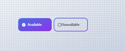{ .light .snapshot} 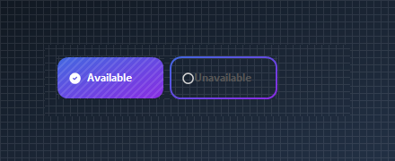{.dark .snapshot}
== tab "Light" icon:sun
{ .snapshot}
== tab "Dark" icon:moon
{ .snapshot}
:::
:::
::: hero layout:split glow:true
## Reacting to selection changes
Use `CheckedChanged` when application logic needs to respond immediately when a radio button becomes selected or unselected.
```csharp "🔴 🟡 🟢"
// using KimTools.WinForms;
var personal = new KtRadioButton
{
Text = "Personal",
Checked = true
};
var business = new KtRadioButton
{
Text = "Business"
};
personal.CheckedChanged += (_, _) =>
{
if (personal.Checked)
business.Checked = false;
};
business.CheckedChanged += (_, _) =>
{
if (business.Checked)
personal.Checked = false;
};
// React to the selected option from CheckedChanged.
personal.CheckedChanged += (_, _) =>
{
if (personal.Checked)
{
// Handle personal selection.
}
};
```
== side
::: tabs
== tab "Auto" icon:app-window
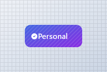{ .light .snapshot} 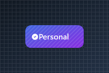{.dark .snapshot}
== tab "Light" icon:sun
{ .snapshot}
== tab "Dark" icon:moon
{ .snapshot}
:::
:::
::: hero layout:split glow:true
## Payment Method Example
```csharp "🔴 🟡 🟢"
var panel = new TableLayoutPanel
{
Width = 420,
Height = 230,
ColumnCount = 1,
RowCount = 4,
Padding = new Padding(16),
BackColor = Color.Transparent
};
panel.RowStyles.Add(new RowStyle(SizeType.Absolute, 42));
panel.RowStyles.Add(new RowStyle(SizeType.Absolute, 48));
panel.RowStyles.Add(new RowStyle(SizeType.Absolute, 48));
panel.RowStyles.Add(new RowStyle(SizeType.Absolute, 48));
panel.Controls.Add(
new Label
{
Text = "Preferred contact method",
AutoSize = true,
Font = new Font(this.Font.FontFamily, 13f, FontStyle.Bold)
},
0,
0);
var phone = new KtRadioButton
{
Text = "Phone",
Dock = DockStyle.Fill,
Border = KtColor.PRIMARY,
Checked = true
};
var email = new KtRadioButton
{
Text = "Email",
Dock = DockStyle.Fill,
Border = KtColor.SECONDARY
};
var message = new KtRadioButton
{
Text = "Text message",
Dock = DockStyle.Fill,
Border = KtColor.ACCENT
};
KtRadioButton[] options =
[
phone,
email,
message
];
foreach (var option in options)
{
option.CheckedChanged += (_, _) =>
{
if (!option.Checked)
return;
foreach (var other in options)
{
if (other != option)
other.Checked = false;
}
};
}
panel.Controls.Add(phone, 0, 1);
panel.Controls.Add(email, 0, 2);
panel.Controls.Add(message, 0, 3);
```
== side
::: tabs
== tab "Auto" icon:app-window
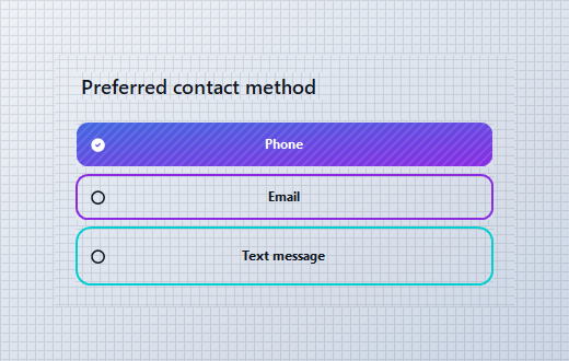{ .light .snapshot} 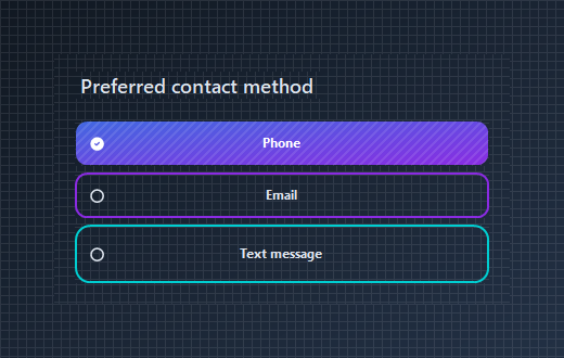{.dark .snapshot}
== tab "Light" icon:sun
{ .snapshot}
== tab "Dark" icon:moon
{ .snapshot}
:::
:::
## API `Reference`
| | | |
| -------- | ------- | ----------- |
| ::: tag "Background" icon:wrench | ::: tag "Kt-Brush" color:#820BF4 icon:corner-down-right url:/utilities/kt-brush | *Sets the Background.* |
| ::: tag "Background_Checked" icon:wrench | ::: tag "Kt-Brush" color:#820BF4 icon:corner-down-right url:/utilities/kt-brush | *Sets the Background Checked.* |
| ::: tag "Border" icon:wrench | ::: tag "Kt-Brush" color:#820BF4 icon:corner-down-right url:/utilities/kt-brush | *Sets the panel's border color.* |
| ::: tag "Border_Checked" icon:wrench | ::: tag "Kt-Brush" color:#820BF4 icon:corner-down-right url:/utilities/kt-brush | *Sets the panel's border color.* |
| ::: tag "BorderEdges" icon:wrench | ::: tag "Edges" color:#6B7C94 icon:check-check | *Sets the Border edges.* |
| ::: tag "Foreground" icon:wrench | ::: tag "Kt-Color" color:#820BF4 icon:corner-down-right url:/utilities/kt-color | *Sets the Foreground.* |
| ::: tag "Foreground_Checked" icon:wrench | ::: tag "Kt-Color" color:#820BF4 icon:corner-down-right url:/utilities/kt-color | *Sets the Foreground Checked.* |
| ::: tag "IconColor" icon:wrench | ::: tag "Kt-Color" color:#820BF4 icon:corner-down-right url:/utilities/kt-color | *Sets the Icon color.* |
| ::: tag "IconColor_Checked" icon:wrench | ::: tag "Kt-Color" color:#820BF4 icon:corner-down-right url:/utilities/kt-color | *Sets the IconColor Checked.* |
| ::: tag "Pattern" icon:wrench | ::: tag "Kt-Pattern" color:#6B7C94 icon:check-check | *Sets the Pattern.* |
| ::: tag "IconStroke" icon:wrench | ::: tag "Double" color:#0B64F4 icon:external-link url:external:https://learn.microsoft.com/en-us/dotnet/api/system.double?view=netframework-4.8 | *Sets the Icon stroke.* |
| ::: tag "ImageAlign" icon:wrench | ::: tag "ContentAlignment" color:#0B64F4 icon:external-link url:external:https://learn.microsoft.com/en-us/dotnet/api/system.drawing.contentalignment?view=netframework-4.8 | *The alignment of the image that will be displayed on the control.* |
| ::: tag "TextAlign" icon:wrench | ::: tag "ContentAlignment" color:#0B64F4 icon:external-link url:external:https://learn.microsoft.com/en-us/dotnet/api/system.drawing.contentalignment?view=netframework-4.8 | *The alignment of the text that will be displayed on the control.* |
| ::: tag "BorderStyle" icon:wrench | ::: tag "DashStyle" color:#0B64F4 icon:external-link url:external:https://learn.microsoft.com/en-us/dotnet/api/system.drawing.drawing2d.dashstyle?view=netframework-4.8 | *Sets the panel's border style.* |
| ::: tag "BorderStyle_Checked" icon:wrench | ::: tag "DashStyle" color:#0B64F4 icon:external-link url:external:https://learn.microsoft.com/en-us/dotnet/api/system.drawing.drawing2d.dashstyle?view=netframework-4.8 | *Sets the BorderStyle Checked.* |
| ::: tag "IconSize" icon:wrench | ::: tag "Int32" color:#0B64F4 icon:external-link url:external:https://learn.microsoft.com/en-us/dotnet/api/system.int32?view=netframework-4.8 | *Sets the Icon size.* |
| ::: tag "BorderRadius" icon:wrench | ::: tag "float" color:#0B64F4 icon:external-link url:external:https://learn.microsoft.com/en-us/dotnet/api/system.single?view=netframework-4.8 ::: tag "Nullable" color:#F96A06 icon:circle-alert url:external:https://learn.microsoft.com/en-us/dotnet/csharp/language-reference/builtin-types/nullable-value-types | *Sets the Border radius.* |
| ::: tag "BorderWidth" icon:wrench | ::: tag "float" color:#0B64F4 icon:external-link url:external:https://learn.microsoft.com/en-us/dotnet/api/system.single?view=netframework-4.8 | *Sets the Border width.* |
| ::: tag "Icon" icon:wrench | ::: tag "String" color:#0B64F4 icon:external-link url:external:https://learn.microsoft.com/en-us/dotnet/api/system.string?view=netframework-4.8 | *Sets the Icon.* |
| ::: tag "Icon_Checked" icon:wrench | ::: tag "String" color:#0B64F4 icon:external-link url:external:https://learn.microsoft.com/en-us/dotnet/api/system.string?view=netframework-4.8 | *Sets the Icon Checked.* |
| ::: tag "Value" icon:wrench | ::: tag "String" color:#0B64F4 icon:external-link url:external:https://learn.microsoft.com/en-us/dotnet/api/system.string?view=netframework-4.8 | *Sets the Value.* |
| ::: tag "Cursor" icon:wrench | ::: tag "Cursor" color:#0B64F4 icon:external-link url:external:https://learn.microsoft.com/en-us/dotnet/api/system.windows.forms.cursor?view=netframework-4.8 | *The cursor that appears when the pointer moves over the control.* |
| ::: tag "BorderMargin" icon:wrench | ::: tag "Padding" color:#0B64F4 icon:external-link url:external:https://learn.microsoft.com/en-us/dotnet/api/system.windows.forms.padding?view=netframework-4.8 | *Sets the border Margin.* |
| ::: tag "Padding" icon:wrench | ::: tag "Padding" color:#0B64F4 icon:external-link url:external:https://learn.microsoft.com/en-us/dotnet/api/system.windows.forms.padding?view=netframework-4.8 | *Specifies the interior spacing of a control.* |
---
## [KimTools / Controls / Rating](https://kimtoo.net/controls/kt-rating/)
---
title: "KimTools / Controls / Rating"
description: "A customizable rating input with star, circle, and square shapes, independent color states for empty, hover, rated, and disabled, plus read-only and right-click-to-clear support."
keywords: ["KimTools", "Controls", "KtRating", "Rating", "Control"]
toc: false
layout: "full"
---
::: hero layout:split glow:true
# Kt `Rating`
A customizable rating input with star, circle, and square shapes, independent color states for empty, hover, rated, and disabled, plus read-only and right-click-to-clear support.
::: callout tip
#### 🟣 PREMIUM
This component is only available in the Premium version of KimTools.
::: button "Get KimTools" external:https://kimtoo.net/#pricinghttps://kimtoo.net/#pricing icon:external-link
:::
== side
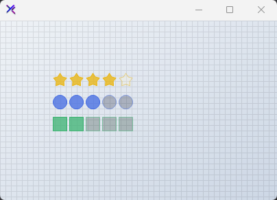{ .light .snapshot} 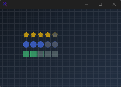{.dark .snapshot}
:::
::: callout success
#### 🟢 DESIGNER SUPPORT
**This control has full Visual Studio design-time support.**
Drag it from the Toolbox onto your form, customize its properties directly in the Properties window, and KimTools will generate the corresponding code for you.
:::
::: hero layout:split glow:true
## Star Shape (`RatingShapes.Star`)
The classic rating layout rendered with precision-calculated star geometry.
```csharp "🔴 🟡 🟢"
var rating = new KtRating
{
Value = 4,
Maximum = 5,
Shape = KtRating.RatingShapes.Star,
OuterRadius = 12,
Spacing = 4,
BorderThickness = 1,
RatedFillColor = KtColor.Yellow % 75,
RatedBorderColor = KtColor.Yellow,
EmptyFillColor = KtColor.Yellow[90] % 25,
EmptyBorderColor = KtColor.Yellow % 50
};
```
== side
::: tabs
== tab "Auto" icon:app-window
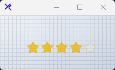{ .light .snapshot} 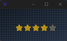{.dark .snapshot}
== tab "Light" icon:sun
{ .snapshot}
== tab "Dark" icon:moon
{ .snapshot}
:::
:::
::: hero layout:split glow:true
## Circle Shape (`RatingShapes.Circle`)
A modern, minimalist circular rating variant suitable for step indicators or simple scores.
```csharp "🔴 🟡 🟢"
var rating = new KtRating
{
Value = 3,
Maximum = 5,
Shape = KtRating.RatingShapes.Circle,
OuterRadius = 10,
Spacing = 4,
BorderThickness = 1,
RatedFillColor = KtColor.PRIMARY % 75,
RatedBorderColor = KtColor.PRIMARY,
EmptyFillColor = KtColor.PRIMARY[90] % 25,
EmptyBorderColor = KtColor.PRIMARY % 50
};
```
== side
::: tabs
== tab "Auto" icon:app-window
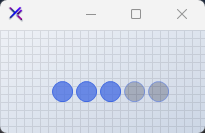{ .light .snapshot} 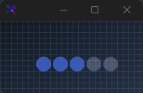{.dark .snapshot}
== tab "Light" icon:sun
{ .snapshot}
== tab "Dark" icon:moon
{ .snapshot}
:::
:::
::: hero layout:split glow:true
## Square Shape (`RatingShapes.Square`)
A compact, box-style rating indicator ideal for quantitative scale displays.
```csharp "🔴 🟡 🟢"
var rating = new KtRating
{
Value = 2,
Maximum = 5,
Shape = KtRating.RatingShapes.Square,
OuterRadius = 10,
Spacing = 4,
BorderThickness = 1,
RatedFillColor = KtColor.SUCCESS % 75,
RatedBorderColor = KtColor.SUCCESS,
EmptyFillColor = KtColor.SUCCESS[90] % 25,
EmptyBorderColor = KtColor.SUCCESS % 50
};
```
== side
::: tabs
== tab "Auto" icon:app-window
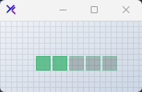{ .light .snapshot} 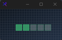{.dark .snapshot}
== tab "Light" icon:sun
{ .snapshot}
== tab "Dark" icon:moon
{ .snapshot}
:::
:::
::: hero layout:split glow:true
## Read-Only Mode (`ReadOnly`)
Set `ReadOnly = true` to present static scores while suppressing hover and click interactions.
```csharp "🔴 🟡 🟢"
var rating = new KtRating
{
Value = 4,
Maximum = 5,
ReadOnly = true,
Shape = KtRating.RatingShapes.Star,
OuterRadius = 12,
Spacing = 4,
BorderThickness = 1,
RatedFillColor = KtColor.Yellow % 75,
RatedBorderColor = KtColor.Yellow,
EmptyFillColor = KtColor.Yellow[90] % 25,
EmptyBorderColor = KtColor.Yellow % 50
};
```
== side
::: tabs
== tab "Auto" icon:app-window
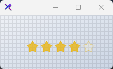{ .light .snapshot} 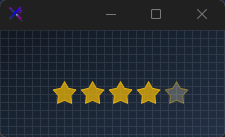{.dark .snapshot}
== tab "Light" icon:sun
{ .snapshot}
== tab "Dark" icon:moon
{ .snapshot}
:::
:::
::: hero layout:split glow:true
## Disabled State (`Enabled = false`)
Configures independent opacity palettes via `DisabledRatedFillColor` and `DisabledEmptyFillColor`.
```csharp "🔴 🟡 🟢"
var rating = new KtRating
{
Value = 3,
Maximum = 5,
Enabled = false,
Shape = KtRating.RatingShapes.Star,
OuterRadius = 12,
Spacing = 4,
BorderThickness = 1,
DisabledRatedFillColor = KtColor.Yellow % 50,
DisabledEmptyFillColor = KtColor.Yellow % 25
};
```
== side
::: tabs
== tab "Auto" icon:app-window
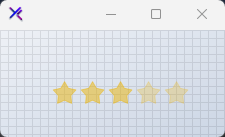{ .light .snapshot} 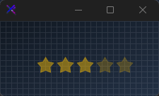{.dark .snapshot}
== tab "Light" icon:sun
{ .snapshot}
== tab "Dark" icon:moon
{ .snapshot}
:::
:::
::: hero layout:split glow:true
## Custom Palette (`KtColor`)
Assign custom theme tones across `Rated`, `Empty`, and `Hover` states to blend with application branding.
```csharp "🔴 🟡 🟢"
var rating = new KtRating
{
Value = 4,
Maximum = 5,
Shape = KtRating.RatingShapes.Star,
OuterRadius = 12,
Spacing = 4,
BorderThickness = 1,
RatedFillColor = KtColor.Rose,
RatedBorderColor = KtColor.Rose,
EmptyFillColor = KtColor.Rose % 20,
EmptyBorderColor = KtColor.Rose % 40,
HoverFillColor = KtColor.Rose % 60,
HoverBorderColor = KtColor.Rose
};
```
== side
::: tabs
== tab "Auto" icon:app-window
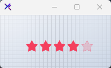{ .light .snapshot} 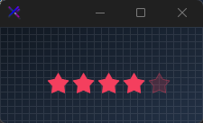{.dark .snapshot}
== tab "Light" icon:sun
{ .snapshot}
== tab "Dark" icon:moon
{ .snapshot}
:::
:::
::: hero layout:split glow:true
## Custom Sizing (`OuterRadius`, `Spacing`)
Adjust overall element bounds using `OuterRadius`, shape distance via `Spacing`, and outline stroke width with `BorderThickness`.
```csharp "🔴 🟡 🟢"
var rating = new KtRating
{
Value = 4,
Maximum = 5,
Shape = KtRating.RatingShapes.Star,
OuterRadius = 16,
Spacing = 6,
BorderThickness = 2,
RatedFillColor = KtColor.Yellow % 75,
RatedBorderColor = KtColor.Yellow,
EmptyFillColor = KtColor.Yellow[90] % 25,
EmptyBorderColor = KtColor.Yellow % 50
};
```
== side
::: tabs
== tab "Auto" icon:app-window
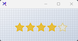{ .light .snapshot} 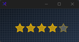{.dark .snapshot}
== tab "Light" icon:sun
{ .snapshot}
== tab "Dark" icon:moon
{ .snapshot}
:::
:::
## API `Reference`
| | | |
| -------- | ------- | ----------- |
| ::: tag "DisabledEmptyFillColor" icon:wrench | ::: tag "Kt-Color" color:#820BF4 icon:corner-down-right url:/utilities/kt-color | *Sets the fill KtColor of unrated shapes when disabled.* |
| ::: tag "DisabledRatedFillColor" icon:wrench | ::: tag "Kt-Color" color:#820BF4 icon:corner-down-right url:/utilities/kt-color | *Sets the fill KtColor of rated shapes when disabled.* |
| ::: tag "EmptyFillColor" icon:wrench | ::: tag "Kt-Color" color:#820BF4 icon:corner-down-right url:/utilities/kt-color | *Sets the fill KtColor of unrated shapes.* |
| ::: tag "EmptyBorderColor" icon:wrench | ::: tag "Kt-Color" color:#820BF4 icon:corner-down-right url:/utilities/kt-color | *Sets the border color of unrated shapes.* |
| ::: tag "HoverFillColor" icon:wrench | ::: tag "Kt-Color" color:#820BF4 icon:corner-down-right url:/utilities/kt-color | *Sets the fill KtColor of rating shapes on hover.* |
| ::: tag "HoverBorderColor" icon:wrench | ::: tag "Kt-Color" color:#820BF4 icon:corner-down-right url:/utilities/kt-color | *Sets the border color of rating shapes on hover.* |
| ::: tag "RatedFillColor" icon:wrench | ::: tag "Kt-Color" color:#820BF4 icon:corner-down-right url:/utilities/kt-color | *Sets the fill KtColor of rated shapes.* |
| ::: tag "RatedBorderColor" icon:wrench | ::: tag "Kt-Color" color:#820BF4 icon:corner-down-right url:/utilities/kt-color | *Sets the border color of rated shapes.* |
| ::: tag "Shape" icon:wrench | ::: tag "RatingShapes" color:#6B7C94 icon:check-check | *Sets the rating shape style.* |
| ::: tag "ReadOnly" icon:wrench | ::: tag "Boolean" color:#0B64F4 icon:external-link url:external:https://learn.microsoft.com/en-us/dotnet/api/system.boolean?view=netframework-4.8 | *Sets a value indicating whether the rating is in read-only mode.* |
| ::: tag "RightClickToClear" icon:wrench | ::: tag "Boolean" color:#0B64F4 icon:external-link url:external:https://learn.microsoft.com/en-us/dotnet/api/system.boolean?view=netframework-4.8 | *Sets a value indicating whether the rating will be cleared after right-clicking it.* |
| ::: tag "Value" icon:wrench | ::: tag "integer" color:#0B64F4 icon:external-link url:external:https://learn.microsoft.com/en-us/dotnet/api/system.int32?view=netframework-4.8 | *Sets the current rating value.* |
| ::: tag "Maximum" icon:wrench | ::: tag "integer" color:#0B64F4 icon:external-link url:external:https://learn.microsoft.com/en-us/dotnet/api/system.int32?view=netframework-4.8 | *Sets the maximum rating count.* |
| ::: tag "Spacing" icon:wrench | ::: tag "integer" color:#0B64F4 icon:external-link url:external:https://learn.microsoft.com/en-us/dotnet/api/system.int32?view=netframework-4.8 | *Sets the spacing between rating shapes.* |
| ::: tag "BorderThickness" icon:wrench | ::: tag "integer" color:#0B64F4 icon:external-link url:external:https://learn.microsoft.com/en-us/dotnet/api/system.int32?view=netframework-4.8 | *Sets the border thickness of rating shapes.* |
| ::: tag "OuterRadius" icon:wrench | ::: tag "float" color:#0B64F4 icon:external-link url:external:https://learn.microsoft.com/en-us/dotnet/api/system.single?view=netframework-4.8 | *Sets the rating's shape radius.* |
| ::: tag "InnerRadius" icon:wrench | ::: tag "float" color:#0B64F4 icon:external-link url:external:https://learn.microsoft.com/en-us/dotnet/api/system.single?view=netframework-4.8 | *Sets the inner radius of the star shape.* |
---
## [KimTools / Controls / Select](https://kimtoo.net/controls/kt-select/)
---
title: "KimTools / Controls / Select"
description: "A fully owner-drawn dropdown with rounded corners, theme-aware colors, adjustable indicator styles, and independent styling for the closed surface and dropdown list items."
keywords: ["KimTools", "Controls", "KtSelect", "Select", "ComboBox"]
toc: false
layout: "full"
---
::: hero layout:split glow:true
# Kt `Select`
A fully owner-drawn dropdown with rounded corners, theme-aware colors, adjustable indicator styles, and independent styling for the closed surface and dropdown list items.
::: callout tip
#### 🟣 PREMIUM
This component is only available in the Premium version of KimTools.
::: button "Get KimTools" external:https://kimtoo.net/#pricinghttps://kimtoo.net/#pricing icon:external-link
:::
== side
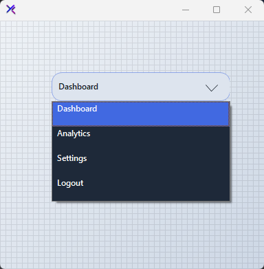{ .light .snapshot} 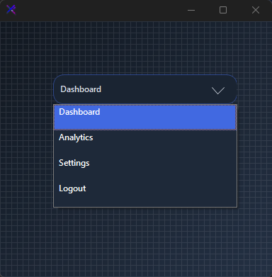{.dark .snapshot}
:::
::: callout success
#### 🟢 DESIGNER SUPPORT
**This control has full Visual Studio design-time support.**
Drag it from the Toolbox onto your form, customize its properties directly in the Properties window, and KimTools will generate the corresponding code for you.
:::
```csharp "🔴 🟡 🟢"
var select = new KtSelect();
```
::: hero layout:split glow:true
## Flat / Minimal Select
A thin-bordered, low-radius dropdown with an outline indicator. Muted `BASE_3` border on a `BASE` surface keeps the control unobtrusive in dense forms.
```csharp "🔴 🟡 🟢"
var panel = new FlowLayoutPanel
{
Width = 300,
Height = 120,
Padding = new Padding(20),
BackColor = Color.Transparent,
AutoScroll = false,
FlowDirection = FlowDirection.TopDown
};
var select = new KtSelect
{
Width = 260,
Height = 36,
Margin = new Padding(5),
Bg = KtColor.BASE,
BorderColor = KtColor.BASE_3,
BorderRadius = 4,
TextColor = KtColor.CONTENT,
IndicatorColor = KtColor.CONTENT % 50,
TextAlignment = KtSelect.TextAlign.Left,
IndicatorAlignment = KtSelect.Indicator.Right,
DropdownBorderThickness = KtSelect.BorderThickness.Thin,
FillIndicator = false,
ItemBackColor = KtColor.BASE,
ItemForeColor = KtColor.CONTENT,
ItemHighLightColor = KtColor.PRIMARY % 15,
ItemHighLightForeColor = KtColor.PRIMARY,
ItemBorderColor = KtColor.BASE_3 % 20,
};
select.Items.AddRange(["Option A", "Option B", "Option C"]);
select.SelectedIndex = 0;
panel.Controls.Add(select);
```
== side
::: tabs
== tab "Auto" icon:app-window
{ .light .snapshot} {.dark .snapshot}
== tab "Light" icon:sun
{ .snapshot}
== tab "Dark" icon:moon
{ .snapshot}
:::
:::
::: hero layout:split glow:true
## Pill / Rounded Select
A thick-bordered capsule with a filled primary indicator. `BorderRadius = 20` and `DropdownBorderThickness.Thick` give the control a bold, button-like presence.
```csharp "🔴 🟡 🟢"
var panel = new FlowLayoutPanel
{
Width = 300,
Height = 120,
Padding = new Padding(20),
BackColor = Color.Transparent,
AutoScroll = false,
FlowDirection = FlowDirection.TopDown
};
var select = new KtSelect
{
Width = 260,
Height = 40,
Margin = new Padding(5),
Bg = KtColor.BASE_2,
BorderColor = KtColor.PRIMARY,
BorderRadius = 20,
TextColor = KtColor.CONTENT,
IndicatorColor = KtColor.PRIMARY,
TextAlignment = KtSelect.TextAlign.Left,
IndicatorAlignment = KtSelect.Indicator.Right,
DropdownBorderThickness = KtSelect.BorderThickness.Thick,
FillIndicator = true,
ItemBackColor = KtColor.BASE_2,
ItemForeColor = KtColor.CONTENT,
ItemHighLightColor = KtColor.PRIMARY,
ItemHighLightForeColor = KtColor.White,
ItemBorderColor = KtColor.BASE_3 % 30,
};
select.Items.AddRange(["Active", "Paused", "Archived"]);
select.SelectedIndex = 0;
panel.Controls.Add(select);
```
== side
::: tabs
== tab "Auto" icon:app-window
{ .light .snapshot} 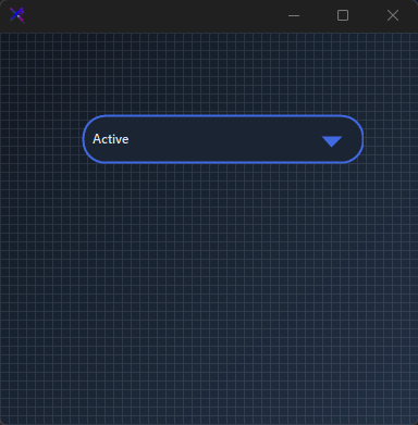{.dark .snapshot}
== tab "Light" icon:sun
{ .snapshot}
== tab "Dark" icon:moon
{ .snapshot}
:::
:::
::: hero layout:split glow:true
## Text & Indicator Alignment (`TextAlignment`, `IndicatorAlignment`)
Position the label and chevron independently. `TextAlign.Left` with `Indicator.Right` is the default. Swap to `TextAlign.Right` + `Indicator.Left` for RTL-friendly layouts or centered headers.
```csharp "🔴 🟡 🟢"
var panel = new FlowLayoutPanel
{
Width = 300,
Height = 220,
Padding = new Padding(20),
BackColor = Color.Transparent,
AutoScroll = false,
FlowDirection = FlowDirection.TopDown
};
var left = new KtSelect
{
Width = 260,
Height = 36,
Margin = new Padding(5),
Bg = KtColor.BASE_2,
BorderColor = KtColor.PRIMARY % 50,
BorderRadius = 14,
TextColor = KtColor.CONTENT,
IndicatorColor = !KtColor.BASE_2,
TextAlignment = KtSelect.TextAlign.Left,
IndicatorAlignment = KtSelect.Indicator.Right,
DropdownBorderThickness = KtSelect.BorderThickness.Thin,
};
var center = new KtSelect
{
Width = 260,
Height = 36,
Margin = new Padding(5),
Bg = KtColor.BASE_2,
BorderColor = KtColor.PRIMARY % 50,
BorderRadius = 14,
TextColor = KtColor.CONTENT,
IndicatorColor = !KtColor.BASE_2,
TextAlignment = KtSelect.TextAlign.Center,
IndicatorAlignment = KtSelect.Indicator.Right,
DropdownBorderThickness = KtSelect.BorderThickness.Thin,
};
var right = new KtSelect
{
Width = 260,
Height = 36,
Margin = new Padding(5),
Bg = KtColor.BASE_2,
BorderColor = KtColor.PRIMARY % 50,
BorderRadius = 14,
TextColor = KtColor.CONTENT,
IndicatorColor = !KtColor.BASE_2,
TextAlignment = KtSelect.TextAlign.Right,
IndicatorAlignment = KtSelect.Indicator.Left,
DropdownBorderThickness = KtSelect.BorderThickness.Thin,
};
left.Items.AddRange(["Left aligned", "Center aligned", "Right aligned"]);
center.Items.AddRange(["Left aligned", "Center aligned", "Right aligned"]);
right.Items.AddRange(["Left aligned", "Center aligned", "Right aligned"]);
left.SelectedIndex = 0;
center.SelectedIndex = 1;
right.SelectedIndex = 2;
panel.Controls.Add(left);
panel.Controls.Add(center);
panel.Controls.Add(right);
```
== side
::: tabs
== tab "Auto" icon:app-window
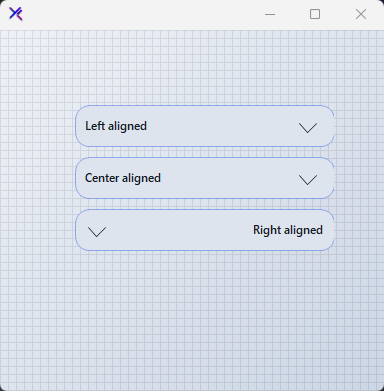{ .light .snapshot} 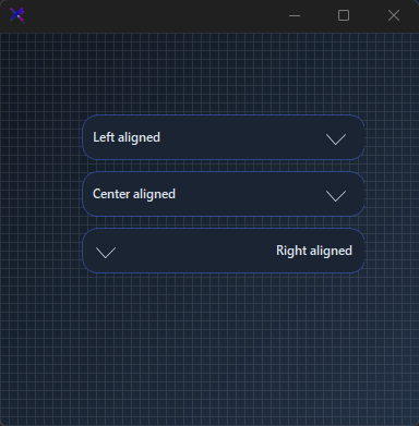{.dark .snapshot}
== tab "Light" icon:sun
{ .snapshot}
== tab "Dark" icon:moon
{ .snapshot}
:::
:::
::: hero layout:split glow:true
## Indicator Styles (`FillIndicator`, `DropdownBorderThickness`)
`FillIndicator = false` draws a hollow chevron; `true` fills it. Pair with `DropdownBorderThickness.Thick` to make the indicator visually heavier.
```csharp "🔴 🟡 🟢"
var panel = new FlowLayoutPanel
{
Width = 300,
Height = 160,
Padding = new Padding(20),
BackColor = Color.Transparent,
AutoScroll = false,
FlowDirection = FlowDirection.TopDown
};
var outline = new KtSelect
{
Width = 260,
Height = 36,
Margin = new Padding(5),
Bg = KtColor.BASE_2,
BorderColor = KtColor.PRIMARY % 50,
BorderRadius = 14,
TextColor = KtColor.CONTENT,
IndicatorColor = KtColor.PRIMARY,
TextAlignment = KtSelect.TextAlign.Left,
IndicatorAlignment = KtSelect.Indicator.Right,
DropdownBorderThickness = KtSelect.BorderThickness.Thin,
FillIndicator = false,
};
var filled = new KtSelect
{
Width = 260,
Height = 36,
Margin = new Padding(5),
Bg = KtColor.BASE_2,
BorderColor = KtColor.PRIMARY % 50,
BorderRadius = 14,
TextColor = KtColor.CONTENT,
IndicatorColor = KtColor.PRIMARY,
TextAlignment = KtSelect.TextAlign.Left,
IndicatorAlignment = KtSelect.Indicator.Right,
DropdownBorderThickness = KtSelect.BorderThickness.Thick,
FillIndicator = true,
};
outline.Items.AddRange(["Outline indicator", "Filled indicator"]);
filled.Items.AddRange(["Outline indicator", "Filled indicator"]);
outline.SelectedIndex = 0;
filled.SelectedIndex = 1;
panel.Controls.Add(outline);
panel.Controls.Add(filled);
```
== side
::: tabs
== tab "Auto" icon:app-window
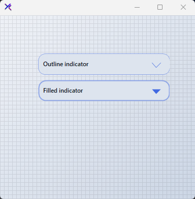{ .light .snapshot} 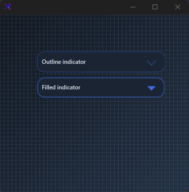{.dark .snapshot}
== tab "Light" icon:sun
{ .snapshot}
== tab "Dark" icon:moon
{ .snapshot}
:::
:::
::: hero layout:split glow:true
## Disabled State (`DisabledBackColor`, `DisabledBorderColor`, `DisabledForeColor`, `DisabledIndicatorColor`)
When `Enabled = false`, the control swaps to its disabled palette. Each surface — background, border, text, and indicator — can be tuned independently for accessible contrast.
```csharp "🔴 🟡 🟢"
var panel = new FlowLayoutPanel
{
Width = 300,
Height = 120,
Padding = new Padding(20),
BackColor = Color.Transparent,
AutoScroll = false,
FlowDirection = FlowDirection.TopDown
};
var select = new KtSelect
{
Width = 260,
Height = 36,
Margin = new Padding(5),
Enabled = false,
Bg = KtColor.BASE_2,
BorderColor = KtColor.BASE_3 % 50,
BorderRadius = 14,
TextColor = KtColor.CONTENT % 50,
IndicatorColor = KtColor.CONTENT % 25,
TextAlignment = KtSelect.TextAlign.Left,
IndicatorAlignment = KtSelect.Indicator.Right,
DropdownBorderThickness = KtSelect.BorderThickness.Thin,
DisabledBackColor = KtColor.BASE_2,
DisabledBorderColor = KtColor.BASE_3 % 50,
DisabledForeColor = KtColor.CONTENT % 50,
DisabledIndicatorColor = KtColor.CONTENT % 25,
};
select.Items.AddRange(["Unavailable", "Offline", "Restricted"]);
select.SelectedIndex = 0;
panel.Controls.Add(select);
```
== side
::: tabs
== tab "Auto" icon:app-window
{ .light .snapshot} {.dark .snapshot}
== tab "Light" icon:sun
{ .snapshot}
== tab "Dark" icon:moon
{ .snapshot}
:::
:::
::: hero layout:split glow:true
## Dropdown List Styling (`ItemBackColor`, `ItemHighLightColor`, `ItemBorderColor`)
The opened list is fully owner-drawn. Set `ItemBackColor` for the list surface, `ItemHighLightColor` for the active row, and `ItemBorderColor` for the separators. `ItemTopMargin` and `TextLeftMargin` fine-tune item padding.
```csharp "🔴 🟡 🟢"
var panel = new FlowLayoutPanel
{
Width = 300,
Height = 120,
Padding = new Padding(20),
BackColor = Color.Transparent,
AutoScroll = false,
FlowDirection = FlowDirection.TopDown
};
var select = new KtSelect
{
Width = 260,
Height = 36,
Margin = new Padding(5),
Bg = KtColor.BASE_1,
BorderColor = KtColor.SUCCESS % 50,
BorderRadius = 14,
TextColor = KtColor.CONTENT,
IndicatorColor = KtColor.SUCCESS,
TextAlignment = KtSelect.TextAlign.Left,
IndicatorAlignment = KtSelect.Indicator.Right,
DropdownBorderThickness = KtSelect.BorderThickness.Thin,
FillIndicator = true,
ItemBackColor = KtColor.BASE_1,
ItemForeColor = KtColor.CONTENT,
ItemHighLightColor = KtColor.SUCCESS,
ItemHighLightForeColor = KtColor.White,
ItemBorderColor = KtColor.BASE_3 % 30,
ItemTopMargin = 2,
TextLeftMargin = 8,
};
select.Items.AddRange(["Deploy", "Staging", "Production", "Rollback"]);
select.SelectedIndex = 2;
panel.Controls.Add(select);
```
== side
::: tabs
== tab "Auto" icon:app-window
{ .light .snapshot} 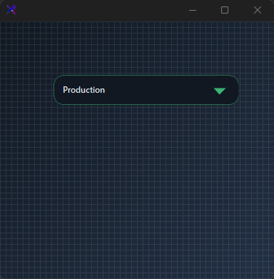{.dark .snapshot}
== tab "Light" icon:sun
{ .snapshot}
== tab "Dark" icon:moon
{ .snapshot}
:::
:::
## API `Reference`
| | | |
| -------- | ------- | ----------- |
| ::: tag "IndicatorColor" icon:wrench | ::: tag "Kt-Color" color:#820BF4 icon:corner-down-right url:/utilities/kt-color | *Sets the indicator color.* |
| ::: tag "ItemForeColor" icon:wrench | ::: tag "Kt-Color" color:#820BF4 icon:corner-down-right url:/utilities/kt-color | *Sets the default items' fore color.* |
| ::: tag "DisabledBackColor" icon:wrench | ::: tag "Kt-Color" color:#820BF4 icon:corner-down-right url:/utilities/kt-color | *Sets the dropdown's back color when disabled.* |
| ::: tag "DisabledBorderColor" icon:wrench | ::: tag "Kt-Color" color:#820BF4 icon:corner-down-right url:/utilities/kt-color | *Sets the dropdown's border color when disabled.* |
| ::: tag "DisabledIndicatorColor" icon:wrench | ::: tag "Kt-Color" color:#820BF4 icon:corner-down-right url:/utilities/kt-color | *Sets the dropdown's indicator color when disabled.* |
| ::: tag "DisabledForeColor" icon:wrench | ::: tag "Kt-Color" color:#820BF4 icon:corner-down-right url:/utilities/kt-color | *Sets the dropdown's fore color when disabled.* |
| ::: tag "ItemHighLightColor" icon:wrench | ::: tag "Kt-Color" color:#820BF4 icon:corner-down-right url:/utilities/kt-color | *Sets the highlighted item's back color.* |
| ::: tag "ItemHighLightForeColor" icon:wrench | ::: tag "Kt-Color" color:#820BF4 icon:corner-down-right url:/utilities/kt-color | *Sets the highlighted item's fore color.* |
| ::: tag "BorderColor" icon:wrench | ::: tag "Kt-Color" color:#820BF4 icon:corner-down-right url:/utilities/kt-color | *Sets dropdown's border color.* |
| ::: tag "Bg" icon:wrench | ::: tag "Kt-Color" color:#820BF4 icon:corner-down-right url:/utilities/kt-color | *Sets the dropdown's background color.* |
| ::: tag "ItemBorderColor" icon:wrench | ::: tag "Kt-Color" color:#820BF4 icon:corner-down-right url:/utilities/kt-color | *Sets the dropdown's items border color.* |
| ::: tag "ItemBackColor" icon:wrench | ::: tag "Kt-Color" color:#820BF4 icon:corner-down-right url:/utilities/kt-color | *Sets the background color of the dropdown list.* |
| ::: tag "TextColor" icon:wrench | ::: tag "Kt-Color" color:#820BF4 icon:corner-down-right url:/utilities/kt-color | *Sets the dropdown's fore color.* |
| ::: tag "DisabledColor" icon:wrench | ::: tag "Kt-Color" color:#820BF4 icon:corner-down-right url:/utilities/kt-color | *Sets the Disabled color.* |
| ::: tag "DropdownBorderThickness" icon:wrench | ::: tag "BorderThickness" color:#6B7C94 icon:check-check | *Sets the dropdown's border thickness.* |
| ::: tag "Direction" icon:wrench | ::: tag "Directions" color:#6B7C94 icon:check-check | *Sets the Direction.* |
| ::: tag "IndicatorAlignment" icon:wrench | ::: tag "Indicator" color:#6B7C94 icon:check-check | *Sets the indicator's alignment position.* |
| ::: tag "IndicatorLocation" icon:wrench | ::: tag "Indicator" color:#6B7C94 icon:check-check | *Sets the Indicator location.* |
| ::: tag "TextAlignment" icon:wrench | ::: tag "TextAlign" color:#6B7C94 icon:check-check | *Sets the default text alignment.* |
| ::: tag "DropDownTextAlign" icon:wrench | ::: tag "TextAlign" color:#6B7C94 icon:check-check | *Sets the Drop down text align.* |
| ::: tag "Enabled" icon:wrench | ::: tag "Boolean" color:#0B64F4 icon:external-link url:external:https://learn.microsoft.com/en-us/dotnet/api/system.boolean?view=netframework-4.8 | *Enables or Disables the control* |
| ::: tag "FillIndicator" icon:wrench | ::: tag "Boolean" color:#0B64F4 icon:external-link url:external:https://learn.microsoft.com/en-us/dotnet/api/system.boolean?view=netframework-4.8 | *Sets a value inidicating whether the indicator will be filled.* |
| ::: tag "FillDropDown" icon:wrench | ::: tag "Boolean" color:#0B64F4 icon:external-link url:external:https://learn.microsoft.com/en-us/dotnet/api/system.boolean?view=netframework-4.8 | *Sets the Fill drop down.* |
| ::: tag "Font" icon:wrench | ::: tag "Font" color:#0B64F4 icon:external-link url:external:https://learn.microsoft.com/en-us/dotnet/api/system.drawing.font?view=netframework-4.8 | *Sets the dropdown's font.* |
| ::: tag "ItemHeight" icon:wrench | ::: tag "Int32" color:#0B64F4 icon:external-link url:external:https://learn.microsoft.com/en-us/dotnet/api/system.int32?view=netframework-4.8 | *Sets the dropdown's height.* |
| ::: tag "BorderRadius" icon:wrench | ::: tag "Int32" color:#0B64F4 icon:external-link url:external:https://learn.microsoft.com/en-us/dotnet/api/system.int32?view=netframework-4.8 | *Sets the dropdown's border radius.* |
| ::: tag "TextLeftMargin" icon:wrench | ::: tag "Int32" color:#0B64F4 icon:external-link url:external:https://learn.microsoft.com/en-us/dotnet/api/system.int32?view=netframework-4.8 | *Sets the margin between the dropdown's text and its borders.* |
| ::: tag "ItemTopMargin" icon:wrench | ::: tag "Int32" color:#0B64F4 icon:external-link url:external:https://learn.microsoft.com/en-us/dotnet/api/system.int32?view=netframework-4.8 | *Sets the margin between each dropdown's item and the items container.* |
| ::: tag "Height" icon:wrench | ::: tag "Int32" color:#0B64F4 icon:external-link url:external:https://learn.microsoft.com/en-us/dotnet/api/system.int32?view=netframework-4.8 | *Sets the dropdown's item height.* |
| ::: tag "Width" icon:wrench | ::: tag "Int32" color:#0B64F4 icon:external-link url:external:https://learn.microsoft.com/en-us/dotnet/api/system.int32?view=netframework-4.8 | *Sets dropdown's item width.* |
| ::: tag "Text" icon:wrench | ::: tag "String" color:#0B64F4 icon:external-link url:external:https://learn.microsoft.com/en-us/dotnet/api/system.string?view=netframework-4.8 | *Sets the dropdown's text.* |
---
## [KimTools / Controls / Shapes](https://kimtoo.net/controls/kt-shapes/)
---
title: "KimTools / Controls / Shapes"
description: "A versatile shape renderer supporting circles, ovals, squares, rectangles, polygons (3 to 16 sides), and lines with independent fill opacity, border, rotation, and side-count control."
keywords: ["KimTools", "Controls", "KtShapes", "Shapes", "Control"]
toc: false
layout: "full"
---
::: hero layout:split glow:true
# Kt `Shapes`
A versatile shape renderer supporting circles, ovals, squares, rectangles, polygons (3 to 16 sides), and lines with independent fill opacity, border, rotation, and side-count control.
::: callout tip
#### 🟣 PREMIUM
This component is only available in the Premium version of KimTools.
::: button "Get KimTools" external:https://kimtoo.net/#pricinghttps://kimtoo.net/#pricing icon:external-link
:::
== side
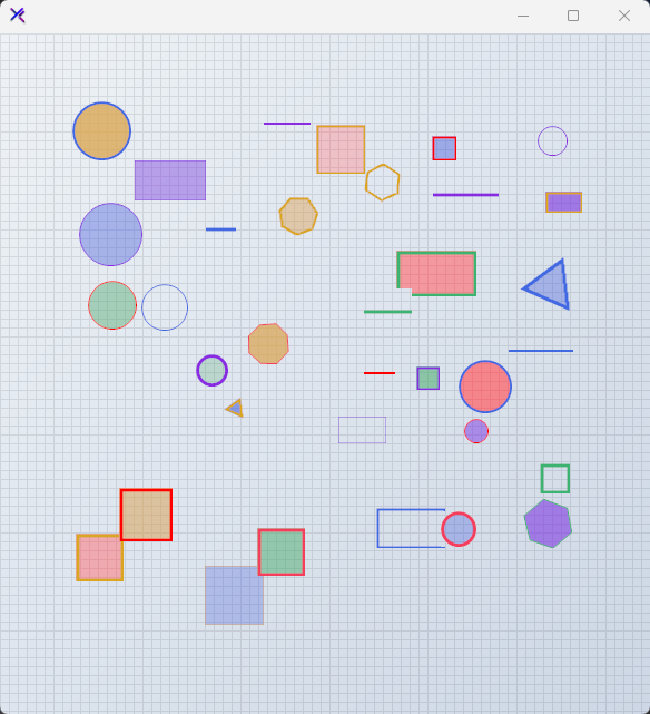{ .light .snapshot} 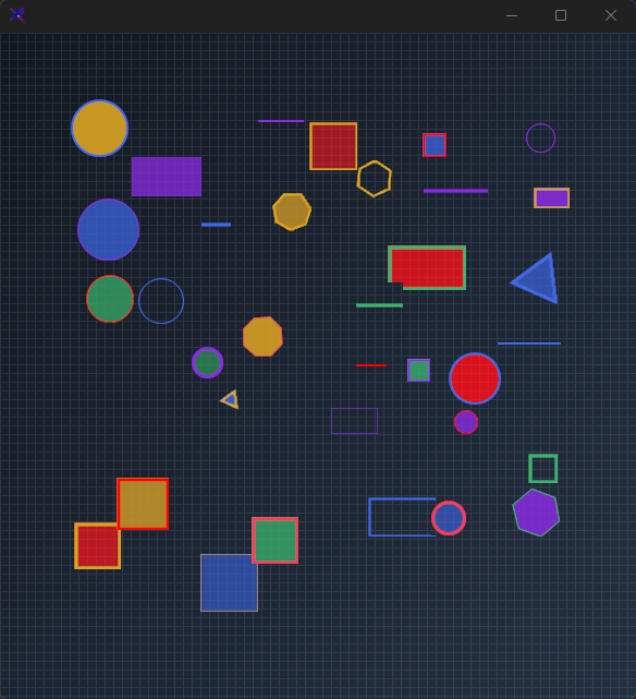{.dark .snapshot}
:::
::: callout success
#### 🟢 DESIGNER SUPPORT
**This control has full Visual Studio design-time support.**
Drag it from the Toolbox onto your form, customize its properties directly in the Properties window, and KimTools will generate the corresponding code for you.
:::
```csharp "🔴 🟡 🟢"
var shape = new KtShapes();
```
| ::: tag "Shape" icon:wrench | ::: tag "Shapes" color:#6B7C94 icon:check-check | *Sets the shape to be drawn.* |
| -------- | ------- | ----------- |
::: hero layout:split glow:true
## Circle (`Shapes.Circle`)
Draws a smooth anti-aliased circle inscribed perfectly within equal control dimensions.
```csharp "🔴 🟡 🟢"
var panel = CreateContainerPanel(120, 120);
var circle = new KtShapes
{
Width = 70,
Height = 70,
Margin = new Padding(5),
Shape = KtShapes.Shapes.Circle,
FillColor = KtColor.PRIMARY % 50,
BorderColor = KtColor.PRIMARY,
BorderThickness = 2,
FillShape = true
};
panel.Controls.Add(circle);
```
== side
::: tabs
== tab "Auto" icon:app-window
{ .light .snapshot} {.dark .snapshot}
== tab "Light" icon:sun
{ .snapshot}
== tab "Dark" icon:moon
{ .snapshot}
:::
:::
::: hero layout:split glow:true
## Oval (`Shapes.Oval`)
Draws an ellipse that dynamically stretches to match rectangular control dimensions.
```csharp "🔴 🟡 🟢"
var panel = CreateContainerPanel(150, 120);
var oval = new KtShapes
{
Width = 100,
Height = 65,
Margin = new Padding(5),
Shape = KtShapes.Shapes.Oval,
FillColor = KtColor.SECONDARY % 50,
BorderColor = KtColor.SECONDARY,
BorderThickness = 2,
FillShape = true
};
panel.Controls.Add(oval);
```
== side
::: tabs
== tab "Auto" icon:app-window
{ .light .snapshot} {.dark .snapshot}
== tab "Light" icon:sun
{ .snapshot}
== tab "Dark" icon:moon
{ .snapshot}
:::
:::
::: hero layout:split glow:true
## Square (`Shapes.Square`)
Draws an equilateral 4-sided box with centered geometry.
```csharp "🔴 🟡 🟢"
var panel = CreateContainerPanel(120, 120);
var square = new KtShapes
{
Width = 70,
Height = 70,
Margin = new Padding(5),
Shape = KtShapes.Shapes.Square,
FillColor = KtColor.SUCCESS % 50,
BorderColor = KtColor.SUCCESS,
BorderThickness = 2,
FillShape = true
};
panel.Controls.Add(square);
```
== side
::: tabs
== tab "Auto" icon:app-window
{ .light .snapshot} {.dark .snapshot}
== tab "Light" icon:sun
{ .snapshot}
== tab "Dark" icon:moon
{ .snapshot}
:::
:::
::: hero layout:split glow:true
## Rectangle (`Shapes.Rectangle`)
Draws a four-sided polygon scaled to custom width and height bounds.
```csharp "🔴 🟡 🟢"
var panel = CreateContainerPanel(150, 120);
var rect = new KtShapes
{
Width = 100,
Height = 65,
Margin = new Padding(5),
Shape = KtShapes.Shapes.Rectangle,
FillColor = KtColor.WARNING % 50,
BorderColor = KtColor.WARNING,
BorderThickness = 2,
FillShape = true
};
panel.Controls.Add(rect);
```
== side
::: tabs
== tab "Auto" icon:app-window
{ .light .snapshot} {.dark .snapshot}
== tab "Light" icon:sun
{ .snapshot}
== tab "Dark" icon:moon
{ .snapshot}
:::
:::
::: hero layout:split glow:true
## Line (`Shapes.Line`)
Renders a vector stroke across the control's diagonal plane.
```csharp "🔴 🟡 🟢"
var panel = CreateContainerPanel(120, 120);
var line = new KtShapes
{
Width = 70,
Height = 70,
Margin = new Padding(5),
Shape = KtShapes.Shapes.Line,
BorderColor = KtColor.CONTENT,
BorderThickness = 4,
FillShape = false
};
panel.Controls.Add(line);
```
== side
::: tabs
== tab "Auto" icon:app-window
{ .light .snapshot} {.dark .snapshot}
== tab "Light" icon:sun
{ .snapshot}
== tab "Dark" icon:moon
{ .snapshot}
:::
:::
| ::: tag "Sides" icon:wrench | ::: tag "integer" color:#0B64F4 icon:external-link url:external:https://learn.microsoft.com/en-us/dotnet/api/system.int32?view=netframework-4.8 | *Sets the number of sides (minimum 16) for a polygon.* |
| -------- | ------- | ----------- |
::: hero layout:split glow:true
## Triangle (`Sides = 3`)
Renders a 3-sided regular polygon shape with transparent fill to emphasize the border.
```csharp "🔴 🟡 🟢"
var panel = CreateContainerPanel(120, 120);
var triangle = new KtShapes
{
Width = 70,
Height = 70,
Margin = new Padding(5),
Shape = KtShapes.Shapes.Polygon,
Sides = 3,
FillColor = KtColor.Rose[60] % 50,
BorderColor = KtColor.Rose[60],
BorderThickness = 2,
FillShape = true
};
panel.Controls.Add(triangle);
```
== side
::: tabs
== tab "Auto" icon:app-window
{ .light .snapshot} {.dark .snapshot}
== tab "Light" icon:sun
{ .snapshot}
== tab "Dark" icon:moon
{ .snapshot}
:::
:::
::: hero layout:split glow:true
## Quadrilateral / Diamond (`Sides = 4`)
Renders a 4-sided regular polygon shape with emphasized borders.
```csharp "🔴 🟡 🟢"
var panel = CreateContainerPanel(120, 120);
var quad = new KtShapes
{
Width = 70,
Height = 70,
Margin = new Padding(5),
Shape = KtShapes.Shapes.Polygon,
Sides = 4,
FillColor = KtColor.PRIMARY % 50,
BorderColor = KtColor.PRIMARY,
BorderThickness = 2,
FillShape = true
};
panel.Controls.Add(quad);
```
== side
::: tabs
== tab "Auto" icon:app-window
{ .light .snapshot} {.dark .snapshot}
== tab "Light" icon:sun
{ .snapshot}
== tab "Dark" icon:moon
{ .snapshot}
:::
:::
::: hero layout:split glow:true
## Pentagon (`Sides = 5`)
Renders a 5-sided regular polygon shape with emphasized borders.
```csharp "🔴 🟡 🟢"
var panel = CreateContainerPanel(120, 120);
var pentagon = new KtShapes
{
Width = 70,
Height = 70,
Margin = new Padding(5),
Shape = KtShapes.Shapes.Polygon,
Sides = 5,
FillColor = KtColor.SUCCESS % 50,
BorderColor = KtColor.SUCCESS,
BorderThickness = 2,
FillShape = true
};
panel.Controls.Add(pentagon);
```
== side
::: tabs
== tab "Auto" icon:app-window
{ .light .snapshot} {.dark .snapshot}
== tab "Light" icon:sun
{ .snapshot}
== tab "Dark" icon:moon
{ .snapshot}
:::
:::
::: hero layout:split glow:true
## Hexagon (`Sides = 6`)
Renders a 6-sided regular polygon shape with emphasized borders.
```csharp "🔴 🟡 🟢"
var panel = CreateContainerPanel(120, 120);
var hexagon = new KtShapes
{
Width = 70,
Height = 70,
Margin = new Padding(5),
Shape = KtShapes.Shapes.Polygon,
Sides = 6,
FillColor = KtColor.WARNING % 50,
BorderColor = KtColor.WARNING,
BorderThickness = 2,
FillShape = true
};
panel.Controls.Add(hexagon);
```
== side
::: tabs
== tab "Auto" icon:app-window
{ .light .snapshot} {.dark .snapshot}
== tab "Light" icon:sun
{ .snapshot}
== tab "Dark" icon:moon
{ .snapshot}
:::
:::
::: hero layout:split glow:true
## Heptagon (`Sides = 7`)
Renders a 7-sided regular polygon shape with emphasized borders.
```csharp "🔴 🟡 🟢"
var panel = CreateContainerPanel(120, 120);
var heptagon = new KtShapes
{
Width = 70,
Height = 70,
Margin = new Padding(5),
Shape = KtShapes.Shapes.Polygon,
Sides = 7,
FillColor = KtColor.SECONDARY % 50,
BorderColor = KtColor.SECONDARY,
BorderThickness = 2,
FillShape = true
};
panel.Controls.Add(heptagon);
```
== side
::: tabs
== tab "Auto" icon:app-window
{ .light .snapshot} {.dark .snapshot}
== tab "Light" icon:sun
{ .snapshot}
== tab "Dark" icon:moon
{ .snapshot}
:::
:::
::: hero layout:split glow:true
## Octagon (`Sides = 8`)
Renders an 8-sided regular polygon shape with emphasized borders.
```csharp "🔴 🟡 🟢"
var panel = CreateContainerPanel(120, 120);
var octagon = new KtShapes
{
Width = 70,
Height = 70,
Margin = new Padding(5),
Shape = KtShapes.Shapes.Polygon,
Sides = 8,
FillColor = KtColor.ERROR % 50,
BorderColor = KtColor.ERROR,
BorderThickness = 2,
FillShape = true
};
panel.Controls.Add(octagon);
```
== side
::: tabs
== tab "Auto" icon:app-window
{ .light .snapshot} {.dark .snapshot}
== tab "Light" icon:sun
{ .snapshot}
== tab "Dark" icon:moon
{ .snapshot}
:::
:::
| ::: tag "FillShape" icon:wrench | ::: tag "Boolean" color:#0B64F4 icon:external-link url:external:https://learn.microsoft.com/en-us/dotnet/api/system.boolean?view=netframework-4.8 | *Sets a value indicating whether shapes will be filled upon drawing.* |
| -------- | ------- | ----------- |
::: hero layout:split glow:true
## Wireframe Outline (`FillShape = false`)
Disables interior shape filling so only the border path is drawn.
```csharp "🔴 🟡 🟢"
var panel = CreateContainerPanel(120, 120);
var outline = new KtShapes
{
Width = 70,
Height = 70,
Margin = new Padding(5),
Shape = KtShapes.Shapes.Circle,
FillColor = KtColor.Transparent,
BorderColor = KtColor.PRIMARY,
BorderThickness = 3,
FillShape = false
};
panel.Controls.Add(outline);
```
== side
::: tabs
== tab "Auto" icon:app-window
{ .light .snapshot} {.dark .snapshot}
== tab "Light" icon:sun
{ .snapshot}
== tab "Dark" icon:moon
{ .snapshot}
:::
:::
| ::: tag "Angle" icon:wrench | ::: tag "float" color:#0B64F4 icon:external-link url:external:https://learn.microsoft.com/en-us/dotnet/api/system.single?view=netframework-4.8 | *Sets the angle to be used when drawing polygons and lines.* |
| -------- | ------- | ----------- |
::: hero layout:split glow:true
## Rotation (`Angle`)
Applies a center-point rotation matrix using degree values (e.g. `Angle = 45`).
```csharp "🔴 🟡 🟢"
var panel = CreateContainerPanel(120, 120);
var rotated = new KtShapes
{
Width = 70,
Height = 70,
Margin = new Padding(5),
Shape = KtShapes.Shapes.Polygon,
Sides = 5,
Angle = 45,
FillColor = KtColor.PRIMARY % 50,
BorderColor = KtColor.PRIMARY,
BorderThickness = 2,
FillShape = true
};
panel.Controls.Add(rotated);
```
== side
::: tabs
== tab "Auto" icon:app-window
{ .light .snapshot} 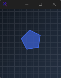{.dark .snapshot}
== tab "Light" icon:sun
{ .snapshot}
== tab "Dark" icon:moon
{ .snapshot}
:::
:::
| ::: tag "BorderColor" icon:wrench | ::: tag "Kt-Color" color:#820BF4 icon:corner-down-right url:/utilities/kt-color | *Sets the shape border color.* |
| -------- | ------- | ----------- |
| ::: tag "BorderThickness" icon:wrench | ::: tag "integer" color:#0B64F4 icon:external-link url:external:https://learn.microsoft.com/en-us/dotnet/api/system.int32?view=netframework-4.8 | *Sets the shape border thickness.* |
| -------- | ------- | ----------- |
::: hero layout:split glow:true
## Heavy Border (`BorderThickness`)
Scales the stroke width up to heavy lines using inset pen alignment.
```csharp "🔴 🟡 🟢"
var panel = CreateContainerPanel(120, 120);
var thick = new KtShapes
{
Width = 70,
Height = 70,
Margin = new Padding(5),
Shape = KtShapes.Shapes.Square,
FillColor = KtColor.PRIMARY % 50,
BorderColor = KtColor.PRIMARY,
BorderThickness = 6,
FillShape = true
};
panel.Controls.Add(thick);
```
== side
::: tabs
== tab "Auto" icon:app-window
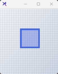{ .light .snapshot} 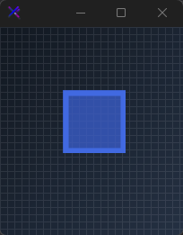{.dark .snapshot}
== tab "Light" icon:sun
{ .snapshot}
== tab "Dark" icon:moon
{ .snapshot}
:::
:::
## API `Reference`
| | | |
| -------- | ------- | ----------- |
| ::: tag "FillColor" icon:wrench | ::: tag "Kt-Color" color:#820BF4 icon:corner-down-right url:/utilities/kt-color | *Sets the shape fill color.* |
| ::: tag "BorderColor" icon:wrench | ::: tag "Kt-Color" color:#820BF4 icon:corner-down-right url:/utilities/kt-color | *Sets the shape border color.* |
| ::: tag "Shape" icon:wrench | ::: tag "Shapes" color:#6B7C94 icon:check-check | *Sets the shape to be drawn.* |
| ::: tag "FillShape" icon:wrench | ::: tag "Boolean" color:#0B64F4 icon:external-link url:external:https://learn.microsoft.com/en-us/dotnet/api/system.boolean?view=netframework-4.8 | *Sets a value indicating whether shapes will be filled upon drawing.* |
| ::: tag "BorderThickness" icon:wrench | ::: tag "integer" color:#0B64F4 icon:external-link url:external:https://learn.microsoft.com/en-us/dotnet/api/system.int32?view=netframework-4.8 | *Sets the shape border thickness.* |
| ::: tag "Sides" icon:wrench | ::: tag "integer" color:#0B64F4 icon:external-link url:external:https://learn.microsoft.com/en-us/dotnet/api/system.int32?view=netframework-4.8 | *Sets the number of sides (minimum 16) for a polygon.* |
| ::: tag "Angle" icon:wrench | ::: tag "float" color:#0B64F4 icon:external-link url:external:https://learn.microsoft.com/en-us/dotnet/api/system.single?view=netframework-4.8 | *Sets the angle to be used when drawing polygons and lines.* |
---
## [KimTools / Controls / SliderVert](https://kimtoo.net/controls/kt-slider-vert/)
---
title: "KimTools / Controls / SliderVert"
description: "A vertical range slider with independent track and elapsed colors, fill/outline thumb modes, and thick/thin border styles."
keywords: ["KimTools", "Controls", "KtSliderVert", "SliderVert", "VScrollbar"]
toc: false
layout: "full"
---
::: hero layout:split glow:true
# Kt `SliderVert`
A vertical range slider with independent track and elapsed colors, fill/outline thumb modes, and thick/thin border styles.
::: callout tip
#### 🟣 PREMIUM
This component is only available in the Premium version of KimTools.
::: button "Get KimTools" external:https://kimtoo.net/#pricinghttps://kimtoo.net/#pricing icon:external-link
:::
== side
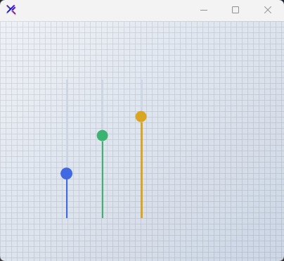{ .light .snapshot} 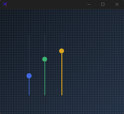{.dark .snapshot}
:::
::: callout success
#### 🟢 DESIGNER SUPPORT
**This control has full Visual Studio design-time support.**
Drag it from the Toolbox onto your form, customize its properties directly in the Properties window, and KimTools will generate the corresponding code for you.
:::
::: hero layout:split glow:true
## Flat / Minimal Vertical Slider
A thin track with an outline thumb. The elapsed region is tinted below the thumb while the remaining track uses `SliderColor`. Compact and unobtrusive for side-panel layouts.
```csharp "🔴 🟡 🟢"
var panel = new FlowLayoutPanel
{
Width = 120,
Height = 280,
Padding = new Padding(20),
BackColor = Color.Transparent,
AutoScroll = false,
FlowDirection = FlowDirection.LeftToRight
};
var slider = new KtSliderVert
{
Width = 31,
Height = 200,
Margin = new Padding(10),
Value = 40,
SliderColor = KtColor.BASE_3,
ElapsedColor = KtColor.PRIMARY,
ThumbColor = KtColor.PRIMARY,
ThumbFillColor = KtColor.PRIMARY,
ThumbStyle = KtSliderVert.ThumbStyles.Outline,
SliderStyle = KtSliderVert.SliderStyles.Thin,
};
panel.Controls.Add(slider);
```
== side
::: tabs
== tab "Auto" icon:app-window
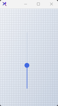{ .light .snapshot} 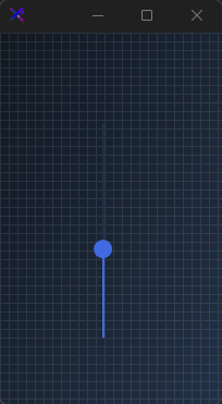{.dark .snapshot}
== tab "Light" icon:sun
{ .snapshot}
== tab "Dark" icon:moon
{ .snapshot}
:::
:::
::: hero layout:split glow:true
## Fill Thumb (`ThumbStyle`)
Switch to `ThumbStyle.Fill` for a solid thumb without an outline border. Pairs cleanly with thin tracks for a modern, minimal volume or level control.
```csharp "🔴 🟡 🟢"
var panel = new FlowLayoutPanel
{
Width = 120,
Height = 280,
Padding = new Padding(20),
BackColor = Color.Transparent,
AutoScroll = false,
FlowDirection = FlowDirection.LeftToRight
};
var slider = new KtSliderVert
{
Width = 31,
Height = 200,
Margin = new Padding(10),
Value = 70,
SliderColor = KtColor.BASE_3,
ElapsedColor = KtColor.SUCCESS,
ThumbColor = KtColor.SUCCESS,
ThumbFillColor = KtColor.SUCCESS,
ThumbStyle = KtSliderVert.ThumbStyles.Fill,
SliderStyle = KtSliderVert.SliderStyles.Thin,
};
panel.Controls.Add(slider);
```
== side
::: tabs
== tab "Auto" icon:app-window
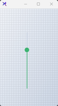{ .light .snapshot} 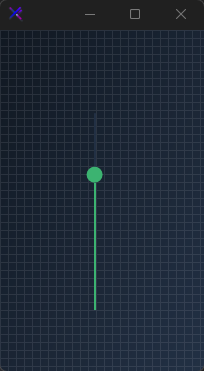{.dark .snapshot}
== tab "Light" icon:sun
{ .snapshot}
== tab "Dark" icon:moon
{ .snapshot}
:::
:::
::: hero layout:split glow:true
## Thick Track (`SliderStyle`)
`SliderStyle.Thick` increases the track weight and gives the thumb more room. Useful for touch-friendly interfaces or when the slider needs stronger visual presence.
```csharp "🔴 🟡 🟢"
var panel = new FlowLayoutPanel
{
Width = 140,
Height = 280,
Padding = new Padding(20),
BackColor = Color.Transparent,
AutoScroll = false,
FlowDirection = FlowDirection.LeftToRight
};
var slider = new KtSliderVert
{
Width = 40,
Height = 200,
Margin = new Padding(10),
Value = 55,
SliderColor = KtColor.BASE_3,
ElapsedColor = KtColor.INFO,
ThumbColor = KtColor.INFO,
ThumbFillColor = KtColor.INFO,
ThumbStyle = KtSliderVert.ThumbStyles.Fill,
SliderStyle = KtSliderVert.SliderStyles.Thick,
};
panel.Controls.Add(slider);
```
== side
::: tabs
== tab "Auto" icon:app-window
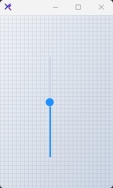{ .light .snapshot} 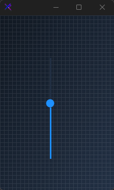{.dark .snapshot}
== tab "Light" icon:sun
{ .snapshot}
== tab "Dark" icon:moon
{ .snapshot}
:::
:::
::: hero layout:split glow:true
## Color Themes (`ElapsedColor`, `ThumbColor`)
Swap the entire slider accent by changing `ElapsedColor` and `ThumbColor` together. Each slider paints its elapsed region from the thumb down, making value differences immediately visible.
```csharp "🔴 🟡 🟢"
var panel = new FlowLayoutPanel
{
Width = 320,
Height = 280,
Padding = new Padding(20),
BackColor = Color.Transparent,
AutoScroll = false,
FlowDirection = FlowDirection.LeftToRight
};
var primary = new KtSliderVert
{
Width = 31,
Height = 200,
Margin = new Padding(10),
Value = 25,
SliderColor = KtColor.BASE_3,
ElapsedColor = KtColor.PRIMARY,
ThumbColor = KtColor.PRIMARY,
ThumbFillColor = KtColor.PRIMARY,
ThumbStyle = KtSliderVert.ThumbStyles.Outline,
SliderStyle = KtSliderVert.SliderStyles.Thin,
};
var rose = new KtSliderVert
{
Width = 31,
Height = 200,
Margin = new Padding(10),
Value = 50,
SliderColor = KtColor.BASE_3,
ElapsedColor = KtColor.Rose,
ThumbColor = KtColor.Rose,
ThumbFillColor = KtColor.Rose,
ThumbStyle = KtSliderVert.ThumbStyles.Outline,
SliderStyle = KtSliderVert.SliderStyles.Thin,
};
var emerald = new KtSliderVert
{
Width = 31,
Height = 200,
Margin = new Padding(10),
Value = 75,
SliderColor = KtColor.BASE_3,
ElapsedColor = KtColor.Emerald,
ThumbColor = KtColor.Emerald,
ThumbFillColor = KtColor.Emerald,
ThumbStyle = KtSliderVert.ThumbStyles.Outline,
SliderStyle = KtSliderVert.SliderStyles.Thin,
};
panel.Controls.Add(primary);
panel.Controls.Add(rose);
panel.Controls.Add(emerald);
```
== side
::: tabs
== tab "Auto" icon:app-window
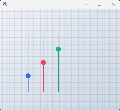{ .light .snapshot} 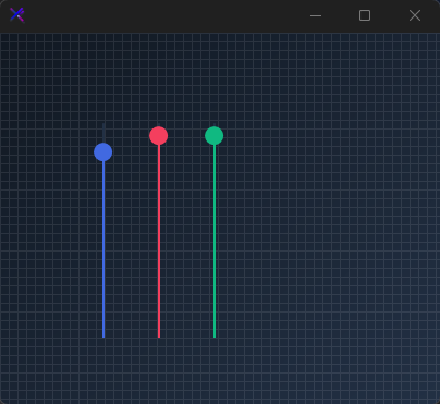{.dark .snapshot}
== tab "Light" icon:sun
{ .snapshot}
== tab "Dark" icon:moon
{ .snapshot}
:::
:::
::: hero layout:split glow:true
## Disabled State
When `Enabled = false`, the slider falls back to muted state colors. All interactive feedback is suppressed, and the thumb and track are desaturated for clear non-interactive signaling.
```csharp "🔴 🟡 🟢"
var panel = new FlowLayoutPanel
{
Width = 120,
Height = 280,
Padding = new Padding(20),
BackColor = Color.Transparent,
AutoScroll = false,
FlowDirection = FlowDirection.LeftToRight
};
var slider = new KtSliderVert
{
Width = 31,
Height = 200,
Margin = new Padding(10),
Value = 50,
Enabled = false,
SliderColor = KtColor.CONTENT % 50,
ElapsedColor = KtColor.CONTENT % 50,
ThumbColor = KtColor.CONTENT % 50,
ThumbFillColor = KtColor.CONTENT % 50,
ThumbStyle = KtSliderVert.ThumbStyles.Outline,
SliderStyle = KtSliderVert.SliderStyles.Thin,
};
panel.Controls.Add(slider);
```
== side
::: tabs
== tab "Auto" icon:app-window
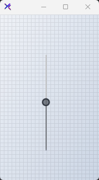{ .light .snapshot} 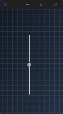{.dark .snapshot}
== tab "Light" icon:sun
{ .snapshot}
== tab "Dark" icon:moon
{ .snapshot}
:::
:::
## API `Reference`
| | | |
| -------- | ------- | ----------- |
| ::: tag "SliderColor" icon:wrench | ::: tag "Kt-Color" color:#820BF4 icon:corner-down-right url:/utilities/kt-color | *Sets the slider's BackColor.* |
| ::: tag "ElapsedColor" icon:wrench | ::: tag "Kt-Color" color:#820BF4 icon:corner-down-right url:/utilities/kt-color | *Sets the slider's elapsed region color.* |
| ::: tag "ThumbFillColor" icon:wrench | ::: tag "Kt-Color" color:#820BF4 icon:corner-down-right url:/utilities/kt-color | *Sets the thumb's inner fill color. This is only necessary when the property ThumbStyle' is set to 'Outline'.* |
| ::: tag "SliderStyle" icon:wrench | ::: tag "SliderStyles" color:#6B7C94 icon:check-check | *Sets the slider's overral style.* |
| ::: tag "ThumbStyle" icon:wrench | ::: tag "ThumbStyles" color:#6B7C94 icon:check-check | *Sets the slider's thumb style.* |
---
## [KimTools / Controls / Slider](https://kimtoo.net/controls/kt-slider/)
---
title: "KimTools / Controls / Slider"
description: "A horizontal range slider with state-based theming, fill/outline thumb styles, thick/thin track borders, and smooth color transitions."
keywords: ["KimTools", "Controls", "KtSlider", "Slider", "HScrollbar"]
toc: false
layout: "full"
---
::: hero layout:split glow:true
# Kt `Slider`
A horizontal range slider with state-based theming, fill/outline thumb styles, thick/thin track borders, and smooth color transitions.
::: callout tip
#### 🟣 PREMIUM
This component is only available in the Premium version of KimTools.
::: button "Get KimTools" external:https://kimtoo.net/#pricinghttps://kimtoo.net/#pricing icon:external-link
:::
== side
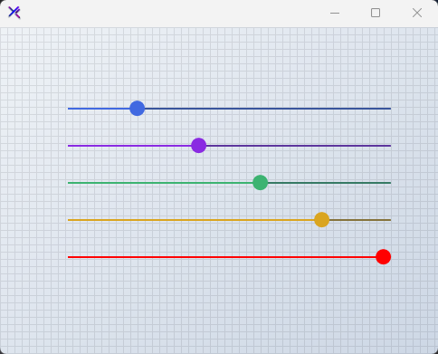{ .light .snapshot} 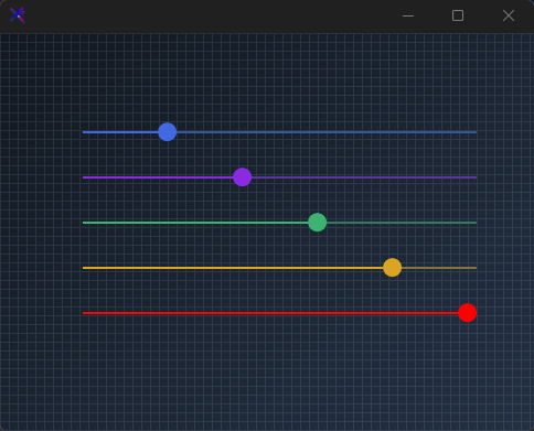{.dark .snapshot}
:::
::: callout success
#### 🟢 DESIGNER SUPPORT
**This control has full Visual Studio design-time support.**
Drag it from the Toolbox onto your form, customize its properties directly in the Properties window, and KimTools will generate the corresponding code for you.
:::
::: hero layout:split glow:true
## Flat / Minimal Slider
A thin track with an outline thumb. The elapsed portion is tinted with `ElapsedColor` while the remaining track uses `SliderColor`. Clean and unobtrusive for form layouts.
```csharp "🔴 🟡 🟢"
var panel = new FlowLayoutPanel
{
Width = 400,
Height = 120,
Padding = new Padding(20),
BackColor = Color.Transparent,
AutoScroll = false,
FlowDirection = FlowDirection.TopDown
};
var slider = new KtSlider
{
Width = 360,
Height = 31,
Margin = new Padding(5),
Value = 40,
SliderColor = KtColor.BASE_3,
ElapsedColor = KtColor.PRIMARY,
ThumbColor = KtColor.PRIMARY,
ThumbFillColor = KtColor.PRIMARY,
ThumbStyle = KtSlider.ThumbStyles.Outline,
SliderStyle = KtSlider.SliderStyles.Thin,
};
panel.Controls.Add(slider);
```
== side
::: tabs
== tab "Auto" icon:app-window
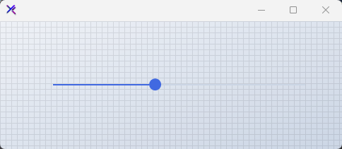{ .light .snapshot} 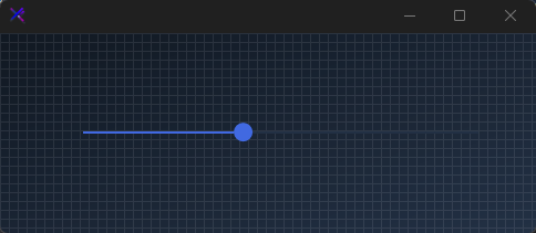{.dark .snapshot}
== tab "Light" icon:sun
{ .snapshot}
== tab "Dark" icon:moon
{ .snapshot}
:::
:::
::: hero layout:split glow:true
## Fill / Bold Slider (`ThumbStyle`, `SliderStyle`)
A thick track with a solid filled thumb. `SliderStyle.Thick` increases the track weight, and `ThumbStyle.Fill` removes the thumb border for a solid, modern appearance.
```csharp "🔴 🟡 🟢"
var panel = new FlowLayoutPanel
{
Width = 400,
Height = 120,
Padding = new Padding(20),
BackColor = Color.Transparent,
AutoScroll = false,
FlowDirection = FlowDirection.TopDown
};
var slider = new KtSlider
{
Width = 360,
Height = 31,
Margin = new Padding(5),
Value = 70,
SliderColor = KtColor.BASE_3,
ElapsedColor = KtColor.SUCCESS,
ThumbColor = KtColor.SUCCESS,
ThumbFillColor = KtColor.SUCCESS,
ThumbStyle = KtSlider.ThumbStyles.Fill,
SliderStyle = KtSlider.SliderStyles.Thick,
};
panel.Controls.Add(slider);
```
== side
::: tabs
== tab "Auto" icon:app-window
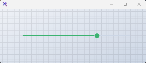{ .light .snapshot} 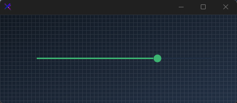{.dark .snapshot}
== tab "Light" icon:sun
{ .snapshot}
== tab "Dark" icon:moon
{ .snapshot}
:::
:::
::: hero layout:split glow:true
## Color Themes (`ElapsedColor`, `ThumbColor`)
Swap the entire slider accent by changing `ElapsedColor` and `ThumbColor` together. Use semantic colors to indicate severity — primary for neutral, warning for caution, error for critical ranges.
```csharp "🔴 🟡 🟢"
var panel = new FlowLayoutPanel
{
Width = 400,
Height = 200,
Padding = new Padding(20),
BackColor = Color.Transparent,
AutoScroll = false,
FlowDirection = FlowDirection.TopDown
};
var primary = new KtSlider
{
Width = 360,
Height = 31,
Margin = new Padding(5),
Value = 30,
SliderColor = KtColor.BASE_3,
ElapsedColor = KtColor.PRIMARY,
ThumbColor = KtColor.PRIMARY,
ThumbFillColor = KtColor.PRIMARY,
ThumbStyle = KtSlider.ThumbStyles.Outline,
SliderStyle = KtSlider.SliderStyles.Thin,
};
var warning = new KtSlider
{
Width = 360,
Height = 31,
Margin = new Padding(5),
Value = 60,
SliderColor = KtColor.BASE_3,
ElapsedColor = KtColor.WARNING,
ThumbColor = KtColor.WARNING,
ThumbFillColor = KtColor.WARNING,
ThumbStyle = KtSlider.ThumbStyles.Outline,
SliderStyle = KtSlider.SliderStyles.Thin,
};
var error = new KtSlider
{
Width = 360,
Height = 31,
Margin = new Padding(5),
Value = 85,
SliderColor = KtColor.BASE_3,
ElapsedColor = KtColor.ERROR,
ThumbColor = KtColor.ERROR,
ThumbFillColor = KtColor.ERROR,
ThumbStyle = KtSlider.ThumbStyles.Outline,
SliderStyle = KtSlider.SliderStyles.Thin,
};
panel.Controls.Add(primary);
panel.Controls.Add(warning);
panel.Controls.Add(error);
```
== side
::: tabs
== tab "Auto" icon:app-window
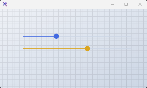{ .light .snapshot} 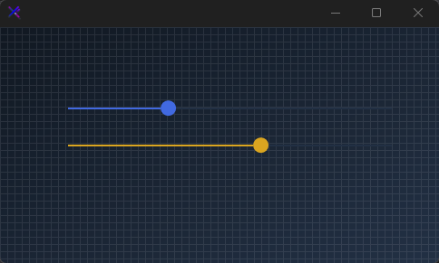{.dark .snapshot}
== tab "Light" icon:sun
{ .snapshot}
== tab "Dark" icon:moon
{ .snapshot}
:::
:::
::: hero layout:split glow:true
## Disabled State
When `Enabled = false`, the slider falls back to muted state colors. All interactive feedback is suppressed, and the thumb and track are desaturated for clear non-interactive signaling.
```csharp "🔴 🟡 🟢"
var panel = new FlowLayoutPanel
{
Width = 400,
Height = 120,
Padding = new Padding(20),
BackColor = Color.Transparent,
AutoScroll = false,
FlowDirection = FlowDirection.TopDown
};
var slider = new KtSlider
{
Width = 360,
Height = 31,
Margin = new Padding(5),
Value = 50,
Enabled = false,
SliderColor = KtColor.CONTENT % 50,
ElapsedColor = KtColor.CONTENT % 50,
ThumbColor = KtColor.CONTENT % 50,
ThumbFillColor = KtColor.CONTENT % 50,
ThumbStyle = KtSlider.ThumbStyles.Outline,
SliderStyle = KtSlider.SliderStyles.Thin,
};
panel.Controls.Add(slider);
```
== side
::: tabs
== tab "Auto" icon:app-window
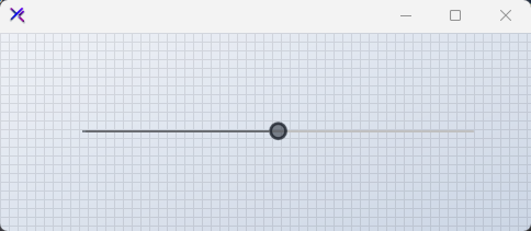{ .light .snapshot} 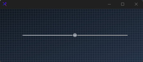{.dark .snapshot}
== tab "Light" icon:sun
{ .snapshot}
== tab "Dark" icon:moon
{ .snapshot}
:::
:::
## API `Reference`
| | | |
| -------- | ------- | ----------- |
| ::: tag "SliderColor" icon:wrench | ::: tag "Kt-Color" color:#820BF4 icon:corner-down-right url:/utilities/kt-color | *Sets the slider's BackColor.* |
| ::: tag "ElapsedColor" icon:wrench | ::: tag "Kt-Color" color:#820BF4 icon:corner-down-right url:/utilities/kt-color | *Sets the slider's elapsed region color.* |
| ::: tag "ThumbFillColor" icon:wrench | ::: tag "Kt-Color" color:#820BF4 icon:corner-down-right url:/utilities/kt-color | *Sets the thumb's inner fill color. This is only necessary when the property ThumbStyle' is set to 'Outline'.* |
| ::: tag "SliderStyle" icon:wrench | ::: tag "SliderStyles" color:#6B7C94 icon:check-check | *Sets the slider's overral style.* |
| ::: tag "ThumbStyle" icon:wrench | ::: tag "ThumbStyles" color:#6B7C94 icon:check-check | *Sets the slider's thumb style.* |
---
## [KimTools / Controls / Spinner](https://kimtoo.net/controls/kt-spinner/)
---
title: "KimTools / Controls / Spinner"
description: "A customizable animated loading spinner with preset styles, dash patterns, cap shapes, speed control, and optional center text."
keywords: ["KimTools", "Controls", "KtSpinner", "Spinner", "LoaderBase"]
toc: false
layout: "full"
---
::: hero layout:split glow:true
# Kt `Spinner`
A customizable animated loading spinner with preset styles, dash patterns, cap shapes, speed control, and optional center text.
::: callout tip
#### 🟣 PREMIUM
This component is only available in the Premium version of KimTools.
::: button "Get KimTools" external:https://kimtoo.net/#pricinghttps://kimtoo.net/#pricing icon:external-link
:::
== side
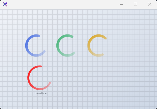{ .light .snapshot} 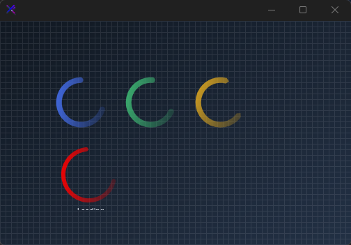{.dark .snapshot}
:::
::: callout success
#### 🟢 DESIGNER SUPPORT
**This control has full Visual Studio design-time support.**
Drag it from the Toolbox onto your form, customize its properties directly in the Properties window, and KimTools will generate the corresponding code for you.
:::
::: hero layout:split glow:true
## Style Presets (`Preset`, `AllowPresets`)
Enable `AllowPresets` and pick from `Solid`, `Dash`, `Dot`, or `Diamond`. Each preset automatically configures `Style`, `DashCap`, and `CapStyle` to a cohesive look.
```csharp "🔴 🟡 🟢"
var panel = new FlowLayoutPanel
{
Width = 420,
Height = 120,
Padding = new Padding(20),
BackColor = Color.Transparent,
AutoScroll = false,
FlowDirection = FlowDirection.LeftToRight
};
var solid = new KtSpinner
{
Width = 60,
Height = 60,
Margin = new Padding(10),
Preset = KtSpinner.Presets.Solid,
Color = KtColor.PRIMARY,
Thickness = 6,
};
var dash = new KtSpinner
{
Width = 60,
Height = 60,
Margin = new Padding(10),
Preset = KtSpinner.Presets.Dash,
Color = KtColor.PRIMARY,
Thickness = 6,
};
var dot = new KtSpinner
{
Width = 60,
Height = 60,
Margin = new Padding(10),
Preset = KtSpinner.Presets.Dot,
Color = KtColor.PRIMARY,
Thickness = 6,
};
var diamond = new KtSpinner
{
Width = 60,
Height = 60,
Margin = new Padding(10),
Preset = KtSpinner.Presets.Diamond,
Color = KtColor.PRIMARY,
Thickness = 6,
};
panel.Controls.Add(solid);
panel.Controls.Add(dash);
panel.Controls.Add(dot);
panel.Controls.Add(diamond);
```
== side
::: tabs
== tab "Auto" icon:app-window
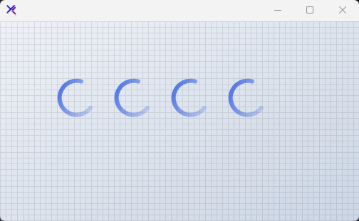{ .light .snapshot} {.dark .snapshot}
== tab "Light" icon:sun
{ .snapshot}
== tab "Dark" icon:moon
{ .snapshot}
:::
:::
::: hero layout:split glow:true
## Ring Thickness (`Thickness`)
Scale the stroke weight from 4 px to 14 px. Thicker rings feel bolder and more prominent; thinner rings are subtle and elegant.
```csharp "🔴 🟡 🟢"
var panel = new FlowLayoutPanel
{
Width = 320,
Height = 120,
Padding = new Padding(20),
BackColor = Color.Transparent,
AutoScroll = false,
FlowDirection = FlowDirection.LeftToRight
};
var thin = new KtSpinner
{
Width = 60,
Height = 60,
Margin = new Padding(10),
Color = KtColor.PRIMARY,
Thickness = 4,
Speed = 3,
};
var medium = new KtSpinner
{
Width = 60,
Height = 60,
Margin = new Padding(10),
Color = KtColor.PRIMARY,
Thickness = 8,
Speed = 3,
};
var thick = new KtSpinner
{
Width = 60,
Height = 60,
Margin = new Padding(10),
Color = KtColor.PRIMARY,
Thickness = 14,
Speed = 3,
};
panel.Controls.Add(thin);
panel.Controls.Add(medium);
panel.Controls.Add(thick);
```
== side
::: tabs
== tab "Auto" icon:app-window
{ .light .snapshot} {.dark .snapshot}
== tab "Light" icon:sun
{ .snapshot}
== tab "Dark" icon:moon
{ .snapshot}
:::
:::
::: hero layout:split glow:true
## Cap Styles (`CapStyle`, `CapPoint`)
Control the line-end shape with `Flat`, `Round`, or `Triangle`. `CapPoint` decides whether the cap appears at the `Start`, `End`, or `Both` ends of the rotating arc.
```csharp "🔴 🟡 🟢"
var panel = new FlowLayoutPanel
{
Width = 320,
Height = 120,
Padding = new Padding(20),
BackColor = Color.Transparent,
AutoScroll = false,
FlowDirection = FlowDirection.LeftToRight
};
var flat = new KtSpinner
{
Width = 60,
Height = 60,
Margin = new Padding(10),
Color = KtColor.SUCCESS,
Thickness = 6,
CapStyle = KtSpinner.CapStyles.Flat,
CapPoint = KtSpinner.CapPoints.Both,
};
var round = new KtSpinner
{
Width = 60,
Height = 60,
Margin = new Padding(10),
Color = KtColor.SUCCESS,
Thickness = 6,
CapStyle = KtSpinner.CapStyles.Round,
CapPoint = KtSpinner.CapPoints.Both,
};
var triangle = new KtSpinner
{
Width = 60,
Height = 60,
Margin = new Padding(10),
Color = KtColor.SUCCESS,
Thickness = 6,
CapStyle = KtSpinner.CapStyles.Triangle,
CapPoint = KtSpinner.CapPoints.Both,
};
panel.Controls.Add(flat);
panel.Controls.Add(round);
panel.Controls.Add(triangle);
```
== side
::: tabs
== tab "Auto" icon:app-window
{ .light .snapshot} 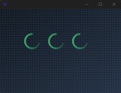{.dark .snapshot}
== tab "Light" icon:sun
{ .snapshot}
== tab "Dark" icon:moon
{ .snapshot}
:::
:::
::: hero layout:split glow:true
## Center Text (`ShowText`, `Text`, `TextColor`)
Set `ShowText = true` to render a label inside the spinner ring. Use `TextColor` and `Font` to match your design system. The ring automatically shrinks to fit the text.
```csharp "🔴 🟡 🟢"
var panel = new FlowLayoutPanel
{
Width = 260,
Height = 160,
Padding = new Padding(20),
BackColor = Color.Transparent,
AutoScroll = false,
FlowDirection = FlowDirection.LeftToRight
};
var spinner = new KtSpinner
{
Width = 100,
Height = 100,
Margin = new Padding(10),
Color = KtColor.PRIMARY,
Thickness = 5,
Speed = 2,
ShowText = true,
Text = "Loading",
TextColor = KtColor.CONTENT,
Font = new Font("Segoe UI", 8f),
};
panel.Controls.Add(spinner);
```
== side
::: tabs
== tab "Auto" icon:app-window
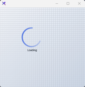{ .light .snapshot} 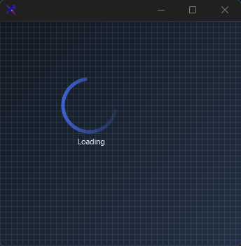{.dark .snapshot}
== tab "Light" icon:sun
{ .snapshot}
== tab "Dark" icon:moon
{ .snapshot}
:::
:::
::: hero layout:split glow:true
## Animation Speed (`Speed`)
Control the rotation velocity. `Speed = 1` is calm and deliberate; `Speed = 8` is urgent and energetic. Adjust to match the perceived weight of the operation being waited on.
```csharp "🔴 🟡 🟢"
var panel = new FlowLayoutPanel
{
Width = 320,
Height = 120,
Padding = new Padding(20),
BackColor = Color.Transparent,
AutoScroll = false,
FlowDirection = FlowDirection.LeftToRight
};
var slow = new KtSpinner
{
Width = 60,
Height = 60,
Margin = new Padding(10),
Color = KtColor.WARNING,
Thickness = 6,
Speed = 1,
};
var normal = new KtSpinner
{
Width = 60,
Height = 60,
Margin = new Padding(10),
Color = KtColor.WARNING,
Thickness = 6,
Speed = 4,
};
var fast = new KtSpinner
{
Width = 60,
Height = 60,
Margin = new Padding(10),
Color = KtColor.WARNING,
Thickness = 6,
Speed = 8,
};
panel.Controls.Add(slow);
panel.Controls.Add(normal);
panel.Controls.Add(fast);
```
== side
::: tabs
== tab "Auto" icon:app-window
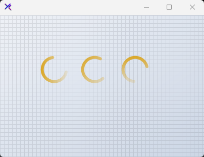{ .light .snapshot} {.dark .snapshot}
== tab "Light" icon:sun
{ .snapshot}
== tab "Dark" icon:moon
{ .snapshot}
:::
:::
::: hero layout:split glow:true
## Color Themes (`Color`)
Swap the entire spinner accent with any `KtColor`. The ring uses a linear gradient from the chosen color to transparent, giving it a soft trailing edge regardless of the base hue.
```csharp "🔴 🟡 🟢"
var panel = new FlowLayoutPanel
{
Width = 320,
Height = 120,
Padding = new Padding(20),
BackColor = Color.Transparent,
AutoScroll = false,
FlowDirection = FlowDirection.LeftToRight
};
var primary = new KtSpinner
{
Width = 60,
Height = 60,
Margin = new Padding(10),
Color = KtColor.PRIMARY,
Thickness = 6,
};
var rose = new KtSpinner
{
Width = 60,
Height = 60,
Margin = new Padding(10),
Color = KtColor.Rose,
Thickness = 6,
};
var emerald = new KtSpinner
{
Width = 60,
Height = 60,
Margin = new Padding(10),
Color = KtColor.Emerald,
Thickness = 6,
};
panel.Controls.Add(primary);
panel.Controls.Add(rose);
panel.Controls.Add(emerald);
```
== side
::: tabs
== tab "Auto" icon:app-window
{ .light .snapshot} {.dark .snapshot}
== tab "Light" icon:sun
{ .snapshot}
== tab "Dark" icon:moon
{ .snapshot}
:::
:::
## API `Reference`
| | | |
| -------- | ------- | ----------- |
| ::: tag "Color" icon:wrench | ::: tag "Kt-Color" color:#820BF4 icon:corner-down-right url:/utilities/kt-color | *Sets the indicator color.* |
| ::: tag "TextColor" icon:wrench | ::: tag "Kt-Color" color:#820BF4 icon:corner-down-right url:/utilities/kt-color | *Sets the fore color.* |
| ::: tag "CapPoint" icon:wrench | ::: tag "CapPoints" color:#6B7C94 icon:check-check | *Sets the point where the cap will be applied.* |
| ::: tag "CapStyle" icon:wrench | ::: tag "CapStyles" color:#6B7C94 icon:check-check | *Sets the indicator cap style.* |
| ::: tag "DashCap" icon:wrench | ::: tag "DashCaps" color:#6B7C94 icon:check-check | *Sets the indicator dash cap format.* |
| ::: tag "Preset" icon:wrench | ::: tag "Presets" color:#6B7C94 icon:check-check | *Sets a loading style preset. Ensure that the property 'AllowPresets' is enabled.* |
| ::: tag "Style" icon:wrench | ::: tag "Styles" color:#6B7C94 icon:check-check | *Sets the indicator ring style.* |
| ::: tag "AllowPresets" icon:wrench | ::: tag "Boolean" color:#0B64F4 icon:external-link url:external:https://learn.microsoft.com/en-us/dotnet/api/system.boolean?view=netframework-4.8 | *Sets a value indicating whether style presets are allowed.* |
| ::: tag "ShowText" icon:wrench | ::: tag "Boolean" color:#0B64F4 icon:external-link url:external:https://learn.microsoft.com/en-us/dotnet/api/system.boolean?view=netframework-4.8 | *Sets a value indicating whether the text will be displayed.* |
| ::: tag "Font" icon:wrench | ::: tag "Font" color:#0B64F4 icon:external-link url:external:https://learn.microsoft.com/en-us/dotnet/api/system.drawing.font?view=netframework-4.8 | *Sets the text font.* |
| ::: tag "Speed" icon:wrench | ::: tag "Int32" color:#0B64F4 icon:external-link url:external:https://learn.microsoft.com/en-us/dotnet/api/system.int32?view=netframework-4.8 | *Sets the progress speed.* |
| ::: tag "Thickness" icon:wrench | ::: tag "Int32" color:#0B64F4 icon:external-link url:external:https://learn.microsoft.com/en-us/dotnet/api/system.int32?view=netframework-4.8 | *Sets the progress thickness.* |
| ::: tag "DashWidth" icon:wrench | ::: tag "float" color:#0B64F4 icon:external-link url:external:https://learn.microsoft.com/en-us/dotnet/api/system.single?view=netframework-4.8 | *Sets the indicator dash pattern.* |
| ::: tag "Text" icon:wrench | ::: tag "String" color:#0B64F4 icon:external-link url:external:https://learn.microsoft.com/en-us/dotnet/api/system.string?view=netframework-4.8 | *Sets the loader text.* |
| ::: tag "TextPadding" icon:wrench | ::: tag "Padding" color:#0B64F4 icon:external-link url:external:https://learn.microsoft.com/en-us/dotnet/api/system.windows.forms.padding?view=netframework-4.8 | *Sets the text padding.* |
---
## [KimTools / Controls / SvgCanvas](https://kimtoo.net/controls/kt-svg-canvas/)
---
title: "KimTools / Controls / SvgCanvas"
description: "A high-performance SVG canvas with a full templating engine supporting model binding, loops, conditionals, show/hide, processing instructions, and CSS SmartFormat variables."
keywords: ["KimTools", "Controls", "KtSvgCanvas", "SvgCanvas", "Panel"]
toc: false
layout: "full"
---
::: hero layout:split glow:true
# Kt `SvgCanvas`
A high-performance SVG canvas with a full templating engine supporting model binding, loops, conditionals, show/hide, processing instructions, and CSS SmartFormat variables.
::: callout tip
#### 🟣 PREMIUM
This component is only available in the Premium version of KimTools.
::: button "Get KimTools" external:https://kimtoo.net/#pricinghttps://kimtoo.net/#pricing icon:external-link
:::
== side
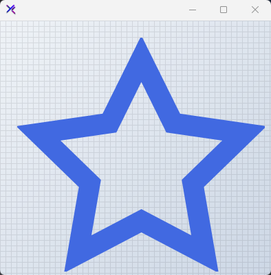{ .light .snapshot} {.dark .snapshot}
:::
::: callout success
#### 🟢 DESIGNER SUPPORT
**This control has full Visual Studio design-time support.**
Drag it from the Toolbox onto your form, customize its properties directly in the Properties window, and KimTools will generate the corresponding code for you.
:::
::: tabs
== tab "IconHeart"
```svg
```
== tab "IconStar"
```svg
```
== tab "IconBell"
```svg
```
== tab "IconCheck"
```svg
```
== tab "IconGear"
```svg
```
== tab "IconHome"
```svg
```
== tab "IconMail"
```svg
```
== tab "IconSearch"
```svg
```
== tab "IconUser"
```svg
```
== tab "IconX"
```svg
```
:::
::: hero layout:split glow:true
## Icon Row / Tabler Set
Display multiple Tabler icons side-by-side in individual `KtSvgCanvas` instances. Each canvas carries its own `KtSvgTemplate` with a distinct icon path. Canvas dimensions are set to 80 % of the panel height for uniform, responsive sizing. Use the `Color` property to theme each icon independently against a transparent background.
```csharp "🔴 🟡 🟢"
var panel = new FlowLayoutPanel
{
Width = 500,
Height = 500,
Padding = new Padding(25),
BackColor = Color.Transparent,
AutoScroll = false,
FlowDirection = FlowDirection.LeftToRight
};
string[] icons = { IconHome, IconUser, IconHeart, IconHeart };
KtColor[] colors = { KtColor.PRIMARY, KtColor.INFO, KtColor.ERROR, KtColor.WARNING };
for (int i = 0; i < icons.Length; i++)
{
int dim = 100;
var canvas = new KtSvgCanvas
{
Width = dim,
Height = dim,
Margin = new Padding(8),
BackColor = Color.Transparent,
Color = colors[i]
};
canvas.Templates.Add(new KtSvgTemplate(canvas.Templates)
{
Name = $"icon-{i}",
Svg = icons[i]
});
panel.Controls.Add(canvas);
}
```
== side
::: tabs
== tab "Auto" icon:app-window
{ .light .snapshot} {.dark .snapshot}
== tab "Light" icon:sun
{ .snapshot}
== tab "Dark" icon:moon
{ .snapshot}
:::
:::
::: hero layout:split glow:true
## Themed Icons (`Color`, `BackColor`)
Tabler icons inherit the canvas `Color` as their stroke color. Place canvases on contrasting `BackColor` surfaces - light on dark, primary on white, or tinted washes. The error state uses `KtColor.ERROR` at full strength over a 20 % opacity wash. This makes the same vector paths adapt to any theme surface without duplicating SVG markup.
```csharp "🔴 🟡 🟢"
var panel = new FlowLayoutPanel
{
Width = 420,
Height = 200,
Padding = new Padding(20),
BackColor = Color.Transparent,
AutoScroll = false,
FlowDirection = FlowDirection.LeftToRight
};
int dim = 100;
var canvasSearch = new KtSvgCanvas
{
Width = dim,
Height = dim,
Margin = new Padding(8),
BackColor = KtColor.SUCCESS % 20,
Color = KtColor.SUCCESS
};
canvasSearch.Templates.Add(new KtSvgTemplate(canvasSearch.Templates)
{
Name = "search",
Svg = IconSearch
});
var canvasCheck = new KtSvgCanvas
{
Width = dim,
Height = dim,
Margin = new Padding(8),
BackColor = KtColor.WARNING % 20,
Color = KtColor.WARNING
};
canvasCheck.Templates.Add(new KtSvgTemplate(canvasCheck.Templates)
{
Name = "check",
Svg = IconCheck
});
var canvasHeart = new KtSvgCanvas
{
Width = dim,
Height = dim,
Margin = new Padding(8),
BackColor = KtColor.ERROR % 20,
Color = KtColor.ERROR
};
canvasHeart.Templates.Add(new KtSvgTemplate(canvasHeart.Templates)
{
Name = "heart",
Svg = IconHeart
});
panel.Controls.Add(canvasSearch);
panel.Controls.Add(canvasCheck);
panel.Controls.Add(canvasHeart);
```
== side
::: tabs
== tab "Auto" icon:app-window
{ .light .snapshot} {.dark .snapshot}
== tab "Light" icon:sun
{ .snapshot}
== tab "Dark" icon:moon
{ .snapshot}
:::
:::
::: hero layout:split glow:true
## Model-Bound Progress Bar & Text
A simplified progress bar built with basic `` elements and top-left text using `dominant-baseline="hanging"` to prevent vertical cropping.
```csharp "🔴 🟡 🟢"
var canvas = new KtSvgCanvas
{
Width = 400,
Height = 400,
BackColor = Color.Transparent,
Color = KtColor.PRIMARY,
Dock = DockStyle.Fill
};
canvas.Templates.Add(new KtSvgTemplate(canvas.Templates)
{
Name = "status",
Svg = """
"""
});
canvas.Model["status"] = "Uploading...";
canvas.Model["progress"] = 60; // 0 to 90 scale to fit the track width
canvas.Render();
```
== side
::: tabs
== tab "Auto" icon:app-window
{ .light .snapshot} {.dark .snapshot}
== tab "Light" icon:sun
{ .snapshot}
== tab "Dark" icon:moon
{ .snapshot}
:::
:::
::: hero layout:split glow:true
## Conditional Rendering (`x-if` / `x-else`)
Toggle entire SVG branches using `x-if` and `x-else` attributes.
```csharp "🔴 🟡 🟢"
var canvas = new KtSvgCanvas
{
Width = 400,
Height = 400,
BackColor = Color.Transparent,
};
canvas.Templates.Add(new KtSvgTemplate(canvas.Templates)
{
Name = "toggle",
// preserveAspectRatio="xMidYMid meet" centers and fills the 400x400 space uniformly
Svg = """
"""
});
canvas.Model["isActive"] = true;
canvas.Color = canvas.Model["isActive"].ToObject()
? KtColor.SUCCESS
: KtColor.NEUTRAL;
canvas.Render();
```
== side
::: tabs
== tab "Auto" icon:app-window
{ .light .snapshot} 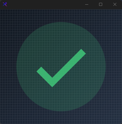{.dark .snapshot}
== tab "Light" icon:sun
{ .snapshot}
== tab "Dark" icon:moon
{ .snapshot}
:::
:::
::: hero layout:split glow:true
## List Rendering with loops (`x-for`)
Repeat SVG fragments with `x-for` using a JSON array literal injected via `
"""
});
```
== side
::: tabs
== tab "Auto" icon:app-window
{ .light .snapshot} {.dark .snapshot}
== tab "Light" icon:sun
{ .snapshot}
== tab "Dark" icon:moon
{ .snapshot}
:::
:::
::: hero layout:split glow:true
## Visibility Toggles (`x-show` / `x-hide`)
Control visibility without removing elements from the DOM using `x-show` and `x-hide`. These attributes compile to SVG `visibility` rules driven by the model. Useful for soft-state indicators - online dots, notification badges, or validation checkmarks.
```csharp "🔴 🟡 🟢"
var canvas = new KtSvgCanvas
{
Width = 400,
Height = 400,
BackColor = Color.Transparent,
Color = KtColor.WARNING
};
canvas.Templates.Add(new KtSvgTemplate(canvas.Templates)
{
Name = "visibility",
Svg = """
"""
});
canvas.Model["visible"] = true;
canvas.Model["hidden"] = false;
canvas.Render();
```
== side
::: tabs
== tab "Auto" icon:app-window
{ .light .snapshot} {.dark .snapshot}
== tab "Light" icon:sun
{ .snapshot}
== tab "Dark" icon:moon
{ .snapshot}
:::
:::
::: hero layout:split glow:true
## Template Injection (``, `x-bg`)
Compose complex graphics by referencing sibling templates. Use processing instructions `` or `` tags to inline one template into another. Here a soft background wash is defined once and injected into the foreground mail icon, keeping markup DRY.
```csharp "🔴 🟡 🟢"
var canvas = new KtSvgCanvas
{
Width = 400,
Height = 400,
BackColor = Color.Transparent,
Color = KtColor.WARNING
};
// Background template - injected by processing instruction
canvas.Templates.Add(new KtSvgTemplate(canvas.Templates)
{
Name = "bg",
Svg = """
"""
});
// Foreground template - consumes bg via then draws the icon
canvas.Templates.Add(new KtSvgTemplate(canvas.Templates)
{
Name = "main",
Svg = """
"""
});
```
== side
::: tabs
== tab "Auto" icon:app-window
{ .light .snapshot} {.dark .snapshot}
== tab "Light" icon:sun
{ .snapshot}
== tab "Dark" icon:moon
{ .snapshot}
:::
:::
::: hero layout:split glow:true
## CSS Variables (`var()`)
Inside `
{label}
"""
});
canvas.Model["accent"] = "#8b5cf6";
canvas.Model["label"] = "KimTools";
canvas.Render();
```
== side
::: tabs
== tab "Auto" icon:app-window
{ .light .snapshot} {.dark .snapshot}
== tab "Light" icon:sun
{ .snapshot}
== tab "Dark" icon:moon
{ .snapshot}
:::
:::
::: hero layout:split glow:true
## Advanced Composition
Combine `